Tampilkan postingan dengan label tracking. Tampilkan semua postingan

Rabu, 20 April 2011

Everyday Tracking - iPhone is Tracking the Users Travels

It has been unveiled by researchers Pete Warden and Alasdair Allan this week on the o'reilly radar, that the iPhone is actually tracking its location and storing it on in a database file that is updated and synced with the mac. As of know it is believed this feature has been put in with the iOS 4.0 update about a year ago.

Warden and Allan have discovered the file while poking around some log files in the backup of the iPhone data. The file appears to store about a years worth of location data amongst with cell and provider information. The actual values stored are time stamp, latitude, longitude, operator, country code and cell id. This is actually very detailed information on individual whereabouts over long term.

iPhone tracking data
Image taken from peteWarden / Screen shot of the app visualising the data collected by the iPhone. Here a section of south east England with Warden's personal tracking data.

This data is exactly what the urbanDiary project has been collecting over two month using specialised GPS devices for very detailed tracking and now it appears that every iPone and iPad user has also been doing this. From the urbanDiary project it became clear how interesting this data is for urban research, but in a next step also very much for urban planning on many levels. Taking all these iPhone and iPad users together great information for the future planning of our cities will be available.

However, the discussion is obviously going completely the other way. Privacy and stalking concerns come first. On the Guardian Simon Davies, director of the pressure group Privacy International, said: "This is a worrying discovery. Location is one of the most sensitive elements in anyone's life – just think where people go in the evening. The existence of that data creates a real threat to privacy. The absence of notice to users or any control option can only stem from an ignorance about privacy at the design stage."

So far it is unclear whether someone other than the owner has access to the data, more concrete whether the file is being submitted to Apple or any third party. Allan and Warden point out that they haven't found anything pointing in this direction. However they point out that the information is not being stored accidentally and it is stored unencrypted.


However, the data stored on the iPhone is nothing new. Every service provider stored this information as part of the service. They even had the data of all the users they serve, where as in comparison the iPhone only stores its own information. But the provider data is protected and it takes a court order to access it.

Allan and Warden have put together a software that will find your tracing data on the computer hardrive (if you are an iPhone or iPad users on iOS4) and visualises it for you as shown above or in the clip below. They promis not to transmit any data and that it al happens locally. You are in compete controle of the data and the visualisation. Their page discusses the topic at length with a good Q&A section at the bottom. However, it seem to have a bit of a conservative touch with a strong focus on the concerns around the fact that it has been tracking. So far however, it seem unlikely that someone else has had access tot he data unless they had access tot he computer and if they did there might be much more delicate information they had access to than the location information of your whereabouts. For example the list of your passwords with your online banking details or your correspondence.

There have been speculations about this sort of tracking but there were mainly concerns about some apps installed on the iPhone and that they would transmit the location information to a central server without letting the user know. This would be more of a concern since with the app providers there is a lot less controle and trust than there might be with on big company providing the system.

Mobile phone tracking data
Image taken from FastCompany / Watch a Cell Phone Company Stalk a Customer. That's every single movement, text, and phone call by Green Party politician Malte Spitz, collected by Deutsche Telekom.

The German newspaper 'Die Zeit' run a story on the tracking data a German politician was able to get from the mobile service provider complaining abou them tracking his moves. And indeed the information is very accurate and also over a long term, six month, similar to the iPhone data. Also TomTom have been collecting the tracking information of all their SatNav users over the past five years. It is at the moment and most likely for the near future the baseline that the location information is going to feature as the main concern of both user and provider. We will see a lot more of these unveilings of location information being stored, transmitted and used. This will be how the twenties in 2000 will be remembered, as the location times.

Jumat, 01 April 2011

Tracking the Worms - Routines and Trails in the Soil

Over the pas few month single-blogs was involve with a another tracking project lead by the British Royal Soil Society. The focus of the project is the investigation of the upper and middle soil layer around Britain to determine the advocational capacity of wildlife. It has been acknowledge how important these layers are in the wider context of the life cycle documentation.

We have been tracking earthworms as the main regenerator of soils. They are essential for the quality of the soil basically eating their way through the ground leaving behind healthier material. This is in the growint traditionof animal tracking projects. For earlier stories see HERE.

earth worm
Image taken form Wikipedia / The common Earth Worm.

soils
Image taken form envirosci / Different types of soils allow for different digging speeds.

For the tracking we have been working with a modified bird tracker, a mini responder worked into a plaster. This flat design of the technology bit has no impact on the worms capacity to digg his way through the tunnels. The antenna is the only element that sticks out but is very flexible. This pat is essential to allow for good communication under ground.

earthWormTracker
Images taken form Arturs clip art and superstock / The tiny tracker plaster used in the study. Here 'Flippy' models the unintrusive investigation device. She seemed very happy and wiggled this way and that way.

Great data has been received from this ongoing investigation. We now have a record depth of 22 meter that one of the worms 'diggy' has reached on the 21 of March. It has been unknown that worms do actually dig very deep after a good night out. Another worm 'speedy' has managed to underpass a road up north in the Willisher Area in just 5.5 days. Given the fact that it is difficult to navigate underground 'Speedy' has shown a tremendously impressive performance.

earthworm digging
Image taken from Transit Newton Abbot / Some of the participating back gardens had to be dugg up in order to reclaim the rather expensive tracking equipment. However most people were happy to contribute something to an important environmental assessment.

However, the activity is not only restricted to underground some of the worms like 'birdy' have a history of overground activities, including climbing and flying. 'Birdy must have been picked up by a bird or something. His record showed a rapid movement up to a hight of 8.4 meter above soil level. Her name should actually be 'Lucky', she escaped and dugg in right after. She is now at a constant depth of around 30 cm.

Some of the study results are also expected to find their way into the development of the the lastest Worms 3D game.

Worms 3D
Image taken form application for us / Guess this is the new bird strategy.

Senin, 07 Februari 2011

Postal Tracking - Where the Mail Goes from London

Inspired by Tim Knowles' work on postal tracking as well as the publication "The Englishman who posted himself", this had to be tried. Maybe one should not try this at home, however, we did. This project is run in collaboration with Studio-Bread in Vienna.

The tracker was sent from London to Vienna, where it arrived after many days, too many days actually. The battery was dead, but the tracker alive. And to much surprise it actually contained data. It did record for the time siting around various Royal Mail London sorting centres.

postalPack01
Image by single-blogs / GPS and parcel as used on the way from London to Vienna. Parcel created by Studio-Bread.

It came back from Vienna in a much more sophisticated little box, faster and with more data. Some places in Vienna, including the airport and presumably a postal sorting centre. And, one is stunned Royal Mail is organised to this extend, on the way back the tracker asses the same sorting centres. From Heathrow back in to London where it sits at the Clerkenwell sorting centre again.


Google Earth embedded, linking to a KML file. You can use the time slider to track the parcel. You can manually adjust the time window. Active tracks are shown in bright yellow rest is faded out. Zoom in to see the locations in detail. You can make your own Google Gadget HERE.

Apparently "Mount Pleasant is one of the world's largest sorting offices, covering an area of 7.5 acres. It's home to an expansive set of 23 miles of train tunnels which were built to deliver the post and did so up until May 2003. Though the railway is no longer used the tunnels, running 70 feet under the streets of central London between Whitechapel and Paddington, still remain. There are no visitors allowed" from LondonTown.

Royal Mail Sorting Office
Image taken from Londontown / Royal Mail Mount Pleasant Sorting Office (Clerks working in the Return Letter Office, Mount Pleasant, 1934).

Since this is not much here is a more inspiring clip as it was mentioned by radek in a comment on the last postal tracking post on this blog - thanks for the link again.

Kamis, 03 Februari 2011

Latitude is Not Dead - Checking in is Taking Over the World

As Google introduced Google Buzz back in 2009 they simply delivered it straight past the existing location based service. Back then, the introduction came with a bang an Google put a lot of effort pushing into the location based application segment. Even though Google basically has a monopole on everything location based, one year on Buzz has been sleeping for most of its existence.

Services popping up, mainly Goala and Foursquare raised instead. With it a whole bunch of similar apps like Brightkite and later in 2010 also facebook managed to more or less successfully integrate the location feature into the platform.

Foresquare released some stats last month claiming a growth of 3400% in the past year! Not sure what exactly this means, but generally it can be said that this sort of application is currently very popular amongst smart phone users. What I haven't seen so far are gender stats on how girls and boys compare in the usage of location based self tagging. From my experience, not at all empirical, when ever I check in at a facebook place, there seem to be a lot more boys already checked in at this place than girls. Maybe I am in the wrong place, but maybe its a boys thing.

foursquare stats
Graph taken from foursquare / Honestly, 2010 was just insane. The numbers tell the story better than we can, so we put together this little infographic. (Also, our 6,000,000th user signed up last week!) See similar twitter stats in this earlier post HERE.

Anyway, here comes Google and resurrects Latitude from the dead (see earlier post on the death of Latitude HERE) to play alongside these platforms letting users check in. This, for those who have missed the short earlier live of Latitude, is quite a development from what L was at the beginning. It was a location sharing platform based on location not venue. Al you coud see was the dots of your friends on the map. Of course this was a major inovation back then and it was one of the first large scale applications of this kind. It was cool, but noone understood it. There was just too much negative press and too many concerned voiced tearring it all back down for Google, only to make way for the 'younger' generation of app that are now this successful.

Privacy concerns were at the forefront of the discussion and one of the odd things that was introduced by Google was a reminder message, sent roughly every two weeks to respond to concerns about people knowing the where abouts of a person without his or her knowing. I still receive this message I guess.
Hopefully Google has now stopped sending them, this would clutter the mailboxes of the potentially now growing user group unnecessarily.

New Latitude New Latitude
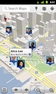
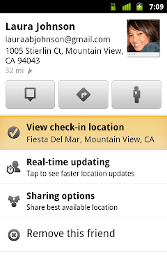
Images taken from Google Lat Long Blog / See where your friends are on a map and where they’re checking in. Latitude check-ins are built right into Google Maps and Place pages.

The new service lets people check in at locations and also, this is new, check out. There are various options for automatic check in or reminders to check in and so on. I especially like the line in the promotion clip where it says "you can automatically check in, there is no need to interrupt the conversation to let your friends know that you have checked in."

The new app has so far only been released for the new Android 1.6 and runs on the updated Google Maps 5.1 iPhone users can so far only use the updated Latitude version 2.01, where the locations of your friends are visible, but for yourself the check in function is not yet available. More details on the Google Blos Official Blog and Mobile Blog.

Kamis, 13 Januari 2011

Postal Tracking - Where the Mail Goes

Sending letters through the post has something very romantic to it, but thats probably only because it has long been overtaken by instant messaging and tweeting. However, the mailing systems are big business and it is not that people send les stuff through the post.

Anything goes, just as Willie Reginald Bray pioneered, as documented in the recently published Princeton publication 'The Englishman Who Posted Himself and Other Curious Objects', parcel are sent everywhere.

How are these boxes over boxes actually shipped, how does it look and feel inside the sorting wear houses, to were did the van deliver before it stopped at my house? Tracing the journey of a parcel could be fascinating. Where Bray tested what can be sent, pioneers today what to find out how it is been sent.

The London based artist Time Knowles has investigated this in his ongoing series 'Postal Works' and is to showcase his latest postal tracking art work today. Keep posted for the link to the movie that will be released later in the day here!

http://www.e3-hs9.com/

Mk3
Image by Tim Knowles / 'Spy Box' A new postal work with the box, buggy and bearings made in perspex, a pen situated in the centre of the buggy traces out it's movements within the box. 2006 - Perspex, cardboard, pen, ink on paper

Knowles started however with his investigation a lot earlier. Very fascinating are his initial movement tracking projects. In the early days the packet contained a blank paper and a pen on wheels to record the movement of the box as it is being shipped through the postal system.

From these analogue projects Knowles moved on to GPS tracking and then also video and sound recording from inside the box as it is on its way from sender to receiver. Of course there where noumerous problems on the 'Spy Box's' way. This included a phone call from the FedEx Head of Security, as they detected the live electronic equipment in the box at the airport.

SpyBox
Image by Tim Knowles / 'Spy Box' A digital camera inside a parcel looks out through a small hole and captures images of its journey through the postal system. The Spy Box was sent from my studio to the gallery taking an image every 10 seconds recording a total of 6994 images these were then edited together to create an animated slideshow. E3 to WC1E - 2006 - Card, aluminium, digital camera, timing circuit, wiring & 6 min DVD loop.

For example "the parcel was stopped by FedEx,” Knowles said. “My phone number was on the box, so I ended up being on the phone to FedEx’s head of security for about 45 minutes explaining that it was an artwork, telling him just to open it up and that there was a switch that could turn it off.” Quite understandably FedEx’s security services said ‘There’s no way we’re opening it’ having X-rayed it and found live electrical equipment inside. They put the package into another card-board parcel and send it back to Knowles, leaving him with a lot of pictures of the inside of a box."

For the latest work Knowles teamed up with Roya Mail. With the recent bombs in FesEx parcels the issu of electronics in the mail was hot and risky. The latest work to be presented today remains therefor in the UK and is a parcel sent from London E3 5QZ, near Victoria Park, to HS9 5XW, Isle of Barra.

PICT129-ScanmnaAnimation
Image by Tim Knowles / 'Pot Box'

On the 902 mile journey the mounted camera took 20'000 pictures and recorded a continuous sound stream. As the Independent journalist Matilda Battersby notes about the work: "One of the lovely things about watching the painstakingly compiled video and audio compilation of the parcel’s journey is the many changing accents and commentary from the workers as it makes its way".

The work is presented to day between 18h30-20h30 at Contemporary Art Society, 11-15 Emerald Street, London WC1N 3QL. A limited book edition is available with the title 'Post Box E3 5QZ – HS9 5XW'.

PICT073-0848k
Image by Tim Knowles / 'Pot Box'

----
U P D A T E 2011-01-14

The website is online at http://www.e3-hs9.com/ and it shows the the video recorded on the parcels journey together with the audio recordings and a map. The parcel was GPS tracked on its journey.
Head over to the website to check out the details.

Senin, 10 Januari 2011

Global Phone Calls

How the world is connected across large distances has recently be shown by projects analysing phone calls and mapping origin and destination. The MIT SensableCity Lab has done some work, Barabasi and his colleagues worked on it and also Jon Reades from CASA.


The latest work by MIT and UCL, above as circulated a couple of weeks ago, has redrawn the regions of Britain according to phone calls. The maps result from the analysis of a large phone data set covering the whole of the UK.

These large data sets are all held by the phone companies together with presumably a whole lote more interesting stuff. It is rather difficult and complicated to handle and only accessible for a few people.

However with the rise of apps on smart phones such data sets are generated by small independant companies. FTFun is one of them. They have developed an app for the iPhone focusing on facetime. Facetime was introduced by Apple with the release of the iPhone 4 and allows people to see one another during the phone call. These video calls are made possible by a second camera on the front of the iPhone 4. This works however only between two users of an iPhone 4. FTFun have developed a desktop app to allow other users to join in these video calls without the need of an iPhone 4.

As a byproduct the company sits on a data pool of location based connection information. At the beginning of the year they have decided to make some of it available as KML files viewable in Google Maps or Google Earth.

The company so far has 11k users and 185766 face time calls in the last four month since the release of iPhone 4. The data is release in three sets, the past three hours, yesterdays data and live data updated every two or so minutes. Below you can see a map showing the connections over the past three hours of the day.


View Larger Map

Found via Geo2web.

Jumat, 07 Januari 2011

Mapping Tracks - Where have you been all these days?

The end of a calendar year has become the time for summing up and reviewing. In terms of tracking this is what a few of us also ave done and presented the track recordings of the closing 2010. So where have you been all these days?

In the past few years more and more people are recording their movements using different methods, mostly GPS devices. With the new smart phone with built in GPS this has become even easier. Numerous apps are now out there helping you to record organise and visualise your movements.

Three guys, Andy Woodruff over at Cartogrammar and Eric Fischer who is the creator of the citie maps based on the geo taged images on flickr and picasa and Achim Tack have been dedicated to record all the 2010 trips and visualise them on a map.

Personal geography of 2010Image taken from Eric Fischer on flickr / Personal geography of 2010. How big is your word?

Eric has coded his trips using a colour code for modes of transport. Very similar to the coding he used for the photo mapping project. So it goes like this: "black is walking, red is bicycling, blue is cars or buses, and green is above-ground rapid transit or freeways". He points out that tunnels are not shown.

It is quite interesting how the red and blue, the bicycle and the car, over lap and almost match. Would be interesting to know if he also used the same automatic mode of transport detection based on speed as he did for the photo mapping project.

Eric is traveling around San Francisco on both sides of the bay area. Here is the corresponding NCL twitter map.

2010 tracks with intensityImage taken from Andy Woodruff on flickr / 2010 tracks with intensity. More yellow = more frequently traveled.

Andy is doing this very low key by hand. Of course many, including myself have suggested to him to start using a GPS unit. But he continues to resist and manually retrace his steps as a sort of summary of the day.

Interesting also his motivation "The most valuable thing about this habit, though, is not the post-mapping analysis but rather the motivation it generates to get out and explore and get to know new parts of the city. I’m sure you can imagine the thrill of getting to draw a line on a new part of the map".

Andy also has recorded the modes of transport on his drawings. Here are the maps by type.

2010 tracks by mode of transportation
Image taken from Andy Woodruff on flickr / 2010 tracks by mode of transportation.

Unfortunately we havent got a NCL twitter map of Boston yet but we are working on it.

Achim is also using a GPS device, a Holux GPSort 245 (we would be interested to hear his experiences with this one), since his move to Hamburg earlier this year and has ever since recorded his everyday moves.

The colour coding here is also according to mode of transport automatically detected via speed, done using arcGIS.

His interest lies more on the repetitive patterns and this is also how he has coded the maps. He notes: "Thursday I go to the gym (Donnerstags gehe ich ins Fitness)" / "I take the bus no 120 to go to work (Ich nehme den Bus 120 zur Arbeit)"

Here is for example a map of his Weekend trips:


The presentation using zoom.it is pretty neat and allows for details to be explored. It works like the imageCutter software that was used for the NCL maps and the twitter social networks. More on Achims paths on his blog.

My own track record has a different cycle, it starts in autumn. The lates map is from October 2009 to October 2010. This year the map shows a comparison between the previous year and the most recent year. However mode of transport is not represented.

oneYearLND09-10 London
Image by single-blogs / London overview of the 2010 GPS track record. A one year drawing of movement on a daily basis, recording all activities and trips. For a large version click HERE.

The NCL London map is available HERE and the corresponding twitter social network HERE.

Rabu, 27 Oktober 2010

Stadtraum - UrbanDiary

The data collection in Basel is well under way and the second series of participants are now collecting data for the study. For ten people we already have a complete set of two month of tracking data using the new GPS trackers.

There are a number of very interesting observations that has been made also in comparison with the previous study undertaken in London. The scale differences are striking what is a regular commute is completely different. It might be on average one hour for Londoner, but is probably stretched for Basler if it is thirty minutes. As a consequence work and leisure journeys do tend to much more similar in Basel than in London where certain trips have a stronger specification.
However there are a lot of similarities too. Foremost the extension of the direct and persistent interaction in the urban realm is very much directed and selective. There is in both cases a strong local activity around the 'known' territory.

The study was also presented to representatives of the Basel Department of Town Planning who were interested to hear about the research undertaken. A summary of the presentation can be previewed below, it is in German though, but there are enough images to illustrate and communicate.


Essentially it explains the method and uses illustration taken from all three sample studies in London, Plymouth and London. The Basel data is still in development so only some preliminary information could be provided. However the maps 'drawn' by the participants using the GPS, beautifully illustrate the focus each individual puts on the city.

UDp_Basel_101026
Image by single-blogs / Visualisation of GPS tracked movement in Basel, Switzerland. The nine different individuals have been tracked over a longer period and it beautifully shows the individual focus on the city that is developed.

Kamis, 02 September 2010

RGS Annual Conference 2010

Today is RGS day, actually RGS has been on since Tuesday this week. RGS is the Royal Geographical Society: 'We are the learned society and professional body for geography'. The annual conference of course is a big event, prestigious and well attended we hope. THe official twitter tag for this conference is #RGSIBG10. So look out for this to follow the latest news on the day.

I will be presenting a paper in the session 143 organised by James Cheshire from spatialanlaysis. The session title is: Postgraduate Session: Analysing and Visualizing Social Change

THe paper I will be presenting is on aspects of routine migration in the city, the daily migration from home to work and changes in location on short term. I will be using both, the study using GPS to trace individuals in urban areas as well as the more recent twitter mined data with the New City Landscapes to illustrate these aspects. Important key elements will be time obviously, but also a number of aspects of repetition, memory and the creation of identity. There will also be a focus on visualisation using the Hagerstrand time-space aquarium.

The abstract of the paper:
The research project investigates temporal spatial patterns of citizens. For the study we are using GPS technology to track participants over a longer period to record repetitive activities. The collected data, through the GPS has a timestamp and a location, serves well this purpose. However the challenge is the visualisation and the interpretation of the data. To approach this problem the ‘technical’ GPS data is complemented with individual information collected through interviews and mental maps. This set of data helps to create a context, in which the aspects of temporal experience can be studied as an additional dimension to urban life. Visualisation concentrates on time budget in the spatial context taking location features into account as part of the memory as well as the creation of identity. For visualisation purposes a number of approaches are used, from time-space aquariums to animations.

Senin, 30 Agustus 2010

UrbanDiary Comparison Study

The UrbanDiary project lay dormant for a while after its write up in the CASA working paper 151. However it is back on track with a new set of participants currently tracking their every move. The biggest problem to overcome was the equipment, we simply did not have the recourses to keep it going on a larger scale. Throughout there were two GPS devices in use, but now we have again expanded and twelve GPS loggers are currently used simultaneously.

The area of study this time is not London. The idea is to set up a comparison between two locations. Currently the tracking location is the wider region around and of course in the city of Basel, Switzerland. Earlier posts on Basel can be found HERE and HERE.

It is a region of about 1'000'000 people The tourism office even puts it to 3.5m) and in this sense small compared to London, but in the Swiss context this is rather big. Basel-Stadt (the city of Basle) is the third largest city in Switzerland with 165'000 inhabitants.

TEB Besiedlung und Landschaftsgliederung
Image taken from TEB / The Basel region with green space (unbuilt land), urbanised land (grey) and water (blue). In dark grey is shown the urbanised land until 1960 and in light grey the urbanised land until the year 2000.

Basel is located right at the border to Germany and France. The region therefore covers all three countries. This is represented in the TEB, the 'Trinationalen Eurodistrict Basel' (the Three National Euro (not sure what Euro stands for) District Basel). This planing group is working across the borders and is put together from representatives of all three countries. For Basel as the main regional centre these connection sare very important as is the city for the region. In this sense the simbiosis of the different elements (culturally, politically and practical) will be an interesting aspect of the study in terms of spatial analysis.

The mix of participants is again, as was the London sample, a mixed group. It is put together of different age groups, interests and occupations. It will probably not be exactly the same mix, but similar. The idea is to also get some twenty participants in total to have a comparable amount of data.

The data is collected and stored locally on the device and it wil take a while untile we can download the new data and start analys and visualise. So for now this project has to run for about a month until the first data samples will be available. However I do have some very few days of sample tracks that will give an idea of the travel patterns that can be expected in this new location.

UD_initial_100829
Image by single-blogs for UrbanDiary / Preliminary GPS tracking data in the region of Basel, Switzerland. The data is based on three participants over a couple of days, data is unprocessed. THe large C shape in the centre corresponds with the shape of the river in the main urban area in the TEB overview above.

Senin, 21 Juni 2010

Live Visualz of London Tube Train Locations - Approximately

A Google Maps mash-up has gone online that visualises the approximate location of every single tube train on the London Tube network. This has become possible since TfL's move to install an open API allowing access to their vast pool of data. Through this the map calculates real time location of trains by accessing the data from departure information board. This is the same information passengers see on the platform. The very familiar 7 minutes, 3 minutes, 1 minute, due, writing in orange dot letters.
The API is currently still in beta and provided through the LondonDataStore.
This comes only a few days after the publishing of the API and it was developed by Matthew Somerville via mySociety. The source code for the mash-up is also available. It was developed in the context of the science hack day that took place over the past weekend.
This is great to look at, but like the information on the tube platform, we know from experience that the time displayed usually is just an approximation.
In an earlier post the beat of the london tube network was covered in a different visualisation type, using timeLapse.

Image by wired.co.uk / Screenshot of the live tube map

Thanks for the link to Duncan.

Jumat, 18 Juni 2010

Visualising Action on the Football Pitch

The Football World Cup virus has of course spread to all the mobile platforms, foremost the iPhone and iPad. Numerous apps promis the most up to date info and the most detailed analysis. In an earlier post I was interested in tracking of activity on the football pitch and came across these different methods of analysis. The big sports broadcaster are using a palett of software helping them with analysis as well as visualisation. The visualisation part has become important during these very formal and serious debates around the table. Usually the graphics put in to the video are based on tracking information derived from different cameras. There aren't currently physical tracking technologies in place, as for example RFID, GPS or Bluetooth. The producers must be very satisfied with the visual tracking tools. Tools are Piero, Visual Sports. A nice visualisation of pitch activity also is supplied by the New York Times including time slider allowing you to scroll through the 90 minutes dynamically.

totalFootball_CH-ES_allPasses
Image by single-blogs / Screen shot taken from Total Football 2010 iPhone app, analysis of the game Switzerland 1-0 Spain, all passes.

If you are keen to get up to date information on matches and analysis where ever you go and where ever you are, you need a app fot the iPhone or your new iPad. A really cool on eis the Total Football 2010 developed by Colm McMullan. It provides you with all the details and infos you want to know. I was particularly interested in the visualisation of spatial activity on the pitch. How do players stand and where is the action taking place. Here you can get detailed info down to which player took a throw in where, when, in which direction and how far - Amazing! With the dynamic slider all the information can be specifically focused on a specific period of the game or over the whole 90 min period.

totalFootball_CH-ES_attackPasses
Image by single-blogs / Screen shot taken from Total Football 2010 iPhone app, analysis of the game Switzerland 1-0 Spain, all passes in the attack third.

In te context of the game Switzerland Spain, the analysis of the spatial pattern are telling a lot about the narrative of the game. If you look at the spatial distribution of the passes by Spain that covers two third of the pitch towards the opposition goal witha strong focus around the Swiss box. The Swiss passes on the other hand got stuck in the center of the field with a high percentage of red, meaning failed passes.
The Swiss goal that decided the match was a real surprise just a few minutes into the second half. It was one of the long balls in to the Spanish half surprising the Spanish defence and muddling the ball in to to the net.
The strategy of the Swiss team to focus on closing the box with every player and simply not letting the Spanish side get to have a got at the net worked out and left this clear spatial pattern of a maximum of activity just outside the Swiss box.

totalFootball_CH-ES
Image by single-blogs / Screen shot taken from Total Football 2010 iPhone app, analysis of the game Switzerland 1-0 Spain, all shots.

The data feed comes through a service from Opta Sports. They are using a specifically developed software to analyse the games. However surprisingly it is all done manually. Two people are watching a football game. Each one focuses on one team and records every single move. The actions are coded and the operator also registers with the mouse the location and direction on the pitch via visual input. Basically this way they record the ball movement. It could be summarised as a linear recording of the balls movement over 90 minutes.

Selasa, 15 Juni 2010

Tracking on the Pitch - Strategies

World cup is on and I even find my self occasionally following a game with some pretended interest. What I am more interested really is the movement and the strategies. There is not much space and most of the points of orientation are moving elements. However rough positions are allocated together with assigned tasks.
There is a lot of important talking about options and chances, tactics and plans. It sounds all very sophisticated and important. But what is it in the end, 23 guys chasing the ball.
This however is random enough to generate some distinct pattern. of course random in this context means the characteristic mixture of task oriented inventive behaviour as we also observe it in everyday movement. In a very interesting blogpost Rob from Mammoth has summarised his thoughts on the similarities between football and urban movement tactics - as diagram traced on exported landscape.

adidas_matchTracker01
Image by single-blogs /Adidas' Match Tracker, the heath map view - game Chelsea vs International.

Analysis of the game in real time is this year available from multiple sources. Addis offers the 'match tracker' or you can check out visualsports.com. The adidas tool offers a graphic replay feature that based on a movement record. It has a quite elaborated interface with an interactive time tracker below.
A very different approach took the artist David Marsh with his work 'Some People are on the Pitch'. He traced with pen and paper the movement of the players in the 1966 victory, the last time England won the World Cup. He also offers the selection of some particular traces, though. For example one plate is the movement of Martin Peters in the first half of the game, another is Charlton vs Beckenbauer over the full length of the match.
It is 'Created by mapping archive footage at 1/2 real speed, using the pitch markings and the stripes of the cut grass as a coordinate system, the work follows the movement of each player against time, on and off the ball, as they move across the 'field' of play throughout the full 90 minutes, plus extra time.
The recorded information is then coded through a system of line type, weight and colour to allow the narrative of the recorded information to be represented and read graphically, producing a work simultaneously latent with an immense level of information, and one seemingly abstract in its aesthetic.'

some people are on the pitch by David Marsh

Image by David Marsh / 'Alan Ball - Full Mach' Working drawing, Ink on trace.

Details via Mammoth and Infostetics. Other football drawings can be found via SwissMiss.

Selasa, 08 Juni 2010

Tracking - Following Your Very Own Virtual Moves

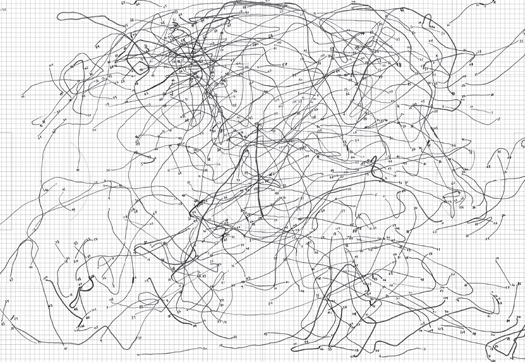
It is really something that is the aesthetic of the time. Thin black endless wiggly lines on an abstract white background, densifying here, loosening up here only to cuddle in an other heap of completely tangled up strings over her. These abstract patterns are visually fascinating, but why this is, I am not sure. One thing is the abstraction from an obvious continuos activity of some sort, the presence of an invisible repetition, of which one is sure must be there and the forming pattern of density and mess.
We have, over the last two, three years learned to recognise these sort of drawings as movement line. Movement of people and animals perhaps, but movement lines quite different from other movement paths previously visualised such as the path of the sun or planets, the movement of shadows or water. It contains the aspects of immediate and real-time decision on the spot, the reaction to a range of influences from large scale, distant events, to the immediate surrounding and interactions with other static or moving objects. It represents in this sense a process as a string of events that were actively dealt with. This aspect of process or in this context better 'creation' - in the sense of creating as you go along, of individual actions influenced by background, experience and personality - is a unique characteristic that usually is either underestimated and erase-simplified or over estimated by putting it as random. What exactly is its role in a denser aggregated context?

IOGraphica_1.9hours_100607
Image by single-blogs / Movement tracking over the period of 1.9 hours working in the evening on some posts and mapping tasks. The activity is captured as curser positions using the software IOGraphica.

The visualisation here, come very close to what has been described above, but actually it does not represent any physical movement, it is a simple track map of the curser activity on the computer screen. There are similarities, however the context is extremely confined and designed to work and relate in a specific way. Nevertheless it produces visually interesting images. And if your bored and dont have time to go for a walk, a stole and drift thought the city, let you mouse curser do it for you. The too is called IOGraphica was deveoped by Anatoly Zenkov and Andrey Shipilov and is currently available in v0.9. A tool to run in the background and track you workday at the desk. One started it records each location of the curser as well as the duration, draws lines between them and upon request visualises the time spent per location as growing black dots. Only a few options available but nicely presented.
Download from HERE. See some more visuals on flickr.

Thanks to Paul M. fo the link

Rabu, 24 Februari 2010

How Predictable is our Movement?

Physicist Albert-László Barabási, well known for his work on network theory, has tuned his attention in a recent paper to the human movement. In the latest issue of Science 19 February 2010
Vol 327, Issue 5968, his paper 'Limits of Predictability in Human Mobility' reports the research work undertaken with 50'000 anonymized mobile phone user data.
Barabási has don a lot of work on networks as early as 1999 were he coined the term Scale Free Networks, describing a type of networks with major hubs, such as for example the world wide web. In his barabasilab at Northeastern University, Centre for Complex Network Research a number of network related project are researched.


Image taken from The University of Chicago / Diagram of a scale-free network that contains components with a highly diverse level of connectivity. Some components form highly interconnected hubs, while other components have few connections, and there are many levels of interconnectivity in between.

However in this recent work the focus is on the predictability of human movement. The authors say: "By measuring the entropy of each individual's trajectory, we find a 93% potential predictability in user mobility across the whole base. Despite the significant differences in the travel patterns, we find a remarkable lack of variability." The work was intended to close a gap in the approaches to modeling human behavior. Despite personally we rarely perceive our actions as random, the existing models are largely based on the factors of random movement. The paper demonstrated that even though the activities, distances and motivations for individual movement might be very divers and different the predictability of an individuals location is not. They all have very similar predictability values, ranging between 80 % and 92 %. AOL News titles their article on the work "Study Makes It Official: People Are So Predictable" implying that this must be soooo boring.


Image taken from AOL News / These diagrams represent the movements of two mobile phone users. The one on the left shows that the person moved between 22 different cell towers during a three-month period, and placed 52 percent of his calls from one area; the other subject hit 76 spots, and was much less rooted.

This might be very surprising news for most people. The fact that there is so much less changing and spontaneity might seem unrealistic, but a similar impression was given by the data collected with the UrbanDiary project last year. Even though this was a really small sample, the fact that individuals travel most of the time along their known routes, between only a few hot spots clearly emerged. This can also be seen visualised in the What Shape are You? renders. Also Hagerstand's work pointed in to this direction arguing that the 'Constraints' are too strong for too many out of rhythm activities.
Barabási already undertook similar work with mobile phone data in 2008, which war published as an article in nature, by Gonzalez MC, Hidalgo CA, Barabasi A-L. with the title 'Understanding individual human mobility patterns'. In this article they analysed data of 100'000 mobile phones. Was the media coverage back then (two years) very much concerned about privacy issues related to the data source, for example NYTimes is this less of an issue. Nevertheless it is obvious that the researchers try to play it save by mentioning about ten times in the article that they work with anonymized data.
The argument is largely the same in both articles and the finding too. In both papers the researchers show their surprise about the outcome, that the movement can be predicted. However to my surprise they stick to their study and do not draw any strong links to routines and rhythms of personal habits. You can listen to a podcast where Barabási talks about this research.
In the more recent paper they conclude "At a more fundamental level, they also indicate that, despite our deep-rooted desire for change and spontaneity, our daily mobility is, in fact, characterized by a deep-rooted regularity."
I believe that the former, spontaneity, is very much a cultural phenomenon similar to the urge to stay young. The later, regularity, is the provider of identity and orientation resulting in stability and safety and therefor fundamental to human everyday life. Interesting should be Barabási's upcomming new book Burst on "The Hidden Patterns Behind Everything We Do".

Senin, 01 Februari 2010

Urban Narrative - Tracking Movement via Twitter

We have been logging Twitter activities in the London area (M25) over an earlier weekend in January with some code Steven Gray has put together. The idea was to log the location based traffic and see what the mapping of it would bring. There are a number of twitter mapping projects out there already, for example twittermap.tv from where the timeLapse of the weekend activity was captured HERE, or the first big mapping project twittervision.com. However, we wanted to focus on a local region, a city, to see what the traffic is and how the location might play a role. The traffic visualisation page tweeTOMeter is part of this interest.

twitterGeoTime01.5QDN6T0B4jWf.jpg
Image by single-blogs / Screenshot of Twitter data visualised in GeoTime’s space-time aquarium.

One could think of this investigation as following the urban story quite literally, while following the tweets of citizens. However it is quite tricky to make sense of it all. The dataset for the weekend, which covers Friday evening to Monday morning contains some 300’000 tweets. Not all of them are properly geo referenced. Only 1’700 have actual Lat/Long information in the geo tag field. Furthermore some 60’000 have Lat/Long details in their profile tag field and the ret only has a generic profile location, such as London. This probably is because of the relatively new geo support of the Twitter API. Most users still seem to have little interest to include their actual location, as well as a lot of the applications do not yet properly support the format. Interesting seems to be the network. Whom are tweets directed at? It seems to be quite a high average of direct tweets, almost 3 per message. Also who will actually read it, how many followers are there in average?
Working with the real geo referenced tweets, surprisingly they contain quite a bit of movement.
For a quick look at the data it has been visualised in GeoTime. The representation in the time-space aquarium makes the diagonal lines, that suggest movement, very distinguishable from the vertical stationary lines. While looking at the replay in the 2D view the weekend really comes to life and London gets busy.


Similar visualisation, with snippets and names, but without the river Thames, can be fund HERE.
GeoTime here really offers a powerful and very quick way of visualising the data in space and time and offers a whole pallet of different visualisation types, each including a set of tools for analysis and manipulation. Import comes either via ARCGIS or even quicker excel.
The main problem really is the quality of the graphics, the design of the result. Here the user has hardly any choice or possibilities to manipulate anything from colour palette to line style or font. This is a bit annoying especially because the tool is kind of an end of the line analysis tool, after you have prepared the data elsewhere.
The second quick one goes into Google Earth obviously. Here the data again comes from a simple excel spread sheet with a VB macro to write the KML file. This literally takes 5 seconds to do and you have a KML file, including time tags in Google Earth.
This one only plays the locations though, also in a time window of some six hours.

Senin, 11 Januari 2010

Tracking Chairs

Are you someone who would just bag a nice object found on the street and take it home? I certainly am and I have a large collection of ‘objet truve’ at home. I am not talking about steeling things, but reusing things that someone else has left behind or doesn’t want any longer. This is apparently called curb-mining.
Secondhand objects have somehow a special charm to them, marks of usage often add to the appearance and make them appear beloved and therefore valuable. It’s amazing what can be found. However in this example here, the object were left out intentionally for people to take home with a commercial idea in mind.

ChairTracking.jSlr8pO73IZQ.jpg
Images taken from clip by BluDot

The furniture and design company BluDot created a publicity stunt to mark the first anniversary of their NY Soho store late last year. Together with mono they created ‘the Blue Dot Real Good Exeriment’. For this they placed 24 of their chairs, product, Real Good’, on the streets of NY and tracked them as people decided to take them home. The public could follow the project on line and witness how the chairs traveled through NY. For some of the tacking GPS was used. They have modified basic GPS devices to fit underneath the seat of the chair. With its sleek thin design this was not an easy task. They even fitted it with an special activation switch, turning the GS device on as the chair is moved by the collector. The rest of the chairs was tracked old style by agents on roof tops with binoculars and cameras with triple dimensional lenses just like in any good old thriller. The whole project was a publicity stunt designed around involvement. I think it is a great idea. Of course the finder could keep the $129 chair but was ‘politely’ asked for an interview to use for the documentation of the stunt. The project has now finished but as a documentation here is a clip. Thanks to Radoslaw Panczak for the link.

Blu Dot Real Good Experiment from Real Good Chair on Vimeo.

Selasa, 05 Januari 2010

Life Lines - Haegerstrand and Time Space

The famous time-space diagram by Thorsten Haegerstrand has featured a number of times on the blog. It was used often for a rather short time span. Initially Hagerstrand was more interested in long term time-space spans, such as life time patterns. In his Survival and Arena he describes an earlier version of the time-space diagram based on his research on life-history in relation to their geographical environment.
One of his examples data describes the population associated with a farm for over 100 years. The data spans from 1840 to 1945. This setup is still clearly a setting focusing on the geographic location. The farm stands in the centre of the observation and the population fluctuates.

farmPopulationTimeSpace01.0JoF4zmqQ3TD.jpg
Image by single-blogs / Taken from Hagerstrand, Survival and Arena in Timing Space, Spacing Time by Carlstein 1978. / The population associated with a farm between 1840 and 1945. Categories A-owner, B-tenants, C-lodgers, D-farmhands and maids.

There are other studies that look at tracks beyond the life of the individual. Another famous example is the study by Bradley, where he traced the life-time tracks of four generations. Here the representation rests on the map and does not explore aspects of time.
However Hagerstrand started incorporating the time aspect and the initial visualisation diagram was simply 2D and really complicated Only later the nowadays famous time-space aquarium was developed.

farmPopulationTimeSpace02.f8CGYFW9AH2h.jpg
Image by single-blogs / Taken from Hagerstrand, Survival and Arena in Timing Space, Spacing Time by Carlstein 1978. / Representing the farm in space and time. Vertical lines represent the occupiers and horizontal movement represents the newcomers and leavers.

Only later this space-time representation was developed in to the aquarium type of visualisation. It is widely quoted and very famous, but reminds remarkably abstract and iconic. It raised a lot of critique and it can be said, that it remained largely theoretical and abstract model. This is due to the lack of computing power to actually process the available data and render the visualisation, but even nowadays, were it is possible as demonstrated for example by Kwan or Miller it remains unused. Some time-space aquarium examples on the single-blogs blog. One of the problem is the complexity the representation gains as soon as it cover longer timespans or numerous individuals. It reaches the limitation of a 3D visualisation displayed in 2D.

timeSpaceAquariumHagerstrand.bmcsaT6MYSMZ.jpg
Image by single-blogs / Taken from Lentrop, A Time-Geographic Simulation Model of Individual Activity Programmes, in Timing Space, Spacing Time by Carlstein 1978.

Sabtu, 26 Desember 2009

Tracking Santa

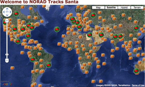
It is a really busy season for Santa Clause as he has to bring presents and surprises to children all over the world in only a couple of days. Its is every year the same rush, but luckily he’s got his little helpers. Together they spend all year long preparing for the mad trip to dispatch all the goods. However these days the big trip can be followed on line, Santa is tracked by NORAD (North American Aerospace Defense Command).
Check out the website where you can see him at different locations all over the world going about his business, mainly flying his sledge. There is little detail on how he actually slides down this chimney...

trackingSanta.obWIwUPwN5TQ.jpg
Image taken from NoradSanta.org - screenshot, map showing Santa’s stopovers.

There is also some detailed instructions on how to use the site in this slideshow.

Senin, 21 Desember 2009

Tracking the Void in Amsterdam

A tracking project based in amsterdam has produced a really nice visualisation of the GPS log data. A couple of people tracking themselves on their daily commutes presumably with a igotU GPS device.
The visualisation is done in processing.
It is amazing how quickly the structure of Amsterdam becomes visible. Compared to the London UrbanDiary map here in Amsterdam a much clearer urban structure shows. This is probably down to a number of factors, for example the urban morphology is fundamentally different between Amsterdam and London and the mode of transport is probably similarly different. A lot more bicycle transport, which makes for a more divers picture, than by using public transport or even traveling underground with the tube.
But because of this is makes for a really nice visual comparison between the two.

Tracks in the void from Steven M. Ottens on Vimeo.