I will be giving a lecture today at the Bartlett School of Architecture to the MA Urban Design course students. The course is directed by Professor Colin Fournier.
My talk will focus on the spatial dimension of narratives and time in everyday urban live. The different topics discussed are Repetition, with an introduction to the machine city and different types of cycles to create an identity of the place, Time as a framework of organisation, Space as a result of body physicality and experience, Pattern as a combination of time and space and a conception of place as mental maps to Morphology as the physical result of the narrative created.
As illustration material serves the data collected via the twitter microblogging site, the New City Landscape maps, as well as urbanDiary GPS tracking data.
Tampilkan postingan dengan label urbanDiary. Tampilkan semua postingan
Tampilkan postingan dengan label urbanDiary. Tampilkan semua postingan
Senin, 21 Februari 2011
Selasa, 09 November 2010
Life in the Line - A one Minute Clip
The experimenting with the SenseCam over the past summer month was great fun and the various contributors and participants have enjoyed the experience.
We are left with a huge pile of data that needs processing now and besides all the other stuff calling for attention it is sort of a tricky task. In total we snapped over 200'000 still images, that goes together with the data collected with the GPS that we attached to the SensCam. Additionally we of course also have the log files of the cameras own sensors.
To give a preview example of the temperature logged by the TMP sensor of the camera here is a Graph of this summers temperature. It wasn't too bad, was it this summer?

Image by single-blogs / Temperature curve over the recording period during the summer of 2010, as captured by the SenseCam Revue TMP sensor.
In terms of visualisation one of the main and intense aspect is the image processing and in a temporal sense the animation of this timelapse data makes sense. An earlier preview of some of the captured dat can be found HERE, together with some screen shots.
One of the participants, the artist Kai has also now processed the data she collected during one day of the experiment into a 1 minute clip, showing her every move, covering a mad range of activities. For detailed description and the longlist of different activities visit the artists website at 3rdlifekaidie.
We are left with a huge pile of data that needs processing now and besides all the other stuff calling for attention it is sort of a tricky task. In total we snapped over 200'000 still images, that goes together with the data collected with the GPS that we attached to the SensCam. Additionally we of course also have the log files of the cameras own sensors.
To give a preview example of the temperature logged by the TMP sensor of the camera here is a Graph of this summers temperature. It wasn't too bad, was it this summer?
Image by single-blogs / Temperature curve over the recording period during the summer of 2010, as captured by the SenseCam Revue TMP sensor.
In terms of visualisation one of the main and intense aspect is the image processing and in a temporal sense the animation of this timelapse data makes sense. An earlier preview of some of the captured dat can be found HERE, together with some screen shots.
One of the participants, the artist Kai has also now processed the data she collected during one day of the experiment into a 1 minute clip, showing her every move, covering a mad range of activities. For detailed description and the longlist of different activities visit the artists website at 3rdlifekaidie.
Rabu, 27 Oktober 2010
Stadtraum - UrbanDiary
The data collection in Basel is well under way and the second series of participants are now collecting data for the study. For ten people we already have a complete set of two month of tracking data using the new GPS trackers.
There are a number of very interesting observations that has been made also in comparison with the previous study undertaken in London. The scale differences are striking what is a regular commute is completely different. It might be on average one hour for Londoner, but is probably stretched for Basler if it is thirty minutes. As a consequence work and leisure journeys do tend to much more similar in Basel than in London where certain trips have a stronger specification.
However there are a lot of similarities too. Foremost the extension of the direct and persistent interaction in the urban realm is very much directed and selective. There is in both cases a strong local activity around the 'known' territory.
The study was also presented to representatives of the Basel Department of Town Planning who were interested to hear about the research undertaken. A summary of the presentation can be previewed below, it is in German though, but there are enough images to illustrate and communicate.
Essentially it explains the method and uses illustration taken from all three sample studies in London, Plymouth and London. The Basel data is still in development so only some preliminary information could be provided. However the maps 'drawn' by the participants using the GPS, beautifully illustrate the focus each individual puts on the city.

Image by single-blogs / Visualisation of GPS tracked movement in Basel, Switzerland. The nine different individuals have been tracked over a longer period and it beautifully shows the individual focus on the city that is developed.
There are a number of very interesting observations that has been made also in comparison with the previous study undertaken in London. The scale differences are striking what is a regular commute is completely different. It might be on average one hour for Londoner, but is probably stretched for Basler if it is thirty minutes. As a consequence work and leisure journeys do tend to much more similar in Basel than in London where certain trips have a stronger specification.
However there are a lot of similarities too. Foremost the extension of the direct and persistent interaction in the urban realm is very much directed and selective. There is in both cases a strong local activity around the 'known' territory.
The study was also presented to representatives of the Basel Department of Town Planning who were interested to hear about the research undertaken. A summary of the presentation can be previewed below, it is in German though, but there are enough images to illustrate and communicate.
Essentially it explains the method and uses illustration taken from all three sample studies in London, Plymouth and London. The Basel data is still in development so only some preliminary information could be provided. However the maps 'drawn' by the participants using the GPS, beautifully illustrate the focus each individual puts on the city.
Image by single-blogs / Visualisation of GPS tracked movement in Basel, Switzerland. The nine different individuals have been tracked over a longer period and it beautifully shows the individual focus on the city that is developed.
Senin, 30 Agustus 2010
UrbanDiary Comparison Study
The UrbanDiary project lay dormant for a while after its write up in the CASA working paper 151. However it is back on track with a new set of participants currently tracking their every move. The biggest problem to overcome was the equipment, we simply did not have the recourses to keep it going on a larger scale. Throughout there were two GPS devices in use, but now we have again expanded and twelve GPS loggers are currently used simultaneously.
The area of study this time is not London. The idea is to set up a comparison between two locations. Currently the tracking location is the wider region around and of course in the city of Basel, Switzerland. Earlier posts on Basel can be found HERE and HERE.
It is a region of about 1'000'000 people The tourism office even puts it to 3.5m) and in this sense small compared to London, but in the Swiss context this is rather big. Basel-Stadt (the city of Basle) is the third largest city in Switzerland with 165'000 inhabitants.

Image taken from TEB / The Basel region with green space (unbuilt land), urbanised land (grey) and water (blue). In dark grey is shown the urbanised land until 1960 and in light grey the urbanised land until the year 2000.
Basel is located right at the border to Germany and France. The region therefore covers all three countries. This is represented in the TEB, the 'Trinationalen Eurodistrict Basel' (the Three National Euro (not sure what Euro stands for) District Basel). This planing group is working across the borders and is put together from representatives of all three countries. For Basel as the main regional centre these connection sare very important as is the city for the region. In this sense the simbiosis of the different elements (culturally, politically and practical) will be an interesting aspect of the study in terms of spatial analysis.
The mix of participants is again, as was the London sample, a mixed group. It is put together of different age groups, interests and occupations. It will probably not be exactly the same mix, but similar. The idea is to also get some twenty participants in total to have a comparable amount of data.
The data is collected and stored locally on the device and it wil take a while untile we can download the new data and start analys and visualise. So for now this project has to run for about a month until the first data samples will be available. However I do have some very few days of sample tracks that will give an idea of the travel patterns that can be expected in this new location.

Image by single-blogs for UrbanDiary / Preliminary GPS tracking data in the region of Basel, Switzerland. The data is based on three participants over a couple of days, data is unprocessed. THe large C shape in the centre corresponds with the shape of the river in the main urban area in the TEB overview above.
The area of study this time is not London. The idea is to set up a comparison between two locations. Currently the tracking location is the wider region around and of course in the city of Basel, Switzerland. Earlier posts on Basel can be found HERE and HERE.
It is a region of about 1'000'000 people The tourism office even puts it to 3.5m) and in this sense small compared to London, but in the Swiss context this is rather big. Basel-Stadt (the city of Basle) is the third largest city in Switzerland with 165'000 inhabitants.
Image taken from TEB / The Basel region with green space (unbuilt land), urbanised land (grey) and water (blue). In dark grey is shown the urbanised land until 1960 and in light grey the urbanised land until the year 2000.
Basel is located right at the border to Germany and France. The region therefore covers all three countries. This is represented in the TEB, the 'Trinationalen Eurodistrict Basel' (the Three National Euro (not sure what Euro stands for) District Basel). This planing group is working across the borders and is put together from representatives of all three countries. For Basel as the main regional centre these connection sare very important as is the city for the region. In this sense the simbiosis of the different elements (culturally, politically and practical) will be an interesting aspect of the study in terms of spatial analysis.
The mix of participants is again, as was the London sample, a mixed group. It is put together of different age groups, interests and occupations. It will probably not be exactly the same mix, but similar. The idea is to also get some twenty participants in total to have a comparable amount of data.
The data is collected and stored locally on the device and it wil take a while untile we can download the new data and start analys and visualise. So for now this project has to run for about a month until the first data samples will be available. However I do have some very few days of sample tracks that will give an idea of the travel patterns that can be expected in this new location.
Image by single-blogs for UrbanDiary / Preliminary GPS tracking data in the region of Basel, Switzerland. The data is based on three participants over a couple of days, data is unprocessed. THe large C shape in the centre corresponds with the shape of the river in the main urban area in the TEB overview above.
Jumat, 19 Maret 2010
Tracks Refreshed - Processing
It has taken a while but now the first track records coming out of the UrbanDiary project are ported and can be visualised with processing. This is really an awesome tool to work with, however there is still a lot of hiccups and stuff to learn for me. So with a lot of trial and error I managed to get this one going. It is based on some stuff Steven M. Ottens has put together for his visualisations of GPS tracks HERE.
For this lot of data, it replay the recordings of seven participants of the UrbanDiary project. THese were recorded between April and August 2009. The setting is Greater London and you can most probably start guessing a few location that get highlighted as the drawing progresses. Some of the denser locations are;
However there are still some problems with the time component of the data as well as the transparency.
From a processing point of view it makes use of the tomc GPX library.
Music Ooze by Klez on mp3unsigned.com
Rabu, 24 Februari 2010
How Predictable is our Movement?
Physicist Albert-László Barabási, well known for his work on network theory, has tuned his attention in a recent paper to the human movement. In the latest issue of Science 19 February 2010
Vol 327, Issue 5968, his paper 'Limits of Predictability in Human Mobility' reports the research work undertaken with 50'000 anonymized mobile phone user data.
Barabási has don a lot of work on networks as early as 1999 were he coined the term Scale Free Networks, describing a type of networks with major hubs, such as for example the world wide web. In his barabasilab at Northeastern University, Centre for Complex Network Research a number of network related project are researched.

Image taken from The University of Chicago / Diagram of a scale-free network that contains components with a highly diverse level of connectivity. Some components form highly interconnected hubs, while other components have few connections, and there are many levels of interconnectivity in between.
However in this recent work the focus is on the predictability of human movement. The authors say: "By measuring the entropy of each individual's trajectory, we find a 93% potential predictability in user mobility across the whole base. Despite the significant differences in the travel patterns, we find a remarkable lack of variability." The work was intended to close a gap in the approaches to modeling human behavior. Despite personally we rarely perceive our actions as random, the existing models are largely based on the factors of random movement. The paper demonstrated that even though the activities, distances and motivations for individual movement might be very divers and different the predictability of an individuals location is not. They all have very similar predictability values, ranging between 80 % and 92 %. AOL News titles their article on the work "Study Makes It Official: People Are So Predictable" implying that this must be soooo boring.

Image taken from AOL News / These diagrams represent the movements of two mobile phone users. The one on the left shows that the person moved between 22 different cell towers during a three-month period, and placed 52 percent of his calls from one area; the other subject hit 76 spots, and was much less rooted.
This might be very surprising news for most people. The fact that there is so much less changing and spontaneity might seem unrealistic, but a similar impression was given by the data collected with the UrbanDiary project last year. Even though this was a really small sample, the fact that individuals travel most of the time along their known routes, between only a few hot spots clearly emerged. This can also be seen visualised in the What Shape are You? renders. Also Hagerstand's work pointed in to this direction arguing that the 'Constraints' are too strong for too many out of rhythm activities.
Barabási already undertook similar work with mobile phone data in 2008, which war published as an article in nature, by Gonzalez MC, Hidalgo CA, Barabasi A-L. with the title 'Understanding individual human mobility patterns'. In this article they analysed data of 100'000 mobile phones. Was the media coverage back then (two years) very much concerned about privacy issues related to the data source, for example NYTimes is this less of an issue. Nevertheless it is obvious that the researchers try to play it save by mentioning about ten times in the article that they work with anonymized data.
The argument is largely the same in both articles and the finding too. In both papers the researchers show their surprise about the outcome, that the movement can be predicted. However to my surprise they stick to their study and do not draw any strong links to routines and rhythms of personal habits. You can listen to a podcast where Barabási talks about this research.
In the more recent paper they conclude "At a more fundamental level, they also indicate that, despite our deep-rooted desire for change and spontaneity, our daily mobility is, in fact, characterized by a deep-rooted regularity."
I believe that the former, spontaneity, is very much a cultural phenomenon similar to the urge to stay young. The later, regularity, is the provider of identity and orientation resulting in stability and safety and therefor fundamental to human everyday life. Interesting should be Barabási's upcomming new book Burst on "The Hidden Patterns Behind Everything We Do".
Jumat, 05 Februari 2010
Urban Diary Working Paper - Update
The paper was published on the CASA page already in December last year. That was as a boring ‘first have to download’ pdf format.
Now, this is cool, it is available on Issuu, conveniently embedded and you can flip through right here, share it with friends and so on.
So there you go, now you can casually flip through and see if your interested to read more, if so click on the fullscreen button and you’ll enjoy it large.
Now, this is cool, it is available on Issuu, conveniently embedded and you can flip through right here, share it with friends and so on.
So there you go, now you can casually flip through and see if your interested to read more, if so click on the fullscreen button and you’ll enjoy it large.
Kamis, 28 Januari 2010
The Temporal Narrative of Space
I will be at the Stadtkolloquium workshop for the next two days. The Stadtkolloquium is an international PhD workshop for and with PhD students here at UCL. A divers range of research topics related to the city and urban aspects of space will be up for discussion.
I will be presenting a paper with he title ‘UrbanDiary - The Temporal Narrative of Space or the Construction of the Collective and its Visualisation’. The main focus will be on the last part of the manufactured title construction, the construction of a collective and visualisation aspects of temporal data.
A brief summary will form the introduction to enable everyone to understand the extent of the investigation as well as to grasp what field work has so far been undertaken. This set the background for the explanations and ultimately the discussion to follow. The focus of the explanatory part is held on the experience and perception of space. The aim is to build up, on one hand the methods and ways of investigation and mapping , as well as on the other hand introduce the concept of the narrative. Along the story of individual experience, the narrative of the space and ultimately the city is redrawn. It is not so much the mark on the city, but the mark the city leaves on the individual that interests. It is hoped that this also clarifies the position. However, the aspect of the body and is left out of this discussion. This is mainly to not confuse the direction of the discussion.
The Discussion part is dived in to two section, the possibility of a collective construction and the visualisation of the findings. Earlier is illustrated with track records shown on a city level including and connecting to the immediate urban morphology, followed by the UD London map. The new twitter weekend map is then used to illustrate other sources of data that could be interpreted as collective. However this is mainly thought as a starting point for the discussion around the construction of a collective and its value compared to the individual data.
With a activity graph based on time and amount of activity, the transition to the topic of the visualisation is introduced. Also the time-space aquarium will be up for debate and an animated UD London map.
Kamis, 10 Desember 2009
UrbanDiary Working Paper
The UrbanDiary working paper has just been published on the CASA publication page. It is a write up of the GPS tracking study undertaken during 2009 with twenty participants. Each one was tracked for a period of two month. The paper outlines the methodology the concepts, such as mental maps and also examines technical aspects of GPS. A main focus is on the aspect of visualisation of this kind of temporal data.
Thanks for supporting this project go to Garmin for supplying the Forerunner 405’s and especially all the participants of the study.
Details on single-blogs can be found on this blog/urbanDiary or on the UrbanDiary facebook page - become a fan!
Now to the content of the paper, abstract: “This working paper investigates aspects of time in an urban environment, specifically the cycles and routines of everyday life in the city. As part of the UrbanDiary project (single-blogs.blogspot.com), we explore a preliminary study to trace citizen’s spatial habits in individual movement utilising GPS devices with the aim of capturing the beat and rhythm of the city. The data collected includes time and location, to visualise individual activity, along with a series of personal statements on how individuals “use” and experience the city. In this paper, the intent is to explore the context of the UrbanDiary project as well as examine the methodology and technical aspects of tracking with a focus on the comparison of different visualisation techniques. We conclude with a visualisation of the collected data, specifically where the aspect of time is developed and explored so that we might outline a new approach to visualising the city in the sense of a collective, constantly renewed space. “
The actual paper can be downloaded from HERE and detailed information are on the CASA publication page.

Image by CASA - working paper 151 cover (part)
Thanks for supporting this project go to Garmin for supplying the Forerunner 405’s and especially all the participants of the study.
Details on single-blogs can be found on this blog/urbanDiary or on the UrbanDiary facebook page - become a fan!
Now to the content of the paper, abstract: “This working paper investigates aspects of time in an urban environment, specifically the cycles and routines of everyday life in the city. As part of the UrbanDiary project (single-blogs.blogspot.com), we explore a preliminary study to trace citizen’s spatial habits in individual movement utilising GPS devices with the aim of capturing the beat and rhythm of the city. The data collected includes time and location, to visualise individual activity, along with a series of personal statements on how individuals “use” and experience the city. In this paper, the intent is to explore the context of the UrbanDiary project as well as examine the methodology and technical aspects of tracking with a focus on the comparison of different visualisation techniques. We conclude with a visualisation of the collected data, specifically where the aspect of time is developed and explored so that we might outline a new approach to visualising the city in the sense of a collective, constantly renewed space. “
The actual paper can be downloaded from HERE and detailed information are on the CASA publication page.
Image by CASA - working paper 151 cover (part)
Rabu, 02 Desember 2009
Upgrade Seminar - Presentation
I will be giving my upgrade presentation today in the form of a CASA seminar. It is under the title: “UrbanDiary - The Spatial Narrative of Everyday Life or the construction of time and space in the city”.
The abstract: This PhD research project focuses on cycles and rhythms in the urban environment. Cycles such as day and night or the rush-hour - there are a number of repetitive patterns occurring in the city.
These patterns are the result of spatial and social organisation methods, but they are involved in the organisation of the city as a system.
The hypothesis is that these rhythms stand in a direct relationship to the urban morphology.
The presentation of posted here is now updated.
Selasa, 01 Desember 2009
UrbanDiary on Layar
Layar featured on the blog before and now I have been playing around with the augmented reality platform to use for the visualisation of the urbanDiary data. I have now created an UrbanDiary layer show track points that are already in the database.
For now this is only a test with and it is not yet available as a public layer. The POI’s it displays are all GPS track points collected by participants of the UrbanDiary project. So each dot means someone passed by here earlier.
I am however not quite convinced with the layar platform visually, as I have expressed in previous post. As a first test to visualise the collected data it serves very well. I am actually thinking about it as an extension to the time-space aquarium.
However this is of course only a first stab at it and a lot of information is not yet included. I tried to have a go at the aspect of time. Each point, after it has properly loaded, displays a visual time indication on the bottom right as a waxing or waning crescent. This gives an idea of the time this particular point was recorded. I choose to do this as for now layar does not allow for individual icons. There is only a set of three icons currently available.

Image by single-blogs for UrbanDiary - waxing and waining crescent indicating the time of the day.
And here is the video to see it in action.
For now this is only a test with and it is not yet available as a public layer. The POI’s it displays are all GPS track points collected by participants of the UrbanDiary project. So each dot means someone passed by here earlier.
I am however not quite convinced with the layar platform visually, as I have expressed in previous post. As a first test to visualise the collected data it serves very well. I am actually thinking about it as an extension to the time-space aquarium.
However this is of course only a first stab at it and a lot of information is not yet included. I tried to have a go at the aspect of time. Each point, after it has properly loaded, displays a visual time indication on the bottom right as a waxing or waning crescent. This gives an idea of the time this particular point was recorded. I choose to do this as for now layar does not allow for individual icons. There is only a set of three icons currently available.
Image by single-blogs for UrbanDiary - waxing and waining crescent indicating the time of the day.
And here is the video to see it in action.
Senin, 30 November 2009
UD Track Map - Update
The latest UrbanDiary map is here, update 2009-11-27. This now includes twenty participants, each tracked over the period of two month. It adds a number of new highlighted routes that mark individual routines. The density of the centre has risen again and strengthens the centralistic structure of routine trips. However there are now also more one of trips to paint a more detailed picture of the London network.
Out of the twenty participants one stands out with a not centric oriented routine. In this case it is a more radial shape produced, with one of’s leading into the centre. If you compare it on the ‘what shape are you?’ it stands out for its orientation - it is square 2/5.
More UrbanDiary updates on the facebook page - become a fan!
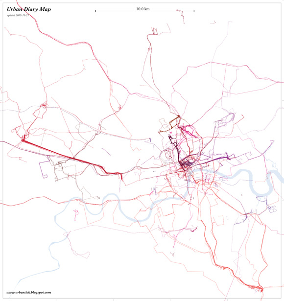
Image by single-blogs for UrbanDiary - Tracking map showing twenty participants by colour, updated 2009-11-27
Jumat, 27 November 2009
Whate Shape Are You? - Update
As an update to the ‘what shape are you?’ post, here are some new shapes. The Project now counts twenty participants so we also have twenty shapes.
All shapes are produced over the period of two month and are represented here at the same scale.
As previously noted these ‘drawings’ depend on the location of important destination relative to one another and on mode of transport as well as frequency. The mental picture of the city that each individual builds up while interacting with the urban fabric is tremendously different. Linking back to the visualisation ‘The Naked City’ the phsychogeography of the city is very much dependant or a result of this as produced through the derive.
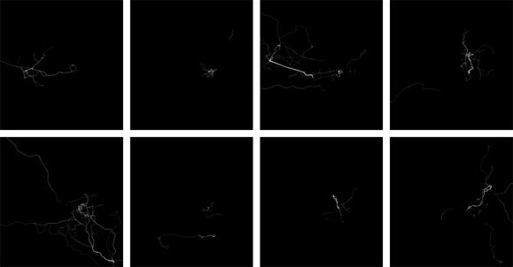
Image by single-blogs for UrbanDiary - (click for large version) - Different shapes produces by participants of the UrbanDiary project over the same period of time.
Kamis, 26 November 2009
New Graphs - The Activity During the Week
Finally I took the time to reprocess the UrbanDiary graphs. Since the last time the study sample has grown from 12 to twenty. This is a good sample size and will give a different picture. However it is to say, that the sample is not as consistent as it was with the first batch. They have all undertaken the study more or less during the same time frame, where as now the sample is spread over the period of half a year or more. Nevertheless the individual tracking time remains the same at two month continuously.
Also there is to note, that this time the graphs have been calculated slightly differently. Where as before it was purely on a count basis, this time it is based on the activity percentage per time unit for each participant. This accounts for the effect of one particular active event has on the overall picture.
The weekly graph remains the same. There is significantly less activity during the week days than there is on Saturdays. Even Sunday remains in line with the rest of the week. Why on Saturday participants record almost twice the amount of activity I don’t know at the moment. Is has something to do with outdoor activity, probably some sports.
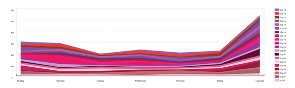
Image by single-blogs for UrbanDiary - Activity graph per day of the week for twenty participants.
While looking at the weekly pattern, the peaks remain largely the same. There is the nine o’clock peak for the morning rush hour and the six o’clock peak for the evening rush hour. There is also the after peak hour both for the morning and the evening.
Clearer in this graph now is the fact that there are more afternoon activities than morning activity. This most likely has to do with the weekend, particularly the Saturday. I suspect that the large chunk of Saturday recordings are based on afternoon activities.
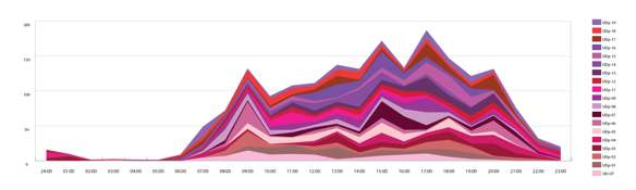
Image by single-blogs for UrbanDiary - Activity graph per 24 hours of one day for twenty participants.
Also there is to note, that this time the graphs have been calculated slightly differently. Where as before it was purely on a count basis, this time it is based on the activity percentage per time unit for each participant. This accounts for the effect of one particular active event has on the overall picture.
The weekly graph remains the same. There is significantly less activity during the week days than there is on Saturdays. Even Sunday remains in line with the rest of the week. Why on Saturday participants record almost twice the amount of activity I don’t know at the moment. Is has something to do with outdoor activity, probably some sports.
Image by single-blogs for UrbanDiary - Activity graph per day of the week for twenty participants.
While looking at the weekly pattern, the peaks remain largely the same. There is the nine o’clock peak for the morning rush hour and the six o’clock peak for the evening rush hour. There is also the after peak hour both for the morning and the evening.
Clearer in this graph now is the fact that there are more afternoon activities than morning activity. This most likely has to do with the weekend, particularly the Saturday. I suspect that the large chunk of Saturday recordings are based on afternoon activities.
Image by single-blogs for UrbanDiary - Activity graph per 24 hours of one day for twenty participants.
Selasa, 03 November 2009
IDRN Mapping Conference at the Royal Geographical Society
I will be at the IDRN conference tomorrow at the Royal Geographical Society in London. It is under the title of ‘The use of mapping software & systems in health and academic research’. Mapping in the area of health research has recently become popular. We have seen some experiments earlier this year using data related to the spread of swine flu. Also there is the Google Flu Trends project, monitoring flu outbreaks. Apparently they are pretty good, only I think with Swine Flu they had some problems. Interesting that there is no data available for the United Kingdom on the Google page.
However, I am presenting a poster with the tracking data of the UrbanDiary project. Showing different approaches of visualisation techniques. The normal map using arcGIS, then there is the time-space aquarium viz, done in either Google Earth or GeoTime and the last visualisation is individual movement with the context of the built environment, again using arcGIS.

Image by single-blogs for urbanDiary - click for detailed view
Langganan:
Postingan (Atom)