Tampilkan postingan dengan label aquarium. Tampilkan semua postingan

Jumat, 24 September 2010

Network Included - The GeoTime 5.1 Update

The folks over at Oculus have been very busy developing the GeoTime software. Version 5 was released in the beginning of 2010 and they are going to released the latest update GeoTime 5.1 these days.
It includes some very interesting new features. The two major ones are the Network feature that allows the user to visualise the data as a network besides the time-space visualisation and the second major change is the support of the macOSx platform (see earlier post on mac adventours using GeoTime). This is in a sense a clear statement of independence, if there was critique that GeoTime integrates too closely with ArcGIS. However of course it continues to integrate well with Arc and support for the new ArcGIS 10 comes with the new GeoTime update.

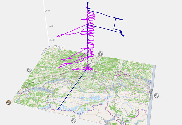
The software is perfectly fitted for the UrbanDiary project that works with GPS tracks of individuals, investigating the spatial extension of everyday routines in the city. It is basically a purely spatial-temporal dataset. In a few easy steps it is possible to see the data visualised in a simultaneously temporal and spatial way, animate it as well as start analysing it.
switzerland_01_osm
Image by single-blogs / A view of different GPS tracks over the period of one month, using GeoTime and an OSM base map pulled in via ArcGIS.

The move away from a secondary software import via ArcGIS or Excel was a good move that came with version 5.0. The importing formats have been extended and redesigned with the release of version 5.0 to include CSV, XLS, and SHP file formats as well as the in version 4.0 existing KML. It is now handled directly by GeoTime through a functional assistant. With version 5.1 the import of GPX file format is added. Data from the GPS exported in this format can be loaded and added to a project directly.
The new dialogue allows to filter the data at import. This is useful especially for my crappy overloaded tables in which I tried to record way to much. The selection of just the five essential columns makes for a much more slik workflow.
GeoTIme focuses on temporal data, however the integration with realtime data has only be introduced recently with the 5.0 release. Now users can import live feeds via Geo RSS that automatically updates.

The data is initially visualised in the 3d view as a time-space cube. To interact with time one finds the tools on the left hand side vertically arranged. On the right hand side the menu provides a range of other tools including representation settings, pattern analysis, reporting tools and the new network tool.
GeotTime51Network
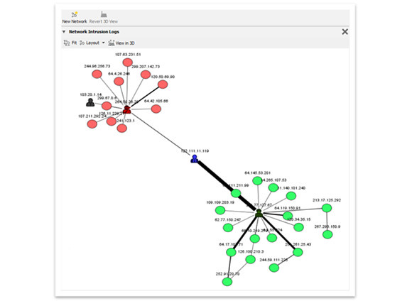
Image by Oculus / An example using the new network tool in GeoTime visualising a computer network.

The network tool is a whole new field that has been added to GeoTime with this functionality. This is particularly interesting for the analysis of complex structure that include spatial and non spatial data, such as for example phone call data or financial transaction. In the context of the UrbanDiary project for which GeoTime is used here this new tool becomes interesting for the investigation of combinatory data from GPS and mental maps, as for the analysis of interrelationships between landmarks and actual route. For the visualisation different present network settings are available. Furthermore it integrates with the 3D visualisation of the spatial data and the network graph is directly linked to the time-space cube and highlighted areas correspond across the two visualisations. So specific sections identified for further investigation at one end can be look at from a different perspective at the other end.

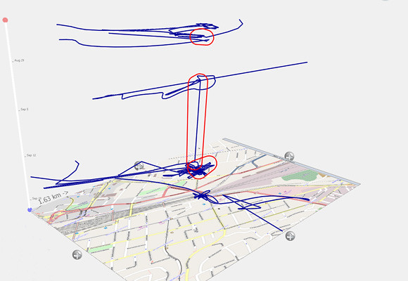
For the data analysis in the spatial-temporal section, one of the new features in this 5.1 release is the stationary detector. The data can now be queried for events that have not moved in space over a longer period of time. This is useful for the data verification as well as detection of move and rest patterns.

One of the remaining points of critique is still the graphical representation of the visualisation as well as the range, simplicity and of possible manipulations of it. There have been however, some changes made and for example the colour palette has been extended. But still both the interface and the results are still very technical thought of and rendered. It would not ne a mater of just making it all fancy and colourful with rounded corners, but it would need one strong design direction as a well as an overall visual simplification.
Basel_02_stationary
Image by single-blogs / Applying the stationary finder to a track imported via GPX directly into GeoTime. This highlights the areas where the GPS device has not moved more than 100 metres over a period of more than 8 hours. It uses the OSM base map pulled in via the ArcGIS link.

In an comment on GeoTime 4.0, I hade described it as an end-of-the-line analysis tool. This was because the data could not be directly exported to other software packages. This has changed with this most recent update, now CSV export is supported in addition to the KML and screenshot export. The analysed file can be passed on to other software or users which dramatically enhances the usage and the integration of GeoTime.

GeotTime51Logo
Image by Oculus / The GeoTime 5.1 Logo.

In this sense the spaceTime aquarium has become a lot more sophisticated with this GeoTime 5.1 release. At the same time, though, it ha become accessibel for a much broader range of specialised fields through the extended palette of tools. It can now integrate in a workflow, be run as stand alone analysis software as well as operate across platforms. GeoTime is a very specialised tool and definitely offers the quickest and most comprehensive set of visualisation and analysis tools for temporal data.

For demos and further information on the GeoTime project use the inks or go HERE or HERE for earlier posts about GeoTime on single-blogs.

Selasa, 02 Maret 2010

London Twitter Cloud

Together with the tweet-O-meter project run at CASA as part of the NeISS research project we have collected location tagged tweets around London (M25). As described in an earlier post on this HERE, the idea is to capture the urban narrative. The current data covers a whole weekend from Friday evening to Monday morning and the set holds some 380'000 individual tweets. However this brakes down to 60'000 truly geo referenced tweets, by 5'500 individual users. The thing is, that these are only the mobile tweets and they are captured only if the locations sharing is activated in the twitter profile. Still this makes an average of 10.6 tweets per mobile user over the weekend. Overall we have 39'222 individual users witch makes some 9.7 tweets. So the mobile users seem to message slightly more, but not significantly as one could maybe expect.
In terms of density per location as one could expect the focus is in the centre. There are local hotspots as the weekend progresses, such as Kings Cross and Old Street. But then there seems to be a accumulation of density along the transport lines into and out of the centre.
To visualise the temporality of the data tweets are in the below clip output as a message cloud rising and hovering above London. It is a simple time-space aquarium were the time is plotted as the hight information. The later in the weekend the tweet is sent the higher above the city it floats. As the density develops the low times can be clearly spotted, when it thins out the lines and London sleeps. The animation is rendered in Google Earth, with the KML file brought in through a VB script from Excel. Once set up this is quite a flexible combination. However, the KML file can get quite big, since there is a lot of information contained with all the messages.

Senin, 01 Februari 2010

Urban Narrative - Tracking Movement via Twitter

We have been logging Twitter activities in the London area (M25) over an earlier weekend in January with some code Steven Gray has put together. The idea was to log the location based traffic and see what the mapping of it would bring. There are a number of twitter mapping projects out there already, for example twittermap.tv from where the timeLapse of the weekend activity was captured HERE, or the first big mapping project twittervision.com. However, we wanted to focus on a local region, a city, to see what the traffic is and how the location might play a role. The traffic visualisation page tweeTOMeter is part of this interest.

twitterGeoTime01.5QDN6T0B4jWf.jpg
Image by single-blogs / Screenshot of Twitter data visualised in GeoTime’s space-time aquarium.

One could think of this investigation as following the urban story quite literally, while following the tweets of citizens. However it is quite tricky to make sense of it all. The dataset for the weekend, which covers Friday evening to Monday morning contains some 300’000 tweets. Not all of them are properly geo referenced. Only 1’700 have actual Lat/Long information in the geo tag field. Furthermore some 60’000 have Lat/Long details in their profile tag field and the ret only has a generic profile location, such as London. This probably is because of the relatively new geo support of the Twitter API. Most users still seem to have little interest to include their actual location, as well as a lot of the applications do not yet properly support the format. Interesting seems to be the network. Whom are tweets directed at? It seems to be quite a high average of direct tweets, almost 3 per message. Also who will actually read it, how many followers are there in average?
Working with the real geo referenced tweets, surprisingly they contain quite a bit of movement.
For a quick look at the data it has been visualised in GeoTime. The representation in the time-space aquarium makes the diagonal lines, that suggest movement, very distinguishable from the vertical stationary lines. While looking at the replay in the 2D view the weekend really comes to life and London gets busy.


Similar visualisation, with snippets and names, but without the river Thames, can be fund HERE.
GeoTime here really offers a powerful and very quick way of visualising the data in space and time and offers a whole pallet of different visualisation types, each including a set of tools for analysis and manipulation. Import comes either via ARCGIS or even quicker excel.
The main problem really is the quality of the graphics, the design of the result. Here the user has hardly any choice or possibilities to manipulate anything from colour palette to line style or font. This is a bit annoying especially because the tool is kind of an end of the line analysis tool, after you have prepared the data elsewhere.
The second quick one goes into Google Earth obviously. Here the data again comes from a simple excel spread sheet with a VB macro to write the KML file. This literally takes 5 seconds to do and you have a KML file, including time tags in Google Earth.
This one only plays the locations though, also in a time window of some six hours.

Selasa, 05 Januari 2010

Life Lines - Haegerstrand and Time Space

The famous time-space diagram by Thorsten Haegerstrand has featured a number of times on the blog. It was used often for a rather short time span. Initially Hagerstrand was more interested in long term time-space spans, such as life time patterns. In his Survival and Arena he describes an earlier version of the time-space diagram based on his research on life-history in relation to their geographical environment.
One of his examples data describes the population associated with a farm for over 100 years. The data spans from 1840 to 1945. This setup is still clearly a setting focusing on the geographic location. The farm stands in the centre of the observation and the population fluctuates.

farmPopulationTimeSpace01.0JoF4zmqQ3TD.jpg
Image by single-blogs / Taken from Hagerstrand, Survival and Arena in Timing Space, Spacing Time by Carlstein 1978. / The population associated with a farm between 1840 and 1945. Categories A-owner, B-tenants, C-lodgers, D-farmhands and maids.

There are other studies that look at tracks beyond the life of the individual. Another famous example is the study by Bradley, where he traced the life-time tracks of four generations. Here the representation rests on the map and does not explore aspects of time.
However Hagerstrand started incorporating the time aspect and the initial visualisation diagram was simply 2D and really complicated Only later the nowadays famous time-space aquarium was developed.

farmPopulationTimeSpace02.f8CGYFW9AH2h.jpg
Image by single-blogs / Taken from Hagerstrand, Survival and Arena in Timing Space, Spacing Time by Carlstein 1978. / Representing the farm in space and time. Vertical lines represent the occupiers and horizontal movement represents the newcomers and leavers.

Only later this space-time representation was developed in to the aquarium type of visualisation. It is widely quoted and very famous, but reminds remarkably abstract and iconic. It raised a lot of critique and it can be said, that it remained largely theoretical and abstract model. This is due to the lack of computing power to actually process the available data and render the visualisation, but even nowadays, were it is possible as demonstrated for example by Kwan or Miller it remains unused. Some time-space aquarium examples on the single-blogs blog. One of the problem is the complexity the representation gains as soon as it cover longer timespans or numerous individuals. It reaches the limitation of a 3D visualisation displayed in 2D.

timeSpaceAquariumHagerstrand.bmcsaT6MYSMZ.jpg
Image by single-blogs / Taken from Lentrop, A Time-Geographic Simulation Model of Individual Activity Programmes, in Timing Space, Spacing Time by Carlstein 1978.

Selasa, 03 November 2009

IDRN Mapping Conference at the Royal Geographical Society

I will be at the IDRN conference tomorrow at the Royal Geographical Society in London. It is under the title of ‘The use of mapping software & systems in health and academic research’. Mapping in the area of health research has recently become popular. We have seen some experiments earlier this year using data related to the spread of swine flu. Also there is the Google Flu Trends project, monitoring flu outbreaks. Apparently they are pretty good, only I think with Swine Flu they had some problems. Interesting that there is no data available for the United Kingdom on the Google page.
However, I am presenting a poster with the tracking data of the UrbanDiary project. Showing different approaches of visualisation techniques. The normal map using arcGIS, then there is the time-space aquarium viz, done in either Google Earth or GeoTime and the last visualisation is individual movement with the context of the built environment, again using arcGIS.

IDRNposter_091103_s.AtTiC5G3cLWL.jpg
Image by single-blogs for urbanDiary - click for detailed view