Tampilkan postingan dengan label mapping. Tampilkan semua postingan

Senin, 25 April 2011

Ovi Map 3D - the New Nokia Service

Since the introduction of the Google Earth service in 2005 it has been the standart for online virtual 3D representation of the world geographically. The service has been hugely successful and millions of people have explored the world from the desk in their home. The service offers tremendous details via hi-resolution aerial imagery combined with layers of annotated point data. In addition the tool offers, via the KML language, the integration of individual and user generated information and data.

Several services have picked up on Googles success and offer now similar services. These are for example the Nasa World Wind, Microsoft Earth now Bing 3D maps, the UK focused yell.com 3D mapping service or the on Australia focused NearMap service. There were however also earlier virtual globes and mapping services, back then running offline. For example by Microsoft Encarta, 1997 or the 3D Word Atlas, 1998.

Google's service still is the most popular. It runs on all platforms, which some of the others dont do and it works more or less intuitive. However there is the characteristic Google playful comic design to it which is, especially for the maps rather annoying. From fonts to placemarks the users always have to accept the content to be slightly ridiculous looking. Some of the other services clearly offer competitive features that are a lot better than the Google service can do. Yell has the amazing 3D modeling of the UK with great zooming, angle and rotation functions or NearMap offers the extremely great time slider function. Both functions Google products can do, but nowhere nearly as nice.

OVImap3D-07
Image taken from OVI Maps 3D / San Francisco down town in 3D. In the foreground the Transamerica Pyramid.

Now, Nokia is entering the market of digital globes and 3D mapping by taking the Nokia OVI Maps service 3D with OVI Maps 3D. And it is a great start, the service looks very pretty and the imagery is amazing.

On the Nokia blog it is described as: "Starting with a bird’s-eye view, you can scale up and down and move around objects such as buildings and trees from the desktop, experiencing a virtual but super realistic perspective of new places.

The feature includes 20 cities today, but will expand over time. Cities in the Nordic region includes Stockholm, Oslo and Copenhagen. When visiting Copenhagen or Oslo in Ovi Maps you can also use the new road-level imagery with a detailed 360-degree panoramic view of streets that completes the experience."

OVImap3D-05
Image taken from OVI Maps 3D / San Francisco's Transamerica Pyramid, showing street view bubbles in blue.

To use the 3D feature of te map the installation of a browser plug-in is required. With this the maps come to live and a combination of map, virtual earth and street view is accessible. The integration of the different elements currently work neatly in one direction. From the map view to the 3D view to the Street View. However going the other way can be frustrating, with the position and perspective being changed in the transition.

Nevertheless the detail and information is very good and of high quality. The best benefit is probably a different design approach using better symbols. For example the street view pops up in the 3D view as blue circles that change size as the user hovers over it with the mouse curser. Looks really neat. However, the integration of temporal aspects in both content and imagery is missing from the OVI maps and 3D. The 3D part is currently in beta and there might be quite some changes with the release of the final version.

OVImap3D-06
Image taken from OVI Maps 3D / San Francisco street view at the foot of the Transamerica Pyramid, looking up.

The digital globe covers the terrain modelling across the entire world. However, currently the 3D rendering of buildings is only available for a selection of cities. This list of 20 cities will be extended continously, but so far they have not provided a schedule for this. Also the integration with the OVI API is not yet announced. Here again OVI offers great features the Google API does not. For example a geoShape that draws a circle with a given radius around a point.


Map by single-blogs for NCL / The current location of NCL twitter mappings of urban areas worldwide on the OVI map.

Jumat, 11 Maret 2011

Mapping Distance on Time - Paris Crunch

As we all know from experience, maps generally focus on the physical quality of the space. They follow the box like idea of pace a a container with objects and chart these features one after the other in metric separations. Creating a mesh of abstract relationships.

How frustrating this can be in practice everyone has probably experienced. Taking the bus from Euston station to Kings Cross to connect to the Eurostar to Paris can be a lot longer than simply walking the distance, since practically always the bus will get stuck on Euston road in traffic.

Very similar with London tube stations, almost always one stop trips are quicker to walk, especially in central London. By the time you have reached the platform and afterwards marched back up to the surface again you have walked a lot further through tunnels and up and down stairs, than you would on street level.

Such representational concepts were developed as for examples by Dicken and Lloyd. They mapped out the impact of the new European High S[eed Rail Network. The map showed how London and Paris moved closer together as a result, putting them closer than London to some of the larger cities in the UK. Some more on Mapping Distance and Time in an earlier blog post HERE.

UK time map
Image from strange maps / Dicken and Lloyd 1981

The time it takes to travel from one place to the other is in everyday practice often a lot more important than how far it actually is. The cultural concept of being on time plays an important role herre. Since we are living together in this city every individual has to arrange his or her needs around the general practice. The bus leaves at this time, the first tube opens then and shuts down after midnight. The density of inhabitants inflicts a strict agreement.

With the density there are also transport mode internal differences occurring. Congestion at peak times can dramatically change the journey times. Traffic jams or free flow times are something the everyday experience teaches inhabitants over time.

Paris time map
Image from Xiaoji Chen's blog / The map of central Paris drawn according the time requirements. Mode of transport from left to right, bicycle, metro, car.

Xiaoji-Chen, a MIT student, looked into this problem and has developed a map representation that changes according to the time required. She explains: "In these distorted maps of Paris, the distance between a spot and the city center is not proportional to their geographical distance, but the cost taken to get there."

To develop the tool processing was used, with Open Street Map data. For the connection data she used Google Directions, RATP.com


Xiaoji-Chen also visualised the differences between the modes of transport, as car, bicycle and walking with obviously shrinking maps as a result. It is fast by car, yes, but as Xiaoji-Chen points out the carbon emission is of course higher, so she introduces this additional information, telling the user also how much carbon this mode produces. In this way the mode of transport for a journey can have on the map a number of different factors included in the decision making process. This is the new thing, the extended map. A map enabled to take multiple factos into a account. This extends the abstract and objective map into the realm of experience, definitely a great development.

Paris time map
Image from Xiaoji Chen's blog / The emissions for the car journey.
Paris time map
Image from Xiaoji Chen's blog / The emissions for the metro journey.
Paris time map
Image from Xiaoji Chen's blog / The emissions for the bike journey.

Via arkinet

Senin, 07 Maret 2011

Floods - Changes Over Time

Australia has only just recently suffered the worst flooding in years, with large areas of the East Coast under water. Brisbane was hit very hard with high waterlevels over days.
ABC-News has put together a coverage story showing in detail the impact of the flooding before and after. It is a sort of time warp representation between two given dates. Click HERE for the slider version 01 and HERE for the slider version 02.

The visualisation is based on date from the nearmap service. They are providing detailed resolution time aerial maps, just like google maps does but with an integrated time slider. Google offers a similar tool in Google Earth to see older imagery, but nearmap offers more and much shorter timespans between the dates. So it happens they also have imagery ready from right during the flooding.

Rosalie Village [Click for original nearmap]
australiaFLooding02

Cleverly the imagery is overlaid and allows to drag the before stage to reveil the after, showing water everywhere. Of course the images line up perfectly with the difference of what happend to the place in the mean time.

Milton (Lang Park) [Click for original nearmap]
Milton (Lang Park) (before flooding)
Milton (Lang Park) (after flooding)

Floating pallets in Rocklea industrial estate [Click for original nearmap]
Milton (Lang Park) (before flooding)
Milton (Lang Park) (after flooding)

In the original representation this obviously has the wow effect for discovering whats underneath and then covering it up again. This is great interactive visualisation. The fasciantion lies in the hidden part.

HMAS Diamantina in 'dry dock' at South Bank [Click for original nearmap]
australiaFLooding03

Two men in a floating 'spa' in Chelmer [Click for original nearmap]
Milton (Lang Park) (before flooding)
Milton (Lang Park) (after flooding)

Via infosthetics

Rabu, 02 Maret 2011

Orientation the All Weather Way - Crumple Your Map

Navigation in al Weather conditions is something not only trained survivors do, but citizens on a daily basis do as part of the urban migration taking place day after day. The scene goes like this: poring rain, in a hurry, forgot to look up the route down from the tube station to Polly Street and I guess not toped up the mobile for the free web allowance... Anyway there is this little piece of paper with a printed Google Map of the area on it. Either the design of the map is too much comic or you are holding it the wrong way up, but it takes too long to decipher. By the time you have located the destination, the paper is wet, by the time you decide which route the paper is soaked and ... you will never be able to take it out of your pocket in one piece again. So no checking on the way.

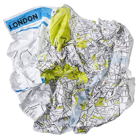
Crumpled City
Image taken from Dezeen / The London map all crumbled up.

You need a water prove tier resistant survival map for All Weather or better All Urban conditions. It comes in the design by Emanuele Pizzolorusso for Palomar, the 'Crumpled City - Soft city maps for urban jungles'.

Interesting how this 'technique' of crumpling the map adds a third dimension to the information and allows for a different perspective, THe flat plane all of a sudden becomes more tangible and a sense of abstraction is present. Through the aspect of irritation of a road all of a sudden going physically uphill the navigation process is more alert and the product placed in a firmer understanding of reduced reality. A benefit of course empowering the user to be freed from the truth of the map via the introduction of possibilities and uncertainty.

The product was presented only last year and go extensively reviewed. The darling of all reviewers it seems. There were articles or mentions from Wire to NYT, or from the TimeOut Lisboa to the Vogue Living.

Crumpled City
Image taken from Palomarweb / The New York map all crumbled up.

However, the product also promisses some hidden spots: "Each map proposes 10 “SoulSights”, places that are chosen to excite you. These are places filled with intense emotions that are brought to life by the people passing through or stopping off in them. Visit these places and you will feel like an artist, a poet, a photographer, a director, a lover and a dreamer." This sounds intriguing and might be something different to explore.

So far only the versions are the limit, currently versions are available for: Rome, London, New York, Paris, Berlin. So there are some treasure places missing, but hopefully they are working on extending the coverage. At least there is a hint on the bottom of the website where a Hamburg Map features.

Crumpled City
Image taken from Palomarweb / The Hamburg version of the Crumpler City Map.


Via Dezeen

Kamis, 24 Februari 2011

Dead Log - Wikileak Data Mapped

News media coverage on the Afganistan War, started in 2001 and the Iraq War started back in 2003 by the then President of america, George W. Bush has slowly but surely been pushed of the headlines. It was big back then and still is every now and then, but the general public has gotten used to it and doesn't know where to go with additional information about similar events. In Afganistan the war is into its tenth year and in Iraq into the eighth.

Nevertheless people are still dying in this war, on all kinds of different sides. Long gone are the days where there was only two sides. Who is with who and who was with whom last time, or tomorrow? Nobody knows and probably nobody will ever know. The only hope is that progress can be made, even if slowly, steadily towards a stable but independent and local rooted sense of direction.

Wikileaks has in July and October last year released a massive amount of documents related to the war. These basically are reports on events and incidents, a War Diary essentially. Tse dat was picket up by the Guardian visualised via Google Fusion Tables. The Wiki Dum consist of some 391,000 records. The Guardian Data Journalists have been pondering over it for weeks and theyr summary is available on the Guardian Data Blog.

Iraq Death Map

Link taken from the Guardian Data Blog / The data on all reported deaths in Iraq is available on the Google Fusion Tables. Full details available directly from the Wikileaks page. For a full view of Iraq zoom out, it really covers the entire country!

It is important to look very closely at this data. The visualisation is extremely missleading and is is vastly unclear what it show. For example as jpsnodgrass in a comment on the Guardian Data Blog points out, there are a great number of unrelated incidents mapped in the same fashion implying they are contributing to the full picture. He notes "the same visual points represent vastly different categories of incidents involving injuries or deaths. For example, look north of Fallujah city where two red dots lie very close to each other. This is the information about one of the events:

RCT-1 CONDUCTS OPF REHEARSAL AND FEINT NORTH OF FALLUJAH
Type: Friendly Action
Category: Attack
Region: MNF-W
Attack on: FRIEND
Enemies killed: 14

This means that Regimental Combat Team One (part of the 1st Marines) conducts Opposing Force (generic "The Enemy" for training purposes) rehearsal and feint. i.e. They were practicing the maneuver into Fallujah and pulled out.
The 14 "enemies" seem to be fictional entities hypothetically killed in a theatric rehearsal.

The dot next to this:
2-7 TANK ROLLS OVER IVO FALLUJAH: 1X CF KIA
Type: Non-Combat Event
Category: Accident
Region: MNF-W
Attack on: NEUTRAL

Read: Tank accidentally rolls over (and kills) Coalition member in the vicinity of Fallujah.

Click on the other points on the map, especially the ones outside of the major cities. You will find that many of them are "criminal events" (i.e. civilian murder, or murderer unknown, or a body was found, cause of death unknown)."

Taking out the 'Accidents', the category 'Others' and turning the map from a dot map into a heat map changed the picture


Link taken from the Guardian Data Blog / Map is based on the Wikileaks information on the Iraq War dumped in October 2010. It is available on Google Fushion Tables. You can log in via your Google Account and play around with the data yourself.

The Wikileaks do not mix things up or are misleading in themselves, but it is just a very large pile of raw data. This includes everything, including information that doesn't belong or is wrong, a dump really. Authoring a visualisation will still require a lot of attention and knowledge on the subject. Even though Google supplies this amazing Fusiontables tool, visualisation has not become easier. It has become more accessible.

By far these documents are the largest and most detailed public available documentation of any war do far. But is it really making a difference? Does this map convince you of the necessity of this operation? Are you now, after clicking a few of these incident reports believe in the strength of military forces and their ability to foster society culture and maybe democracy?

Guess the same critique applies to the Afganistan War Diary data released by Wikileaks around the same time. Here is also a Google Table available together with a crude mapping. The same category mixing is going on. It hoever includes many more, since it does not only focus on deaths.

Available on Google Fusion Tables or directly on Wikileaks, or also via the Guardian.

Afganistan War Diary Map
Data available on Google Fusion Tables via the Guardian Data Blog.


Link taken from the Guardian Data Blog / Map is based on the Wikileaks information on the Afganistan War dumped in July 2010. It is available on Google Fushion Tables.

War Reporting is not done from the desktop, not with Google and not with Wikileaks. As it is with 'clean warfare' and 'smart bombs', putting the distance between operation and action, or directing devastation from the comfort of a remoteness location is not changing the reality on the ground. War kills and imprecise reporting does not help save lives either.

war reporter action figure
Image taken from dcrtv / THe war reporter as action figure.

Rabu, 23 Februari 2011

NCL World View - Update

The NCL raw data collection has been running continuously over the past few weeks and data has been collected for cities around the world. It seems time to update the world map from is previous version. So far we have covered 67 cities. However they are not all mapped yet. This will take a bit more time, but we are working on it.

In fact, so far we have in order of appearance:
New York, London, Munich, Paris, Moscow, Sydney, San Francisco, Barcelona, Denver, Hong Kong, Beijing and Chongqing. Further more the urban areas that need processing are: City
Abu Dhabi, Amsterdam, Athens, Atlanta, Bangalore, Basel, Berlin, Bogota, Boston, Cairo, Cape Town, Chicago, Doha, Dubai, Dublin, Glasgow, Guongzhou, Istanbul, Jakarta, Johannesburg, Lima, Liverpool, Los Angeles, Madrid, Manchester, Manila, Mexico City, Mumbai, New Delhi, Oslo, Rio de Janeiro, Rome, Sana'a, Santiago, Sao Paulo, Sfax, Shanghai, Sofia, Stockholm, Taipe, Tehran, Tokyo, Toronto, Tripoli, Tunis, Vancouver, Zagreb.

The NCL maps show a virtual landscape generated from geo located tweets sent from within a 30 km radius of the urban centre.

For now there is an updated world map of NCL world map with links to the individual locations. A link is provided to click through to the interactive and zoomable version of the individual urban area map. This will allow to explore the city of interest in more detail. It does now including the covered area. If you zoom in to a location the 30 km radius is plotted as an overlay.


For a large scale map click HERE. The maps were created using our CASA Tweet-O-Meter, in association with DigitalUrban and coded by Steven Gray, this New City Landscape represents location based twitter activity.

There are, as pointed out in earlier posts great variations between the cities activities on twitter. Also the number of geolocated tweets vary dramatically. So far Amsterdam is clearly leading the table with over 50% geolocated tweets. Compared the most active cities London and New York both on average send about 10% geolocated tweets.

NCLworldMapStats_110223
Image by single-blogs for NCL / Urban Areas with total number of tweets (purple) and total no of geolocated tweets (yellow)> This gives an idea of the relationship between tweets and geolocated tweets in different areas of the world.

Selasa, 15 Februari 2011

Sound Based Research - Fieldwork

Sound is part of the everyday experience landscape as much as the visual, however dramatically less present. The dimensions and the extensions of sound scapes were earlier discussed in the MyTime interview with Salomé Voegelin.

One of the major topics in this discussion was the relationship between sound and space or the construction of an soundTimeSpace a Voegelin called it.

Check In / Check Out
Image by Andriko Lozowy taken from merlepachett / View of a tailings pond and Syncrude Oil Sand Mine in the distance.

In some new research work, Merle Pachett investigates sound landscapes. She has be working recently in Canada and her project im by mapping the acoustic ecologies of the Athebasca Oil Sands to develop on the work of the ground-breaking 1970’s project Soundscapes of Canada whose objective was to capture disappearing sounds in response to over noise pollution.


Sound by Merlet Patchett

In her most recent presentation of the collected raw material she collaborates with a photographer, Andriko Lozowy, from the University of Alberta. The two media appear to work rather well together and do not simply merge into one as if it were video recordings. The tension that builds up between the different media is really the interesting bit in this documentation.

It is not as if sound was too boring to listen to just like that, but with the photographs a certain dialect emerges between how it looked at this time and how it sounds in this moment.

It seems surprising how the aspects of time play a very different role in both these two medias. We are trained and have acostomised to read photographs as a document of the past. Certain aspects of the image can be read as to guess the approximate time distance. With sound however, this seems less of an immediate reaction. This data is much more in the present, there is not this reflex as to put it as something of the past.


Sound by Merlet Patchett

Check In / Check Out
Image by Andriko Lozowy taken from merlepachett / Fort McKay Industrial Park.

Rabu, 29 Desember 2010

Urban Growth - World Models a Trend

Recently large scale models have come back into fashion and researchers around the globe have started to develop different types of urban grows simulations spanning across urban areas, countries and even started looking at a global scale urban growth models.
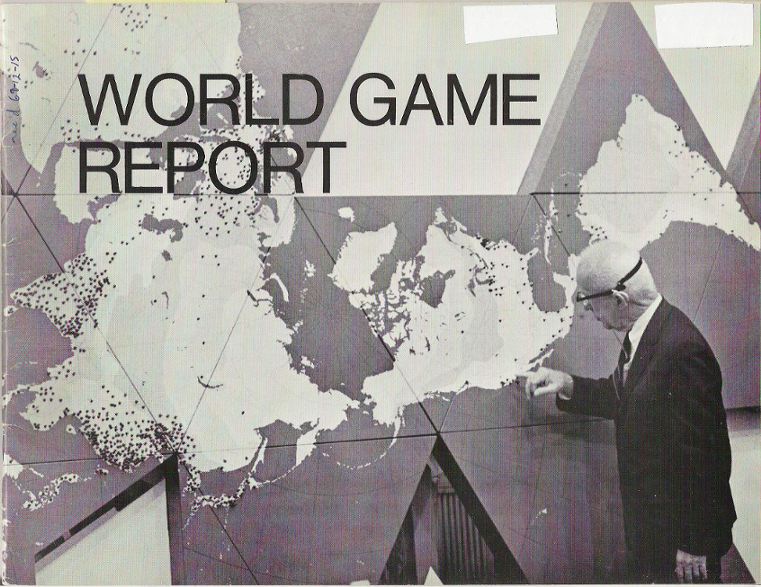
Of course one of the precedences is the Bucky world model called the "World Game" or the world peace game. Of course this was based on a Dymaxion Map.

World-Game
Image taken from genekeyes source: scanned by Gene Keyes from cover of
World Game Report, [28 p.], ©1969, Edwin Schlossberg
Photography by Daniel Gildesgame and Herbert Matter /


It was branded a game, but recently scientists have become much more bold and call it a model. They are also not shy of promises of what could be solved by such a large scale everything incorporating algorithm based predictions.

The main problem back then but even more so nowadays is the base data. With the flood of information we have now it is getting more difficult to manufacture a decent working dataset. And of course it would need to cover the past as well as the current state.

The data, as far as recorded would be available but most likely not in the format and resolution required. So to start a lot of foundation work is required and no one seems willing at them moment to invest in this fundamentally important piece of work. everyone whats to get on with the exciting bit of the prediction, that how one makes money.

Even more interesting to look at some of the few existing visualisations of the past urban growth globally. The New Town Institute has put together a flash based visualisation of world wide urban growth of the past 6000 years. This is quite a good starting point and interesting in it self. Have a look how urban areas evolved, declined and reinvented themselves. The database is also online available.


Visualisaion taken from newtowninstitute

Senin, 29 November 2010

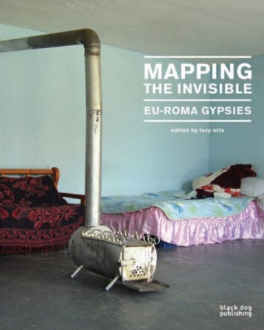
Book - Mapping the Invisible

The title of this Black Dog Publication seems very general and trendy at firsts glance, but in fact describes the content much better than most other publications. With 'Mapping the Invisible - EU-Roma Gypsies' edited by Lucy Orta, a topic is in depth documented that currently definitely doesn't features on any agenda. A topic concerned with the 'invisible' culture of the Gypsies, 'mapping' out an identity and the condition they currently live in.

Of course both terms here are used in a wider sense than the currently trending meanings. Already for this one is very grateful. 'Mapping' has become a dead term, suffocated by start up app developers and run over by cross-discipline geographers. In the context of this publication additional potential of mapping breathes some live back into a dead corps with a lot of success and in fact very few maps.

Before even talking about any content, the main element of the book are the photographs. This probably wan't intentional and the photographs are neither glossy nor very good, but they tell the story, illustrate factual and narrate emotionally. There are currently very few publications out there that manage a similar intensity using photographs.

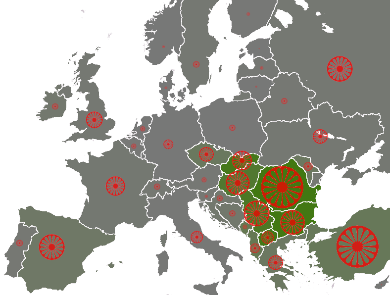
Gypsies in Europe
Image taken from Wikipedia / populations of the Romani people by country, showing the "average estimate" published by the Council of Europe[1]. Based on these estimates are the number of seats by country in the European Roma and Travellers Forum (ERTF) based in Strasbourg. The size of the wheel symbol represents total population by country (Romania 1.85 million), the shade of each country's background colour represents the percentage of Romani with respect to the total population (Romania 8.5%). The three different green shadings 0%, 5%, 10%

The current state of the Gypsies is documented in five chapters as 'History Migration', 'Human Rights', 'Extreme Poverty', 'Creative Ingenuity' and 'Family Identity'. These topics are simultaneously observed in different European countries, such as Italy, England, Romania, Turkey or Greece. Interestingly each topic is portrait in a spatial context and even though the cuture is largely known as traveling or travelers, the place, here used distinct from space, is always very important. This provides sort of a continuous tread through out the book and continuously pieces start interlocking. However, there is no need to read linearly, thanks to this thread.

What are Gypsies? Wikipedia says this: "The Romani (also Romany, Romanies, Romanis, Roma or Roms; exonym: Gypsy; Romani: Romane or Rromane, depending on the dialect) are an ethnic group living mostly in Europe, who trace their origins to the Indian Subcontinent.
The Romani are widely dispersed, with their largest concentrated populations in Europe, especially the Roma of Central and Eastern Europe and Anatolia, followed by the Iberian Kale in Southwestern Europe and Southern France. Deported to Brazil by Portugal during the colonial era [16] and via more recent migrations, some people have gone to the Americas and, to a lesser extent, other parts of the world."

The book's effort is summarised in the foreword by Alexander Valntino and Lucy Orta as: "European Roma mapping stemmed fromt he need to know more about the precarious living conditions of the Romani across Europe. Awareness, we believe is an absolut necessary first step towards an auspicious change in the Roma condition." And this is definitely what the term invisible describes, a cultural group disappearing in the in the sea of sub suburb sprawl of individualised housing and generalised industry.

Clearly the Roma people are marginalised and pushed to the edge of society. Hoever, every now and then the Roma culture has played a role in a broader cultural movement as for example in links to the Situationist, who were especially interested in the idea of moving. More recently in 2007 the first Roma pavilion at the 52nd Venice Biennale was established as discussed with Daniel Baker in the chapter 'Creative Ingenuity'.

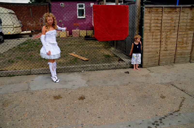
Holy Communion
Taken from Valentina Schicardi / A photograph taken from the series on the Holy Communion of the granddaughter.

The book manages to produce a comprehensive documentation, aso for a lay audience, of the Roma culture and the current state of place it is manifesting itself. This is clearly a very sad situation and in all the different countries an unsolved condition without any ideas or concepts in reach for improvement.

This documentation is on the other hand also a clear reflection and the society we live in and how this society we are al part of treats certain groups. You thought slums are something that only exists in faraway, exotic countries, think again. Talking about the latest flashy architecture magazine glossi spread? Read this publication and you'll learn a lot more about what architecture could mean and the role it would play.

This publication is low key and at first glance resembles more a comprehensive study report or a sophisticated thesis. However, this is extremely misleading flipping through will unveil the density and comprehensiveness of the documentation and the liveliness of the images will bring you goos bumps
into your cosy living room. There might be no over designed layout, but the power of the narrative here are simply incredible. A must have for every analytically interested architect as well as all the mapper out there. A wakeup call for the urbanised, western societies for a lot more than the subject at hand. A very important contribution, especially now in this conservatives' dominated political and social climate.

Also read a review of the book at we-make-money-not-art.

cover
Image taken from Radio.CZ / Publication cover.

Orta, L., 2010. Mapping the Invisible: EU-Roma Gypsies, Black Dog Publishing Ltd.

Jumat, 19 November 2010

Book - Atlas of the Conflict - Making up Borders

The spatial manifestation of presence, such as ownership, power or usage is commonly clearly and durable regulated in stable societies. The practice has sort of merged with the everyday routines and is hardly notable. There might be the odd neighbours dispute over a garden shed, a tree or a parke car but largely the boundaries are in place and not negotiable on a individual or even personal level. In a sense they are accepted as a sort of pre existing spatial institution.
Boundaries do change in shape and ownership. Usually lager pieces, such as plots of land, if they are not public, are traded as a good on the market, payed for and sealed with a contract. So pretty save stuff here.

This is however only a condition and depends on the accepted practice.

In a brand new 010 publication by Malkit Shoshan exactly these conditions and practices are examined. Shoshan meticulous works his way through the spatial extends and manifestations of the Israel-Palestine conflict over the past 100 years. The book 'Atlas of the Conflict - Israel-Palestine' maps out the processed and mechanisms behind the shaping of the area over the past century.

Atlas of the Conflict 02
Image taken from Atlas of the Conflict 010 Publishers / Spread 132-133, chapter 3, showing the pattern of settlements by size.

The conflict is a constant topic in the western news with its ebbs and flows. Sometimes the coverage is more intense and then it fades away again, depending mainly on the involvement of western authorities or individuals. The last wave of prolonged news coverage flicked across our screens this past May 31, as the ship convoy, the Gaza Freedom Flotilla, tried to reach the Gaza Strip to deliver humanitarian aid and suplies. Over 700 People from 37 different countries were aboard to support the mision, including Britons. The Israeli special force Shayetet 13 brutally stopped the convoy, killed nine of the passengers and injured dozens. The goods did not reach the destination. This act was widely criticized and dominated the news for a couple of day and it faded away again.

However the extend and the implications of this conflict are hard to grasp by following these only doted coverages. The news stories are usually quite narrated and in comparison to this the Atlas of the Conflict ha a very different approach. It is promising to develop an objective overview through mapping and factual documentation. Factual we can most likely expect from the large news channels, but the comprehensive mapping really offers a new perspective on this entangled situation.

This book is not the first attempt to map out this topic. For example there is the 'The Routledge atlas of the Arab-Israeli conflict' and other earlier book dating back to the eighties or early nineties. In this sense it is time for a new publication with a fresh approach.

Atlas of the Conflict 01
Image taken from Atlas of the Conflict 010 Publishers / Spread 414-415, lexicon, showing the evolution of the wall erected by Israel along the border to Palestine.

The collection of maps is extensive. The book boosts a massive 500 maps and illustrations, detailing different aspects. It puts things into places, context and more importantly into relation to each other. The developed context is however very limited, it hardly goes beyond the ever changing borderlines of the Israeli state. It does however go into a lot of detail on the inside of the border line and puts things on the maps such as infrastructures and demographics.

The publication is organised into two parts. The first part is mapping, mapping, mapping, putting the information into beautifully simplified maps, often reduced to icons. In the second part the author presents a lexicon of selected objects, topics, facts and figures to intensify and narrate the topics presented in the maps section. The two sections are interlinked with page numbers to offer option for nonlinear reading of the atlas. This element however works only one way, from the maps section to the lexicon section.

As hinted above the design of this publication are outstanding and do set standards. There is no other way to put it. Behind this is again Joost Grootens who was already responsible for the design of 'Atlas of the New Dutch Water Defense Line', reviewed here earlier. Through out the book the design works with a three colour colour scheme. Blue is used for Israeli information, brown for Palestine information and black for general info. The illustrations are very often reduced in detail and information to be mainly an icon. This is extremely beautiful and makes this publication a pleasure to brows. However it also struggles at times with the odd non fitting design problem, but thats part of the game.

The overall size of the publication is at first surprising. For an atlas it is very small and more a sort of pocket atlas. This especially in comparison to the oversize 'Atlas o the New Dutch Water Defence Line'.

A striking speciality of the publication's approach to document the conflict over the last 100 years is the largely absent topic of religion and individual destiny. Shoshan explains in the introduction how she started investigating the spatiality of the conflict and it can be assumed that it is a very conscious decision to exclude these topics in order to enable a different access to the conflict as a whole.

While reading through the publication and studying the maps, a very strong sense of temporality of space, land and even country started to emerge. Even though the maps and illustrations are very static and by definition exclude temporality, a story of the conflict started to emerge of which spatial practice of an idea was the key player. All of a sudden it became clear that a country, the land and the people are not one and the same thing. But all have their own very different theoretical interpretation and reading, but also practice.

The practices and strategies employed in this conflict appear in this presentation as tools and mechanics of an extremely theoretical vison of a myth to try and bring the three element of country, land and people together.

Atlas of the Conflict 03
Image taken from Atlas of the Conflict 010 Publishers / Spread 154-155, chapter 4, showing two typologies of Israeli spatial practice, the 'Wall and Tower and the 'Moshava'. Both are two ways of settling to claim ownership of the land.

Through out, but foremost in my favorite section, chapter 4, the utilisation and manipulation of the population through spatial planning and strategies is portrayed in depth. Chapter 4 introduces the typologies of settlements on an almost architectural scale and illustrate how individuals are misused for a bigger cause, as pins on a map, as shields, as metaphor, as demonstration, but not as humans.

As a technique of spatiality this illustrates how important or more so fundamental the presence of human being is, to value the spatial dimension. It could be argued that this publication, not intentionally, but as a by product, shows how important the individual act of creation, space making is, as recognised and institutionalised by the Israeli government.

The list of examples and fascinating details that could be put forward here is really long. There are so many moments while reading this book where you go ah..., uh..., yes! and things, you have heard from the sporadic news over the years, all of sudden make sense in a wider context. By definition Shoshan excluded the narratives and stories, but cleans and reassembles the base map for the news, tales, fact, information, tales and events we hear elsewhere. The book might not be as objective as it would like to be, but it as objective as possible an this makes this atlas also worthwhile in another context.

Atlas of the Conflict 03
Image taken from 010 Publishers / Cover of the atlas of the Conflict - Israel-Palestine.


Shoshan, M., 2010. Atlas of the Conflict - Israel-Palestine, Rotterdam: 010 Publishers.

Selasa, 16 November 2010

London 365- 2010 - One Year of GPS Tracking

It is one more year since the last summary of personal tracking was posted. This year it is a consistant 405 tracking record as compared to a mixed device record the previous year. This matters in so far as the 405 performs very well and the data processing job is a simpler for the cleaning part. The down side is that it is slower for the processing part since there are very detailed records with loads of points. THe previeous year can be found at Plymouth365 and oneYearLND_2009.

oneYearLND09-10 London
Image by single-blogs / London overview of the 2010 GPS track record. A one year drawing of movement on a daily basis, recording all activities and trips. For a large version click HERE.

The map also shows the previous year in green, since there is a striking similarity and in order to highlight the differences this seemed to make sense. The similarity goes as far as the two records being more or less the same. I expected a similarity, but not to this extend.

There are differences only on a very small scale. There is one major change in routine that dominates the differences between the two years. My son has started school and the trips to the nursery near the work place have been substituted by trip to drop of or pick him up at the school near our home. This changes the spatial practice and with it the pattern. However it is not as obvious since the directions of movement stayed more or less the same.

oneYearLND09-10_small02
Image by single-blogs / London Bloomsbury zoom of the 2010 GPS track record. A one year drawing of movement on a daily basis, recording all activities and trips.

To update the zoom in to the leisure area around Regents Park here is an updated version showing the different visits to ZSL. In 2010 there appear definitely a shift in interest focus. Never been to Australia this year.

As pointed out in last years post, the capacity to recall events using the lines as memory triggers works very well. I can basically over the whole year piece together my steps. Being this for example in the bottom left corner some of these trips to the Natural History Museum, Royal Geographical Society or in Hyde Part visits the Diana Memorial.

oneYearLND09-10_small01
Image by single-blogs / London Regents Park zoom of the 2010 GPS track record. A one year drawing of movement on a daily basis, recording all activities and trips.

Kamis, 11 November 2010

New City Landscape - the World View

The collection of NCL maps of Urban Areas is growing fast and it is getting difficult to keep track of all the cities we have covered so far. The NCL maps show a virtual landscape generated from geo located tweets sent from within a 30 km radius of the urban centre. In fact, so far we have in order of appearance:

New York, London, Munich, Paris, Moscow, Sydney, San Francisco, Barcelona, Denver, Hong Kong, Beijing and Chongqing. Further more the urban areas that need processing are: Shanghai
New Delhi, Chicago, Vancouver, Rio de Janeiro, Tehran, Tokyo, Jakarta, Sao Paulo, Toronto, Oslo, Basel, Rome, Guongzhou, Mumbai, Bangalore.

To provide a better overview here is a NCL world map with links to the individual locations. A link is provided to click through to the interactive and zoomable version of the individual urban area map. This will allow to explore the city of interest in more detail.


For a large scale map click HERE.

The data collected from the different cities varies quite a lot and especially the number of geo located tweets is a sort of tricky parameter. It does not correlate with the number of messages sent. The dependencies are more complicated and link probably more to the living standards and income. For example urban areas such as Jakarta and Sao Paolo have high numbers of twitter messages sent, but very few lat/lng referenced messages. This is more to be related to the coverage of smart phones and data charges, where people tend to use the twitter service over a broadband internet connection for free.

However, it is interesting to note that the number of geo located messages sent per unique user tend to be around 10 over the period of one week. Some areas go up to 15 or down to 8, but it is fairly constant across the board.

NCL_stats_bubles_log_101111
Image by single-blogs for NCL / The graph is showing the urban areas covered so far in the New City Landscape project, were we generate an activity landscape of an urban area using twitter data. The comparison shows vertical: percentage of geo referenced tweets, horizontal: average geo tweet sent per user, size: number of unique user, lable: urban area code.

The maps were created using our CASA Tweet-O-Meter, in association with DigitalUrban and coded by Steven Gray, this New City Landscape represents location based twitter activity.

Kamis, 16 September 2010

New City Landscape - San Francisco and Sydney

We are updating the the collection of New City Landscape maps and add two new world cities. The earlier maps can be found HERE and HERE. The new data comes from San Francisco and Sydney. In terms of physical Landscape they both have the Ocean as a defining element of the urban area, together with large water bodies enclosed by the urban area. In both maps these features come through in topography generated from the tweet locations.

sanFrancisco_ncl_100916
Image by single-blogs / New City Landscape also available in the flickr pool NCL


San Francisco New City Landscape


Image by single-blogs using the GMap Image Cutter / San Francisco New City Landscape - Use the Google Maps style zoom function in the top right corner to zoom into the map and explore it in detail. Explore areas you know close up and find new locations you have never heard of. Click HERE for a full screen view.

San Francisco on the other hand shows similar to New York multiple centres that grow together. Beside San Francisco, also Oakland and some other sub centres show up. A strong point is of course the airport again.

Sydney has a very strong island characteristic, with downtown showing up strong on the right hand side. The Sydney map was developed in collaboration with 'The Works Sydney'.

Sydney New City Landscape


Image by single-blogs using the GMap Image Cutter / Sydney New City Landscape - Use the Google Maps style zoom function in the top right corner to zoom into the map and explore it in detail. Explore areas you know close up and find new locations you have never heard of. Click HERE for a full screen view.

The maps were created using our Tweet-O-Meter, in association with DigitalUrban and coded by Steven Gray, this New City Landscape represents location based twitter activity.

Earlier maps cover London, New York, Munich, Paris and Moscow.

Rabu, 14 Juli 2010

London 1910 and London 2010

One hundred years apart and still people are fascinated with three dimensional representations of the city they live in.
In 1910 a London guide book was published by Simpkin, Marshall, Hamilton, Kent & CO., Ltd. & Love & Malcomson, Ltd., at Dane Street, Holborn, W.C. illustrating the capital in 20 Birsd-Eye Views of the Principal Streets. It also includes a Large Folding Map and an updated, coloured Tube Map. The Price - one shilling.

London1910_whitehall_l

The book opens to describe London with the lines: 'In this vast metropolisthere are to be seen individuals, families, tribes of pretty nearly every race on the habitable globe, of almost every tongue and dialect, of every colour and complexion, of every faith, religion, persuasion, and opinion - howsoever eccentric.'(London in 1910, p. B) At the time London had some 7 million inhabitants, putting it ahead of New York with 4.5 million and Paris of 2.8 million. And the book states that London adds about 108 people daily to 'her' population.
It is a guidebook with the different areas portrait in detail including historical aspects such as details of the Trafalgar Battle to introduce the Nelson Column on Trafalgar Square and so on. However, in terms of layout is is rather a text book.

London2010_whitehall_m
Images taken Yell.com / A view from Trafalgar Square in London down Charing Cross road towards Whitehall and Westminster.

The publication must have been partly financed also with advertising. There are some really nice examples in this book, of companies selling curtains, or flats for renting and so on. This too gives a pretty good impression of the passage of time compared to todays advertisement. Similar the prices, a hotel prices its rooms at 9s per day. This wold nowadays be more like £110.
The Birds-Eye Views are the main feature of this publication and they are quite impressive. Note sure though how they have been drawn. Whether from the top of some roofs or entirely as sort of imagined hovering over the houses.
In comparison the new Yell.com maps service is rendered from aerial imagery and gives the option to view the city in 3D. 'The 3D maps were created from actual film footage shot from light aeroplanes using sophisticated aerospace technology, which is then merged with other film taken from ground level' according to the Yell press release. 'Its technology appears to drape multi-directional aerial imagery over 3D point cloud. It offers true 360 degree view of objects on the ground and the map also has a control to adjust the tilt of the camera to the horizon' acording to allThingsSpatial.

London1910_tcRoad
Images taken from London 1910 and Yell.com / A direct comparison of the Tottenham Court Road area in 1910 on the left and 2010 on the right. For a detailed 1910 scan of the illustration go to flickr, for the 2010 version go to yell.com/maps

Very interesting how this has changed the perception of many. The city has in a relatively short period of time become the completely visualised space with uncountable attempts to capture it all. This has somehow shifted the perception form it being a space one can explore and discover and has the luxury to be surprised by new features. However this has changed into a we know it all attitude with the dreadful surprise being something one doesn't know.


Thanks for bringing the book over to my neighbour Steve. We'll be trying to generate those 3D flights.

Senin, 28 Juni 2010

New City Landscapes - Interactive Tweetography Maps

Over the past few months we have been harvesting geospatial data from Twitter with the aim of creating a series of new city maps based on Twitter data. Via a radius of 30km around New York, London, Paris, Munich we have collated the number of Tweets and created our New City Landscape Maps.

New York New City Landscape

Image by single-blogs using the GMap Image Cutter / New York New City Landscape -Use the Google Maps style zoom function in the top right corner to zoom into the map and explore it in detail. Explore areas you know close up and find new locations you have never heard of. Click HERE for a full screen view.

The highest New York point is the Time Square Peak. It sits within a ridge running down the lengt of Manhattan. It drops of in the south shortly after Chinatown Head and Little Italy Side. A second group of mountains are location around the Franklin Avenue Rock and a third in the Jamaica area.

The maps were created using our Tweet-O-Meter, in association with DigitalUrban and coded by Steven Gray, this New City Landscape represents location based twitter activity.

Image by DigitalUrban / Screenshot of the Tweet-O-Meter
Image by DigitalUrban / Screenshot of the Tweet-O-Meter showing New York, London, Paris and Munich.

The data is derived from tweets sent via a mobile device that includes the location at the time of sending the message. The contours correspond to the density of tweets, the mountains rise over active locations and cliffs drop down in to calm valleys, flowing out to tweet deserts. Throughout the emerging landscape features have been renamed to reflect these conditions. Embedded below a zoomable version of London, created using CASA GM Image Cutter software software developed by Richard Milton, you can zoom in and pan around just as you would do on Google Maps.

London New City Landscape

Image by single-blogs using the GMap Image Cutter / London New City Landscape - Use the Google Maps style zoom function in the top right corner to zoom into the map and explore it in detail. Explore areas you know close up and find new locations you have never heard of. Click HERE for a full screen view.

In this visualisation London does not show the normally characteristic East-West differentiation. Here it is a more North-South directed structure. The highest peak is Soho Mountain in the centre of London extending Eastward towards Liverpool Street.

Munich New City Landscape

Image by single-blogs using the GMap Image Cutter / Munich New City Landscape -Use the Google Maps style zoom function in the top right corner to zoom into the map and explore it in detail. Explore areas you know close up and find new locations you have never heard of. Click HERE for a full screen view.

Paris New City Landscape

Image by single-blogs using the GMap Image Cutter / Paris New City Landscape -Use the Google Maps style zoom function in the top right corner to zoom into the map and explore it in detail. Explore areas you know close up and find new locations you have never heard of. Click HERE for a full screen view. This map was created with the support of Annick Labeca.

‘New York, London, Paris, Munich everybody talk about Pop Musik’ – that was 1979 and the catch line by the group M. This was the start of the project, to mine what people are talking about in 2010. This has led to the creation of our New City Landscape maps.

Images of the maps can also be found on flickr. More cities are coming soon….

Jumat, 25 Juni 2010

Territoriality - Mapping Individual City Perspectives

How do we identify our selves with the spaces we use and how do we navigate with the many obstacles the urban environment contains?
Living in the city means to constantly negotiate spaces as well as navigate space. This becomes more difficult under the density aspect as well as the mobility aspects. Also the cycles of change are very short and frequent adaptations require constant reorientation.
Aspects of repetition and routine play an important role in the navigation of everyday situations. Being familiar with the aspects makes this task a lot easier. However, as soon as there are changes, new features or temporary obstacles, those have to be integrated.
Even more difficult such tasks are for people with disabilities. Here people also have to deal with obstacles built into the urban landscape, simply because someone ignored additional needs.
Megafon is a project to investigate and map these obstacles using collaborative and user generated methods.

magafonNET_access01
Image by megafon.net / Geneva obstacle map 2008. Based on Google Maps with clickable content. Click on image for the interactive map.

They work with focus groups and equip their participants with a camera and GPS to document their experiences in everyday situations. The images were uploaded directly to the internet feeding in to a realtime map of the city. Two of these cities are Barcelona, Spain and Geneva, Switzerland. The resulting maps a very detailed and visualise a very specific perspective on the city.

Image by wired.co.uk / Screenshot of the live tube map
Image by megafon.net / Barcelona obstacle map 2006.

Kamis, 10 Juni 2010

Mood Mapping - How do you Feel Today?

'How are you?' a phrase used constantly at meeting someone. Rarely the response is anything other than a 'fine'. The relationship between location or activity and mood has been subject for lots of research projects, for example the early mental maps by Peter Gould and Rodney White of desired locations to life, Christian Nold's BioMapping or Sorin Matei's Maps of Los Angeles spaces.
With the Glow iPhone app the latest persona mood is georeferenced and contributes to a location based mood map. It offeres a palett of features, leaving the actual mood meter bit almost behind. Anyway, what you get is a map, a AR view window and a bunch of sharing options, including twitter and facebook.
The mood is then visualised with an outwards fading blob of glowing reds, purples and blues. Looks neat and makes you feel almost a bit better.
To see the map you first have to contribute your current mood status. The AR looks particularly promising with its superimposed colour schema.
Check it out and add your moods to the cloud, the app is free.

moodApp
Image by single-blogs / Screen shots from the mood app GLOW for the iPhone. Location based sharing of your current mood.

Senin, 07 Juni 2010

Book - Cartography of Time

A long awaited book with the tremendously interesting subject of time and mapping is finally out. Princeton Architectural Press has published a beautiful scholarly book by the two professors Daniel Rosenberg and Anthony Grafton, 'Cartography of Time - A History of the Timeline' Beautiful in this case means not only the layout is nice, but this also extend to the presentation, material, text and depth and presentation of research.
Alone the collection of examples is astonishing and can serve as a visual encyclopaedia. I happily spend hours just browsing the pages and dive here and there in contextual texts of one of the illustrations.
The timing for this publication seems perfect. Time is a hotter topic than ever, from science labs to the work place to everyday live. Every service has a temporal aspect these days.
The content is presented in eight chapters, that seem to fit with the content maybe because it has multiple meanings. For one it represents loosely history, but also the history of the book as the process of developing and writing it and at the same time imposes structure to large groups of aspects. It starts with genealogy charts and develops over linear history charts to end in the chapter 'Big Time' where arrangements of long term timescales up to the current days are presented. Even though we take the timeline as a given tool of communication, the authors demonstrate here how this understanding was developed and how it came to be so intuitive.

cartographyTime_p
Image taken from Cartographies of Time p120 / Joseph Priestley, 1769, A New Chart of History.

The examples shown are documented and explained with of lot of care for details and put in context. A lot of te examples are beautiful coloured in with watercolours, showing these quiet but present colours of green yellow, red and blue. Most examples are linear, but some are circular or even three dimensional. It features John Sparks' 1931 'The Histomap' but also R. Buckminster Fuller's 1943 'Profile of the Industrial Revolution as Exposed by theChronological Rate of Acquisition of the Basic Inventory of Cosmic Absolutes' and his 1963 'Shrinking of our Planet by Man's Increased Travel And COmmunication Speed Around the Globe'.
The book puts a lot of emphasis on the graphics and representation techniques. So not surprising, the first book quoted is Eduard Tufte's 'The Visual Display of Quantitative Information'
and the second is from the same author, 'Beautiful Evidence'.
The publication makes it clear in the first sentence what the content is about: "While historical texts have long been subject to critical analysis, the formal and historical problem posed by graphic representation of time have largely been ignored." (p.10) The authors introduce two terms for one subject, History = Time. Very few publications actually state their intentions this clearly and usually try to benefit from some vague outlines. 'Cartographies of Time' really is a history book, as the authors themselves admit in the lecture.

cartographyTime_p
Image taken from Cartographies of Time p24 / Manuscipt timeline for Olaf Stapledon's classic 1930 science fiction novel, 'Last and First Men: A Story of the Near and Far Future.

For me, in this sense, the title of the book can be a little misleading and the move to declare time and history the same is questionable. For me there are overlaps and one (history) benefits from the other (time - especially concepts of linear times as in the sense of a time 'line' line). However the publication incudes representation of time that go beyond a pure history representation. For example it features Charls Josephs Minard's 1860s graph depicting Napleon's assult on Russia, a first sketches of ideas and devices to capture many frames in immediate sequence as developed by Muybridge and Marey in , '201 Days' artwork by Katie Lewis where she mapped body sensation over a period of time on an abstract map or the 'Historical Atlas' by Eduard Quin published in 1828 depicting the spatial extension of the known world at different points in time using clouds as a graphical metaphor of the unknown.
Those examples for me indicate that there is a lot more to the aspect of time than the traditionally linear approach often chosen by historians. But at the same time history is not history and in the meaning of the word, for me, has more to do with story than line. In a sense I picture history and mapping history especially, similar to J. R. R. Tolkien's 'Lord of the Rings' map of Middle-earth and accurat representation of an idea. TIme and time concepts are very much representations of a social and scientific understanding or concept. I am aware that this is a big discussion and authos such as Zerubavel or Thrift have written extensively about it.

cartographyTime_p
Image taken from Cartographies of Time p128 / Eduard Quin, 'An Historical Atlas'. The European known Earth shown through clouds from the birth of Christ to the death of Constantine, A.D. 337. In full color from Scandinavia and Morocco to Korea.

However even though it is absent from this publication here, it was stated by the authors at the very beginning and this publication has its strength, as highlighted above, in very different areas.
This is a book about the graphical representation of history, told along a brilliantly selected chain of examples and the physical extend of it clearly shows that this is enough. Further more, the content demonstrates that this book contributes a significant elements, again as identified by the authors, to the field of time research as well as the discussion, for witch debating the subject again in this case is not necessary.
But maybe there is room for a sister publication on the representation of time in other fields, for example time, space, maths, religion, ...

For additional reviews see the one on Bibliodyssey or information and a audio record of the lecture given by the authors at the book launch party organised by Cabinet.

Rosenberg, D. & Grafton, A., 2010. Cartographies of Time, Princeton Architectural Press, New York.

Kamis, 03 Juni 2010

New City Landscape - Tweetography

We have been monitoring different cities' tweeting habits over the past months using the Tweet-O-Meter. This project is developed together with DigitalUrban and was coded by Steven Gray. Earlier we had covered a London Weekend (HERE, HERE, HERE) and now we are looking at four cities. Those are New York, London, Paris and Munich over the period of one week.
The data is derived from tweets sent via a mobile device from an app that includes the location at the time of sending the message. We see large differences between the overall tweeting as well as in the mobile usage of twitter. London and New York generally send about the same amount of tweets, New York however has about twice the amont of mobile users compared to London.

tw_newYork_100507_m
Image by single-blogs / New York tweetography, the New City Landscsape generated from tweet density. Click map for a detailed version.

From the pool of tweets covering the city we have generated the New City Landscapes as a form of tweetography. Here the landscape features corresponds with the twitter activity of locals. THe mountains rise over active locations and cliffs drop down in to calm vallies flowing out to tweet deserts. Through out the emerging landscape features have been renamed to reflect the conditions.
The data is based on information collected over a seven day week last month. SOme temporal graphs will follow. There are obviously differences in temporal activities, but the New City Landscape is an overview of the logged time frame as a whole.

NewYork_contourNames_zoom_m
Image by single-blogs / New York tweetography, the New City Landscsape generated from tweet density - Zoom.

Charactering New York along the New City Landscape we can distinguish a massif of mountains from Fordham Heights southwards over the Central Harlem Rock, dropping down into Central Park to steeply rise up to the Timesquare Peak a long a ridge to the NYU Top to the Chinatown Head, where it starts dropping down the Financial Cliff. Towards the East the Manhattan Bridge Ditch separates this massif from the Brooklyn set of peaks. Were it starts with the Downtown Peak towards Bedford Hill, turning south over Ocean Hill, Rugby Ridge down towards Flatlands into the Mill Bassin Curve, dropping into the Jamaica Bay Pit. Another smaller group of hills form around the Jamaica Hills, Rosedale Hill and JFK Terminal 4 Point. For more details refer to the detailed map. Special thanks to John Reads for helping out with local knowledge.

london_contourNames_m
Image by single-blogs / London tweetography, the New City Landscsape generated from tweet density. Click map for a detailed version.

London has compared to New York a centralised Peak structure with the Soho Mountain as its peak. The massif here falls from this point in all directions with a north ridge going along the Camden Ridge across Arsenal Point, Finsbury Park Ridge to the Tottenham Hill. This line ends with the Edmonton Peak at the Ponders End. Further outside singular peaks can be found such as the Heathrow Peak, the Selsdon Peak or the Chaffordon Hundred Hill in the East.

london_contourNames_Zoom_m
Image by single-blogs / London tweetography, the New City Landscsape generated from tweet density - Zoom.

We are still working on other maps. Munich and Paris are under way and more are to come soon. The language translation is tricky but with the help of specialists we might get that together.
Here a Munich preview.

munich_contourNames_m
Image by single-blogs / Munich tweetography, the New City Landscsape generated from tweet density. Click map for a detailed version.

------
Update 2010-06-04

Paris is now joining the other three cities. Here is the New City Landscape map of the Ille de France. Special thanks go to Annick for helping out with the terminology.

paris_contourNames_m
Image by single-blogs / Paris tweetography, the New City Landscsape generated from tweet density. Click map for a detailed version.

And the zoom-in as a preview

paris_contourNames_zoom_m
Image by single-blogs / Paris tweetography, the New City Landscsape generated from tweet density - Zoom.