Many different location based apps have surfaced recently making excellent use of the localising capacity of the latest generation of smart phones. However the trend is going through phases. everything from transport app to news feed now wants to use the current location for whatever. In the beginning there was a lot of excitement that it actually works and apps where pars. The check-ins came along and made it big with Brightkite and Latitude, then Foursquare and finally Facebook pushing the train. Now we're in a sort of location bubble with every app inside. This is not going anywhere, so better getting into a niche as things are still rolig.
Wanderlust is such a tool for the smart phone developed for a niche, however closely related to other specialised fields. Wanderlust (the making of) is a mobile story telling platform integrating with the cohort of Foursquare, making use of their massive database of check-ins. Via these location the narratives unfold. The clever concept of the Wandelust stories is, that they play at generic type locations instead of actual unique locations. The narrative relates to the type 'Bar' and this is not a specific bar, but just any bar you can find.
If the story starts at a 'Shop', off you go, into the next shop and the narrative unfolds. The location plays an important role in so far that it is used to determine the type of location you are in. In some sense this is location type hopping according to storyboard. The narrative will tell you where to go next to find the next part of the story and hear how this bloody mess is resolved (in the story obviously).
The platform is very helpful in finding the right place as it ties in with the Goole Maps routing service and finds the quickest way to get there. So it is hard to get lost, but it is especially hard to find an excuse not to play or listen in this case. Not even the platform provides an escape, it runs across platforms. Quite cleverly it is built as a webpage, using JQuerry, any browser capable mobile phone can load. No complaints, out you go, pull these stories in!
Tourism by Naomi Alderman: A chilling urban fantasy, beginning in a bar. Tech by Tom Chatfield: A thousand words of science fiction in one act, beginning in a restaurant. Ivy by Andrea Phillips: A dark and dreamlike fairytale, beginning in a nightclub or music venue. In The Shadow Of Her Tail by Matt Wieteska: An urban fantasy, beginning in a shop. South by Southwest by Adrian Hon: A homage to Hitchcock’s spy thriller North by Northwest set during SXSW 2011, beginning (of course) in a convention center.
If you have an ide for a story get in touch with the guys at @wanderlustapp.
Image taken from narrativenow / Wanderlust graphic.
As Google introduced Google Buzz back in 2009 they simply delivered it straight past the existing location based service. Back then, the introduction came with a bang an Google put a lot of effort pushing into the location based application segment. Even though Google basically has a monopole on everything location based, one year on Buzz has been sleeping for most of its existence.
Services popping up, mainly Goala and Foursquare raised instead. With it a whole bunch of similar apps like Brightkite and later in 2010 also facebook managed to more or less successfully integrate the location feature into the platform.
Foresquare released some stats last month claiming a growth of 3400% in the past year! Not sure what exactly this means, but generally it can be said that this sort of application is currently very popular amongst smart phone users. What I haven't seen so far are gender stats on how girls and boys compare in the usage of location based self tagging. From my experience, not at all empirical, when ever I check in at a facebook place, there seem to be a lot more boys already checked in at this place than girls. Maybe I am in the wrong place, but maybe its a boys thing.
Graph taken from foursquare / Honestly, 2010 was just insane. The numbers tell the story better than we can, so we put together this little infographic. (Also, our 6,000,000th user signed up last week!) See similar twitter stats in this earlier post HERE.
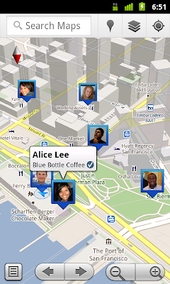
Anyway, here comes Google and resurrects Latitude from the dead (see earlier post on the death of Latitude HERE) to play alongside these platforms letting users check in. This, for those who have missed the short earlier live of Latitude, is quite a development from what L was at the beginning. It was a location sharing platform based on location not venue. Al you coud see was the dots of your friends on the map. Of course this was a major inovation back then and it was one of the first large scale applications of this kind. It was cool, but noone understood it. There was just too much negative press and too many concerned voiced tearring it all back down for Google, only to make way for the 'younger' generation of app that are now this successful.
Privacy concerns were at the forefront of the discussion and one of the odd things that was introduced by Google was a reminder message, sent roughly every two weeks to respond to concerns about people knowing the where abouts of a person without his or her knowing. I still receive this message I guess. Hopefully Google has now stopped sending them, this would clutter the mailboxes of the potentially now growing user group unnecessarily.
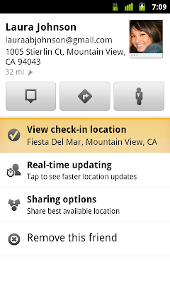
Images taken from Google Lat Long Blog / See where your friends are on a map and where they’re checking in. Latitude check-ins are built right into Google Maps and Place pages.
The new service lets people check in at locations and also, this is new, check out. There are various options for automatic check in or reminders to check in and so on. I especially like the line in the promotion clip where it says "you can automatically check in, there is no need to interrupt the conversation to let your friends know that you have checked in."
The new app has so far only been released for the new Android 1.6 and runs on the updated Google Maps 5.1 iPhone users can so far only use the updated Latitude version 2.01, where the locations of your friends are visible, but for yourself the check in function is not yet available. More details on the Google Blos Official Blog and Mobile Blog.
How the world is connected across large distances has recently be shown by projects analysing phone calls and mapping origin and destination. The MIT SensableCity Lab has done some work, Barabasi and his colleagues worked on it and also Jon Reades from CASA.
The latest work by MIT and UCL, above as circulated a couple of weeks ago, has redrawn the regions of Britain according to phone calls. The maps result from the analysis of a large phone data set covering the whole of the UK.
These large data sets are all held by the phone companies together with presumably a whole lote more interesting stuff. It is rather difficult and complicated to handle and only accessible for a few people.
However with the rise of apps on smart phones such data sets are generated by small independant companies. FTFun is one of them. They have developed an app for the iPhone focusing on facetime. Facetime was introduced by Apple with the release of the iPhone 4 and allows people to see one another during the phone call. These video calls are made possible by a second camera on the front of the iPhone 4. This works however only between two users of an iPhone 4. FTFun have developed a desktop app to allow other users to join in these video calls without the need of an iPhone 4.
As a byproduct the company sits on a data pool of location based connection information. At the beginning of the year they have decided to make some of it available as KML files viewable in Google Maps or Google Earth.
The company so far has 11k users and 185766 face time calls in the last four month since the release of iPhone 4. The data is release in three sets, the past three hours, yesterdays data and live data updated every two or so minutes. Below you can see a map showing the connections over the past three hours of the day.
Twitter communications span the globe and the pinpointing of end locations of conversations in this animation shows how the network spans around the planet. It jumps between the hot spots of cities and even continents. In the description of the project the authors discuss the rather interesting point of the meaning of 'Location in the case of twitter. In fact this not only applies to twitter but many location based services, the here is not always here. "'Location' has 2 meanings in the world of Twitter. It can mean (1) where someone was when they tweeted provided they are using a GPS-enabled smartphone, or (2) where someone lives (users can specify their home location)." (Geography 970)
In a second version the locations were mapped on a rotating globe which give a good impressionof how we communicate around an axis. For details please see Geography 970.
Augmented reality application have developed rapidly over the last year and have reached a number of platforms by now. Also there are now multiple providers to run AR services. This is a dramatic change from the early days were Layar was the only open plattform. Same thing with location based services. Google Latitude and Brightkite have been overtaken in the meantime by Foursquare and Gowalla as the leading applications. Actually one dosen't even think of them as applications but communities. Anyway to push their position Google now tries a new approach, integrating image recognition in to the AR environment. This could potentially improve the service in terms of accuracy. So far the technology relied on the location from the aGPS and the direction via the compass. However this is within a range of a couple of meters up to ten twenty meters. So in this sense you could have actually already walked past the trendy Sushi place you are desperately trying to find.
Image taken from AddSite / Scanning a contact card.
However, now with Google Goggles (its sounds a bit like Googoo Goggles, the Dr Seuss character) your mobile client will detect the place via its features, scanned from the camera image. It still links back to a massive database containing the background information but the identifiers were delivered by the camera. In this sense a true visual search. It is still in beta and overall the technology is still in the beginnings. Unfortunately it runs on Androids only. Currently it can scan contact cards and translate them into a digital contact on your phone, recognise art work (I would like to see it recognise this Giacometti sculpture?), recognise landmarks (incase you are usure whether or not this is the Eiffel Tower you are looking at), detect logos (this could be helpful with the sushi place) or also book covers and presumably posters like theater plays or movies. Search and related services are the core business of Google and this is the sort of innovation they are looking for. Already the term visual search makes a lasting impression, and linkes to all sorts of relations. It sounds like a great application of technology and it will probably work very well at some point. However on the other hand it does start to rais the question of how dependent on the mobile client do you want to be? Do you really want to look at the world through the ridiculous small screen of your touch screen? Maybe to fins the sushi place?
The Twitter data is still top of the list and we are experimenting currently with different models in Google Earth. Here we have a version using the 3D London Model developed here at CASA. In the flight through you can now see where the tweets actually were sent and in what context. It covers currently central London using approximately 10,000 tweets only, because we are experiencing performance problems. We are working on it and hopefully will have a solution shortly.
Together with the tweet-O-meter project run at CASA as part of the NeISS research project we have collected location tagged tweets around London (M25). As described in an earlier post on this HERE, the idea is to capture the urban narrative. The current data covers a whole weekend from Friday evening to Monday morning and the set holds some 380'000 individual tweets. However this brakes down to 60'000 truly geo referenced tweets, by 5'500 individual users. The thing is, that these are only the mobile tweets and they are captured only if the locations sharing is activated in the twitter profile. Still this makes an average of 10.6 tweets per mobile user over the weekend. Overall we have 39'222 individual users witch makes some 9.7 tweets. So the mobile users seem to message slightly more, but not significantly as one could maybe expect. In terms of density per location as one could expect the focus is in the centre. There are local hotspots as the weekend progresses, such as Kings Cross and Old Street. But then there seems to be a accumulation of density along the transport lines into and out of the centre. To visualise the temporality of the data tweets are in the below clip output as a message cloud rising and hovering above London. It is a simple time-space aquarium were the time is plotted as the hight information. The later in the weekend the tweet is sent the higher above the city it floats. As the density develops the low times can be clearly spotted, when it thins out the lines and London sleeps. The animation is rendered in Google Earth, with the KML file brought in through a VB script from Excel. Once set up this is quite a flexible combination. However, the KML file can get quite big, since there is a lot of information contained with all the messages.
Google seemed for a long time to kind of miss the upcoming social networking hype. They have actually paved the way for this development to happen, especially where it comes to location based services and now it looks like they miss the train. This is not the first time though, already with the chat they could not catch up with msn or with voip, skype was the number one. Same here again with social networking, Google had to watch the rise of facebook and twitter for quite a while and similar with the location based social networking services. Here Brightkite or foursquare are small, but very agile and successful providers of location based services. Earlier these services were discussed HERE. Google came up with the Google Latitude service. It offers the option to let a mobile device track its route and broadcast it on the web or share with invited friends. It was a very simple platform and did not offer anything in addition. Were Brightkite offered tools for networking, commenting and socializing, Latitude would only show a the location. This inability not to interact could be frustrating and this might be the reason why Latitude stayed a niche product. But Google was determined to come up with some sort of service to mach the still growing social networking community. So earlier this month they launched Google buzz, sort of an extension to Gmail. Google buzz was introduced on their official blogs HERE or HERE or on googlemobile. It is kind of a cross between a chat and micro blogging tool that can be used directly from within Gmail. It combines elements of Gmail, Wave and Latitude, looks a bit like facebook (in the way it displays the activities) and works a bit like twitter (the way you can sign up and follow other users). There are however also differences. It is tied to the Gmail account, which means no strange names or funny images. It automatically links to everyone you have ever emailed through Gmail, your identity is set. Also the fact that it is embedded in Gmail means you have to be inside your mailbox to use it and follow your friends (for now, there will be for sure other clients pop up - depending how it develops). I have to say for me is the Gmail integration at the moment not the most interesting part, but rather a bit annoying. I very seldom log in to check my email. In fact I basically have only joined buzz because I am logging in to the Gmail service at the moment due to a faulty machine and I don't have access to my regular mail client. But lucky me, the real deal with the Google buzz is the way it works on mobile clients such as the iPhone. Blogs, for example the next web, have this week described the service, what twitter should be, or what the next generation facebook with integrated location awareness must be! And really this is it, buzz mobile, in this case one could say it is an extended Google Latitude, gives you the service you'd expect. In a list or on the map you see the buzz's around you and you can interact with them. Nothing new, yes we know, Brightkite or Foursquare do this for a year already, but twitter doesn't yet properly do this. THe main problem really is the graphical interface. I know this is a tricky one, but I really can't get warm with this Google style. This was already one of my main complaints with Google Wave and now it is again with Google buzz. It is simply ugly and unfriendly. It might work properly, but if it aint good looking you don't want to use it. Compared to twitter or facebook , similar complaints apply there too and the boring design of facebook is one of the reasons I hesitated long before starting to use it. Twitter is a different case. It took me a while to get used to it, but they managed to develop their own stile and invented a format for micro blogging. To come back to the actual functions of the buzzing buzz, it is integrated with Gmail as mentioned above, so direct buzzing is easy, even more Google has integrated the buzz button on the search page too. So as you have found something while searching, simply click the buzz button and your very personal news go out to the world. Similar with the location based integration, Google makes the most of the services they already have and are successful. They have added a buzz layer to Google Maps for example, where you can see what is buzzed around a certain location. For a more complete list on the features and how to use them see mashtrends. The map feature is great and you get quick and simple an impression of what is going on in an area. This, however, creates an interesting problem of how to represent the aspect of time. At the moment this is not really a question, but soon certain places will become very buzzy and it will become impossible to decide which buzz you actually want to see. It was similar with the user generated KML files that would be automatically be integrated into the general Google Earth layer in the early days of Google Earth. It obviously quickly grew to be too much user generated information and Google started selecting. By now the have established 'official' layer contributors, such as Panoramio or Discovery Channel. But here, with Google buzz, the aim is different n so should be the solution. How can Google simplify the growing content without losing the important content you are looking for? There are aspects of time involved, beside possible categories or tags. A feature like the timeline in Google Earth would be a good start, to see how this location developed and where the information lies that one is looking for. Anyway, if other clients start picking up the format it might all change, at least this is what was the promise with Google Wave, we'll see. For now there is a new Google buzz button with each post here on the blog, so keep buzzing away, it could develop into something.
A review of yesterdays conference on health mapping will give you some insight on the current state of mapping practice in health research and related areas. The day overall was interesting and my poster presentation went well, there were some interesting discussions. The city migration behavior of individuals seemed interesting for health researchers. However the day was packed with talks and that was the main bit.
The first speaker will be Dr Russell Stothard from the Natural History Museum. He is talking about the use of GPS. His talk has the title ‘Using GPS/GIS for Schistosomiasis research - building a better picture of exposure to water contact sites’. First he is pointing out that actually it is possible to geotag an image. Well this is a start. He introduces us to handheld devices available to time and location stamp data such as images. This probably sets the context of the conference. It is a different field than we are used to. He goes on about the GPS system on how global positioning works. He is working in Africa and this might give a different setting. However somehow I get the feeling that there is still a mystical aura to the continent, you could maybe still get lost down there. He moves on to talk us through the Garmin devices available and there he mentions a nice expression for the back tracking setting, Bread-crumbing. How cool is this. This might lend a new title to the urbanDiary project as we are bread-crumbing across the city. The fact that there is not a GPS camera at current is presented as very sad, but actually there might be software solutions for this? Interestingly he then starts talking about the location as such and the following slide is titled ‘so precisely knowing where things are has never been easier’. Furthermore he points out that actually the location might not be the actual site of where something is, so to say location is not location. He show some of the examples he is working on. It is about a disease in Africa that is using a snail as a host. He is working on the East coast of South Africa. Snail species are quite difficult to tell apart, and the disease is picky, living only in one type of snails. So they have to go out and collect the snails take them back to the laboratory to determine what species it is. The location information therefore is important to reconnect the sample with the area of collection. It is a lot about mapping the source (snails) and the impact of the disease. Part of their conclusion then is that the spatial distance from the water source, where the snail hosts live, results in a higher possibility of having the infection. Largely the research is about the lifecycle of the disease. He also shows a nice device iGotU. This device was used to track 20 people of a village. They are tracking the people to determine the amount of risk they are exposed to. There are also time aspects as there are only certain times of the day where the snails shed to release the larvae to infect people. He shows a timelapse of the peoples movement over a two day period. This tracking determined quite clearly the contact these people have with the water. It is a very nice example for the use of GPS. However the standard questions remain what does that actually say. Is this just a scientific There are the strong cycles these people follow, but somehow these aspects have not yet penetrated the research. If the nail has a cycle and the people have a cycle you can mach these up? There might be a chance to change the peoples habits to prevent them from getting infected. This might not be as simple as they mostly rely on fishing and this in turn requires a naturally determined schedule in order to get a good catch.
Next speaker is David Aanensen from the Imperial College London talking about ‘www.spatialepidemiology.net - tools for mapping infectious disease epidemiology’. Introducing us to Google Maps use in health research. He also points out there are other services including OSM. So Mash-Ups are the hot key word. He introduces a series of mashups that he has worked on mapping gene sequences, if I have understood him right. He is talking rather casually. The live demo of his websites makes him rather nervous, surprisingly. But it worked well and he was able to demonstrate how it works comparing a set of genes across different countries, by a manual selection done in the mashup. The big question with thee mash-ups probably really is the accessibility for further research. It is mainly a visualisations the public world wide web, but what now. How can other researcher collaborate or use the provided data? It looks nice but the usability is not yet clear. Do the for example offer an API, for other people to access the data and mash it up? He then shows an other example that to some extend partially answers the question. A platform that can be accessed to produce maps. It is based on a copy past eel data input field to import data and map it. He moves on to demonstrate a mobile device application he has developed. Especially for the android. The app does allow to input data, adding GPS location and sync is with a web server. Also directly mapping it on a map. It additionally allows for pulling data from the server to see the new records in context or deciding on where to collect more data. He summarizes the limitations of the technologies. The big problem is the battery live, but also the network coverage and the costs, both for the handset and the contract. He mentions in the end that they have actually just release an iPhone app - lets check EpiCollect on the app store. Haven’t been able to find it so far.
It follows Dr Mat Fisher again from Imperial College London. His talk is entitled ‘Using Google Earth to identify populations and invasions in emerging fungal infections’. He uses the mapping to predict and an link it to analysis, pattern and process. He stresses that the mapping does not tell us anything unless we have a clear design of the research of what to get out. He shows a clear example of spatial spread of a disease in southern middle America over time. Spreading from 1987 from Costa Rica to Panama City in 2008. So he then uses global mapping based on Google Maps to ma the other occurrence of the disease on this scale. This makes a lot of sense if you can combine it with other environmental data available globally, such as whether and climate data. Identifying potentially vulnerable locations is very important as the disease is highly spreadable and deadly for amphibians. He provides an example of the extinction of the ‘Spring from that happened this year after the introduction of the disease in March 2009, and by now he frog is belied to be extinct. The protection of these identified areas with similar condition is key. He shows an example of his work hunting frogs across Europe. For the data storage he is in fact using Google docs. He is even using the KML function provided by the Google Docs. Even though it is limited to some four hundred examples. The output is clearly spatial. However this could have been expected as for one he is collecting spatial data and for two animal habitat are spatial determined by conditions. To verify the spatial data he is using the barcode technique. They go ahead and determine the gene of the infection and can show that they are locally connected and individually introduced. So the result shows that the infection is related to UVB, min. temperature and longitude. In an additional example he shows time based location data of samples from the UK and visualises the spread of a virus in amphibians across the UK from 2001 to 2008.
After the coffee brake speaks Dr Marianne Sinka and Mr Will Temperley, University of Oxford about ‘Mapping the geographical distribution of the Anopheles vectors’. What are the aspect of mapping malaria data are producing predictable global distribution together with a summary of bionomics, as well as compare the data. She explains how the initial database of vector transitory animals is generated form existing publication sources. Basically she has subscribed to any malaria related publication source by email and gets news to put directly into the data base if related to animal species samples and locations of those. Additionally they add spatial information to the database. Together with a group of experts with detailed knowledge of the locations they have produced area coverage maps. In terms of technology they are using PostgreSQL data base, combining excel and shape files. Accessing the database is via Python. For the web based stuff they are using Django and Python, but are now developing a Java an Google tool kit based version because of the demand on dynamic content. Together with spatial, physical data I suppose, and climate data they can model potential areas where a certain species can be found, As a result they are aiming at publishing papers this year on the first set of maps.
Talk by Dr Richard Myers, Health Protection Agency Centre for Infections with the title ‘ Web based GIS mapping of molecular / epidemiological database. They are working on Swine Flu, TB an so on. He runs us through the functional diagram of his functional database. Data Input - Data Storage- User Interface - Data Retrieval and Data Analysis. For his talk he identified a set of three areas that are important to be looked at to produce a good web based mapping application. The most important aspect he stresses is the why and what you want to get out of the mapping exercise, as the web based formation has its limitations. The two other ones are data and sampling also in terms of the reliability of the data. Interestingly he points out the identification problem with small scale data. They are working with postcode level data. On this level individuals can not be identified , but the zoom factor is important, as they don’t want to have individuals identified in a location. For the website application they are using flash for the visualisation. It looks nice but he points out some downsides to it. It is slow and currently low resolution as well as limited capacity to show multiple data sets. So he moves on to show examples of Google Maps. His list o pros and cons of using Google Maps for the mapping is rather long on the other hand. The surprising result is the slowness of it that he points out. What cannot be displayed on web enable databases. He concludes with a list containing, confidentiality data, dynamic data, local out brakes, detailed analysis and so on. And the list of what is possible is as long, most technological based here though.
Navigation through London comes after lunch presentation it is Tim Fendley, Applied Information Group from Legible London – a way finding system for London. He starts with an introduction to navigating London with some hilarious examples of guidance through the city. He continuous with the examples of psychogeography and the urban islands. It is for a change a really refreshing talk with a lot of energy and joke. It points out how dry and dull the rest of the day was. He then runs us through how they have developed and introduces the new navigation elements. The structure for the new navigation system is all based on the naming of locations. There is also a very detailed process to actually develop the maps and navigation aids. Defining the named areas is tricky and a statement of position. The whole system appears very much connected to the tube stations, as it seems to mainly address the tourists and visitors. It is true that the tube is a simple way to navigate London and building on this is one way of tackling the problem. But I think it still has to proof its use for local people. However as they focus at the moment on central London most people going around there are in fact visitors. It will be interesting if this gets rolled out over London and how people learn to navigate their neighborhood.
Chris Phillips of MapAction is talking about, would you guess it, ‘Maps in Action’. Subtitle ‘Disaster mapping at the front lines’. They are working with a rapid responds mapping team. They get deployed within hours of a disaster to the location. They claims to be local within 24 hours. From the equipment box: laptop, GIS, Google Maps/Earth, printer, GPS and camera. There is actually an UN respond team, but it takes them about 4 to five days to get their container shipped into the area. They are working all over the world and the work is obviously very much appreciated by locals suffering from the event. Usually afterwards they are hired to train locals for continuing the job and to prepare for an similar event. He points out the importance of spatial information in struck areas beside all the equipment. And he mainly draws o the visual aspect of the information and these implicitly to understand the information as compared to text information. The title is interesting - ‘everything happens somewhere’ - as a justification of his work, but it might be also his philosophy. He draws on the aspect of solving the chaos. He also points to some volunteer mapping project like john the map cartographer - mapping towns on his bicycle. Actually this was a promotion talk for mapping, concluding with everyone can map and everyone should map actually.
Peter Yang & Tian-Wei Sheu, National Taichung University, Taiwan with ‘An Effective Use of Social Network Analysis for the Study of Taiwanese Employees' Mental Health at Work’. He is focusing on the social network analysis and the aspects of health. The term social capital seems relevant, but hard to define. His use of the analysis is rather focused on networks. He identified five types. Dispersion, Durability, homogeneity, intensity and reciprocity. To get the data he used questionnaires. For the analysis he is using the UCINET 5 for Windows. However the important finding here is probably that location information is not only about maps, but also about networks and connections, crossing points and so on.
The last presentation for the conference is given by Dr Mikaela Keller, Harvard Medical School, USA on ‘Mapping the influenza A H1N1 outbreak’. Unfortunately my macBook run out of battery and I had a chance to follow her talk in more detail. To take it up front she also showed a iPhone application for the project she is working on. It is available on iTunes and simply called heathMap. This is at the same time the project in short, mapping news of diseases. They have invented a internet crawler that works on the basis of text and sentence structure recognition to spot any news in the text, grabbing location and disease transferring it into the database and producing Google Maps mashup with the data. This information is then accessible to the general public. However this is where the critique on the system pulls in. What is the benefit of the information to the general public. And who exactly is this ‘general public’. It goes a step further, as the presented iPhone application actually allows the ‘general public’ to directly submit a ‘case’, including disease (from a suggestive pull down menu that tells you up front it must be swine flu) and location of course. You can even include an photograph of the sick person if you’d like to make a point! I find this very doggy even though the project as a whole has some very interesting aspects. For example the idea of looking at the world as a whole and visualising everyone on the planet as part of the whole.
Somehow I have a creeping feeling that some of this research somehow still has a colonial aspect to it. It is interesting to look into problems of distant locations as some sort of export, but not as working together. Also all this spatial mapping is pointing towards the time-space problem and the issue with location information. It is in fact tied to the idea of the globe (as in the globe on your desk as a rotating ball on a axis that represents an abstraction of the world) and if this view is outdate the visualisations are too. So what to do? Is the mapping guild in a crisis because everyone is mapping? All this here seems to be riding on the open source mapping wave.
This question is urgent and regarding the take I went to in the evening at the Tate Britain by Doreen Massey a debate around these subjects is ongoing and the question of place and identity are up for challenge, but have to be redefined in the globalised world. I strongly agree with her view on the importance of boundaries for the structuring of places and especially with the argument regarding the human body as the first place it seems obvious to have a definition of the self and the other. And if it is something, it is not something else and this makes the distinction between the two. The main aspect is the way boundaries are set up and maintained in terms of the political dimension.
New development on the navigation gadget front. This time it comes from Microsoft and that is in it self a bit surprising. So far the company has not been closely linked with navigation. In general they are trailing behind everyone, generally trying to improve the stuff other have developed and promoted. In this sense this ‘new’ development has to be looked at. The research featured as an article on Technology review this week where its chef researcher Billy Chen introduces us to the concept. They are using video for driving directions. Instead of Google Street View, they are playing video recordings of the route in Microsoft Virtual Earth. The research is partly about the recording and synchronising of the map a video, but partly also about the influence of this method for direction instructions. The results of course claim that the animated instructions enable participants to find the route easier, with 70% to 60% for participants who were instructed only with image (Google images I presume).
Image by Microsoft - (a) Original spacing of panoramas. (b) Final spacing of video frames, after slowing down at landmarks/turns and speeding up between. (c) Straight ahead orientation. (d) Final orientation with look ahead. (e) Widening the view and freezing the landmark thumbnail.
However, the paper written about the project can be found HERE. It has to be noted, that it i not simply a replayed clop. An important feature of the software is the way it focuses on landmark and guides the users view files. It is not a passive record that has just followed the movement. Rather it is a carefully calculated section of the 360 Degree recording. Through this movement emphasis is put on certain aspect along the route, say a landmark. This means that the route somehow has to be processed and interpreted. How quickly and with what kind of system the software can be rolled out is not clear,