Tampilkan postingan dengan label visualisation. Tampilkan semua postingan

Minggu, 15 Mei 2011

Data Globe by Google - Chrome Experiments

Google presents fir the currently running I/O conference in San Francisco a new Google Chrome Experiment. The developers print a data globe for visualisation purpose. It's an in-house production and is a sort of simplified Google Earth in black and white showing colourful data spikes.

Its part of the series to demonstrate the power of the web browser. The war is on for quite a while between the companies and is currently fought the hardest on the browser front. Firefox has only just recently launched the new version and Microsoft is currently putting up paper adds across London trying to sell the detail capacity of the all new Explorer.

GooglewebGLGlobe_population
Image taken from readwriteweb / Screenshot of the WebGL Globe showing world population. Click the image for the interactive version

The chrome Experiments are already an established institution and contains a large selection of projects. Brilliant stuff like the interactive human body in 3D, the TimeLaps GigaPan or last years music video feature the Wilderness Downtown. Its an ongoing collection, so some new features will come up all the time.

The WebGL Globe uses web GL for the rendering all based on JavaScript. Doug Fritz of the Google Data Arts Team explains the challenges as: "The primary challenge of this project was figuring out how to draw several thousand 3D data spikes as quickly and smoothly as possible. To do this, we turned to Three.js, a JavaScript library for building lightweight 3D graphics. For each data point, we generate a cube with five faces – the bottom face, which touches the globe, is removed to improve performance. We then stretch the cube relative to the data value and position it based on latitude and longitude. Finally, we merge all of the cubes into a single geometry to make it more efficient to draw."

GooglewebGLGlobe_seach
Image taken from readwriteweb / Screenshot of the WebGL Globe showing Google Search results by language. Click the image for the interactive version

The second challenge was to create the interaction with the globe to enhance the experiment. since it is 3D users with the experience of Google Earth will want to drag and pan the globe. Using the mouse wheel there is also a zoom function so the data can be looked at locally. In this sense the interaction is quite nice however, the large spikes are difficult to grasp. The local level is really only for the smaller spikes.

The Google Arts Team has put online two data visualisations. One is showing the world population showing at three intervals 1990, 1995, 2000 accessible via some click links. The second visual is showing Google search volume by language.

Currently the tool seems only to offer point data and they have not yet announced a plan for additional features. It is not much more than an visualisation. However they are hoping it will be picked up by the community and have set up a Google code page, but not yet put the code for donned. Currently there seems to be only one custom visual, showing the bloggers mood around the world, based on the english speaking blogger community.

The language for the visualisation is not based on KML, but a sort of JSON interpretation. not sure how the transformation will work but apparently this should be simple. The package is now available for download on the projects Google Code page, including the two examples for reference. If you have a play with it and come up with some exciting stuff you can submit your project to Google HERE.

GooglewebGLGlobe_feelings
Image taken from alignedleft / Screenshot of the WebGL Globe showing Recently Blogged Feelings based on english speaking blogs.

Kamis, 21 April 2011

Book - Guide to Information Graphics

In most disciplines graphics, as is graphs, are not exactly new. The presentation of data, facts and figures have come to play a important role. Especially with the limited capacities of excel and other spread sheet software this was easy to do, but never really successful. One of the areas graphs play a central role is definitely financing and it is no surprise in this context 'The Wall Street Journal presents its Guide to Information Graphics - The Dos and Don'ts of Presenting Data, Facts, and Figures'.

It is put together by a former student of Edward Tufte, the master of information graphics, Dona M. Wong and published by Norton & Company Inc. She has worked in the industry long enough to know the graphic side of it inside out. This comprehensive guide is looking is great detail at the production, the characteristics and the context of graphs with a specific focus on the representation of financial data.

Talking financial data this is bar or line graphs. This is still probably right and the book does not chalenge this, but puts these tools into a wider context and provides a step by step guide with great detail on how to make the most of these 'well known' tools.

The chalenge is great, mainly because this is probably one of the most traditional markets ever. Especially because it has such a long tradition talking a core element through and making suggestions can be a very delicate matter. On the other hand Wong is also challenging the excel practice and up against the overworked executive assistant who has to put together a final report on facts two minuts before the meeting. It's not laziness but practice that produces these terrible charts.

In this sense Wong reacts to this by making an effort to make the guide look very traditional and simple with a very clear structure. However, the tone of the to dos and don'ts is clearly telling and not suggestive. There is little room for experimentation and invention, the ways to do it are resented about as factual as the bar represents a end of the year sum.

The book talks through all the pitfalls and mistakes commonly made. It has a great introduction highlighting the wider context of chart and the importance of framing, comparison and sectioning. It then looks at font and colour giving some very practical advice on how to avoid the impossibilities in possible combinations. Then it talks through the actual graph types, their strength and weaknesses. After the form, Wang discusses the content and its preparation with the common mistakes made by ignoring some basic math, such as standard deviation, mean and median, distribution and average, but also logarithmic scale and percentage, ending with some money cases. The last chapter is a discussion of problem solving strategies fo 'tricky situations.

Even if you are a frequent charter this hands on book, focusing on the traditional finance market practice has something to tell you and chance are good it will help you improve the message the next time your rushing the data into a pie chart while eating a donut and taking the stairs to the bar.
After reading this it, knowing the rules, it will be time to find out how to brake them.

Information Graphics
Image taken from mostOfYouAreAverage / The Wall Street Journal Guide to Information Graphics: The Dos and Donʼts of Presenting Data, Facts, and Figures - Book cover

Wong, D., 2010. The Wall Street Journal Guide to Information Graphics: The Dos and Donʼts of Presenting Data, Facts, and Figures, New York: W. W. Norton & Co.

Selasa, 19 April 2011

Datamatics Ver.2.0 - Data Viz Black and White

As part of the Spill Festival of Performance 2011 at the Barbican, Ryoji Ikeda played a set. It was another installment of his Datamatics Series started back in 2006. The new Datamatics [ver.2.0] series has evolved quite a bit from the first version already played at events around the world including Sonar, Barcelona (2006); Mutek, Mexico City (2007); Centre Pompidou, Paris (2007); RomaEuropa, Rome (2008); Itaú Cultural, Sao Paulo (2009) and Second Nature, Aix-en-Provence (2010) to name a few.

The soundscape is an artwork based on purely mathematical parameters transforming electronic data into sound and visualisations. Ikeda describes it: "Using pure data as a source for sound and visuals, datamatics combines abstract and mimetic presentations of matter, time and space in a powerful and breathtakingly accomplished work."

data.tron
Image taken from ryojiikeda.com / data.tron [8K enhanced version] audiovisual installation - 2008-09. Materials - 8 DLP projectors, computers, 9.2ch sound system. Dimensions - W16 x H9 x D9m. Date / Place JAN 1, 2009 - DEC 31, 2010 Deep Space venue, Ars Electronica Center, Linz, AT. Credits - concept, composition: Ryoji ikeda, computer graphics, programming: Tomonaga Tokuyama commissioned by Ars Electronica, 2008-09.

Breathtakingly it definitely is. The installation has you on the edge of the seat from very early on. The level of abstraction, the volume and the frequency of the flickering on screen mount to a experience very close the the limitation of the actually perceivable. After onl ten minutes the first people leave.

This work is clearly set in a wider context of sound art and electronic music. A few references to spring to mind immediately are John Cage as the very early highlight, Daft Punk with the Tron collaboration. Then there are also some more recent web project where data visualisation has turned into very playful results as for example with the Subway Conductor by Alexander Chen.

Interesting are Ikeda's use of geometrical elements for the visualisation. The main elements obviously are lines, both as geometrical lines but also as animated data lines. The Datamatics 2.0 performance then also starts with a linear setup, first vertical scrolling, then horizontal scrolling. The next element is the data point. Here again in many different variations, including as a node connected to other data points in 2D and 3D. Additional elements are planes and then effects such as spinning, copy and fast forward. With this basic setup the set reminds also of the short story 'Flatland' (if you haven't read it pdf is available HERE).

data.tron
Image taken from artshool.cfa / John Cage Liberation of sound.

However the visuals are not limited to the geometric elements. From early on, also with rather simple elements the screen is only showing a flat representation. The visuals are always rendering, an abstract, three dimensional scape. The visuals have clear references, of ist and arrays all the way to interstellar arrangements, the big bang and the glow of a sun with the removing of the geometries keeping only the texts. The audio on the other hand also has its elements that it evokes, from highway traveling to train journeys or rain you'll find it all in the sounds scapes.

Of course on is curious what sort of data sets Ikeda is using for the performance. Is it a sort of stream like a twitter feed, or is it a more static field like property data, but maybe it is some medical data on DNA sequencing or the time table of the Moscow subway?

At first the performance at the Barbican feat like a film screening, only at the very end as Ikeda rushed from the back onto the stage during the applause it became clear he was actually present and involved in the performance. However how much of it was live and 'interactive' remained unclear.

Nevertheless the audience was engaged from early on. Each time the performance released the audience from its strong grip of audio visual bombardment sighs of relieve and cheers spread the ranks. This almost physical link through the intensity of the experience was challenging, but at the same time created a very intimate connection.

A trailer of Ikeda's Dramatic [er.2.0] set.

Senin, 11 April 2011

Deleted Wikipedia

The online encyclopedia Wikipedia is a great resource for quick look up and input. In the internet world of linking and explaining it is together with Google one of the central elements. Earlier this year Wikipedia celebrated its 10th anniversary.

The platform of user contributed knowledge is constantly growing and changing with every internet user having the ability to ad a new article, amend an existing article or delete content. These actions however are subject to community discussion and are in some cases subject to heated debates.

notabilia
Image taken from dataviualisation.ch

This dynamic has for quite a while attracted researchers to study different aspects, from user group interactions to the dynamics of growth and change. Since it offers a open source data set with millions of element it is a great field of massified research of online data, mixing social and technical aspects.

There are a lot of subjects that have been deleted overt the years and exactly these were subject to a 10th anniversary visualisation for Wikipedia content. The work notabilia.net was developed by Moritz Stefaner, Dario Taraborelli and Giovanni Luca Ciampaglia. The visualisation grows the 100 longest discussion treads about the deletio n of an article into a visual tree with branches for each article.

They explain "Like a garden, an online encyclopedia needs constant weeding. Unlike a garden, an online encyclopedia has thousands of potential gardeners. Over years Wikipedia has developed guidelines and policies to help editors collectively decide whether topics are suitable for inclusion or not."

notabilia
Image taken from Dave cullen's blog

The visualisation assigns a colour, green for keeping and red for deleting, as well as an angle for each vote for or against deleting in the discussion branch. The length and the shape o the branch is therefore a visual representation of the dynamics of the discussion. As a result controversial topics tend to be straight with pro and contra keeping the balance, one sided discussions curl inwards and if the pros and cons are grouped the branch 'swings' in 's' shape.

notabilia
Image taken from Red Pepper Flakes

Senin, 04 April 2011

Wanderlust - Visual Stories

To pick up on the topic discussed herre last week with the Wanderlust story app for location based narratives an other 'Wanderlust' interpretation using visual imagery or visual narratives possibly.

This one here is a visual version traveling through Central America, Europe, and New Zealand, bringing back a little of what they saw of very local stories and moments. As Thinklab, the creator of the clip puts it, it is inspired by Stefan Sagmeister's TED talk on the importance of time off. In this sense they packed the camera up and traveld the world, bringing back stories as a visual catalogue lining up stunning scenery, special moments and a melancholie that owes a lot to the soundtrack by Max Richter's infra 1. It's great to get out there, dreaming and being.

Minggu, 03 April 2011

MTV Music Awards 2010 - Visualisation

THe MTV Music Awards are one of the really big yearly music shows and as such a important date in the calendar. Of course this transfers to the social networking sites, with loads of followers chatting about it online.

For last years show Stamen has teamed up with MTV and Twitter to deliver a live visualisation of the conversations on twitter about the stars related to the show. The whole thing was based on word tags, counts to indicated how often each star was mentioned. These numbers feed into the visualisation showing an icon for each performer in the relative size of its online counter.

Twitter Visualisation MTV Music Awards
Image taken from fastcompany / screen shot of the live visualisation created by Stamen for the MTV Music Awards 2010.

This generates this bubble size chart layout, with the higher rated names moving into the centre. There is obviously some direct action going on between the fn camps of the individual stars and the online conversations reflect pretty much in real time the activity on screen. People are tweeting as they watch, mainly in front of the tv, presumably. As Stamen points out:"Midway through the video, Taylor Swift gets up on stage to receive her first Video Music Award—to have it promptly snatched from her grasp by Kanye West, who immediately blows up on Twitter."

Selasa, 29 Maret 2011

LinkedIN by Numbers

The professional version of facebook has now als reached the 100 million user mark and is still growing. LinkedIN the social networking platform for the professional world has published at the beginning of March 2011 their growth in numbers to make a good impression. Founded in 2003 in Santa Monica, California by Reid Hoffman, Allen Blue, Konstantin Guericke, Eric Ly and Jean-Luc Vaillant, the platform has grown to be worth almost $ 3 billion and makes a revenue of over $ 160 million, this is up over 200% from the previous year 2009 at just over $ 80 million.

It was a niche market back the and probably still is. But once your big things settle and a niche can be good business. The main asset linkedIN really has is the content. All these details of businesses, jobs and positions as well as the real people behind it. They say that 73 of the Forbes 100 best companies are using linkedIN hiring systems. This means that the platform hosts a massive amount of details and hors unimaginable stock of knowledge on the worlds markets. These days knowing about the business connections is worth more than actually making business.

Regarding the numbers, there is one more number of the financial sector that is probably interesting. LinkedIN earns about $160 million, but its expenses are almost $150 million. It's actually expensive to know all these details. Presumably most of the cost goes into infrastructure.

In terms of the demographics, LinkedIN hosts over 58% male profiles and only about 42% female profiles. The main user group is between 25 and 50 years old, but the group of 18-25 year olds are also quite keen on the service with over 20%.

In terms of geographical distribution, as you would expect North America is LinkedIN homeland. with about 48% of all the users. The classic blindspots on the map are Africa, South America (except Brasil and Argentina), the Middle East and the Far East (except India). In terms of geographical gender distribution North America is doing better in terms of equality than every body else with 45% f and 55% m, where the Middle East with 23% f and 77% m is the most unbalanced market. However this is presumably not taking the numbers of users into account.

Through out the network the larger companies, over 1000 employees, are the most common. Also Smaller businesses tend to like the service, where medium sized businesses seem to be not that interested. As you would expect the leading branches are hightech 16% and finances 13% with agriculture covering the end with only about 0.4%. In terms of the job function academics are floating towards the top with around 10%, only the sales department is larger with 13%.

Interesting are aso the facts around the use and growth numbers. In terms of time of the day apparently there is a very high after lunch peak over all. During lunch and after lunch really seems to be the time web users find time for the sneaky break to check their social networking status, read a few blos and apply for a better job on inked in. The graph below also incudes the mobile user times and interestingly they mainly access the service after work and in the evening. However I imagine the graph to be slightly out of scale, the mobile users would be a lot smaller in numbers than the actual web users, but never mind. So if you really want this job you better apply before lunch.

linkedIN 2011
Image taken from mashable.com / The linkedIN network by numbers compiled by xxxxx on 2011-03-22.

Via zioigor

Senin, 28 Maret 2011

Protest in the Middle East - Inception

Over the last few month Europe realised that there are changes under way in the Middle East. Since December 2010 in a number of countries around the Mediterranean and the red sea people are protesting against their regimes, essentially asking for a changing of Government with fundamental changes for their society. In most cases the regimes are in place for thirty years or so and govern the countries in a totalitarian fashion not letting the large part of the population take part on any of the political processes.

Path of Protest_Guardian
Image taken from the Guardian / Interactive infographic depicting the protests in the Middle East on a timeline. Each icon links to a news coverage of the event. Click image for the interactive version.

These events are both culturally and politically very significant and were largely not expected. The protest in some countries have already lead to the toppling of the regimes as in Tunisia, and Egypt and there are ongoing protests in Algeria, Bahrain, Iran, Jordan, Marocco, Saudi Arabia, Syria and Yemen. In Libya the protests have turned into a civil war between pro Gadhafi military and Rebel fighter causing some European countries together with the US to intervene and establish a no flight zone, essentially helping the Rebells by attacking the Gadhafi troops from the air.

The Guardian has put together an oerview of the events, covering the timespan from end of 2010 to Spring 2011 listing the events interms of news coverage. They have come up with a really interesting visualisation for this summary as a sort of blend of Google Place marked timeline with an Inception theme, very much in the style of Here + There by Berg but in a temporal context.

The bending of the time axis indicated the time flow as a linear progression dropping down from the top, vanishing under the viewers feet as if on a running machine or in a hamster wheel. However, there is something very engaging to this sort of visual, similar to the first person shooter perspective, the consumer is presented with an interpretation of the viewing field. It has this computerized navigation feel to it.

Inception
Image taken from Etheriel / City folding, with an onlooking Leonardo DiCaprio as Cobb.

An other reference of course is the Inception theme, of last years Christopher Nolan Blockbuster staring Leonardo DiCaprio in a race inside the human mind against the cock touring different levels of dreams. One of the visuals for the film scenery was the folding of space, bending parts of the city of Paris.

The visual for a temporal, rather than a spatial representation, as use by the Guardian, has lesser boundaries for such folding concept. The developers Sheila Pulham who was recently involved with a number of data vidualisation for the Guardian and Garry Blight can play more freely with the projection of the future and make good use of effects such a perspective and blurring. The navigation however is solved with two handels, one to go back and forwards like a gear shifter and the other one as a slider across the top in the form of a horizontal timeline. Both are doing exactly the same and it is very unclear why they have chosen to add a second timeline in the 'traditional' horizontal orientation.

The verticality of the representation has a very convincing feel to it. It of course refers closely to the ideas of Hagerstrand and his time-space aquarium, where the time is plotted vertically, extending a 2d spatial plane into a 3d cube. The bending sort of implies more of a 'lived' version where the pure vertical option is rather abstract with the time coming from somewhere and never enduringly dropping down. In the folded option the time at least lies behind the observer, however it leaves open how this big pile of unwound time string piles up in the back.

Here+There
Image taken from Etheriel / City folding, with an onlooking Leonardo DiCaprio as Cobb.

Via information asthetics

Jumat, 25 Maret 2011

Massified Research and Visualisation

Today at the conference in Oxford 'Visualisation in the Age of Computerisation' we will be presenting a paper. The conference is packed and there are waiting lists for all events. This is to say how popular the topic currently is. Of course Oxford is a great place, they have managed to cover a vast variety of topics and invite popular and well known key speakers. Nevertheless there is also the aspect of hype and coolness about the topic that plays an important role. For an outine of the conference see HERE.

Steven Woolgar has in his key note already pointed out the differences in the rais of the visualisation and surprised with a few in depth analysis of visualisations. From neural advertisement analysis to the translation of lectures in to animations and the viualisation of key strokes as colour and sound.

The paper presented by Tim Webmoor and myself is focusing on aspects of ethics and practices for online social research especially regarding the gray area in which it operates given the lack of covering academic protocols. The title of this contribution is 'Massified Research and Visualisation' and it is based on the forthcoming paper "Scaling Information in the Information Economy: Implications for Massified Research and Visualisation from Public API Feeds'. The abstract of the presentation can be found HERE.

Below you can find the presentation to click through.

Rabu, 23 Maret 2011

Visualisation in the Age of Computerisation - Conference

The Institute for Science, Innovation and Society (InSIS) is organising a two-day conference 'Visualisation in the Age of Computerisation' on 25-26 March 2011 at Saïd Business School, University of Oxford.
"The theme of the conference is the permeation of science and research with computational seeing. How does computer mediated vision as a mode of engagement with information as well as with one another effect what we see (or think we see), and what we take ourselves to know?"

The event is structured along three main topics: Changing Notions of Cognition, Changing Notions of Objectivity and Changing ontologies of scientific vision.

Rain at musicfestivals
Image taken from onlinejournalism blog / for a viral-friendly piece of visualisation, it’s hard to beat this image of festival rainfall in the past 3 decades.

Speakers include: Peter Galison, Department of the History of Science, Harvard University, Michael Lynch, Department of Science and Technology Studies, Cornell University, Steve Woolgar, InSIS, Saïd Business School, University of Oxford and the summarising discussants are: Anne Beaulieu, Virtual Knowledge Studio, Paolo Quattrone, IE Business School and Fulbright New Century Scholar

I will be presenting a paper together with Tim Webmoore on ethics and visualisation of large scale dataset mined from the web, with a focus on twitter. We'll be using the NCL mapping project for examples, to develop an illustrated argument for ethics in this field. However, the aim is to use ethics to support this kind of research, using ethics and a clear position as a framework. We believe that such structures are of additional value to the research and researchers and ensure in the long term academic research quality and standards.

Abstract: In this paper, we examine some of the implications of born-digital research environments by discussing the emergence of data mining and analysis of social media platforms. With the rise of individual online activity in chat rooms, social networking platforms and now micro-blogging services new repositories for social science research have become available in large quantities. The change in sample sizes, for instances, from 100 participants to 100,000 is a dramatic challenge in numerous ways, technically, politically, but also in terms of ethics and visualisation. Given the changes of scale that accompany such research, both in terms of data mining and communication of results, we term this type of research 'massified research'. These challenges circle around how the scale of, and coordination work involved with, this digitally enabled research enacts different researcher-participant relationships. Consequently, much of the very innovative and creative research resulting from mining such open data sets operates on the boundaries of institutional guidelines for accountability. In this paper we argue that while the private and commercial processing of these new massive datasets is far from unproblematic, the use by academic practitioners poses particular challenges. These challenges are manifold by the augmentation of the capacity to distribute and access the results of such research, particularly in the form of web-based visualisations.
Specifically we are looking at the spatial and temporal implications of raw data and processed data. We consider the case study of using Twitter's public API or application programming interface for research and visualisation. An important spatial consequence of such born-digital research is the embedding of geo-locative technology into many of these platforms. A temporal consequence has to do with the creation of 'digital heritage', or the archiving of online traces that would otherwise be erased. To unpack these implications we consider how a selection of tweets can be collected and turned into data sets amenable to content and spatial analysis. Finally, we step through how visualisation transforms such vast quantities of tabular data into a more comprehensible format through the presentation of several visualisations generated from Twitter's API. These include what one of us has developed as 'Tweetographies' of urban landscapes, as well as examples of recent Twitter activity surrounding the disasters in Japan.
Such analysis raises issues of privacy and ethics in relation to academic ethical approval committees' standards of informed consent and risk reduction to participants. Such massified research and its outputs operate in a grey area of undefined conduct with respect to these concerns. For instance, what are the shifting boundaries of public and private space when using Twitter and other platforms like it? Are Twitter and other social media platforms' disclaimers as to privacy sufficient justification for academic and commercial use? Are the standards of social science research protocols applicable to research on and for 'the masses'?
To conclude, we discuss propose some potential best practices or protocols to extend current procedures and guidelines for such massified research.

Mountains out of Molehills
Image taken from Nora Oberle's blog / Another beautiful data visualisation. Even though in this case, the topic is not that hilarious- it’s about news coverage of scare stories. Remember tumours and cellphones or “killer wifi”?

Full conference programm to download HERE.

Selasa, 22 Maret 2011

Just for the Fun of it

In sync on the dot with the beat, goes the graphic as the beautifully melancholic song by James Blake drags on. Its fascinating to watch the transformation of form, shape and colour in tune with a very rhythmic pice of music. This is nice because of its visionary combination and a serious attempt to imply importance on a level of playfulness popping dimensions.

The work is created by Yaniv Fridman with the title Unluck. As he discribes it "Messing around with C4D, just for the fun of it". Well what a mess and what a beautiful mess. But then, mess is usually beautiful and inspiring in a second attempt and paying with the potential it has to create additional work driving the development and leading on, messing is definitely worth it. You never know.

Selasa, 15 Maret 2011

Word Count the Library - Google Ngram Viewer for the Google Books Stock

How do terms compare in usage over the centuries. With the Ngram Viewer now available on the Google Labs the massive stock of scanned books as part of the Google Book project becomes available for search. It allows for the graphing of terms according to the frequency they are used per year. The data ranges from 1800 to 2000.

GoogleNgram_century
Image taken from Google NGram / Comparing the two search terms decades of the century. Interesting how the different decades peak some decades after. Some decades have a shifted or even two peaks, like for example the 'nineties' that peak already around 1920. Of course the continuos fascination with the sixties is visible, but also te thirties cling on.

Google has grouped it into several corpora, groups of books. Most of them related to different languages, currently these are English, Chinese, French, German, Hebrew, Russian, and Spanish, but also samples like the 'Corpora Million', where no more than 6000 books per year are samples for the result. There are of course difficulties with punctuations and muti words. Generally the search field is case sensitive and punctuation is treated as individual tokens. More details on this on the Google Ngram page.

GoogleNgram_timeunit01
Image taken from Google NGram / Comparing the search terms month, year, day, hour and week. The different time units are used differently with the word day leading the table throughout, diving however very low around 1960 where it almost was overtaken by the term year. Have things slowed down? Surprisingly the month and the week, both in planning terms very important words are nowhere compared to the terms, year and day.

However, the results are quite tricky to interpret even though things might look very cear through the simplicity of the graph. Google has managed to make it look very simple and clean, each term is shown as a graph with time on the horizontal x axis and frequency on the vertical y axis. It has to be taken into account however, that there are changes in the usage of words, for example 'the Great War' vs 'World War I'. Even more important is the fact that more and more books are written. This of course influences the results. Google points out that there is only a catalogue of around 500'000 English books before the 19th century. This means, that a search term can have a stronger peak early on than it would have later o, since this one book has more of an impact on the sample as a whole.

GoogleNgram_ruralUrban
Image taken from Google Ngram / Comparing the two search terms rural and urban. As you would expect the word rural dominates and the urabn term only really comes in in the last century with a dramatic peak during the 70ies.

It is a great way to explore different terms especially in combinations. Even term that have a similar meaning can show a dramatic diversion on the graphs over time. Basically it show how trends in language change. Of course also the birth of terms can be observed as some terms only apear after a certain period or after the object has been invented as for example visible in this graph showing the terms used for different rooms in a house or flat. The invention of 'living' in architecture around 1900 brought along the terms 'living room' and 'dining room'.

If your are not satisfied with what you can get fromt he graphs, Google has some of the datasets available for download (or HERE for the two Billion Timeseries) and you can have a go at visualising and searching it yourself. Note the file structure thought.

GoogleNgram_twitterFcebook
Image taken from Google NGram / Comparing the two search terms twitter and facebook. This is of course ridiculous since both terms were invented after 2000, surprising however how twitter makes a dramatic appearance during the 19 hundreds.

Via The Atlantic

Jean-Baptiste Michel*, Yuan Kui Shen, Aviva Presser Aiden, Adrian Veres, Matthew K. Gray, William Brockman, The Google Books Team, Joseph P. Pickett, Dale Hoiberg, Dan Clancy, Peter Norvig, Jon Orwant, Steven Pinker, Martin A. Nowak, and Erez Lieberman Aiden*. Quantitative Analysis of Culture Using Millions of Digitized Books. Science (Published online ahead of print: 12/16/2010)

Selasa, 08 Maret 2011

Lighting trails - Visualising urban Wi-Fi

There are a lot of hidden treasures to be found in the city. Being this some historic relicts, a great view across to a place all of a sudden becoming a landmark or a lovely coffee place. One can also find inspiration, patience or pleasure in many ways and colours. The city is a truly amazing digging place.
The thing with finding is that there is more to the way of finding than the way of searching. Some things just don't want to be found, you run into them.

20 December, 16.51
Image taken from Ti.Mo on flickr / Walking the pole at night in Oslo, tracing the Wi-Fi quality.

However, in this case the desired thing, if it is one, is invisible. It requires an invention to actually make it visible. The waves of the wireless network swirling the urban spaces are no where to be seen other than on the display of your gadget in the form of four stacked arches. This is sort of point information concerning just the immediate location. And if you have ever tried to catch a signal in an awkward spot, you must have experienced how much difference one side step can make, or half a pirouette, wonders.

The guys over at touch have invented the ultimate light painting rod to visualise exactly these waves. This is not coming out of the bue though. There is some history to this. In short, they where earlier experimenting with RFID working on the nearness project, together with berg. In a next step they used a similar approach, on much small scale, to visualise the transmitter field of the RFID reader. In this sense the visualisation of the Wi-Fi is some sort of large scale, real world implementation. They also experimented with the visualisation of Wi-Fi earlier. This new very much hands on approach works amazingly well in terms of the images it produces. I guess this is the nice thing with finding the treasure, you get to give it an image, you can brand it.

20 December, 15.54
Image taken from Ti.Mo on flickr / Detail of the rod with LED lights and loads of wiring.

They explain "we built the WiFi measuring rod, a 4-metre tall probe containing 80 lights that respond to the Received Signal Strength (RSSI) of a particular WiFi network". As they take the rod for a walk the light indicate the signal strength vertically. Amazingly the fluctuations in signal quality are dramatic, making it possible to differentiate changes on a step by step basis. It would be quite cool to attempt a surface modeling. Maybe as a section by section path across could generate a leveled view? As a distant relative of this tool the pole land surveyors use comes to mind with the red and white markings. In reference to one point the profile of the topography is charted. Similarly this could be implemented here. As it looks on some of the photographs they are using a visualisation software on the laptop to record the measurements. Seems to be built with processing, maybe this can be reused if they simultaneously record the location via GPS for examples. Maybe it could even be developed into a mobile application using a mobile device as the flashing light, being this the iPhone or the iPad as for example shown in light paintings developed by berg as part of the making future magic project.

In a way the landscape the rod is making visible is not too disimilar from the New City Landscape (NCL) we developed from twitter messages. Both are providing an interface between real world and virtual world.

The photographs used here were shot in the Grünerløkka area in Oslo. The lighting works really nicely against the backdrop of dark buildings and white tones of the snow cover. As they point out in some of the write ups there is a fascinating relaionship to the architecture around in terms of scale. The super human size of four meter matches about one story of a building picking up the architectural line and stepping out of the human reference. This gives it a more objective relevance, looking very meaningful.

20 December, 17.01
Image taken from Ti.Mo on flickr / Visualisation of a cross country cross section.

Senin, 07 Maret 2011

Floods - Changes Over Time

Australia has only just recently suffered the worst flooding in years, with large areas of the East Coast under water. Brisbane was hit very hard with high waterlevels over days.
ABC-News has put together a coverage story showing in detail the impact of the flooding before and after. It is a sort of time warp representation between two given dates. Click HERE for the slider version 01 and HERE for the slider version 02.

The visualisation is based on date from the nearmap service. They are providing detailed resolution time aerial maps, just like google maps does but with an integrated time slider. Google offers a similar tool in Google Earth to see older imagery, but nearmap offers more and much shorter timespans between the dates. So it happens they also have imagery ready from right during the flooding.

Rosalie Village [Click for original nearmap]
australiaFLooding02

Cleverly the imagery is overlaid and allows to drag the before stage to reveil the after, showing water everywhere. Of course the images line up perfectly with the difference of what happend to the place in the mean time.

Milton (Lang Park) [Click for original nearmap]
Milton (Lang Park) (before flooding)
Milton (Lang Park) (after flooding)

Floating pallets in Rocklea industrial estate [Click for original nearmap]
Milton (Lang Park) (before flooding)
Milton (Lang Park) (after flooding)

In the original representation this obviously has the wow effect for discovering whats underneath and then covering it up again. This is great interactive visualisation. The fasciantion lies in the hidden part.

HMAS Diamantina in 'dry dock' at South Bank [Click for original nearmap]
australiaFLooding03

Two men in a floating 'spa' in Chelmer [Click for original nearmap]
Milton (Lang Park) (before flooding)
Milton (Lang Park) (after flooding)

Via infosthetics

Minggu, 06 Maret 2011

Glass the Future of Tomorrow - Backwards

The future is probaby the topic of the month here. Not only on the blog but deeper. We started the last week already with a vision of the future, so it goes in the tradition to continue on this.

Was the 'We are the Future' a more social one, this one here is material based. Its all about glass. Well this is not new, have we already had this back in the nineties, the big boom in the glass industry with new products and a new acceptance in architecture. Glass and with it light was desired in single family homes, but in housing in general.

This new vision takes on the consumer electronic industry and combines it with the built environment. This combination functions via the material, glass as the omni present element. As the hero of the story wakes up the glass turns from dark to transparent and only then he steps up to the massive tv screen, to check the latest news, actually he looks at the traffic camera, presumably on his way to work. A classic, his wife (or is it partner in this case?) is still in bed and he goes into the kitchen makes breakfast. Note the large red pepper he takes out of the fridge, what sort of breakfast is he gona cook? Also keep an eye on the pan, at some point it looks like a soup. Anyway, the story takes an interesting twist starting with the two girls, his daughters (or her daughters) an one of them carrying the pink football boots. This is the hint that in this commercial the producers have worked very hard on the role models. Just after that, and the video call to gran, actually this reminds definitely of the new iPad clip currently playing on apple.com, the wife, partner, whatever enters the kitchen and waves good by, she is off to work. She takes the car, she is navigate the traffic, actually the car does and communicated it via some glass panel (sort of transparent Knight Rider). So things are slightly different, before everything falls back into place, she is working in fashion, guess an generally aceptable profession for females.

This has now brought us slightly off track from the actual vision. Even though these social role models are an important part and on the way we have touch up on a series of other ones. In parallel there are some hints and references to earlier attempts at at the same technology implementation. There is the iPhone echoing through most of the interactions, but there is aso the windows table, the surface project.

As pointed out on Archidose two of them are 'An Eco-House for the Future' by Dillier Scofidio and the Kramlich Residence and Media Collection (1997) by Herzog and de Meuron. Maybe in terms of the setting we could even get further back into the sixties and quote Superstudio, but the spatial interaction combination is definitely related to a whole bunch of science-fiction movies such as Blade Runner with the large billboards.

Is it a sort of back to the future thing? As archidose puts it: "Just because we can make something doesn't mean it should infiltrate our lives." In this context maybe it is a fun because it coud be a dream come true, but not quite yet, still dreaming and this could turn into a nightmare.

Note at the end, he is waiting in bed for her to finish watching some astronomy documentation in HD 3D with the girls. He is reading glass obviously as she turns the glass of the window dark and switches off the lights. And the roles are reversed, he sleeps in the front and she is at the back. Not into routines and habits this couple, everything very flexible and spontaneous representing the ultimate freedom and independence. However, the overall tone of the clip transports a rather different tone, everything is highly connected, organised and clean - routine pure.


Via Archidose

Kamis, 24 Februari 2011

Dead Log - Wikileak Data Mapped

News media coverage on the Afganistan War, started in 2001 and the Iraq War started back in 2003 by the then President of america, George W. Bush has slowly but surely been pushed of the headlines. It was big back then and still is every now and then, but the general public has gotten used to it and doesn't know where to go with additional information about similar events. In Afganistan the war is into its tenth year and in Iraq into the eighth.

Nevertheless people are still dying in this war, on all kinds of different sides. Long gone are the days where there was only two sides. Who is with who and who was with whom last time, or tomorrow? Nobody knows and probably nobody will ever know. The only hope is that progress can be made, even if slowly, steadily towards a stable but independent and local rooted sense of direction.

Wikileaks has in July and October last year released a massive amount of documents related to the war. These basically are reports on events and incidents, a War Diary essentially. Tse dat was picket up by the Guardian visualised via Google Fusion Tables. The Wiki Dum consist of some 391,000 records. The Guardian Data Journalists have been pondering over it for weeks and theyr summary is available on the Guardian Data Blog.

Iraq Death Map

Link taken from the Guardian Data Blog / The data on all reported deaths in Iraq is available on the Google Fusion Tables. Full details available directly from the Wikileaks page. For a full view of Iraq zoom out, it really covers the entire country!

It is important to look very closely at this data. The visualisation is extremely missleading and is is vastly unclear what it show. For example as jpsnodgrass in a comment on the Guardian Data Blog points out, there are a great number of unrelated incidents mapped in the same fashion implying they are contributing to the full picture. He notes "the same visual points represent vastly different categories of incidents involving injuries or deaths. For example, look north of Fallujah city where two red dots lie very close to each other. This is the information about one of the events:

RCT-1 CONDUCTS OPF REHEARSAL AND FEINT NORTH OF FALLUJAH
Type: Friendly Action
Category: Attack
Region: MNF-W
Attack on: FRIEND
Enemies killed: 14

This means that Regimental Combat Team One (part of the 1st Marines) conducts Opposing Force (generic "The Enemy" for training purposes) rehearsal and feint. i.e. They were practicing the maneuver into Fallujah and pulled out.
The 14 "enemies" seem to be fictional entities hypothetically killed in a theatric rehearsal.

The dot next to this:
2-7 TANK ROLLS OVER IVO FALLUJAH: 1X CF KIA
Type: Non-Combat Event
Category: Accident
Region: MNF-W
Attack on: NEUTRAL

Read: Tank accidentally rolls over (and kills) Coalition member in the vicinity of Fallujah.

Click on the other points on the map, especially the ones outside of the major cities. You will find that many of them are "criminal events" (i.e. civilian murder, or murderer unknown, or a body was found, cause of death unknown)."

Taking out the 'Accidents', the category 'Others' and turning the map from a dot map into a heat map changed the picture


Link taken from the Guardian Data Blog / Map is based on the Wikileaks information on the Iraq War dumped in October 2010. It is available on Google Fushion Tables. You can log in via your Google Account and play around with the data yourself.

The Wikileaks do not mix things up or are misleading in themselves, but it is just a very large pile of raw data. This includes everything, including information that doesn't belong or is wrong, a dump really. Authoring a visualisation will still require a lot of attention and knowledge on the subject. Even though Google supplies this amazing Fusiontables tool, visualisation has not become easier. It has become more accessible.

By far these documents are the largest and most detailed public available documentation of any war do far. But is it really making a difference? Does this map convince you of the necessity of this operation? Are you now, after clicking a few of these incident reports believe in the strength of military forces and their ability to foster society culture and maybe democracy?

Guess the same critique applies to the Afganistan War Diary data released by Wikileaks around the same time. Here is also a Google Table available together with a crude mapping. The same category mixing is going on. It hoever includes many more, since it does not only focus on deaths.

Available on Google Fusion Tables or directly on Wikileaks, or also via the Guardian.

Afganistan War Diary Map
Data available on Google Fusion Tables via the Guardian Data Blog.


Link taken from the Guardian Data Blog / Map is based on the Wikileaks information on the Afganistan War dumped in July 2010. It is available on Google Fushion Tables.

War Reporting is not done from the desktop, not with Google and not with Wikileaks. As it is with 'clean warfare' and 'smart bombs', putting the distance between operation and action, or directing devastation from the comfort of a remoteness location is not changing the reality on the ground. War kills and imprecise reporting does not help save lives either.

war reporter action figure
Image taken from dcrtv / THe war reporter as action figure.

Rabu, 23 Februari 2011

The City Never Sleeps - Augmented Graffiti

Graffiti artist Marc C. Woehr and Interaction Designer Achim Kern have collaborated on this project to augment graffiti using light. The installation with the title 'The City Never Sleeps' features a Woehr drawing and uses projection to light paint into it.

It is quite amazing how the light has the power to completely change the scene. It is possible to turn the whole thing inside out by lighting up the facades of the buildings and taking them out of the darkness or especially when the sky behind the buildings becomes the focus of the activity.

the city never sleeps
Image taken from Achim Kern / Impression form the exhibition where 'The City Never Sleeps' was shown. The artist were not atisfied with the exhibition pace, not dark enough, so they prduced a second visual shich can be seen HERE.

Graffiti feature everywhere in the urban scene and are already quite a lively part of the street scape, since they apear and disappear on a short term basis. Adding the temporality of the lighting this could grow into a fully blown interactive urban landscape using augmented reality or tagging technologies. Maybe even in combination as demonstrated by the Tales of Things team at the last CASA Seminar. Martin de Voot demonstrated how to use QR tags as AR tags.


With technology becoming available, especially for examples mobile projectors this could be a fantastic feature for the urban context. Products are available for examples from Microvision.

Senin, 21 Februari 2011

Water Cycle - What Comes Around Goes Around

Talking cycles and repetition, this is probably the most prominent example everybody remembers from primary school, the water cycle. The rain comes down over the mountains filters through the stone, a spring, a creek, a river, a stream into the ocean, where it is picked up by clouds, ferries to the mountains.

A fairly romantic picture, but definitely a basic diagram explaining connection. Also it servers very well as a starting point for questions. For example for a six year old, why is the water salty in the ocean, but not the rain? How does the water know the way to the ocean? And why are the couds not drifting of to the moon?

This could go on and on developing into a full blown session on earthly systems, but it is all about the basic idea of a systemic concept. It is not about what happens it is more about what happens with it.

So or an ad explaining what a water supplier company does, this is a gold one, back to school.


Senin, 14 Februari 2011

Live Report and Self Surveillance - Data Trends

The Feltron Annual Reports have become something like an institution. On one hand for the graphics they celebrate but on the other hand also for the content or topic each report focuses on.

In the current design climate of hyped data visualisation the Feltron Report is one of the leading publications. Even though the series started earlier in 2004, it became an icon with the 2007 report. It features for example in the great documentary 'Journalism on the Age of Data'.

Feltron 2006
Image taken from Feltron / Page 3. The 2010 Annual Report on personal activities.

How are these reports compiled? Feltron explains in the FAQ: "The first and most difficult step is to keep meticulous records of the year. On top of my own records, I rely on services like Last.fm, Netflix and Flickr to keep records of my music-listening, movie-renting and photo activities. For my offline activities, I make daily recordings in iCal which are later poured into spreadsheets to enable counting and comparisons within the data."

The rising interest has lead to the creation of the logging platform Daytum. Here individuals can start collecting data about everyday live activities as a sort of log book. Further more the page offers the option to also visualise the data, of course very much in the style of the Feltron Annual Reports.

EMoore report
Image taken from asis&t / The personal logbook at EMoore.

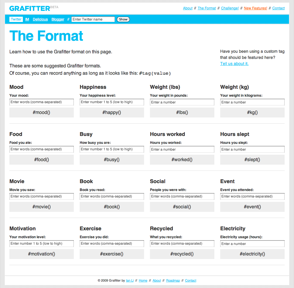
Other Self Surveillance Services could be Moodstats or lifemetric. A more embedded approach takes grafitter. It monitors your twitter account and picks up on defines hashtags. This can then be graphed out. So you can tweet away your log book.

grafitter
Image taken from farm4 / The settings and hashtag definition page at grafitter.

The lates Feltron report departs from the personal log book and maps out a third persons life line. In this case it is Feltron's father. This relates very much to the Travel Pattern Over Generations report compiled by David Bradley. It is an interesting documentation, not so much in it self, but very much as a personal comparison. With the personal dimension of the data it is very easy to relate to it and the primary reading of it will be in relation to one's own history.

Feltron 2010
Image taken from Feltron / Page 4. The 2010 Annual Report is an encapsulation of my father's life, as communicated by the calendars, slides and other artifacts in my possession.

The Feltron Reports are available for purchase in the Feltron Shop.

Rabu, 09 Februari 2011

Sorting Shapes and Cleaning up Cities

What would the world look like if we get everything sorted? Things would be tucked away neatly, places are clean, papers sorted and regulations clear. Maybe.

Sorting and cleaning, polishing and updating, pushing and flushing are frequent terms used in design and research and as part of the discussion definitely have a relevance. They convey a certain change and proposition together with implied 'to the better'.

Armelle Caron
Image taken from Armelle Caron / Paris as it is and sorted.

As usual with terms they can be overused, for things they don't apply or to describe something that is not this way or doesn't even exist. Even more so, they can be over stretched and filled with an missionary believe and practice and followism. This is definitely the case when people start to believe in one of the terms as being the only one, the world saving solution.

Academia is pruned to be a place for sorting and clearing, but on the other hand is also a very messy place. But hey invention and creativity are different beasts altogether. Anyway, it is probably the exchange and the collaboration that prevents ideas and concept to overflow and draining down one of these few juicy terms.

Armelle Caron
Image taken from Armelle Caron / Tamarac as it is and sorted.

Mapping is one of the very visual disciplines that is fundamentally about ordering and sorting. This is built on a intelectual concept of reference, singularity and ultimately truth. A very helpful strategy actually, with a lot of benefits as an abstract representation, simplified to clarify. Nevertheless, the combination of the terms is lethal in terms of reprojection. The things do no longer add up if the abstraction is reversed as a revitalised self. A map is a map, is a map, is a map.

For not bringing them back we can as well sort them pieces. In any order, as you please, but let them be abstractions.

Armelle Caron
Image taken from Armelle Caron / MontPellier as it is and sorted.

Armell Caron has produced these wonderfully sorted pieces of sections or urban plans, sorted into order, any order but the previous one. Nights working on the computer tracing and then moving piece by piece with the curser in Illustrator until neatly sorted in rows. Seems like a very meditative work, at least the power of them illustrations suggests this. Works developed 2005 / 2008.

Via PYTR 75, more details on Armell's blog, on socks-studio, urbain-trop-urabain, the map room or on deconcrete.

Armelle Caron
Image taken from urbain-trop-urabain / City blocks made from wood as a giant puzzle. Probably impossible to sort it exactly in the original way, but there are plenty of variations to mess about.