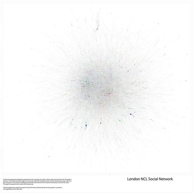
Graph by single-blogs / The London NCL Social Network graph of twitter users. The dataset is defined as geolocated tweets collected over the period of one week in the urban area of London set to a 30 km radius. Click on the image for a larger version on flickr or see the interactive zoomable version HERE.
The network is built from nodes and edges, were the nodes are the twitter users active during the time period of message collection back in May 2010. The edges visualise the connections between these users. From the messages sent connections are established based on activity and interaction. In reality these are the @ messages that are directed at one or more particular user. The second indicator of a connection are the RT messages, the message that have been retweeted by followers of the creator of the initial message.

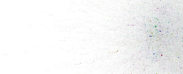
Graph by single-blogs / Zoom of the London NCL Social Network graph of twitter users. The dataset is defined as geolocated tweets collected over the period of one week in the urban area of London set to a 30 km radius. Click for a larger version on flickr.
Using these two methods the network graph is established as a directed network, meaning that the connection between the nodes has a direction since a message originates from a sender being delivered to a receiver.
The resulting network is built from a total of 17618 nodes and 26445 edges. In the case of this London twitter network not everyone is connected to everyone and about 5400 subnetworks were identified. Furthermore via the colouring the modularity of the network is visualised. Each subgroups has a unique colour shading indicating groups with tighter connections.
London NCL Social Network
Graph by single-blogs using the GMap Image Cutter / London NCL Socia Network - Use the Google Maps style zoom function in the top left corner to zoom into the map and explore it in detail. Click HERE for a full screen view.
The sizing of the nodes is derived from the number of connections this particular node has for both incoming and outgoing edges.
For the comparison of the networks we are currently working on graphing out the whole range of NCL across the world in order to establish a analysis parameter set. We'll keep you posted about the progress here.
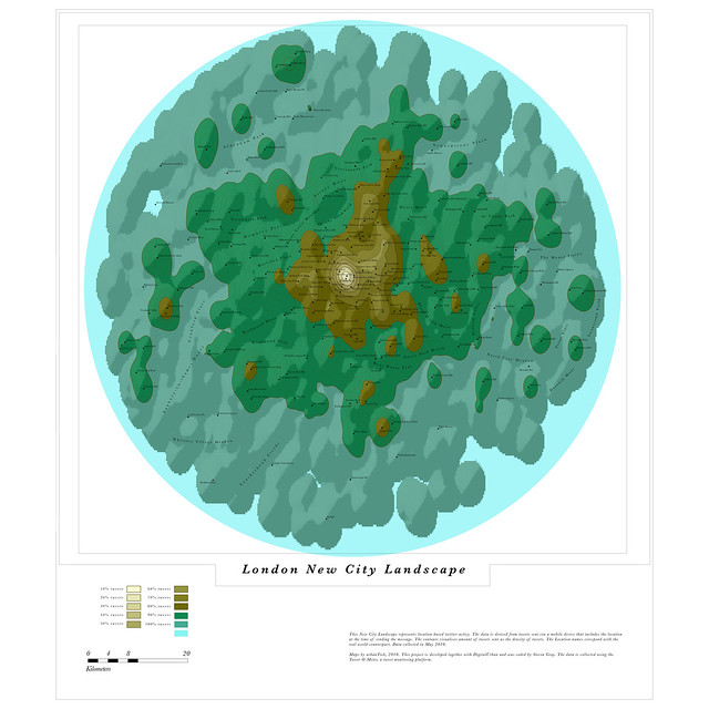
To compare it, the geolocated London New City Landscape map. It is important to keep in mind that the graphs are not spatially representative as compared to the NCL maps which are properly geolocated.

Image by single-blogs using the GMap Image Cutter / London New City Landscape Click HERE for a full screen view.
Tidak ada komentar:
Posting Komentar