Tampilkan postingan dengan label environment. Tampilkan semua postingan

Selasa, 12 April 2011

London Rising

Rising water levels are a real concern for large areas around the world close to he sea. The treads posed by the water are many, with tsunami waves as recently occurred in Japan following the devastating earthquake or simple flooding due to a combination of heavy rain and a storm.

In London this second scenario is a real concern and could potentially effet vast areas along the river Thames. The current water defence infrastructure in place is very soon to be out of date and needs replacement with a refreshed strategy on how to deal with potentially massive water masses moving in. The problem of course sharply rises together with every centimeter of sea level rise.

notabilia
Image taken from the londonist

Extensive scenarios have been drawn out, both in terms of planning and post apocalyptic visionary.

An interesting visualisation here is using the tube maps as a reference point going back in history and projecting the changes in the nature of the river in to a possible future. The animation both introduces the Thames as a reference point, but at the same time highlights the river as a constant element of negotiation. This taking place both over time in real world with building project and through out usage, but also graphically in terms of its representation as part of the most iconic of maps, the London Tube Map.

Rabu, 24 November 2010

Personalised Urban Space

If we start with Petra Kempf's publication 'You Are The City' we jump straight into the discussion about the personal expression in the urban environment. Clearly this has become dramatically individualised and
and citizens have grown into roles as independent user, aspiring for flexibility and uniqueness.
The technological development in the recent years, month actually, is fuelling these developments. Here individuality turns into solitary and disconnectednes with the latest app telling you whats happening around you. Interaction becoming the biggest thing as long as we don't need to talk to anyone.

The urban landscape is turning from a servicescape in to a stagescape for individuals to produce themselves as the latest celebrity. Interaction becomes one directional, the famous show off to be looked at, the ultimate aspiration.

The individualisation obviously is a very big topic in the media and some recent project are quite cleverly employing this trend to the point of questioning its real existence.

For example the current aviva campaign puts the individual in to the centre. On the website http://www.youarethebigpicture.com/ they started a collection of portraits, with the option to draw in your facebook image, as a representation of personal commitment and support. The great thing is the personalised video clip everyone gets as a sort of gift. The uploaded image is embedded in the clip and everyone has the chance to appears big in the city.


In fact aviva actually is running live projections of the submitted images in cities around the world. Some have ended, but on the page you have access to the recorded time lapse.

Another effort is made by the Dentsu London media company. They have recently had some really exciting project utilising the latest technologies with quite visionary content. See for example the iPad illumination clip.

THey were also looking into the personalisation of the city environment and visualised their ideas in two animated clip, sort of augmented visualisations. Their claim goes beyond the content, but this doesn't matter at the moment I guess.

The basic idea is to utilise and augment existing objects and surfaces with personalised content and information. The desire to keep up to date with the latest social networking news, updates, notifications and tweets. Some of the idea are quite interesting, especially the ones that aim at linking the individual back to the physical context. It is very simple, but for example the Dentsu train ticket idea is a different take on the location awareness trend.


There is a lot of potential in this trend to personalise the everyday environment. There might be individual benefit and surprises to be discovered for everyone. However it might be not as new as it would like to be. But it is certainly a new take on the everyday routines and a chance to embed it with the aspired independence and individuality of our current culture. Definitely the city is the playground.

Jumat, 15 Oktober 2010

Sabtu, 28 Agustus 2010

Augmented City 3D

What if the city would be interactive in the sense of the emerging augmented reality technology? Not that the city is not interactive, but if one would be able to controle many aspects of the environment constantly and from every location? Not that we are not in controle of our lives, but just that there is more that we are aware of.
This time its in HD and 3D - put your glases on!


Via BLDGBLOG

This is a great clip and goes in line with the previous one Keiichi Matsuda produced at the Bartlett School of Architecture for his thesis.
I very much like the sequence with all the adds and stuff crowding the footpath and swirling away like dry leaves. In the intro scene I guess the possibilities are portrait best. One of the protagonists is waking up, starting the day, changing some options and as the camera zooms out we see he is already in this cafe place. Reminds me very much of those zoom/re-zoom books.

Jumat, 09 Juli 2010

Draw your Landscape

A new GPS drawing project by Jeremy Wood (earlier on uT with the dog drawings and the dragon) has hit the online news. A contextual landscape map drawn by walking the landscape and tracing it with a GPS. Couldn't be more simple as engadget points out: "walk around in the defined area with a GPS unit and end up with a 1:1 scale map of where he walked."
The concept is very similar to Open Street Map (OSM). Take a GPS and with the recordings you can trace landscape features, OSM traces the streets and a visualisation of the data collected produces a map.
However Wood's approach is interesting in so far as that he attempts to already process the landscape features in regards to the output map by using the trace to mimic mapping symbols. This provides an enhanced readability of the outcome.
Did he actually climb over fences and invade peoples gardens to achieve this? The map covers the Campus of the University of Warwick with some 238 miles of path over 17 days. Wood recalls: "Security was called on me twice on separate occasions and I lost count of how many times I happened to trigger an automatic sliding door." More images on the artists page.

Traverse Me
Image by Jeremy Wood taken from GPSdrawing.com / Traverse Me is a map drawn by walking across campus with a GPS device to invite the viewer to see a different landscape to that which surrounds them. It questions the possibilities of where they are and inspires a personal reading of their movements and explorations of the campus. Commissioned by the Mead Gallery, Warwick Arts Centre.

Tanks for the link to Ralph Barthel, via engadget and infosthetics.

Selasa, 13 April 2010

Book - The World's Fairest City - Question Time

How can a serious book project be justified by a article in a crappy newspaper? Well, there are many reasons for this and it is not per se a negative thing. It only looks more nobel if the product comes in responds to a well established and respected authority. One of the most obvious reasons is probably the fact that we all started reading these free and cheaply produced, written and distributed papers on the way to work and again on the way back home. Even thought it would be possible to access quality paper online for free around the clock, the free papers still have a largely entertaining character on the commute. Unusual then is to relay on it and reuse it as a foundation for an proper project.
This is a lot of blurb for the introduction paragraph here, but I am really surprised finding the prologue of this publication circling around the news paper 20minuten, a Swiss free street news paper that usually dosen't hold a tenth of the promised time in the title.
Anyway, the article in the paper was spreading the news that a Swiss city has won first place in one of these literally hundreds of city ranking programs. But 'How do you rank a city?' With this first question, the book project started and triggered a series of questions in the bulk load. The book contains fifty topics with some five questions each, makes 250 questions regarding the urban environment. 'What has been there forever?' might be one of the time based questions. Another is the 'How do you recognise the seasons?' linking in aspects of nature and natural time pattern.
All this is summarised in the recent Lars Muller Publishers publication 'The World's Fairest City - Features of Urban Living Quality' by Ruedi Baur, Martin Feuz, Carmen Gasser Derungs, Andrea Gmünder, Thomas Hausheer, Martin Jann, Philipp Krass, Margarete von Lupin, Trond Maag, Ursula Tgetgel and Marcel Zwissler.
Some of the questions serve cliches 'Can everybody get enough?' and others are suggestive 'What color is your tap-water?' or 'What can you do with the click of the mouse?'. I am calling this suggestive because the photographs used to illustrate the topics obviously are located in the western European context and based in the same cultural context. The existence of other conditions seems to bee a ghost around the corner. 'How to you survive in a slum?' ?
But sure enough the same observations started bugging the authors too and Ruedi Bauer reflects on this in his text 'The Top of the Word'. There is a second part to the book where a number of contributors share their thoughts on the topic in very short snippets of text. Some, like Kurt Aeschbacher a Swiss TV presenter, answer in a few sentences two questions, others talk about their experiences to life in different cities around the world, like Mathis Guller. Overall this section paints an image of different experiences and characters of cities.
The book is complemented by a website, you might have guessed it: http://fairestcityintheworld.org/ where all the questions are accessible and one can register to vote for the personal favourite. Currently Munich is the voters favourite city on this platform.
This project has a counterpart in the form of a card set developed by ARUP and published by Prestel called 'Drivers of change'. It also is an extensive collection of questions set in the urban environment and ARUPS take on sustainability.


Image taken from fairestcityintheworld.org / Book cover


Baur, R. et al., 2010. The World's Fairest City - Yours and Mine: Features of Urban Living and Quality: Features of Urban Living Quality, Lars Muller Publishers.

Rabu, 24 Maret 2010

Book - A Manifesto for Sustainable Cities

A manifesto for sustainable cities is definitely a task with two diverting possible outcomes to it. On one side this is a winner, because everyone is talking sustainability and if you can offer this bound knowledge on the topic you are clearly up to the task. However, there is also the other side, you can only fail with this approach. It has been over used and become a real media word without meaning or program. Furthermore some sort of resignation has settled and a lot of practitioners think it is just too complex to fit in one field of expertise.
This book here with the title: ‘Albert Speer & Partner: A Manifesto for Sustainable Cities, Think Local, Act Global’ by Jeremy Gaines & Stefan Jaeger, published by Prestel in 2009, is probably such a candidate for this kind of black and white judgement. It is either great and you love it, or you will find it terrible and you don’t bother. However, the topic is kind of urgent and it has to be taken seriously globally to tackle the issue and every little helps.
This book is not a little, but 220 pages think and therefore must have something to say?
It is organised in ten chapters each in command style what you have to do and how you have to do it. It looks kind of more like a manual than a manifesto. The content is put together from practice examples drawn from all over the world, both in house Albert Speer & Partner (AS&P) projects and external projects by leading practices.


Image by AS&P, taken from german-architect / Artist impressio nof the proposal for Abuja, Nigeria. Note the six lane boulevard running down the length of the proposed development. This not only creates two parts or reminds us of Haussmanns Paris, but it also is clearly planned for individual traffic - cars - sustainable? More ilustrations can be found HERE.

The guys at Albert Speer & Partner really seem to know what they are talking about and they know it so well that they have to tell everyone else that they know it. So what you get with the book, is a set of ten rules, and I have to stress the importance of these rules, on how to do it. I have to repeat it again, this book tells you how to do it and of course also tells you how not to do it. It comes as a surprise to actually find such an old school approach to the complex topic of sustainable urban design especially because planners and designer only begin to grasp the extent of the topic and the required complexity of processes needed to address some of the issues at hand. But with this publication in hand you are saved and with you the planet, if this is not sarcastic enough.
There seems to be a never ending list of complex interwoven topics that render this book impossible to acknowledge as serious beyond a marketing publication. The text starts right away in the introduction with a sharp critique on the Fosters and Partner project ‘Masdar’, the zero carbon city outside Abu Dhabi. I agree with the critique in some points, but why would you choose to open a book with such a statement? Is there such a need to establish this distance between oneself and the others, dealing with the same problems? Similar, at a later point, there is talking about the new Alianz Arena in Munich, a new Football Arena built for the World Cup in Germany 2006. AS&P somehow had a part in this project, but the actual architect is not once mentioned in the paragraph. And who do you guess the architect was? A famous architect of course and not Foster and Partner. Yes, it was Herzog and de Meuron. This strategy of not mentioning seems to go through the book and frequently not the whole context is revealed. Other examples can be found again in the introduction where the talk is of another mysterious zero carbon city, this time in the United Arab Emirates called Ras al-Khaimah, who do you guess is the project author for this one - O(h)M(y)A(?). The name of the architect must have gone lost somewhere on the way. Also in the paragraph ‘Icons and Idiosynchrasies’ where only specifically selected icons are presented, such as the Guggenheim in Bilbao, but with great care not mentioning the architect. More is in ‘Current Mobility Fosters Immobility’ with the example of the Curitiba Bus System but no reference to where it came from and who invented it.
Either it is a decision to keep the descriptions extremely simple and this information is considered as clutter or it is strategical non-placement of references that would distract from the glory of AP&P.


Image by AS&P / perspective view of the master plan for Changchun JingYue, Ecological City in China. Extreme axial organisation again, as in the previous example, while creating a lot of physical boundaries in addition with transport and water features. Surprising her is the lack of clarity regarding the definition of space or voids. The parcels seem to be developed under aspects of value and dimension along a grid of roads. The buildings are then detached isolated placed floating around inside the plot. It is only a diagram yes, but one that clearly states the road in with it the individual car traffic as its dominant factor,

The glory really doesn’t end here. You have probably by now understood that the book must be in ten chapters - reference, what comes in ten chapters down from the hill, somewhere in the desert? AS&P must also have picked it up somewhere in the desert as they ... sorry this is going to far, but yes The Ten Commandments are, according to Wikipedia: “a list of religious and moral imperatives”. As if this is not good enough, there is an eleventh chapter, the conclusion. This is the book killer, it is entitled: ‘Applying The Ten Commandments: Cairo’ ??? Is this some sort of 21st Century Christianization? (I am aware that the Ten Commandments do also play a role in Islam, but the context and the way ideologies are thought directly by the head teacher is truly astonishing.)
A note on the style of the text, it is surprising at times and lets one wonder who actually is telling the story here. From the first impression you would expect that this is some kind of a knowledge output by an architectural practice, they talk about what they learned and experienced. But then after a few lines you come across the first third person reference and then follows the first quote of someone, apparently a board member of AS&P. After a few times this lets you wonder who is writing here. Do architects also have ghost writers?

Overall there is very little good to say about the style of the book. However, it has to be said that it covers different aspects of sustainability, illustrates them and through this can offer a perspective on the topic. It is just that one has to like the style to like the book, I guess. This is a half hearted recommendation, but have a look at the book and see what you think of it.


Gaines, J. & Jager, S., 2009. Albert Speer & Partners: a Manifesto for Sustainable Cities: Think Local, Act Global, Prestel.

Senin, 22 Maret 2010

Book - Atlas of the new Dutch Water Defence Line - Colour Seduction

A book you don't want to give out of your hands for its beautiful cartography and graphic design overall. Well it goes in the tradition of Atlases designed by Jost Grootens. He has only recently received the Rotterdam Design Prize for the set of atlases he designed for 010 Publishers so far. Those are the Groten KAN Atlas, the Metropolitan World Atlas, the Limes Atlas and the Vinex Atlas.
The now published 'Atlas of the New Dutch Water Defence Line' edited by Rita Brons and Bernhard Colenbrander, designed by Studio Joost Grootens and published by 010 Publishers adds an other chapter to this 'series'. It continues with the power full use of colour that already the 'Metropolitan World Atlas' made so attractive, but this new publication makes a lot better use of the overall appearance. It is a real gem.
In the first place it is the cartography you will be looking at, but beside this the book actually has a true subject. And this is simply as the title says the Dutch Water Defence Line. Actually this is about defense in a proper military sense, and not as you might have guessed while already seduced by the pretty colours about water defense. Since it is set in the Netherlands it could have been about water drainage and pumping systems to fight the storm flooding of vital agricultural land, but its not. It is about a specific element of Dutch history, built between 1815 and 1885 as a "technically accurate territorial military system" (Johan van der Zwart abd Clemens Steenbergen in Atlas of the New Dutch Water Defence Line, p.28)
In a nutshell the military conceptis to defend the territory by simply flooding a stretch of land and in this way make it impossible for any land based mode of transport to traverse. It sounds very effect full and simple, but is actually a rather complicated piece of infrastructure and engineering. A detailed system of canals and basins are laid out in such a way as to create, by opening strategically positioned flood gates, a man made flood zone.
The whole system is based on the element the Netherlands has enough anyway and since water has its very own rules the given parameters are tight. Not only from the water element but also in terms of the landscape. In this sense, the here documented military defense structure is in a very strong way trying to make the most of a successful management of possibilities over constraints. This results ins a strongly context based solution, that is unique to this exact location and circumstances and paints a beautiful portrait of the character of an entire region.


Image taken from 010 Publishers / Showing a spread of the publication.

As hinted in the introduction, the graphics, cartography and design overall are brilliant. Especially the colour schema used for the maps is intriguing. In terms of the graphic design even this book is not protected from mistakes and problems. Everyone who is working with maps and plans knows these painful moments when you have a strong concept and clear structure and then for some elements it just doesn't work out. A name is too long to fit in the desired space in the key, in one summary map suddenly two colours representing important information cancel each other out or the approach chosen for one element does not fit for another or in other scales. It is sort of a tradeoff and ad-hoc adjustment job one has to do, restricting damage while hoping the final product may remain close to the desired result. This sounds all very pain full, I know, and it actually is. However, this process can be used to continue developing the strategy and representation and ideally will raise the quality of the end product over the initially thought out concept. Still some minor problems will always be there and the quality of the end product is probably more about these are managed and integrated than how good the anyway functioning elements are developed. I believe this publication managed this process extremely well and the final product is great.
For me the main issue with the graphic elements in this publication is the representation of the forts. This being the central element of focus it plays many roles and obviously a single representation can't be able to play all of them equally well. The colouring of the water protecting the forts as well as the pink used for the fill are not always consistent with the overall context of the maps.
The maps actually come with quite extensive background information in the form of essays and I think it is worth pointing this out because of the almost over powering presence of the cartography. I kind of owe it to this review that I have actually read and tried to understand the background, because otherwise I am pretty sure I would have been (still am) simply seduced by the pretty pictures and had satisfied put the publication to the top of my pile of inspirations. But going beyond the graphics starts opening up a perspective on a cultural territorial identity of a region that is even more inspiring and actually informative.
In this sense there is a hidden treasure in this book, but one needs to battle the dragon of seduction first, a fight I am bound to loose, at times. This one is definitely worth the effort already for the beauty of an bright orange or pink.
A book, or even a series, that has definitely already set a standard and will let loose a trend.


Image taken from Kosmograd / Showing a spread of the publication.

See also reviews on mammoth and Kosmograd.


Brons, R. & Colenbrander, B. eds., 2009. New Dutch Water Defence Line, 010 Publishers.

Selasa, 16 Maret 2010

DIY Google Street Car

Now that the whole of the UK is is covered by Google Street View, will the Google car disappear as a species from the streets? Many don't believe it would and this not only because Google might want to update the views. Maybe just because it has become impossible to stop the drivers. See the hilarious clip on digitalUrban. However some people have grown so fond, or indeed started hating Google so much they might start their own project either way. You can now build your own Google Street View car. You have to start from scratch, though, but most likely you already own most of the ingredients needed.


What better way to explore the urban streets around you than in a pimped car in Street View style? The detailed instructions can be found HERE. And this really means detailed instruction. Yu will learn that this project need (x2) wooden board 40 x 23 x 1 cm (center box) and (x1) 50 meter roll of white duct tape for example. For full details refer to fffff.at
The prototype was developed by F.A.T. for a workshop in Berlin last year. They are very much anti Google and make the most of taking the piss out of the big brand, and marketing wise this is definitely a strategy for an art project. Here is the documentation clip posted on vimeo (includes some background and detail) by F.A.T. Some scenes are stunts, where other are real, never mind.


via urbanophil

Senin, 01 Maret 2010

Book - Asia Beyond Growth

A heavy book about a heavy topic and in this case size matters. Since the book is a bout size and its content celebrates the vast extend of the land area covered or better involved one might understand the motivation behind the physical extension of this publication. However other factors might also play a part.
We are talking about Asia Beyond Growth - Urbanization in the World's Fastest-changing Continent by AECOM former EDAW is published by Thames & Hudson.
The book starts with what has been leading the debate about the future of urban design and urban planning for now three years: "Today, for the first time in history, more than half the world's population lives in cities ..." and it adds quite rightly, and this is then also what the books really celebrates on the following 484 pages: "... and most of these cities are in Asia."
It is sort of a monograph as the books author is AECOM former EDAW, a single planning and design firm. It is, however, not a documentation of their projects only, it is more sort of an extended report of experience and knowledge. It coincidently falls into place with the change of name. The company was formerly known as EDAW (all the projects and most of the experience dates back to the EDAW times) and has recently, late 2009 changed its name to AECOM, a publicly traded company on the New York Stock Exchange (NYSE: ACM). They are proudly presenting themselves on the website as: "Today, listed on the Fortune 500 list as one of America’s largest companies, AECOM has approximately 45,000 employees located in 100 countries."
The book however is about the companies work in asia an documents the drastic change, the massive amount of work done as well as the vast extend of individual projects. For this the authors make extensive use of photo documentation and graphs. And the publication seems to follows in the footsteps of well known publications that introduced this sort of graphical language, for example S,M,L,XL or Massive Change. This language seems to be at the moment very popular, i.e EndlessCity and I pointed this out recently in connection with the book Comeback Cities - Transformation Strategies for Former Industrial Cities published by NAi Publishers.
In twelv chapters the Authors discuss the challenges of planning in the Asian context and chare their experinces. THe photographs used to illustrate are a really big part of the book and there is also an online blog thatextends this and documents the photographers work for the publication work. You can find it HERE.
The problems faced by planners are very often similar. It is described in many examples through out the book. For example in the case of Shanghai: "These developments are often the scale of new towns, requiring comprehensive planning and amenities, but lacking the cultural or historical background that might lend the place a distinct identity." Surprisingly still a lot of examples are then developed in reference back to the European city which is in turn stylized as an ideal type. We have all heard these stories of groups of Chinese investigators being sent to Europe to measure and document villages or entire town to replicate them back home in Asia. An we have all hoped this might be a single case or an exemption, but this might be more often the case than hoped. This really fuels the important debate about creation of identity which, to a large extend urban design is about, is an ongoing process. Probably especially in the Asian context, the role of foreign practices, mainly western offices, probably is more important than usually discussed. In fact the discussion about cultural export and 'international style' is not extensive enough in most cases. It is primarily about size and money and recently about work and jobs and less about the culture clash, export of values, believes,f culture and knowledge. The burning question here is, how interactive and emancipated this collaboration is. Probably one could argue that it is not the role of the international practice to lead this debate, but it should be left to other to do so. On the other hand who could this be, architectural critics, academic sociologists or even publishers? I believe it has to be part of each and every project and it is to a large extend part of the role and responsibility of the planner to be involved in an ongoing discussion around the impact and extend of the project in progress. And of course all the other disciplines have to be involved too, and in the case here especially when it comes to a publication. The book represents a clear position whether it is explicitly discussed or equally explicitly absent. And for me this is the main week point of this publication. It is a documentation of multiple facets of the Asian growth, a nice picture book, a heavy weight in your bag and definitely a document of its time of a certain subject, but it is lacking this discussion of a wider context for not to ask for an explicit standpoint.
This includes other areas of discussion and is not limited to the debate about westernization of Asia through planning firms. It continues in through the trend topics put forward. What I mean for example is that often topics are presented very shallow and with an sort of innocent view. Take for example the topic 'It's all About People', already the topic is suggestive enough, there is no need for explanations, so the authors decide to illustrate it with photographs and minimal text. This text says:"In Asian cities, it is common for people to use the spaces between the buildings as outdoor living rooms. ... In many places, it seems, all pieces of the city are used for and by people." This is then illustrated for example with a fish market or a street with small mobile fast food stands. Not enough, it leads in directly the topic of the slums. Which is a bit odd in the context of what has been said about the topic: "In many places, it seems, all pieces of the city are used for and by people." and showing a photograph of lots of these slum hutches crammed into a tiny space between high-rise buildings and streets. Another example is the photograph of the little boy, shown full front, as he urinates onto the street to illustrate that people in Asia do not use the public toilets. This sort of, by the authors, pretended innocence, while showing material left open for interpretation in multiple contexts (one of them might be a wrong one) gives the book a strange taste, which is definitely not intended.
So to conclude, this is a book in a tradition of thick and heavy architecture books (if such a category exists) on a subject that has been dominating urban design practice and planning for the past decade (not clear at this point in time how it continues). It is rich on illustration through photographs, graphs of illustrative and sometimes suggestive character and text essays on certain subjects. It does, however, at times have this character of uncertain shallowness or unidentified innocence that can leave the reader in the dark about the real aim.


Image taken from webster.it / it shows the initial cover, where it still says edited by EDAW and Denise Scott Brown. I don't know what happened to this collaboration , since her name does not come up in the publication I have here. Only some of the chapter titles that start with 'Learning from ...' suggest a connection, but could be a reference.


For an alternative view read Adrian Hornsby's review of the book.


AECOM, 2010. Asia Beyond Growth: Urbanization in the World's Fastest-changing Continent, Thames & Hudson.

Jumat, 26 Februari 2010

The Sandpit New York- or Everyday is Beautiful

Probably the beauty of the product lies not in the subject of the product, but in the way it is done. Might not be the latest headline, but there is something to this. Can one build nice highways, is it possible to design a meaningful park and ride or can a disused railway lines turned into a park? Well you must have guessed it by now, I am thinking of specific examples here. Even though it is probably a lot easier to come up with terrible examples for infrastructure projects, you probably only have to look out the window, there are some really 'knock you out of your shoes' examples of good practice. A great collection is put together in the book 'the Landscape of Contemporary Infrastructure', published by NAi Publishers.


Image taken from Archphoto / A view of the Swiss highway A16.

And of course here are the examples I was thinking of, 'Tunnel Artifices', highway projects by Flora Ruchat-Roncati and Renato Salvi 1988-2008, realized in Switzerland; 'Terminal Hoenheim Nord' by Zaha Hadid Architects 1999-2001, realized in Strassbourg, France; or the 'High-Line' by Dillier Scofidio + Renfro with James Corner Field Operations 2005-2010, in New York, USA.
And actually New York was what I wanted to get at, to introduce this beautiful timeLapse. A day in the Sandpit of the big Apple portrayed so beautifully the everyday situations that it lives up greatly to the examples give. Everyday life is beautiful, no matter what.

Kamis, 25 Februari 2010

Book - Subnature the Other Side of the World

There are things and things in our material world, that are not the same. Some things, especially if they inherit the ability to change between different forms and states or even context, are contradictially received. This phenomenon is known in all areas, but it is particularly distinct in the context of the environment. More so because it is so consequently denied.
And I am probably taking it a little far here, but a great deal of the sustainability debate of the recent decade is related to this denial of context and integrativity of more than a century of constructing and theorizing environment. So in this context the debate about how and especially why we should build ecological or sustainable buildings and cities makes more sense. Because of the radical and to a large extend successful exclusion of anything unplanned, uncontrolled we now are doomed to sit out the debate around how to live a life on our planet and to learn to accept that everything is part of the plan even and particularly the planner. This is a tuff one, I know, but there is no return, we have to obey the culture we live in (@geno).
Beauty might lie in this. Louis Sullivan wrote a poem to one such banned commpanion of the environment:

"I made a little one to a weed the other day. I like weeds: they have so much 'style' to them and when I find them where they grow free they seem most interesting and suggestive to me. I think I'm something of a weed myself....And then there are so many of them, and they differ so much in shape, colour and arrangement; the form follows the function so beautifully as you would say. I wish I knew the names of the little rascals; then it seems to me, I could talk to them better." (David Gissen (2009), Subnature. p. 154)

In his book Subnature - Architecture's Other Environments, published by Princeton Architectural Press, the author David Gissen goes to a great length to shade light on different aspects of denial of context in the practical and theoretical construction of environment. It is a book that you probably wouldn't take first down from the shelve in the store, but not because it is not good written or pleasant looking (the opposite is true), but very likely because the topic puts oneself against so much practice and cultural conventions, that it might still be hard for people to take this step of acceptance.
It is worth it, moreover it is necessary and I believe this publication is only the start of the theorization of a movement that has developed tools and practices to allow numerous completely forgotten dimensions to feed into the man made environment.
Gissen has positioned the book very cleverly out of the main line of commercial sustainability debate and with this can avoid all the unnecessary discussion around the education of professionals and can concentrate on actually discuss concrete examples, approaches and theories on this subject.
The book is organised in three parts. Part one is on darkness, smoke, gas, exhaust; Part two is on dust, puddles, mud and debris; Part three is on weeds, insects, pigeons and crowds. A not on first blink self explaining structure, but as you dive into the content a skeleton that starts to make sense as Gissen continuously feeds the reader with examples. An this is really the strength of the book. The author has illustrations for most of his arguments and subjects. This is really brilliant and pulls the reader in immediately. It is not one of these "I tell you to to this!" books, but a real discussion of the subject matter. THe examples are not presented as right or wrong, but as a way of reading something, leaving it open for the reader to read more into it or read something completely different from it. This is something very few books mange to do, creating this platform for an debate between professionals.
For the conclusion, I realize that I have actually given away very little on the content of the book, but I guess this is a good thing in this context. There is little point in me repeating what David Gissen has put so beautifully and engaging in print. This is simply a must read, if you are prepared to take the plunge and be prepared to see the world, and definitely your work, with different eyes.
For further and detailed reviews visit Landsacpe+Urbanism or Archidose or see the authors blog for a 11 point list on Subnature.


Image taken from HTcExperiments / Alternative book cover, showing the work by Jorge Otero Pailos.


Gissen, D., 2009. Subnature: Architecture's Other Environments 1st ed., Princeton Architectural Press.

Jumat, 15 Januari 2010

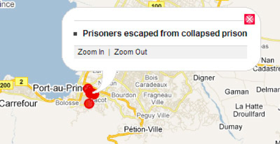
Devastating Earth Quake in Haiti

’A huge earthquake rocked the impoverished Caribbean nation of Haiti on Tuesday, Jan. 12, 2010. Thousands are feared dead.’ Those are the sad news we are currently hearing across the media and increasingly through out the internet. The blogging and especially the micro blogging community is playing an increasing role in spreading and informing about events. Only last year several events grew very big in these media, such as the swine flu case and the Iranian demonstrations against the results of the presidents election.
The earth quake has, as it looks at the moment almost completely wiped out the infrastructure of a anyway struggling country and this dramatically complicates possibilities to brig in help. So currently most of the news are coming from outside and satellite observation and analysis.
There are first satellite images now also appearing on Google Earth. The Satellite GeoEye passed over Haiti yesterday morning (14th) and the imagery has been passed on to Google.


You can download the KML file HERE to see the imagery in Google Earth on your desktop. Details on the Google Latitude blog.
Also on facebook large groups form to inform, support and find people. One group with 170’000 members is the Earthquake Haiti. They also give advise if you want to provide support or donate. It is advised to make sure any donations go to a properly registered organisation. Fears over false companies and fraud are also sweeping the internet simultaneously. Some options her, the British Red Cross Haiti Appeal, Oxfam Haiti Appeal, advice from the White House in Washington.

Some first map mashups also emerge. There is twitter (on trendsmap) or also youtube mashups. The best content focused mashup is produced by ushahidi which seems to be as factual a possible even though it is partly crowed sourced. It serves at the same time as communication board as users can post requests to find missing family members or friends. This is helpful until official information have caught up. Since then all the information has to be consumed with care and a portion of skepticism.

PastedGraphic1.lWigJxBc0OvU.jpg​
Image taken from GoogleMapsMania / screenshot of the haiti.ushahidi information mashup

Help and support is under way from all over the world. MapAction for example, they featured on the blog in an earlier post on mapping, have deployed a four man team early on Wednesday. Also the united state have deployed a aircraft carrier carrying helicopters that and support material. It arrived early this morning and will be used as a hub according to the NYtimes. Other countries also have sent rescue teams and supply. However there is some reluctance to help simply because of the extend of the disaster tat creates together with the already difficult condition before hand a definitely unpredictable situation. No one knows where to start quite literally, the country has to be built up from scratch seems to be the common tone of the reports. In terms of media coverage, I was struck by the extensive use of dead bodies to illustrate the disaster and its extend. Maybe it is only a feeling but I haven’t recognised this type of media coverage since the Yugoslavia conflict, where too dead bodies and extreme violence was widely used in media coverage. I do understand that the disaster, pain and horror have to be communicated, but maybe there is still a boundary. An image like some of those are for me not doing the right job.

Selasa, 17 November 2009

New City

To continue from the post on the origin of architecture, which I have to admit wrote in a haste, there is an interesting talk by Greg Lynn on his project ‘New City’. It continues the debate with a lot of critique on the contemporary state of the city, but especially critique on the way the city is thought of, not only if we take virtual representations as indicators of the general understanding of urban aspects.

Lynn_newCity.ri3DI0Ch972s.jpg
Image by imaginary forces - Screenshot taken from NewCity clip - the New City toroids.

Earlier this year Greg Lynn has given a talk that was broadcasted in the Seed Design talks series with the title ‘New City’. He was talking about a recent project he had on exhibition at the MoMa. It was the idea of developing a virtual world from an architectural point of view. His analysis of existing spatial and especially architectural representation in virtual worlds is quit interesting. I do not really have virtual world experience, like Second Life or something, but this is to some extend down to the visual representation. To me the graphics are simply ridiculous, why should I use this to represent my virtual self if I cannot identify myself with it? I can however identify with the graphical language used by Lynn. But then I think, this represents a very specific social grouping thorough factors like, culture, education, background, financial situation, location and so on. Whether you choose one over the other is not an as free decision as we might like to think of it as.
However this might be a side line of the debate, in terms of the evolution it is obvious that Lynn very cleverly positions his work in this context. His introduction makes good use of and plays well with the expectations of the audience. He knows exactly what this social group is looking for.

The most interesting aspect Lynn is talking about in this presentation to me is his critique on the spatial configuration. He says: “The world is not...ah..its not a globe. I mean I do think... I, I, do think Google Earth is fabulous, but the idea that you go on the internet to see what the world looks like and you find this kind of 15th Century globe sitting there, that you spin around on it on an axis, is ... is very strange to me. (at 05.50 in the seeds clip”
So what the come up with is a series of rings called toroids, that are interlocked to replace the globe. it is an interesting idea and has a logic to it as he is talking about it. However there is definitely critique in terms of space, distance, separation and so on. However the visualisations are pretty sexy and this is probably what it needs to be.
However what I am really not convinced by is the actual representation of architecture. This has a long way to go. It looks at the moment like space box renderings. They are following a gravity model to structure activities, but the dealing with the actual form of something needs to be developed.
Especially in the context of the concepts of space and time as social conventions. The current model of space and time could be described as being based on the idea of a market place as the definition of a location and a time. However this would also needed to be radically rethought in this proposal, especially as Lynn introduces this new city as “a new sort of encyclopedia”. This would move the framework from the trade focus towards a focus of knowledge and this might generate a space time construction based on the library as the location and the past as the time.
However have a look at the talk it is only 20 something minutes so a good clip for the lunch brake.


Seedmagazine.com Seed Design Series

Here is an interview with Greg Lynn where he discusses the propsal.


Rabu, 11 November 2009

A Day in the Life of the City

An attempt to mimic the daylight in the city. The project is realised as an A-level art project by the student jamatkins. The sound scape is also quite nice, so turn your headphones up.