Tampilkan postingan dengan label software. Tampilkan semua postingan

Kamis, 20 Januari 2011

Cytoscape - Networking

The rise of network research and visualisation in the past ten years was dramatic. From initial ideas and clunky software programs we now see a number of great open source platforms appearing.

The concept of network visualisation is rather simple, there are two elements, nodes and they have a relationship, called edge. From here both nodes and edges between them are added and complicated systems can be represented in terms of how the identified elements are connected, simple.

Nicholas Christakis talks in his TED talk at the top of his voice about the basics of social networks and outlines the dreams, implicating the power of network.


However this is on the visualisation level, where it looks simple. The real task lies before and after this. How are the nodes and edges actually defined and identified in the run up to the funky visualisation of clusters and groups? This question in both a practical definition sense as well as in a technical sense of how is the input file generated is the real task.

This is to some extend reflected in the file standards of these network visualisation softwares, there aren't any. The whole area might be to young and the big player is missing, like ESRI in GIS or Autodesk in CAD. This might be part of the explanation, but the other part is that the simplicity of node and edge hasn't put pressure on the file formats.

Since last year the Gephi platform is setting standards for this group of open source network visualisation softwares. It offers great functions and juicy looking visuals with a easily manageable interface.

Developed by a consortium of universities and research companies, including the University of California San Francisco and the University of Toronto, comes a second very powerfull and flexible network software called Cytoscape. The software is not new as new, development reaches back to 2002 where version v0.8 was released. Currently version 2.8 is available for download and work on version 3.0 in underway although there is no release date as of now.


DAG
Image taken from cytoscape / Visualization of Gene Ontology Term Tree (DAG). More images can be fond in this flickr group

Cytoscape initially was developed for biology and molecular research, has however developed into a multipurpose network visualisation platform. The software is JAVA based and therefore rund across platforms with a lot of plugIns freely available. Basicaly everyone can contribute their own plugIns.

Cytoscape suport variety of standarts, see above, but for quick and dirty the text or table import is extremely useful. If you have a table or CSV with three columns, defining the start node end node and the type of relationship you are good to go. This addresses some of the issues discussed above.

Running the visualisation algorithms can be processing intensive especially once the network goes above 10'000 nodes. Here Cytoscape performs very good also from a interface perspective. The progress is clearly indicated and each process can be stopped at anytime. Usually it is very stable and would not crash on you all of a sudden, even with large network calculations.

The package comes with a lot of preset layout algorithms. These sets hold the definitions of how the graph is going to evolve and the nodes and edges are laid out. The selection ranges from force directed, weighted to circular or grid layouts. Each preset layout can be fully adjusted.

Regarding the visualisations graphically, here Cytoscape is extremely flexible and every single aspect of the graph can be manually set. This is great and makes for a dramatic flexibility, but on the other hand it is painstakingly difficult and time consuming. Especially if working on a dataset early on and results are not yet clear it is not were you put your effort and ugly visuals can be depressing.
Anyway the great examples on the website should be consulted for motivation.

Some of the other great features include Cytoscape works as a Web Service Client, great search functionality for nodes and edges as well as extensive filter functions, useful not only to hide or show, but to highlight. Furthermore it allows for custom node representation. This means Cytoscape can display images and icons individually for each node. Cytoscape also supports networks within networks, quite a tricky thing.

TNexample_text01g-text02r
Image by single-blogs / Visualisation of two text snippets as a network.

Two things are crucial now that the data is compiled and graphed, the analysis and the output. In both cases Cytoscape is very powerful. Extensive analysis function very detailed spits out numbers and even puts them on graphs. All these tables and calculations can be exported too to further analysis in external packages. Regarding the output of the graph a palett of formats are offered, covering both image formats as well as graphic formats such a s PDF, EPS and SVG.

If you are into network visualisation and keen on a good alternative to established packeges such a Pajek this might be one for you. More recources on Cytoscape can be found on pubMed or GenomeResearch.

Jumat, 24 September 2010

Network Included - The GeoTime 5.1 Update

The folks over at Oculus have been very busy developing the GeoTime software. Version 5 was released in the beginning of 2010 and they are going to released the latest update GeoTime 5.1 these days.
It includes some very interesting new features. The two major ones are the Network feature that allows the user to visualise the data as a network besides the time-space visualisation and the second major change is the support of the macOSx platform (see earlier post on mac adventours using GeoTime). This is in a sense a clear statement of independence, if there was critique that GeoTime integrates too closely with ArcGIS. However of course it continues to integrate well with Arc and support for the new ArcGIS 10 comes with the new GeoTime update.

The software is perfectly fitted for the UrbanDiary project that works with GPS tracks of individuals, investigating the spatial extension of everyday routines in the city. It is basically a purely spatial-temporal dataset. In a few easy steps it is possible to see the data visualised in a simultaneously temporal and spatial way, animate it as well as start analysing it.

switzerland_01_osm
Image by single-blogs / A view of different GPS tracks over the period of one month, using GeoTime and an OSM base map pulled in via ArcGIS.

The move away from a secondary software import via ArcGIS or Excel was a good move that came with version 5.0. The importing formats have been extended and redesigned with the release of version 5.0 to include CSV, XLS, and SHP file formats as well as the in version 4.0 existing KML. It is now handled directly by GeoTime through a functional assistant. With version 5.1 the import of GPX file format is added. Data from the GPS exported in this format can be loaded and added to a project directly.
The new dialogue allows to filter the data at import. This is useful especially for my crappy overloaded tables in which I tried to record way to much. The selection of just the five essential columns makes for a much more slik workflow.
GeoTIme focuses on temporal data, however the integration with realtime data has only be introduced recently with the 5.0 release. Now users can import live feeds via Geo RSS that automatically updates.

The data is initially visualised in the 3d view as a time-space cube. To interact with time one finds the tools on the left hand side vertically arranged. On the right hand side the menu provides a range of other tools including representation settings, pattern analysis, reporting tools and the new network tool.

GeotTime51Network
Image by Oculus / An example using the new network tool in GeoTime visualising a computer network.

The network tool is a whole new field that has been added to GeoTime with this functionality. This is particularly interesting for the analysis of complex structure that include spatial and non spatial data, such as for example phone call data or financial transaction. In the context of the UrbanDiary project for which GeoTime is used here this new tool becomes interesting for the investigation of combinatory data from GPS and mental maps, as for the analysis of interrelationships between landmarks and actual route. For the visualisation different present network settings are available. Furthermore it integrates with the 3D visualisation of the spatial data and the network graph is directly linked to the time-space cube and highlighted areas correspond across the two visualisations. So specific sections identified for further investigation at one end can be look at from a different perspective at the other end.

For the data analysis in the spatial-temporal section, one of the new features in this 5.1 release is the stationary detector. The data can now be queried for events that have not moved in space over a longer period of time. This is useful for the data verification as well as detection of move and rest patterns.

One of the remaining points of critique is still the graphical representation of the visualisation as well as the range, simplicity and of possible manipulations of it. There have been however, some changes made and for example the colour palette has been extended. But still both the interface and the results are still very technical thought of and rendered. It would not ne a mater of just making it all fancy and colourful with rounded corners, but it would need one strong design direction as a well as an overall visual simplification.

Basel_02_stationary
Image by single-blogs / Applying the stationary finder to a track imported via GPX directly into GeoTime. This highlights the areas where the GPS device has not moved more than 100 metres over a period of more than 8 hours. It uses the OSM base map pulled in via the ArcGIS link.

In an comment on GeoTime 4.0, I hade described it as an end-of-the-line analysis tool. This was because the data could not be directly exported to other software packages. This has changed with this most recent update, now CSV export is supported in addition to the KML and screenshot export. The analysed file can be passed on to other software or users which dramatically enhances the usage and the integration of GeoTime.

GeotTime51Logo
Image by Oculus / The GeoTime 5.1 Logo.

In this sense the spaceTime aquarium has become a lot more sophisticated with this GeoTime 5.1 release. At the same time, though, it ha become accessibel for a much broader range of specialised fields through the extended palette of tools. It can now integrate in a workflow, be run as stand alone analysis software as well as operate across platforms. GeoTime is a very specialised tool and definitely offers the quickest and most comprehensive set of visualisation and analysis tools for temporal data.

For demos and further information on the GeoTime project use the inks or go HERE or HERE for earlier posts about GeoTime on single-blogs.

Rabu, 28 April 2010

Tales Of Things - Interview with Ralph Barthel of the Developer Team

Tales of Things, the new service to link digital memories and physical objects has gone online recently. It was covered widely in the media, from the New Scientist, to WIRED and the Guardian, as well as of course on single-blogs HERE and HERE. The internet of things has come to life. It is now in your pocket on your iPhone and ready to interact 24/7. How and why this is happening now with this new project out of the ToTeM labs is the question put at the initiators. In this interview Ralph Barthel, from the developer team behind the service, explains the context and the details of this project.

single-blogs: Tell us something about your background and your role in the project and of course tell us about your most precious tale!

Ralph: My research and work background is in the areas of social computing, design research and new media system development with specific applications for learning and knowledge building. In this first phase of the project I was responsible for the development of the backend web application of the Tales of Things service and some aspects of the Interaction Design. In the next few months I will start to explore additional interactions and novel user interfaces to engage with the Tales of Things service.
My first tale on Tales of Things was about an old audio tape recorder (Grundig TK 23) that my grandfather owned. It was built in 1963 and is extremely heavy by today’s standards. Interacting with this thing brings back joyful memories from my youth.

Grundig TK 23 Advertisement
Image taken from TalesOfTings website / The Grundig TK23 documentation from the 60's. Find out more about the Grandfather tale on TalesOfThings.

single-blogs: Can you describe the development process of this project.

Ralph: In October 2009 Andy Hudson-Smith, the project leader here at CASA, brought Martin De Jode, Benjamin Blundell and me together to work on the TOTeM (Tales of Things and Electronic Memory) project. The TOTeM project is funded through a £1.39 million research grant from the EPSRC to explore social memory in the emerging culture of the Internet of Things. Five universities in the UK (Edinburgh College of Art, University College London, Brunel University, The University of Salford and The University of Dundee) are collaborating in this project. The scope of our initial work up to the launch in April 2010 was very much predetermined and detailed by the TOTeM project plan. Consequently we soon started building and evaluating prototypes of our web application and mobile clients with the aim to refine them through formative evaluation with project partners, advisors and selected user groups. In the next phase of this project the Tales of Things service will enable us and our partner institutions to study the relationship of personal memories and old objects when mediated through tagging technologies.

single-blogs: Technical difficulties and special solutions?

Ralph: From a technical point of view the main difficulty in an applied project like TOTeM is to leverage the capabilities of broadly available tagging and ubiquitous computing technologies while making them accessible for a large number of people. In this context it is important to go beyond the step of providing a proof of concept (which is the purpose of many research projects) but to create a sustainable and maintainable technological infrastructure for years to come. Within the constraints of a research project with a small technical core team it can be difficult to balance innovation with providing basic support services. This tension cannot readily be resolved and in the next few months also depending on the uptake of the service we will see how this will develop.

single-blogs: In this sense Tales of Things is not a pure research project. What are the aims and who are you working together for the development and for the application (service)?

Ralph: The core development team does currently all development work and hosting in-house. Our project partners in Salford are exploring the possibilities of commercialisation. We are planning to collaborate with libraries and museums and to be present Tales of Things technologies at events and festivals. TOTeM will for example be in May in Manchester at the Future Evertything Festival.

single-blogs: Describe the basic steps to take part in the tales of things project.

Ralph: To start people can go to www.talesofthings.com and browse around and have a look at some of the tales that have been already added. They can register on the site for a free account and can download the iPhone application that reads Tales of Things QR Codes and enables people to create new tales when they interact with a tagged object. After loging in to our web services people can create a new things. To do this they would typically provide some information about the thing such as description and title and a photo of the object if available. In the process of creating a thing they will also be asked to provide a first tale for the thing they are adding. People can then generate and print the QR Codes of their things and comment on other peoples tales of things. The website provides further map views that display where in the world the tales have been created.

single-blogs: The tale is refering to the memory someone has of a thing. As we all know these memories are variable and can be difficult to pin down. Can you describe the strategy you developed to can ephemeral thoughts, what does a tale consist of?

Ralph: A tale starts with a brief textual description and a title of the tale. References to any addressable media for example from services like YouTube, Flickr, Audioboo can be added to a tale. Currently files from the three mentioned services are displayed in an integrated media player interface. All other URL’s are linked as additional resources. Finally a geolocation can be added to a tale.

Banksy'sMaid_talesofthings
Image taken from TalesOfThings / The tale of the Banksy maid in Camden, long gone but still here.

single-blogs: The project has only launched two weeks back on the 17 of April. How was it received and how will you develop the platform in the coming weeks?

Ralph: It was receiving quiet a bit of media coverage for example in the Guardian Technology blog or BBC Radio 4. The media feedback was largely positive. There were also some critical voices that doubt that people will socialize around tagged objects. Obviously this is something that time will tell. The media coverage brought some attention to the project and many people visited the website and several hundred already signed up for user accounts.
At this stage we will closely follow how people engage with the Tales of Things service. At this point we are looking for different uses and the values and meaning that people assign to Tales of Things in several pilot studies with different communities. The results from this piloting stage will inform further development efforts. We also aim to support additional mobile platforms such as Android and to develop an API so that other services can connect to Tales of Things.

single-blogs: There are a number of specific terms frequently used to describe aspects of this project. Some are borrowed, some are newly defined and other are everyday words. Can you explain the "thing", the "tale" and the "tag"?

Ralph: A thing refers to any object (e.g. industrial objects, tools, architecture) people would like to link an individual memory to. A tale is story of a personal memory that someone associates with this thing. A tale is told on the platform using different digital media (text, video, images, audio). Video, Image and Audio media can be taken from the web and users can create textual content through our web service. Consequently people can link any addressable digital media file in the creative storytelling process. The thing and the tale(s) are then linked via the tag. This is a unique identifier in the form of an QR Code. This tag is machine readable and can be attached to the thing. The Tales of Things service generates QR Codes for each thing automatically. We also have the option to use RFID identifiers to mark an object. This emerging technology is known for example from the Oystercards. We are curently developing an Tales of Things RFID reader to further explore the possibilities of this technology. For now any existing RFID tags can be linked to the things in our database.

single-blogs: The project could be classified as being another social networking site. Is it, and if so what is different, or how would you characterize it instead?

Ralph: In the concept of Tales of Things the physical interaction with tagged objects is important. People can only add new tales about things if they physically interact with an object through reading its tag. Certain permissions can only be shared and passed along through the interaction with the object which changes the configuration of the server. While people can view tales of things on our website they can only add new tales when interacting with the tags. Consequently the website, that has elements of social networking sites, is only a part of the entire service experience of Tales of Things. The project aims broader to explore implications of a service space in which enabled through ubiquitous forms of computing physical world and cyberspace are interlinked. The project is interdisciplinary so that the research inquiry includes aspects of Human-Computer Interaction, Art Practise, Anthropology and Commerce.

worldofthings_talesofthings
Image taken from talesofthings.com / The World of Things, map on the project site showing the location of the objects and tales. It is also possible to track objects as it loggs each location it was scanned.

single-blogs: Potential of the internet of things?

Ralph: There is a certain anticipation that the Internet of Things will eventually lead to a technical and cultural shift as societies orient towards ubiquitous forms of computing. The development of technology and practises are often co-evolving so that it is important to understand possible implications. Internet Of Things applications can be complex services that evolve in space and time. The experience of using an Internet of Things service spans several user interfaces and the design space encompasses physical artifacts in the real world as well as conceptual artifacts. Personally I am interested in exploring human-computer interaction (HCI) in this design space as it poses specific methodological, ethical and philosophical challenges that need to be addressed when design IoT applications.

single-blogs: The Internet of Things is not new, why do you think it is emerging just now again?

Ralph: The idea of tagging of things and networked objects is by no means new. What has changed in recent years is that enabling technologies such as internet-enabled smartphones have become more affordable, usable and widespread. More and more people carry powerful small computational devices with them. This has led recently to a renaissance of Internet of Things applications used in a non-industrial context which can be witnessed by services like Foursquare or Pachube.

single-blogs: Critical mass for the internet of things to enter as a important player?

Ralph: Internet of Things applications are already important and wide-spread in many industries such a logistics. The TOTeM project is concerned with a different application of the Internet of Things outside industry practise. I can’t say what the critical mass for our project is. The critical mass is not necessarily the most important aspect of the project. It might very well be that the technologies that are developed as part of this project have the potential to add value to the social practises of specific communities. Such findings would be equally important. Tales of Things is after all a research project albeit an applied one.

single-blogs: What is your vision for this project?

Ralph: The partners in TOTeM are from five universities and have different backgrounds and might therefore have different visions. From a research perspective I am mainly interested in studying and exploring the Internet of Things as hybrid interaction design space and how IoT applications can be used for learning and knowledge building in everyday activities. From a long-term perspective it would be great to see a sustained engagement of many people with the Tales of Things service.

Kamis, 15 April 2010

The Internet of Things - Tags and Memory - Tales of Things

Linking thoughts, visions and memory to real object has so far been surprisingly difficult and complicated. Only when you start thinking about recording a message related to an object and making it available in relation, you realize how impossible this currently is. A number of projects are under way storing and making memories accessible such as the BBC Memoryshare. But it is not related to actual objects or locations.
Well actually not any longer this changes and the web of things becomes reality. Online projects are under development. Here at CASA we have just launched today a project specifically focused on the relationship on the object and the related memory: Tales of Things.
This project comes out of the Totem Labs funded by the Digital Economy and is developed in a collaboration between Brunel University, Edinburgh College of Art, University College London, University of Dundee, University of Salford. CASA is involved in the development of the technical elements of this project.
Tales of Things allows you to link any object with the internet as a place to store memory and thoughts. This link is established via an unique tag, a 2D barcode. This tag is machine readable and specific software can read it via built in cam or web cam and direct you to the linked content. The link can be any content from info and text to multimedia files.
This could become very interesting for trading, e.g. ebay and libraries or museums. The underlying concept is not new and visionairs have fantasised about it for long, but only now the technology and the practice is available to make it happen.
It is one of these ideas that could potentially change the way we interact and process data and information, in a very practical sense brings the virtual and the real world closer together.


Image taken from taesofthings.com / Project logo.

It is currently a bit hard to get at these tags, I mean to find taged objects, until a number of stuff has been taged. So unless you start making your own, HERE, you can only follow other's tales.
It is simple to create your own. Take an picture of the Thing, upload it, give it a name and keywords so that others can find it. You can then write a blurb about your memory or paste the URL of anything from a video clip to a normal website to link it. So your all set! If someone scans the code, automatically the provided information and links will be shown. Your visions and thoughts or memories will be accessible to others.

The most important bit really is the iPhone app! It is available in the app store, in time for the launch, that was lucky guys!

The project has been presented at the CASA conference by Andy from DigitalUrban, it has a twitter account as well as a blog and first reviews and comments were published by the NewScientist, Wired and the Guardian.

So how does it work? Here is a first example, I created a note for one of my everyday objects and linked it to a clip on youtube. Get the iPhone app, scan the barcode and see where it takes you!

QRC_notebook

Rabu, 31 Maret 2010

SimpleGeo - Spatial Database

A quick visualisation illustrating the location war between foursquare, brightkite, Gowalla, twitter, flickr, blockChalck and Bump. This is a weeks worth of data. Animation is created in processing.org The data was intially collected during the South by SouthWest Interactive Festival. The live datastream was available on http://austin.vicarious.ly It is a demonstration using SimpleGEO, the online geo database project.

Selasa, 30 Maret 2010

Presentaion Tool as You Dream it

Prezi the tool you have been dreaming of ever since you were forced to use powerpoint for the first time. Finally these dreadful times are over! Prezi is here and it work! There is little to be said just head over to Prezi and start using it. Alternatively you stay here and test it right below with the embedded presentation. Use the arrow to click through, once you feel comfortable you can freely interact and drag the canvas with the mouse or zoom in and out with the moue weel or trackpad gesture. Note, I had problems loading this particular prezi with my chrome browser. I am having an issue with flash, safari and firefox should be safe.


However if you are still here, or you have come back, here is some more information on what it is and what it ca do.
It is a flash based application that will allow you to present content in a non linear way. You re working on a single infinite canvas, on which you can arrange content. Double click anywhere to write text, add images or shapes. It works all intuitively and is graphically stylish from the beginning.
The structuring is archived foremost by panning the canvas and the zooming in or out on content. These simple gestures make for extremely powerful tools and together with the stylish camera animation the result is astonishing.
The zooming is applied already while populating the canvas. By zooming in, performing gestures know from digital map navigation, a certain hierarchy is established. Text size for example will be directly adjusted to the current zoom level. There are virtually no limitations to the zoom level. This in it selve is already an extreme feature that can be used to surprise the audience. Details can be unveiled while the show progresse, elements that were only burred lines will suddenly be the important points. This will definitely engage the audience.
The panning or sequencial camera movement is applied by a separat tool as a path of numbered dots. O course they will be invisible in presentation mode. The panning is not restricted to horizontal and vertical movement, ut can aso be rotations and with a cleaver integration this too will definitely engage.
For me the online version is definitely more interesting. Having a fast internet connection helps. The very first question then is what kind of web content can be integrated. Here the functions are limited, but the most important feature works, videos can be embedded vi youtube. Simple put the link as text on the canvas. The clip will be shown just there, however an internet connection is required.
Presentations can be either put together on line in your web browser or you can download a desktop client. The final product can either be presented online or be downloaded and be shown locally. To present locally you don't need any extra software this will be integrated.
This is a really cool tool, with the downside of the price tag. There is a free version that will have a prezi watermark on it, next up will set you back $60 or then $160 per year. If you have to give a few presentation a year and you want to spice them up while having fun this product is definitely worth it! There is also an academic license available, a great option.
So far I have been using Google docs to do my presentations, mainly because it was a simple solution to have the content I wanted to show online. I have to say, that I actually dont like it, the graphics and the interface are just horrible and the options are very limited, which in it selve is not a bad thing. But if elements can not be arranged or scaled properly, combined with limited font and colour options, it becomes extremely difficult to create a nice sheet. Also the presentation options were constantly limited to the browser window and the biggest thing on the screen was usually the Google logo. Prezi is a lot slicker and offers stile out of the box. The potential of the nonlinear structure and the power of the zoom are a revelation. For me this is definitely one of the softwares of the year! And it comes with a cool Twitter support.


Thanks for the link go to urbagram

Selasa, 23 Februari 2010

A Buzz for the iPhone - Latitude is Dead

Google seemed for a long time to kind of miss the upcoming social networking hype. They have actually paved the way for this development to happen, especially where it comes to location based services and now it looks like they miss the train.
This is not the first time though, already with the chat they could not catch up with msn or with voip, skype was the number one. Same here again with social networking, Google had to watch the rise of facebook and twitter for quite a while and similar with the location based social networking services. Here Brightkite or foursquare are small, but very agile and successful providers of location based services. Earlier these services were discussed HERE.
Google came up with the Google Latitude service. It offers the option to let a mobile device track its route and broadcast it on the web or share with invited friends. It was a very simple platform and did not offer anything in addition. Were Brightkite offered tools for networking, commenting and socializing, Latitude would only show a the location. This inability not to interact could be frustrating and this might be the reason why Latitude stayed a niche product.
But Google was determined to come up with some sort of service to mach the still growing social networking community. So earlier this month they launched Google buzz, sort of an extension to Gmail. Google buzz was introduced on their official blogs HERE or HERE or on googlemobile.
It is kind of a cross between a chat and micro blogging tool that can be used directly from within Gmail. It combines elements of Gmail, Wave and Latitude, looks a bit like facebook (in the way it displays the activities) and works a bit like twitter (the way you can sign up and follow other users). There are however also differences. It is tied to the Gmail account, which means no strange names or funny images. It automatically links to everyone you have ever emailed through Gmail, your identity is set. Also the fact that it is embedded in Gmail means you have to be inside your mailbox to use it and follow your friends (for now, there will be for sure other clients pop up - depending how it develops).
I have to say for me is the Gmail integration at the moment not the most interesting part, but rather a bit annoying. I very seldom log in to check my email. In fact I basically have only joined buzz because I am logging in to the Gmail service at the moment due to a faulty machine and I don't have access to my regular mail client. But lucky me, the real deal with the Google buzz is the way it works on mobile clients such as the iPhone. Blogs, for example the next web, have this week described the service, what twitter should be, or what the next generation facebook with integrated location awareness must be! And really this is it, buzz mobile, in this case one could say it is an extended Google Latitude, gives you the service you'd expect. In a list or on the map you see the buzz's around you and you can interact with them. Nothing new, yes we know, Brightkite or Foursquare do this for a year already, but twitter doesn't yet properly do this.
THe main problem really is the graphical interface. I know this is a tricky one, but I really can't get warm with this Google style. This was already one of my main complaints with Google Wave and now it is again with Google buzz. It is simply ugly and unfriendly. It might work properly, but if it aint good looking you don't want to use it. Compared to twitter or facebook , similar complaints apply there too and the boring design of facebook is one of the reasons I hesitated long before starting to use it. Twitter is a different case. It took me a while to get used to it, but they managed to develop their own stile and invented a format for micro blogging.
To come back to the actual functions of the buzzing buzz, it is integrated with Gmail as mentioned above, so direct buzzing is easy, even more Google has integrated the buzz button on the search page too. So as you have found something while searching, simply click the buzz button and your very personal news go out to the world. Similar with the location based integration, Google makes the most of the services they already have and are successful. They have added a buzz layer to Google Maps for example, where you can see what is buzzed around a certain location. For a more complete list on the features and how to use them see mashtrends. The map feature is great and you get quick and simple an impression of what is going on in an area. This, however, creates an interesting problem of how to represent the aspect of time. At the moment this is not really a question, but soon certain places will become very buzzy and it will become impossible to decide which buzz you actually want to see. It was similar with the user generated KML files that would be automatically be integrated into the general Google Earth layer in the early days of Google Earth. It obviously quickly grew to be too much user generated information and Google started selecting. By now the have established 'official' layer contributors, such as Panoramio or Discovery Channel. But here, with Google buzz, the aim is different n so should be the solution. How can Google simplify the growing content without losing the important content you are looking for? There are aspects of time involved, beside possible categories or tags. A feature like the timeline in Google Earth would be a good start, to see how this location developed and where the information lies that one is looking for.
Anyway, if other clients start picking up the format it might all change, at least this is what was the promise with Google Wave, we'll see. For now there is a new Google buzz button with each post here on the blog, so keep buzzing away, it could develop into something.

Kamis, 14 Januari 2010

Time Line Continuum

Working with time and especially the specialised work with time in a computer software is a big challenge. A number of posts on this topic featured on the blog earlier with some really amazing approaches to the problem. The MIT open source code for timeMap is a good example.
I have earlier discussed time representation problems often along the lines of narratives. I believe that narratives offer a helpful tool to organise time. Generally the time is simply represented as one continuous line, however while using narratives this could be extended by using multiple strands. In this method then the intersections and interlinks suddenly need a special attention. The twists and bends of the story become the defining elements and drive the visualisation. The time-space cube has to be critically reviewed regarding the one dimensionality of time it represents, but to some extend the Hagerstrand aquarium substitutes this with the spatial dimension it adds to the visualisation.
The main aspect of my interest in narratives and the potential to use it for time representation is also the aspect of repetition. I am thinking very much of the narrative in everyday life and the repetition of the personal routine. With the help of the narrative it becomes possible to integrate a lot more than the bare time information. It enables to refer to the repetition, the importance of stability and the joy of the element of surprise.

continuum.KhgHBGiIvpvI.jpg
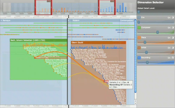
Image taken from Continuum demonstration clip / screenshot.

I have come a cross a new tool for time visualisation developed at the University of Southampton by Paul André, Max L. Wilson, Alistair Russell, Daniel A. Smith, Alistair Owens and M.C. Schraefel. It offers a clean interface to explore the data with some good features for quick modification of the data displayed e.g. the right hand sliders to adjust level of detail, tick box to turn on and off information sets and overall time span sliders that can be split to compare data. It also supports non temporal relationships which are represented by yellow lines.
However, beyond the clean interface, neat features it does not offer a completely new approach. It is still based on a single time line and it is based on a singular hierarchy. Nevertheless the beautifully integrated level of zooms make it a very useful visualisation tool. It is built to be integrated into a website and accepts XML or JSON data input where the child dependencies can be defined. For a demonstration see clip below. There is also two papers on the project HERE and HERE.

Kamis, 10 Desember 2009

Obama's Speeches - Visual Comparison

While living in the era of knowledge the visualisation of content has become ever so important. At least this is what current trends suggest. At the same time incredible and powerful tools are available to do so and synthesis new knowledge as a result. The spiral is turning fast especially in the field of digital or web based knowledge. However there are a few people out there that produces very high quality syntheses with intriguing visualisations. One of my favorit is BLPRNT.
Only recently BLPRNT has put online the visual comparison between two speeches by President Obama on the same topic. One speech was given in July 2009 in Cairo and the second one in Tokyo, during Obama’s far east trip in November 2009. It is all produced using processing 1.0 an open source tool. The project featured in an article on cluster.
It works on the basis of word comparison. The word in the centre is shared by both texts, the size of each word shows how often it is used and text snippets show the context of words or word groups.

PastedGraphic.lxNVoZPJzMEH.jpg
Image by BLPRNT taken from cluster, more can be found on BLPRNT’s flickr page.

BLPRNT has earlier developed the tool to compare two texts on a different subject. For this project a clip demonstrate how the software works.

Two Sides of the Same Story: Laskas & Gladwell on CTE & the NFL from blprnt on Vimeo.

Selasa, 13 Oktober 2009

CoMob - Collaborative Tracking With the iPhone

CoMob is an iPhone GPS tracking application developed at Edinburgh College of Art in collaboration with Edinburgh University. “The CoMob iPhone Application was developed as part of a research project exploring the creative use of collaborative GPS mapping.”
It is a simple tracking application that sends the location to a customisable server. It was designed for an art project presented at ISEA2009. Some images of the event can be seen on flickr here by jensouthern. The application determines the position and ends the information to a pre configured server. The update frequency is customisable as well as the server. You can change the server and for example send the location to your own server. It does not give you a visual feedback, all you can see is numbers. The interesting data is saved on the server.

PastedGraphic.BwcYLk9ypPLw.jpg
Image from CoMob - Logos CoMob (red) and CoMob Net (blue)

The CoMob (in red) application has only recently received a sister application CoMob Net (in blue). It is built on the base of CoMob, but adds some group functionality and a visualisation using Google Maps. A group of iPhone users can use the application simultaneously and see the location of each group member on the screen. Locations are shown with a connection line between them producing shapes across the urban fabric. Usage is really simple, all you have to do is put in a user name and choose a name for the group. If joining an existing group simply type the name in the box provided and you’re linked up. Here too it is possible to customise the server to store the data.
So get your iPhone friends to come out into the streets and start mapping... Download CoMob or CoMob Net directly from iTunes here. You can then join our casa group by entering the name of the group to the settings page (lowercase and you have to hit return to verify the entry).

comob02.5HPeF4AUThTR.jpg
Image by single-blogs - Screenshots CoMob Net