Tampilkan postingan dengan label Identity. Tampilkan semua postingan

Senin, 29 November 2010

Book - Mapping the Invisible

The title of this Black Dog Publication seems very general and trendy at firsts glance, but in fact describes the content much better than most other publications. With 'Mapping the Invisible - EU-Roma Gypsies' edited by Lucy Orta, a topic is in depth documented that currently definitely doesn't features on any agenda. A topic concerned with the 'invisible' culture of the Gypsies, 'mapping' out an identity and the condition they currently live in.

Of course both terms here are used in a wider sense than the currently trending meanings. Already for this one is very grateful. 'Mapping' has become a dead term, suffocated by start up app developers and run over by cross-discipline geographers. In the context of this publication additional potential of mapping breathes some live back into a dead corps with a lot of success and in fact very few maps.

Before even talking about any content, the main element of the book are the photographs. This probably wan't intentional and the photographs are neither glossy nor very good, but they tell the story, illustrate factual and narrate emotionally. There are currently very few publications out there that manage a similar intensity using photographs.
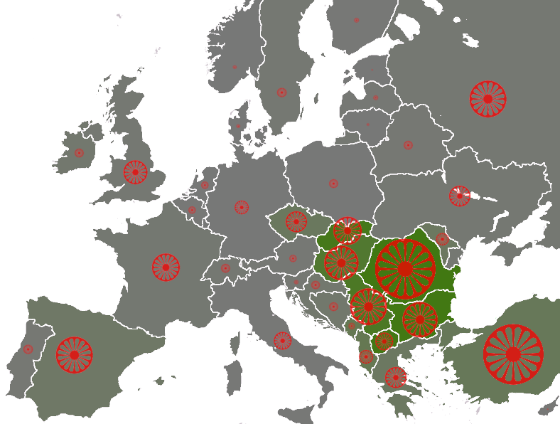
Gypsies in Europe
Image taken from Wikipedia / populations of the Romani people by country, showing the "average estimate" published by the Council of Europe[1]. Based on these estimates are the number of seats by country in the European Roma and Travellers Forum (ERTF) based in Strasbourg. The size of the wheel symbol represents total population by country (Romania 1.85 million), the shade of each country's background colour represents the percentage of Romani with respect to the total population (Romania 8.5%). The three different green shadings 0%, 5%, 10%

The current state of the Gypsies is documented in five chapters as 'History Migration', 'Human Rights', 'Extreme Poverty', 'Creative Ingenuity' and 'Family Identity'. These topics are simultaneously observed in different European countries, such as Italy, England, Romania, Turkey or Greece. Interestingly each topic is portrait in a spatial context and even though the cuture is largely known as traveling or travelers, the place, here used distinct from space, is always very important. This provides sort of a continuous tread through out the book and continuously pieces start interlocking. However, there is no need to read linearly, thanks to this thread.

What are Gypsies? Wikipedia says this: "The Romani (also Romany, Romanies, Romanis, Roma or Roms; exonym: Gypsy; Romani: Romane or Rromane, depending on the dialect) are an ethnic group living mostly in Europe, who trace their origins to the Indian Subcontinent.
The Romani are widely dispersed, with their largest concentrated populations in Europe, especially the Roma of Central and Eastern Europe and Anatolia, followed by the Iberian Kale in Southwestern Europe and Southern France. Deported to Brazil by Portugal during the colonial era [16] and via more recent migrations, some people have gone to the Americas and, to a lesser extent, other parts of the world."

The book's effort is summarised in the foreword by Alexander Valntino and Lucy Orta as: "European Roma mapping stemmed fromt he need to know more about the precarious living conditions of the Romani across Europe. Awareness, we believe is an absolut necessary first step towards an auspicious change in the Roma condition." And this is definitely what the term invisible describes, a cultural group disappearing in the in the sea of sub suburb sprawl of individualised housing and generalised industry.

Clearly the Roma people are marginalised and pushed to the edge of society. Hoever, every now and then the Roma culture has played a role in a broader cultural movement as for example in links to the Situationist, who were especially interested in the idea of moving. More recently in 2007 the first Roma pavilion at the 52nd Venice Biennale was established as discussed with Daniel Baker in the chapter 'Creative Ingenuity'.
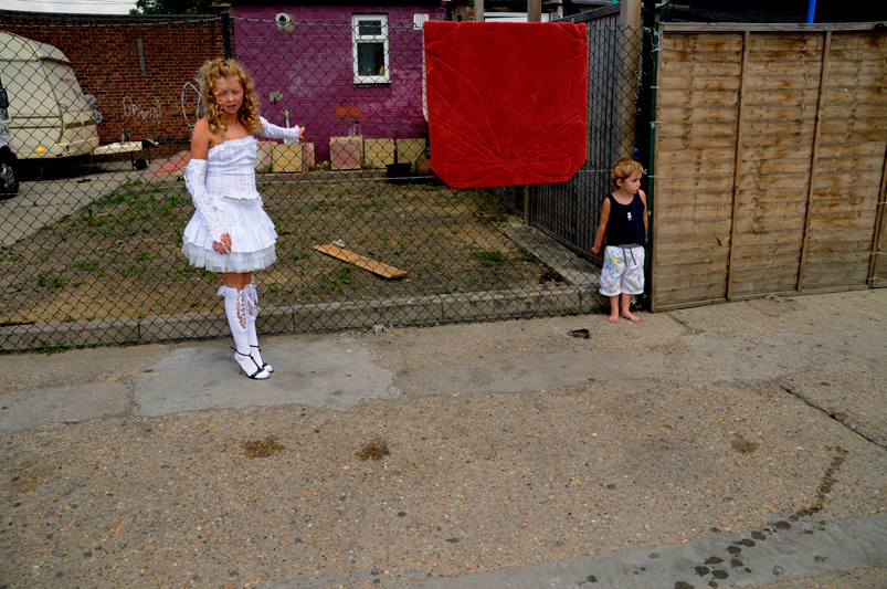
Holy Communion
Taken from Valentina Schicardi / A photograph taken from the series on the Holy Communion of the granddaughter.

The book manages to produce a comprehensive documentation, aso for a lay audience, of the Roma culture and the current state of place it is manifesting itself. This is clearly a very sad situation and in all the different countries an unsolved condition without any ideas or concepts in reach for improvement.

This documentation is on the other hand also a clear reflection and the society we live in and how this society we are al part of treats certain groups. You thought slums are something that only exists in faraway, exotic countries, think again. Talking about the latest flashy architecture magazine glossi spread? Read this publication and you'll learn a lot more about what architecture could mean and the role it would play.

This publication is low key and at first glance resembles more a comprehensive study report or a sophisticated thesis. However, this is extremely misleading flipping through will unveil the density and comprehensiveness of the documentation and the liveliness of the images will bring you goos bumps
into your cosy living room. There might be no over designed layout, but the power of the narrative here are simply incredible. A must have for every analytically interested architect as well as all the mapper out there. A wakeup call for the urbanised, western societies for a lot more than the subject at hand. A very important contribution, especially now in this conservatives' dominated political and social climate.

Also read a review of the book at we-make-money-not-art.
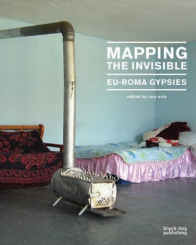
cover
Image taken from Radio.CZ / Publication cover.

Orta, L., 2010. Mapping the Invisible: EU-Roma Gypsies, Black Dog Publishing Ltd.

Jumat, 22 Oktober 2010

Urban Portrait - Identification

Get your head out and pump up the volume. While vizzing around on ground level following everyday trails from one spot to the next one the overall picture might sometimes get a bit lost. But there are these moments when al of a sudden the sky clears up and things become clear, the focus sharpens and the pattern emerges. While leaving the hedgerows and brick walls far beneath one gets to see what is really out there. The beast we are battling while trying to establish a routine that in the end only lasts while we are on it. So what does it look like then, the urban legend?

city portrait
Images by Volk / 'The city of sounds, the city of words'

The more you start to identify with the city you live in, I guess the more you become like the city and the city becomes like you. And once more 'You are the City'.

The graphic was produced by Enrico Bonafede from Volk Graphic Studio. It was produced for Radio Citta' Futura.

city portrait
Images by Volk / 'The city of sounds, the city of words'

via urbansynergies.ca

Jumat, 14 Mei 2010

City Life - Drama

A nice timeLapse clip with very dramatic music composed together by Constantin Philippou. It is just another taken on the city thing, but the soundscape makes this an intense portrait of everydayLife with some touching behind the (City) scenes moments. So turn your headphones up.

Rabu, 14 April 2010

Logo City

The city built from logos by the french artist collaborative H5. The short with the title “Logorama” is entirely put together using familiar brand logos to represen the different elements of the city and you have the pringels man dring a truck past or the familiar Malibu Palms along the road or the windows live butterflies whizzing by.


Found vie urbanophil
17min version to be seen at urbanshit.de

Selasa, 13 April 2010

Massive's City

A city vision born from darkness with references to a long line of classics, from Metropolis to Blade Runner. Massive Attack have pushed the boundaries in a number of areas and have always tried to reach beyond simply making music. This would usually also include political and social topics. We all very well remember their impressive live performances.
This new clip is a impressive flight-through a city, frozen in the moment of battle and disaster. It is a curious moment, developing along the camera path, despite being a framed moment in time. Director Eduard Salier is well known for his music videos and the long list of bands he worked with includes beside Massive Attack, Orishas and Air, or comercials for Nike or O2.
The city created also has references to Guernica, the famous Picasso Painting, depicting the Spanish Civil War. In this light I believe there is less litteral meaning to the animal featured in the clip and more a hint at the current war on urban streets in general. The urban battlefield is probably part of the Massiv Attack story since the beginning.


Image taken from massiveattackarea by Eduard Salier / Storie board for the video clip to Splitting the Atom by Massive Attack


Read the interview with the director Eduardo Salier at Pitchfork.

Kamis, 01 April 2010

Book - The SANAA Studios - Pritzker Prize Winners

The winners of the 2010 Pritzker Architecture Prize is SANAA, a collaboration by Kazuyo Sejima, Ryue Nishizawa, who have been working together for the past seven year. The prize is the biggest thing you can get in architecture. It is something like the nobel prize for architecture. SANAA are definitely a worthy winner. SANAA actually stands for SejimA and NishizawA and Associates. Their work has played an important role in the young 21st century. Their projects have a very distinct character and the language they have developed is clearly rooted in Japanese architecture, but SANAA ha developed it further and adapted for specific usages. The clarity, purity and whiteness are the main obvious characteristic, but the directness, simplicity and playfulness are for me the interesting aspects. The projects they are best known for are large scale museums or school buildings. The main one are the Toledo Glass Pavilion, the 21st Century Museum of Contemporary Art, or more recently, opened only in February, the Rolex Learning Centre in Lausanne Switzerland. However they have also built some interesting housing projects, for example the Kitagata Housing project or the small early project a House in a Plum Grove Tokyo. They have also built the 2009 Serpentine Pavilion in London.


Image taken from designpublic.com / An outside view of the 21st Century Museum of Contemporary Art.


Image taken from inhabitat.com / Outside views of the New Museum of Contemporary Art in New York

Just in time Lars Mueller Publishers have now also a new publication about elements of SANAAs work. 'The SANAA Studions 2006-2008', edited by Florian Indenburg. It is a magazine style booklet about SANAAs teaching between 2006 and 2008 at Princeton University. Nevertheless this is very much a publication about SANAA as architects, since their teaching is very much about what they do on a daily basis. The student projects can hardly be distinguished from the original. Of course this is interesting to see and read about what the two actually teach the students and how they help them progress, because this is very much the pure architecture they practice.
The publication cleverly mixes the university design studio work with practice design studio work as well as built examples and references. It features project reports, essays and interviews / discussions. And all this creates a very interesting and detailed picture of what SANAAs practice is all about. It is not about the stardom, the icon or the craziest idea. It is very much abou the joy of building and creation of places, all very low-key. The format of the publication is obviously very well thought out and brilliantly supports this 'a little bit different' portrait of the now crowned architecture 'stars', portraying them as teacher and colleagues in a context. The will be a lot of great texts celebrating their work, but this one is about how they do it and how they teach other to do it.
So if you want to know the other side of the duo, this is the publication for you.

SANAAstudios02
Image taken by single-blogs / Spread of the publication.


Idenburg, F., 2010. The SANAA Studios 2006-2008: Learning from Japan: Single Story Urbanism, Baden: Lars Muller Publishers.

Kamis, 18 Maret 2010

The Identity of the Place

The new Monu Magazine comes with a beautiful quote describing the characteristics of the city as a particular locally sourced parameter that lives and breathes with the citizens.
"Most of our cities are shaped by a particular set of values that does not necessarily lead to high quality urban spaces, but instead to scary, ethically unacceptable and distorted forms." (MONU issue #12, )
This is something we all experience on a daily basis and therefore are very familiar with. However it doesn't stop there. We also contribute to our surrounding, we are part of it. At least since 'The Social Logic of Space' by Hillier and Hanson we also have an attempt to describe and characterize this phenomenon. It it is not the only attempt, but one that claims to be fundamental and 'scientific' i.e. mathematical. But still, it is based on the static concept of the space as a given entity. This doesn't fit together with Open Source, Free Content or User Participation. To some extend with the emerging filed of spatial dynamics research based on the new location awareness technologies is to look into this very same field. Since it focuses on the activity of the citizens directly they finally play the important role in the description of the urban environment. It really comes back to 'You are the City'.

You can brows the magazine on YouTube, for convenience I have simply embedded the clip below, so go a head a flip through the pages.

Minggu, 07 Februari 2010

Book Review - Installations by Architects

To come back to the discussion about the identity of the architecture profession I have here a publication that explores this question from a different direction. What if architects make something else, what if they work in the field of art and produce installations? Are they still architects, and if so what does it mean for the identity of the professions, both of the artists and the architects?
Installations by Architects - Experiments in Building and Design by Sarah Bonnemaison and Ronit Eisenbach (2009) is published by Princeton Architectural Press. The book identifies a “rich and increasingly diverse practice” that emerged over the past few decades in art practice, the working with installation and architects are amongst the user of this type of expression. It seems to be the ideal playground for architects, the installation implies a direct spatial component and the profession identifies it self with spatial practice.
Architects as artists have a long tradition. More often than I feel comfortable with, the architect is stereotyped an artist, a practitioner capable of doing art work or at least someone with an ‘arty’ flair. In most cases architects enjoy playing in this mist of uncertainties and enjoy the opportunities and in some cases reduced responsibility. This has over the years, however, created a watered self image and architecture today can be anthropology, sociology, engineering, planning, construction, sustainability, geography, politics, management, art, archeology, research, business, fashion, theatre, just to name a few. This can be confusing, if the standard idea is the planning and construction of a house. However there is noting wring with this practice in principle and as art of the Bauhaus movement, architecture was part of an idea of space, together with other disciplines, including the arts, that had the boundaries blurred explicitly with the idea to foster collaboration between the different disciplines. Today it seems almost as if the architects still follow this idea, but as the only discipline ending up isolated and with a fading identity. It is probably more about the attitude, not about the practice.

PastedGraphic1.mrltPlD82FrA.jpg
Image by Andre Forget taken from we-make-money-not-art / Asher DeGroot, David Gallaugher, Kevin James, and Jacob Jebailey, Walking in the Park.

And this is exactly what this publication manage to demonstrate. The projects, better installations illustrated and documented in the book are all, without exception extremely ‘good practice’, whether artist, architect, sociologist, or community worker. The really new aspect highlighted in the book is the use and benefit of this practice for educational purposes. But yes it is obvious, not in this book but leading schools such as the Bartlett school of Architecture make a lot of use of these techniques.
In the introduction the authors take the readers through a chain of historic examples of installations that you might be familiar with. For example Kurt Schwitters, Merzbau or Gordon Matta-Clark’s Splitting or Christo and Jeanne-Claude’s work The Gates.
For the book the selected projects are grouped into five thematic topics: tectonics, body, nature, memory and public space. This list seems a bit general at first, but makes perfect sense in the context of the projects.
The representation of the projects happens in two parts. Part one is a text based description of the work, the context, comments and critique, whereas the second part is a visual, mainly photographs based documentation with short explanation texts, mainly explaining the content of each illustration. The two parts are spatially separated. So you get these blocks of texts, some five projects, followed by a block of visual documentation. This is confusing at first but again falls in to place later on. It opens up possibilities to cross read projects, widen the contexts and link practices.
Documented work’s include Diller + Scofidio (1993), Bad Press, Dissident Ironing; Pilip Beesley (1998-2007), Geotextiles; Marco Casagrande and Sami Rintala (1999), Land(e)scape; fieldoffice (2001), NY A/V or the pixualisation of facades by LAb[au] (2007), touch.
The presented work is extremely evocative and of the type, why didn’t I have this idea? I could have done this! in very positive sense here. I believe this is not only the case for the audience, but very much for the installation practitioner himself and this is most likely the reason behind why architects are so much into this kind of practice. Their other work is actually benefitting from these ‘research’ practices.

land%28e%29scapes.SerZVeBnqIzH.jpg
Image taken from archiworld / land(e)scape (Savonlinna, Finland - 1999 - Recalling the little barns that pepper the traditional Finnish landscape, the architectural installation is designed as a protest against the desertification of the countryside. Three of these abandoned barns have broken free from their moorings to rise majestically 10 meters from the ground.


Bonnemaison, S. & Eisenbach, R., 2009. Installations by Architects: Experiments in Building and Design, Princeton Architectural Press.

Rabu, 03 Februari 2010

Book - Transformation Strategies for Former Industrial Cities

In the current times the topic of change is big, Life is changing and the awareness of this consumes a lot of the attention both, individual as well as collective. The Financial crisis has just rocked the world for the whole of the last year, health concerns dominated the media with the pig flu virus and wars are not won quickly any longer, to name just a few of the current big topics of change. Global climate change would be an other big topic. However there is a common topic to all of them and I believe this is the awareness of time as an aspect of the topic description. You could almost say it hasn’t featured to such an extent at any point in history. The second element is the global awareness, we all share the same planet in the end.
Big changes are also discussed among cities and it is true that the construct city faces a really dramatic change. It has become a global phenomena how cities grow and predictions point still upwards. Cities or better city regions are at current extremely attractive. However the extent of the change we are facing in structural, organisational or social terms, hardly anyone can grasp.
The crowded, dense and dirty instalment of the industrial city is long gone and new identities have to be found or most likely invented. A whole series of heavily industrial cities struggled with decline over the past fifty years. This was already pointed out by the Shrinking Cities Network or by the Shrinking Cities Project lead by Philipp Oswald. In a series of publications V1, V2 and an Atlas of Shrinking Cities, the group has researched case studies of mainly former industrial cities struggling with decline. To some extend this project was an eye opener for a lot of people did it for once divert from the cliché of the ever growing, pretty and strong city. It lent an image to the deserted city centres and run down neighbourhoods. If you wanted you could accuse them of simply moving beyond the empty industrial building in the inner city location stylised to a trendy urban loft and sexify the decline of the city as a whole. But this is probably going too far.
Since we now have the shrinking in our repertoire of capitalist planning reality, we can steer our attention back to the growth of the cities. Growth is one aspect of the solution these cities are working with. There are other aspects too, for example sense of place or identity are other factors to play an important role, not only for location marketing. In a recent NAI Publishers publication ‘Comeback Cities - Transformation Strategies for Former Industrial Cities’ edited by Nienke van Boom and Hans Mommaas (2009), brings together a documentation of eight cities’ strategies to develop themselves into the twenty-first century. The different places are Tilburg, Entschede, Manchester, Huddersfield, Tampere, Forssa, Ghent and Roubaix. However oddly the whole setting is created around the city of Tilburg and its anniversary celebration of the fact that it received its municipal charter two hundred years ago from 2009. This is really an odd context or such topic as immediately one gets a sense of actually becoming part of a cities promotion effort, quite literally, marketing between book covers. This is clever, if it then is and reaches a different group. What better way to promote than to become a model.
Anyway, we leave this discussion aside for now and look more at the content of this as usual with subtle design decisions surprising publication. NAI Publishers really love their books, you can tell. This one here has textured covers that give it a nice touch as you hold it.
The content is preceded by fact sheets documenting anything from population size to type of fiber used in production to levels of education. It seems almost that this kind of quick context creation starts to become a common feature of a serious book. I ultimately think of ‘the Endless City’ book by Ricky Burdett, Deyan Sudjic, where the facts even crept onto the covers to make the point. This element of the book is of course also the perfect stage to clarify the publications graphic design position. The ‘Endless City’ is bold black on bright orange, to underline the fact that they are talking fact. Here in ‘Comeback City’ the information is communicated through diagrams represented by sewing thread bobbin (I had to look this one up, what a creation. It is probably also long lost together with the tradition of the industry in cities.) So no the first few page you get a really good sense of the material these industrial cities worked with and in all sorts of colours. At times these bobbins almost transform into characters.


Image taken from ‘Comeback Cities’ p28/29 / Opportunities

The main art of the book the is a series of chapters named ‘Case Study’ each comparing two of the example cities, out of the eight. These texts are structured as similar analysis writ-ups starting with some history, talking about the years of suffering and then the slow change highlighting the different players and their roles in the context. There are detailed descriptions of political processes right down to who was the major during which period and what were his interests. It does end up in propaganda paragraphs at times, in a series of cliff-hangers from positive aspect to positive aspect. Having said that the amount of detail is astonishing and even if at times extremely one dimensional it is valuable and gives a good insight to understand the mechanisms almost on the level of daily business (in case you wana run your own city). So you end up with a bunch of creative cities, highlighting their cultural potential and practice mixed up with cafes, restaurant entertainment and a big bit of higher education. Anything the cliché of a contemporary dynamic city would ask for, right out of a third year architecture students project presentation. But I guess this is the reality we live in and consuming is a westerners main occupation. To some extent this raises the question whether these cities are not on the road to buy right into the next big mono functional bubble after escaping battered the industrial gripper.
However the one phrase that really jumps out from all the descriptions is ‘the DNA of the City’. It is used in most of the city portraits as a subheading and it is an element I really can not relate to. After having read all of the paragraphs I can still not understand what the authors describe with the phrase. It is probably thought to refer to the basic, fundamental building blocks of the city, but I doubt those are creative industry and knowledge. The only element I can think of that could maybe fit the shoe are the citizens, the society living the cultural context the city is created in, but there is little talking about them in this book.


Image taken from ‘Comeback Cities’ p82/83 / Industrial halls in Tilburg at different times.

There are two intermezzo elements to the book structure, each a photo essay illustrating the feel of these places then and now. These are beautiful parts where the reader can put together the puzzle of descriptions and sense the extent of the drama covered by the book. You see black and white or sepia photographs of mainly women, but also men in vast halls standing at machines with hundreds of threads going off and then you see a contemporary group of people looking at art work in a similar building. This really illustrates the dimension of change and for me helped to understand the struggle described in the text. It also directly talk about the memory of places that might not be accessible for outsiders but are the essential element of identification.
However nice the book is designed sadly the sections with the photographs is pretty unfortunate. Somehow the framing of the images, the blue colour of the page background, the wiggly line, the black of white frame and the description text box do not make sense, a real pity.

The book is concluded with a section documenting student projects developed in the context of Tilburg addressing the issue of change and identity. This is a refreshing section and underlies the potential and the capacity these cities have, both actual and for marketing.
I guess in this sense the review can be concluded, a refreshing book that does not always follow the much used paths of documentation, plays with the subject even as part of the book, fails in some cases but succeeds in others. A valuable contribution to the debate around the creation and recreation of an identity of place.


van Boom, N. & Mommaas, H. eds., 2009. Transformation Strategies For Former Industrial Cities, R: NAi Publishers.

Selasa, 02 Februari 2010

Stadtkolloquium Workshop

The PhD workshop took place over two days at UCL and was a platform for PhD students to discus their research with other students. The sixteen participants are all doing research related to urban questions. Nevertheless this proofed to be a very divers criteria. It was a mix of geographers, anthropologists, artists, architects and more. Quite a few people didn’t fit only one category so the group was very dynamic.
The workshop was organised by two PhD students from UCL, Sandra Jasper from the Geography department and Luis Moreno from the Urban Laboratory. The concept was for each participant to present condense and short her or his work, followed by a longer plenum discussion and questions. This worked very well, as the organisers managed to structure the program in blocks of two with a similar topic. This would provide a good structure through out. My contribution can be found HERE.
It was for me, with an architectural background, really refreshing to discuss for once amongst other architects. Some completely different topics came up for discussion in this divers setting and this was the real benefit.
Looking thought the notes and the program again the five main topics were Urban Interventions, Urban Complexity, Urban Politics, Writing Spaces and Ethnographic fields.
The most striking discussion, that followed as lead unintentionally through al the topics really was the identity of the profession. What do we do and how does it relate to other filed and the urging questions how can we work together, exchange and develop. What better setting than to discuss it with people in a similar situation with divers backgrounds and interests, but common ground?
I happened to watch Prince-Rasmus’ TED talk the night before the workshop and this probably already set my mind for this debate. He was talking about Architectural Agency.

Senin, 18 Januari 2010

A View From the Road - Landscape Features at High-Speed

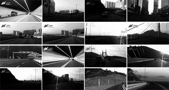
To continue on the topic of ‘a view from the Road’ another high-speed clip documenting a road trip. Here with 800mph from North Point Hong Kong Island to Mui Wo on Lantau Island. Very interesting how the features of the urban development direct the experience of the trip.
Some examples I picked out to illustrated the idea Lynch used to characterise and describe the urban experience as seen from the road in his book ‘The view From the Road’ (1966). I have increased the contrast on those key images to highlight the landscape feature. One should spend a bit more time on this to do it properly, was just a quick sketch.

ViewFTRoad_Hong-Kong01.Vyl37c5mnibM.jpg
Image by single-blogs / screenshots taken from the clip by LantauOnline / The increased contrast highlights the landscape features.

Kamis, 07 Januari 2010

snow, snow, snow, snow, snow, moving north.

Simply because it is so nice and I enjoy the snow here in the UK. Isn’t it amazing how the land change and the perception of it shifts from the UK we know to a nordic almost polar region image. The power of the image to evoke memories and preconceptions works even on the level of the map or as here, a satellite photo. To compare here a link to a zoom in on Greenland.
Interesting also how the land is structures. There are various shades of white and I am pretty sure the dark spots are settlements. There are Manchester, Birmingham, Plymouth, Leeds and Glasgow. There might also be the north-west end of London appear between the clouds.
Its a real winter fairy tail on how the country rests under the cover of sweet sugar dust for a while. Spring will come round render the islands green again, summer warms up the air and autumn might bring the brown colours. And hopefully it will come back as the clock strikes the same season again.

UKcoeredSnow.JajMRuy36ZQn.jpg
Image by rapidfire.sci.gsfc.nasa.gov / 2010/007 - 01/07 at 11 :50 UTC, Snow across Great Britain, Satellite: Terra / Thanks to Matthew Dance from wiseristhepath for the link

Jumat, 11 Desember 2009

Walking Through Time - iPhone App

The rise of location information brought us knowledge of where we are ad beyond. Today you’re not only told were you are but also what is around you, how it looks like, how far it is and in which direction. Almost assuming that you are not actually there. This is usually also the selling point. If you can’t find it for example or your still too far away this will give you guidance. However it also demands in-depth engagement of the end user. This is probably the point where all these services have trouble penetrating the everyday.
However, it is still fascinating and if you are into mapping and interested in what happens around you sooner or later aspects of time will start bothering you. Most of the apps feeding your ‘location awareness’ are actually static. They relate to one point in time or assume a permanence.
This is now being addressed with a number of emerging apps, including augmented reality like layar. But also in the area of the actual map information there is a rising wealth of information regarding past location information as in the form of old aerial photos or historic maps. Google has introduced the timeline feature in Google Earth earlier this year with the version 5.0, where you have the ability to access old aerial photos used since the launch of the Google Earth service in 2005. Now it has also swapped to the mobile market and apps for the iPhone are available. On this blog earlier featured the great app Historic Earth which has a huge database of old digital maps from the mother company Historic Map Works. Now the Edinburgh College of Art has developed a new web based mapping service called ‘Walking Through Time’ that is also available for mobile gadgets, such as the android and the iPhone. It looks really promising, with the developers saying: “...our user group is interested in walking through real space whilst following a map from 200 years ago (for example) and being able to tag and attach links to the map that offer historical and contextual information”. Tagging and linking? that is something we are interested, sounds great!
See teaser below.


found via digitalUrban

Jumat, 27 November 2009

Whate Shape Are You? - Update

As an update to the ‘what shape are you?’ post, here are some new shapes. The Project now counts twenty participants so we also have twenty shapes.
All shapes are produced over the period of two month and are represented here at the same scale.
As previously noted these ‘drawings’ depend on the location of important destination relative to one another and on mode of transport as well as frequency. The mental picture of the city that each individual builds up while interacting with the urban fabric is tremendously different. Linking back to the visualisation ‘The Naked City’ the phsychogeography of the city is very much dependant or a result of this as produced through the derive.

whatShapeAreYou_BW.XM5ooDPazs8m.jpg
Image by single-blogs for UrbanDiary - (click for large version) - Different shapes produces by participants of the UrbanDiary project over the same period of time.

Selasa, 03 November 2009

Relocation of concepts and identity

A beautiful short film by Peter Kidger an ex Bartlett students - ‘the Berlin infection’ - is a a mixture of high resolution still photographs and 3D animation. It is an intriguing tale of identity and the assigning of it to particular objects of the urban context.
He produced it as part of his postgraduate diploma in architecture in the unit 15 at the Bartlett School of Architecture in 2006.
On his youtube page you can find some more animations of this kind.

Jumat, 16 Oktober 2009

Historic Earth - Old Maps Georeferenced for the iPhone

Former old map app has transformed and teamed up with a large library and is now Historic Earth. The old map app featured earlier this year on the bog with a review and now we want to look back, previous post HERE.
The really big change is the data, the app now has in the background. It draws the data from Historic Map Works a huge database of maps, containing some 1’000’000 maps including United States Property Atlases, Antiquarian Maps, Nautical Charts, Birdseye Views, Special Collections (Celestial Maps, Portraits, and other historical images), Directories and other text documents. Their main business is to provide high quality images of old maps to researchers and map enthusiasts. The main focus is North America, but they stock and increasing number of world maps and others. This means for now that the iPhone app also only covers North America. But this is changing, they have a visual counter on their web page to demonstrate how they are making progress both, increasing the service for the iPhone and geocoding maps in general. The aim is to offer some 130’000 maps in the next month. You can follow them on twitter to check on the status. For facebook lovers here is the fan page.

historicEarth02.5silGfNFPlp8.jpg
Image by single-blogs - Screenshot, looking at the Los Angeles Bay area over different times.

The iPhone app is probably aiming at map enthusiasts mainly really. As for research one probably wants’ more specific access to the data. However the app serves a fascination and is very addictive. It is developed by Emergence Studios as was the old map app. It is introduced as “Historic Earth allows you to map the history of cities, times, buildings and landmarks. View historic maps showing property owners, see buildings constructed and replaced, and watch the landscape change over time.”
The app is using OSM for the background to reference the layers to the modern map of the location. The overlay, the base can be adjusted in its transparency with a slider, normal gestures as known from Google maps are used to navigate the map. Once in the actual map window it is great you flip between times with the arrows provided and watch the area change. The trouble really is to get into, as the menu is not intuitive and there is for example no link between the map showing the covered area and the actual historic map.
However once figured out that in the settings the “lock frame when switching maps” switch is set to on it is a real pleasure to browse.
Not only the area changes, but also the representation techniques and focus of the maps. In this respect it is also a documentation of a changing space perception.
It is a bit slow to load here in London, I suppose this is down to all the 32’000 maps have to squeeze into the tube to get across the big blue : ) But the frustrating thing is not that it is slow (I don’t mind waiting for interesting content), but there is no indicator that something is actually happening. Usually while loading the screen only displays the, sort of, old paper background, but no progress bar or indicator of any sort. It is also one of the very few apps to choose not to display any information of the usual top bar with basic iPhone stats, like quality/type of connection, time and battery life. So there is no way you can tell the device is actually doing something and this has, at least for me, been very irritating I have to admit.
But sure enough, this is the first release of the app (if you don’t count the previous one) and as usual there are some things that just had to be done quickly in the end, but can easily be solved and improved in a following update. The main thing is the quality of the interface and the value of the data available. For both of these points the app scores very high!
You can get it for some £3.49 from iTunes.

historicEarth01.7Ves6uAjM23Z.jpg
Image by single-blogs - Screenshot, settings, coverage and menus