It includes some very interesting new features. The two major ones are the Network feature that allows the user to visualise the data as a network besides the time-space visualisation and the second major change is the support of the macOSx platform (see earlier post on mac adventours using GeoTime). This is in a sense a clear statement of independence, if there was critique that GeoTime integrates too closely with ArcGIS. However of course it continues to integrate well with Arc and support for the new ArcGIS 10 comes with the new GeoTime update.
The software is perfectly fitted for the UrbanDiary project that works with GPS tracks of individuals, investigating the spatial extension of everyday routines in the city. It is basically a purely spatial-temporal dataset. In a few easy steps it is possible to see the data visualised in a simultaneously temporal and spatial way, animate it as well as start analysing it.
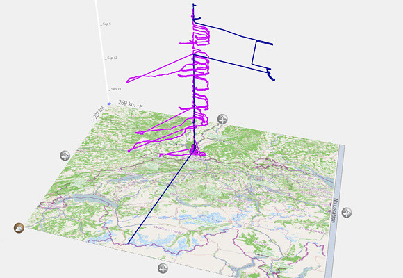
Image by single-blogs / A view of different GPS tracks over the period of one month, using GeoTime and an OSM base map pulled in via ArcGIS.
The move away from a secondary software import via ArcGIS or Excel was a good move that came with version 5.0. The importing formats have been extended and redesigned with the release of version 5.0 to include CSV, XLS, and SHP file formats as well as the in version 4.0 existing KML. It is now handled directly by GeoTime through a functional assistant. With version 5.1 the import of GPX file format is added. Data from the GPS exported in this format can be loaded and added to a project directly.
The new dialogue allows to filter the data at import. This is useful especially for my crappy overloaded tables in which I tried to record way to much. The selection of just the five essential columns makes for a much more slik workflow.
GeoTIme focuses on temporal data, however the integration with realtime data has only be introduced recently with the 5.0 release. Now users can import live feeds via Geo RSS that automatically updates.
The data is initially visualised in the 3d view as a time-space cube. To interact with time one finds the tools on the left hand side vertically arranged. On the right hand side the menu provides a range of other tools including representation settings, pattern analysis, reporting tools and the new network tool.
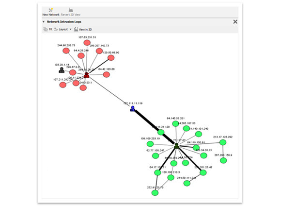
Image by Oculus / An example using the new network tool in GeoTime visualising a computer network.
The network tool is a whole new field that has been added to GeoTime with this functionality. This is particularly interesting for the analysis of complex structure that include spatial and non spatial data, such as for example phone call data or financial transaction. In the context of the UrbanDiary project for which GeoTime is used here this new tool becomes interesting for the investigation of combinatory data from GPS and mental maps, as for the analysis of interrelationships between landmarks and actual route. For the visualisation different present network settings are available. Furthermore it integrates with the 3D visualisation of the spatial data and the network graph is directly linked to the time-space cube and highlighted areas correspond across the two visualisations. So specific sections identified for further investigation at one end can be look at from a different perspective at the other end.
For the data analysis in the spatial-temporal section, one of the new features in this 5.1 release is the stationary detector. The data can now be queried for events that have not moved in space over a longer period of time. This is useful for the data verification as well as detection of move and rest patterns.
One of the remaining points of critique is still the graphical representation of the visualisation as well as the range, simplicity and of possible manipulations of it. There have been however, some changes made and for example the colour palette has been extended. But still both the interface and the results are still very technical thought of and rendered. It would not ne a mater of just making it all fancy and colourful with rounded corners, but it would need one strong design direction as a well as an overall visual simplification.
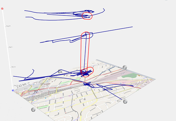
Image by single-blogs / Applying the stationary finder to a track imported via GPX directly into GeoTime. This highlights the areas where the GPS device has not moved more than 100 metres over a period of more than 8 hours. It uses the OSM base map pulled in via the ArcGIS link.
In an comment on GeoTime 4.0, I hade described it as an end-of-the-line analysis tool. This was because the data could not be directly exported to other software packages. This has changed with this most recent update, now CSV export is supported in addition to the KML and screenshot export. The analysed file can be passed on to other software or users which dramatically enhances the usage and the integration of GeoTime.
Image by Oculus / The GeoTime 5.1 Logo.
In this sense the spaceTime aquarium has become a lot more sophisticated with this GeoTime 5.1 release. At the same time, though, it ha become accessibel for a much broader range of specialised fields through the extended palette of tools. It can now integrate in a workflow, be run as stand alone analysis software as well as operate across platforms. GeoTime is a very specialised tool and definitely offers the quickest and most comprehensive set of visualisation and analysis tools for temporal data.
For demos and further information on the GeoTime project use the inks or go HERE or HERE for earlier posts about GeoTime on single-blogs.


