New York, London, Munich, Paris, Moscow, Sydney, San Francisco, Barcelona, Denver, Hong Kong, Beijing and Chongqing. Further more the urban areas that need processing are: Shanghai
New Delhi, Chicago, Vancouver, Rio de Janeiro, Tehran, Tokyo, Jakarta, Sao Paulo, Toronto, Oslo, Basel, Rome, Guongzhou, Mumbai, Bangalore.
To provide a better overview here is a NCL world map with links to the individual locations. A link is provided to click through to the interactive and zoomable version of the individual urban area map. This will allow to explore the city of interest in more detail.
For a large scale map click HERE.
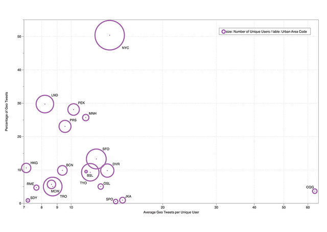
The data collected from the different cities varies quite a lot and especially the number of geo located tweets is a sort of tricky parameter. It does not correlate with the number of messages sent. The dependencies are more complicated and link probably more to the living standards and income. For example urban areas such as Jakarta and Sao Paolo have high numbers of twitter messages sent, but very few lat/lng referenced messages. This is more to be related to the coverage of smart phones and data charges, where people tend to use the twitter service over a broadband internet connection for free.
However, it is interesting to note that the number of geo located messages sent per unique user tend to be around 10 over the period of one week. Some areas go up to 15 or down to 8, but it is fairly constant across the board.

Image by single-blogs for NCL / The graph is showing the urban areas covered so far in the New City Landscape project, were we generate an activity landscape of an urban area using twitter data. The comparison shows vertical: percentage of geo referenced tweets, horizontal: average geo tweet sent per user, size: number of unique user, lable: urban area code.
The maps were created using our CASA Tweet-O-Meter, in association with DigitalUrban and coded by Steven Gray, this New City Landscape represents location based twitter activity.
Tidak ada komentar:
Posting Komentar