Jumat, 29 Januari 2010

Mental Mapping Architectural Experience - by Donna Wheatley

How is architecture perceived and what impact does it have on inhabitants. Architects tend to have their own thoughts about this and communicating about this abstract entity between inhabitants, client, developer, and architect is an almost inexistent field. However Donna Wheatley, a PhD researcher form the University of Sydney has developed her own approach to the problem. She is using mental maps and network analysis to bring light on this problem.

------
Guest Post by Donna Wheatley for single-blogs
------

One of the features of the mapping technique developed in the PhD is that individual and consensus conceptions of designed environments can be generated. This can then be used to compare the mental maps that the architect has towards the environment they designed with that of the user group. As a designer I am familiar with the expectation to incorporate specific abstract values into architectural designs, but it is difficult to know if these efforts are successful or in how far this has been achieved in previous cases. In response, I undertook this study at half a dozen new corporate headquarters in UK, Germany, China and Australia, where attempts have been made to attract and retain employees by communicating particular values.

donnaW_mentalMaps01.0WgxonCqBZ7g.jpg
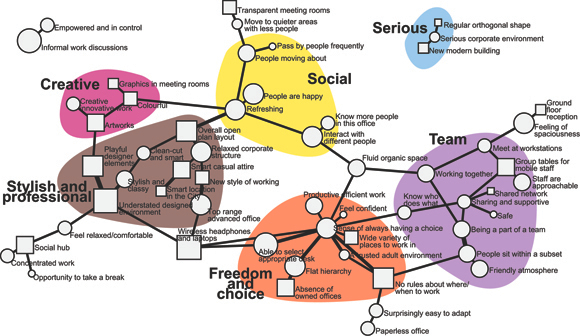
Image by Donna Wheatley / The user group mental map. Each connection in the network refers to concepts that were also syntactically connected in interviews. Edges and nodes weighted by the number of participants mentioning it and metatopics found with cluster algorithms.

The data for the maps is derived from in-depth interviews with users, architects and clients using metaphor elicitation. The interview transcripts are coded by extracting identifying keywords and grouping them in pairs. These pairs form semantic networks which are read as the mental maps.
Determining what thematic clusters or topics emerge (called ‘metatopics’) from the networks is a primary aim. The networks usually contain 4-7 metatopics. A range of network analysis algorithms, calculating measures such as centrality and proportional strength of ties are applied to identify important constructs and help identify metatopics (I will now apply additional analysis procedures on advice from CASA researchers – thanks!!). These metatopics can also themselves be ranked and compared through network analysis indicators.
Through these tools, new observations on the structure of collective mental representations of built environments are gathered.

donnaW_mentalMaps02.mR31BNtpwSRV.jpg
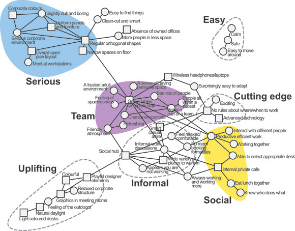
Image by Donna Wheatley / The architects mental map. Metatopic ‘freedom and choice’, the most prominent one for the users, has not been anticipated – and ‘seriousness’, disconnected and minor for the users, is the largest metatopic from the designer’s point of view.

I visited CASA at the beginning of 2010 to discuss the analysis and interpretation of mental maps of architecture in my PhD at The University of Sydney. I gave a presentation called ‘Mental mapping architectural experience with network analysis’ at one of the weekly CASA seminars which can be found on their website. These maps are visualised using social network analysis software Pajek.

Kamis, 28 Januari 2010

The Temporal Narrative of Space

I will be at the Stadtkolloquium workshop for the next two days. The Stadtkolloquium is an international PhD workshop for and with PhD students here at UCL. A divers range of research topics related to the city and urban aspects of space will be up for discussion.
I will be presenting a paper with he title ‘UrbanDiary - The Temporal Narrative of Space or the Construction of the Collective and its Visualisation’. The main focus will be on the last part of the manufactured title construction, the construction of a collective and visualisation aspects of temporal data.


A brief summary will form the introduction to enable everyone to understand the extent of the investigation as well as to grasp what field work has so far been undertaken. This set the background for the explanations and ultimately the discussion to follow. The focus of the explanatory part is held on the experience and perception of space. The aim is to build up, on one hand the methods and ways of investigation and mapping , as well as on the other hand introduce the concept of the narrative. Along the story of individual experience, the narrative of the space and ultimately the city is redrawn. It is not so much the mark on the city, but the mark the city leaves on the individual that interests. It is hoped that this also clarifies the position. However, the aspect of the body and is left out of this discussion. This is mainly to not confuse the direction of the discussion.
The Discussion part is dived in to two section, the possibility of a collective construction and the visualisation of the findings. Earlier is illustrated with track records shown on a city level including and connecting to the immediate urban morphology, followed by the UD London map. The new twitter weekend map is then used to illustrate other sources of data that could be interpreted as collective. However this is mainly thought as a starting point for the discussion around the construction of a collective and its value compared to the individual data.
With a activity graph based on time and amount of activity, the transition to the topic of the visualisation is introduced. Also the time-space aquarium will be up for debate and an animated UD London map.

Rabu, 27 Januari 2010

Tweet-O-Meter - the Tweeting Habit of Cities

One of the twitter tool under development here at CASA is the TweetOMeter, currently in beta, coming soon. All it does is measuring and visualising the amount of tweets sent around different cities. Currently it is New York, London, Paris and Munich. This is a mini hint at the late seventies hit ‘NewYork, London, Paris, Munich everybody talk about Pop Musik’ by the group M.
So what are people talking talking about in 2010 in these cities?


Currently in beta mode the TweetOMeter updates every 10 seconds displaying the city with the highest number of Tweets, the logged 24 hour period will be announced next week. Once logged we will be able to make city maps showing the Tweet activity over time and space, the system will be launched as part of a free data collection service via NeISS in the next couple of months.
Tweet-o-Meter is designed to mine data for later analysis relating to furthering our understanding of social and temporal dynamics for e-Social Science within the Twitter demographic. It is under development at CASA, University College London as part of a wider survey tool as part of the NeISS project in association with single-blogs and Digital Urban, code by Steven Gray.
One of the main interests will be the temporal user pattern contained in the data. Twitter offers a great platform to look into details of the urbanNarrative quite literally. The aim will be to map the development of the narrative in the spatial context and integrating it with the social network.

Click on the image below to view NewYork, London, Paris, Munich via TweetOMeter and if your in one of those cities and want to take part, simply make sure you have geolocation turned on in your Twitter preferences.

tweetOmeter.4IaIqnXeC2zk.jpg
Image by single-blogs / Schreenshot

Selasa, 26 Januari 2010

Twitter Never Sleeps - TimeLapse Tutorial

The busy twitter service never sleeps. I was not sure about this and so I wanted to test it. Over the weekend the activity on the tweet mapping service twittermap.tv was recorded and here we have now a timeLapse of the activity. And actually, twitter does not sleep!
It is busy all the way round the weekend.
Twittermaps the location of the outgoing tweets according to the geoLocation. However there is a bit of confusion at the moment what this actually is. The information was only recently introduced by twitter and is not used very much by users and developers. So there i a workaround in place. twitter codes via Google the location saved in the profile of the twitter user and adds this as a geoLocation. Similar the actual geoLocation field also updates the location of the profile, so a lot of confusion around this at the moment.
Because of this most of the tweets in this visualisation come from central London, Westminster, around the House of Parliament. This is because this is Google’s geoLocation for ‘London’. The blue lines that start cluttering up the screen are @tweets, directed at another user.
If you have been tweeting over the weekend it is very likely that you find the message in the clip some where, check the clock on the top right corner. If you happen to spot your tweet in the clip, drop me a line.


Music Cerberus Engine by Klez on mp3unsigned.com

The clip is produced via a screen grab tool, that would capture the map about three times a second, e.g. 3fps. Tools for this are available online for example SnapzPro or screenFlow. More software for the mac can be found at pure-mac. This is then either put together, if a real timeLapse, or processed in the software if a video. For clips a low frame rate is advisable, most likely you don’t want to watch the whole weekend in real time. You process the raw material, in my case with 3fps it ended up being some 20 GB, to fit a clip with 25 or 30 fps. The processing brings it down to some 9 GB, in my example. To speed it up you need some video processing software. Take iMovie or Premiere, I was using QuickTime Pro, I love the tool. There is no simpler way to speed up the clip. Simply copy all, and past and fit to a five minute clip.
As a nice feature to visualise the time passing I have placed a desktop clock in the frame. This gives a good indication of time and speed.

We have currently the twitter virus her at CASA. The content mining started with the CASA version of the ukSnow map, the iPhone signal strength map and we are developing some more tools - coming soon.

Transport - the Machine is on

Visualisation of the transport network of Washington D.C. over 24 hours. Developed by Rahul Nair in Processing. It is visualised in processing with a data set from WMATA transit system. The transport network has made their dat available through the open Google Transit Feed Specification (GTFS). If you want to have a go the set is available from HERE. It has been made available to allow for the third party development of application, especially mobile applications for travellers. This way the transport provider hopes to source attractive and convenient applications without having to pay for it. A good plan I guess. However, what I didn’t know is that there is a whole lot of feeds available through this GTFS schema. The list can be found HERE, only US, but pretty cool.
Beautiful how the the dots buzz around. The back and forward pattern is not as obvious as expected, for this the D.C. area is simply too busy. The overall pattern of an ebb between two and four in the morning is something one would expect, however it seems surprisingly short.


Second try can be found HERE.

REVIEW:Bollywood Actor Salman's VEER

Mumbai-Salman Khan in a period film?!! I won't deny I was a bit apprehensive about how Veer would turn up to be. Yes, from the look and feel it did look like a period film, but fifteen minutes into the film, I was pleasantly surprised to find myself enjoying the plot as we saw cannons roar, swords clash and men on galloping horses slaying one another on the battlefield.

Set in the times when the British were colonising India, Veer is a tale of bravery, treachery and love rolled into one. As the British enslave India with their shrewd 'Divide and Rule' policy, kings and nawabs fall to their guile and entrust their kingdom to them, one of them being Jackie Shroff, the Raja of Madhavgarh. He cheats the Pindaris, a fighter tribe from Rajputana, to please the British and loses his right hand to Prithvi Singh (Mithun Chakraborty).

Prithvi, one of the proud heads of the Pindaris, swears to return and kill every white man and the Raja to avenge the deception that cost his tribe, their land and their reputation. The vile Raja of Madhavpur too harbours a similar intention behind his cool demeanour. But as fate would have it, little did he realise that one day his daughter Jashodhara (Zarine Khan) would fall in love with the bravest of them all, Veer.

Now Veer not only takes on the British rulers, he also has to fight the cunning Raja of Madhavgarh. But then he has fallen head-over-heels in love Jasho and has killed her brother (Puru Raj Kumar) too. Will he succeed or won't he is for you to figure out.

Salman seemed to be back in form. He has lost more weight this time and looked better than in Wanted. It felt good to see him dancing gracefully and emoting right at the same time, maybe because Salman himself has invested a lot in terms of story as well.

The film has good music with a few hummable tracks.

But the discussion would be incomplete if we don't talk about Sallu's action sequences and his dialogues. As in Wanted, here too he has a few punch lines kept aside for his fans. Sample this: Ek bar leta hoon toh paanch ser gosht le ke hi chhodta hoon. If this was not all he goes on to prove it by actually killing a rebel Pindari with his bare hands by scooping out his flesh. And guess what he comes up with? 'Tol lena, paanch ser se zyada hi hoga." Woof!!

Senin, 25 Januari 2010

Twilight Star kristen stewart hot and exclussive photo gallery

American and  Twilight Star actress Kristen Jaymes Stewart is best known for playing Bella Swan in Twilight and New Moon, and will reprise her role in Eclipse.


Twilight Star kristen stewart hot kiss photo gallery

American actress Kristen  Stewart is best known for playing Bella Swan in Twilight and New Moon, and will reprise her role in Eclipse.


Good Morning Monday

There are tons of nice Twitter visualisations out there and I have only been looking at a few over the weekend to get a feel for what people are producing. Different strands of interest, some more towards social network for example neuroproduction’s ‘twitter_friends_network_browser’, who knows who and how, some focus on stats, like the twitterholic and others obviously focusing on the content of the tweets e.g. the ‘TwitterStreamGraphs’ by neoformix. Interesting are also the combination of both. A nice clip by BLPRNT with ‘Good morning’ tweets from all over the world as a god morning to start the week (an earlier similar project by BLPRNT ‘ Just Landed...’ featured HERE). There is little needed to explain the content - bring on the week.

Minggu, 24 Januari 2010

3 Default Facial Hairs (Teen - Elder)


Hi guys! :]

Sorry for the lack update.
But finally today I have
something 'oh so shinny' new for y'all :)
Hopefully you guys like it.

Anyway, I made 3 Default Facial Hair
Recolorable
from Teen through Elder.

(click on the pics to enlarge them)

Soulpatch


Goatee


Thin Goatee


Recolors


Enjoy and Happy Simming!
NewOne

+ DOWNLOAD +


Model by Me:


Custom Content by Me:

Deafult Facial Hairs

Custom Content I Used:

Skin by Aikea
Eyes by Escand
Hair by Cazy

Credits:

I wanna thank specially Robokitty aka Kitty Klan
for helping me finding a good tutorial.
Without her help I could never make this 'dream' come true.
(Yes, I've been wanting to do this for long time)
Thomas Riordan for Tutorial
CTU Team for the tool
Inge & Peter Jones for the tool
All creators above for creating cool CC. Thankies!
FALLEN
(for being so patient with me when I took a bunch of his pics :)

Jumat, 22 Januari 2010

Book - Otto Neurath - The World Simplified

We life in a fast world and a visual world. Information is consumed anytime everywhere. Information and with it knowledge has become one of the worlds resource. The battle around it is mainly about the visualisation.
In a stunning publication Nai Publishers have dedicated a book to one of the founders of our contemporary understanding of visualisation. Don't worry if you haven't known him before very few actually have. His name is Otto Neurath. The book with the title 'Otto Neurath - The Language of the Global Polis' by Nader Vossoughain tells the story of this Austrian sociologist who did not fear any topic or occupation to follow his interest. Neurath is an incredible vital and versatile scholar, practitioner, politician, theoretician, developer or craftsman. What we maybe don't know is his work, but remarkably it feels somewhat familiar, as if we'd known it.

Image by Otto Neurath, taken form gis and science where you can find a collection of Neurath's illustrations.

The publication is in the tradition of Nai publishers a truly nice designed piece and it has this surprising twist to it, it is a hardcover but in the form of a paperback, I love it.
The book redraws Neurath's life along his work and engagements. It puts a special focus on his collaborations with well known figures of his time, such as Le Corbusier or Corneis Van Eesteren. The later's work was also currently published by Nai Publishers in the book 'The Functional City' also reviewed on single-blogs (1, 2). The author has chosen to structure the book along three major topics under which Neurath's work can be organised, community, democracy and globalism. It gives a good sense of the broadness of Neurath's work and involvement. However it can be confusing as this structure is not chronological, but the content is still based on his life. So duplication and repetition can no be avoided. Nevertheless this also has an upside and can for the observant reader lead to some hidden 'Pulp Fiction' moments, were the same situation is seen from different vantage points.

Image by Gerd Arntz u. Otto Neurath, Collection International Institute of Social History, Amsterdam taken from artnews / Mengenvergleiche.

The title of the book basically already hints at most of the aspects of Neurath's work. The 'language' points to Neurath's work on a 'language of symbols' making knowledge and information accessible to all and with it empowering everyone to take part in social and political discussions and decisions. 'Global' has to be read in the sense of everyone, Neuraths vision as described in the book at a number of occasions really was to reach everyone, especially making data accessible to underprivileged groups of society. 'Polis' finally summarises Neurath's interest for the city, settlement or aspects of spatial organisation of society in general. This is, as you have guessed, at the same time summarised the three chapters in a nutshell.

Image taken from the book 'Otto Neurath - The Language of the Global Polis' (p 64) / "Neurath felt that cut-outs allowed the masses to feel as though they were participating in the production of knowledge, which was central to his philosophy of reform in general"

But be aware the book is a lot richer and if it were a thriller the many twists and bends would be highlighted. And really this is what it is, because it is modelled on Neurath's life there are jobs and projects that just didn't work out, especially in connection with the war and other dramatical political changes in Europe at the time. Neurath seemed to have been involved in almost all of them. So don't miss the section with his detailed biography that is attached towards the end. Together with the index, a section on detailed notes and epilogue a this is a publication that leaves little to desire.

In 2008 there was also an exhibition at Stroom den Haag on Otto Neurath curated by Nader Vossoughain. A lot of the content i still accessible on line, including a video interview with the curator.


The modern day version of Neurath's icons or isotyes can be for example found at AIGA, the professional association for design, at the Isotype Institute or seen in use for a chart visualising the war in Iraq by the NYTimes.

As seen, still today, some will claim even more so, the visualisation is the very big topic. Together with the computer and finally with the internet increasingly unbelievable amounts on data a created, recreated and shared. Large collections only now with the contemporary technology become accessible. Recently the public claimed successfully to free data sources and open them up for public access, e.g. data in the UK and London specifically -London data store. Not that the general public can handle or understand all this information but currently they have the power to put on enough pressure. But globally visualisation is the hot topic. In all areas but also specifically in politics a traditional field of facts argumentation.


Vossoughian, N., 2008. Otto Neurath - The Language of the Global Polis, Rotterdam: NAi Publishers.

Kamis, 21 Januari 2010

Life Cycle - the Idea of the Nest


Image by Donna Schwartz from the series Nest / Before.


The course of the life is what we make of it and it takes many twists and bends. It is for the individual in the present a somehow difficult unit to grasp. The personal finiteness is a constant companion and part of the identity, but not in absolute value. The focus is on shorter timespans and immediate tasks. It is however for the collective an important unit. Much of the stability of society, a community even a family rests on the unit of the life cycle. Generations and the presence of the past bring with them the security and identity shaped through the collective memory.

Hagerstrand focused on this larger unit in his 'Survival and Arena' (1978) as discussed HERE. His visualisations show how the farm, as such the place, was maintained through the continuos 'life lines' of the individuals 'passing by', but it was less the distinct individual than the overall character of the sequence that defined the place.

However for individuals different aspects or events of the life have a 'place' changing character and one of them is definitely the moment the 'individual' transforms into a 'collective'. Of course this is culture based and depending on the individuals character and circumstances, however a certain trend can maybe be described. The concept of the family plays an important role her, but the 'arrival' of the child marks an uncertain moment. A moment that will be prepared, but how. Modelled on personal experience, from memory and peer information a tiny little world is constructed, a world for an new individual, a new generation - the nest.

Donna Schwatz, a photographer from Minneapolis, Minnesota, has documented this moment in her latest project called 'Nest'. The photographs beautifully capture this moment of uncertainty just before the birth of the baby, where the to be parents have the child's room ready along what they imagined would be the right way to have it ready. The viewer can sense the uncertainty in the air about everything, from social, personal and emotional to really the spatial aspect of the change. Clearly it is a big question what sort of space does a baby need? Even more important what sort of space is the baby able to produce? (linking back to the concept of production of space)

Donna Schwartz combines these images together in a pare with before and after. She goes on to photograph the next also after the babies have grown up and left the nest, once again changing the situation of the parents as they are 'left behind', here again also very much in a spatial sense. A very similar situation where the parents are left uncertain to how best use the space. It is no longer occupied with the dramatic scenes of the teenage years but not quite a fitness studio either.

Not too many answers, but the photographs are a beautiful illustration of the pressing questions how to deal with the spaces around us during the course of the life cycle?


Image by Donna Schwartz from the series Nest / After.

Rabu, 20 Januari 2010

Steam Water Ice - Seasonal Cycles Wrapped Up

The seasons are a fundamental experience of the passage of time. There are other indicators on shorter timespan, but the seasons really give this great sense of stability, continuity and achievement - a year has passed. It is not from nothing that mostly the seasons lend themselves for the illustrations of deep feelings, such as feeling light, fresh and in love like spring or low, calm and heavy as in autumn. It also very often stands for the abstraction of a life cycle. Being born, growing up, getting old and dying, as in spring, summer, autumn and winter.
It is not as if there are better seasons or worse, but strong character associations exist as part of the culture and for cultures worldwide according to the local seasonal conditions.

temperaturePeriods01.LHCJbaGfoYvU.jpg
Image taken from serc.carleton.edu / On a 500 million year scale, we see the Great Ice Ages!

The UK, just had one of the snowiest winters for over thirty years. There was some covering on this HERE. A lot of people on the street start now explaining these events with the global warming. It has sunken in, that something is happening with our planet.
However cold and warm periods where always part of the overall shift beyond the seasons, on the scale of thousands of years. This time however the increase in temperature is different.
The seasonal build up and melting away of ice in the arctic and mountain regions is part of the seasonal phenomena. This way the ice works as a fresh water storage for the planet. If there is now more ice melting away than is produced during the colder month less fresh water is available during the hotter month.

IceProtector-4.CU7O8XQxqd3N.jpg
Image taken from Eiger International / IceProtector Optiforce in action, location unknown.

Several projects are now testing methods to keep the ice cool during the summer. In Switzerland special ice blankets are used to cover the ice and snow to protect it from the summer sun. However you can probably not attest them of saving the planet, but more their ski slopes, jumps and half pipes for the next season of winter tourists. Nevertheless the same technique has now been used in trials for larger scale test to tackle global warming phenomena. A produce of the sheet material is the Landolt Group based in central Switzerland.
This is how it works: “A lightweight dual-layer composite, its top layer consists of polyester to reflect ultraviolet light while the bottom, composed of polypropylene, is a polymer that is often used to block heat. Its purpose is to prevent a glacier’s top snow layer and permanent ice base from melting in the summer. At a cost of $12 million per square mile, the material has already proved successful in a small pilot in which its use on the Gurschen glacier resulted in 80% less melt than surrounding snow and ice two years in a row.” (as explained on threehugger)

It looks a bit funny, but has this poetic element to it that we were introduced to by Christo and Jeanne-Claude with their wrappings of natural and artificial features. At first when I saw the images I thought it is a joke or another Christo copying project, but it appears to be serious. Everyone seems to know about this - why hasn’t anyone told me this before?

christoWraping01.hPoiUZYbDVis.jpg
Image by Wolfgang Volz, taken from NYC.gov / Christo and Jeanne-Claude: Surrounded Islands, Biscayne Bay, Greater Miami, Florida, 1980-83

The blankets are now tested around the globe, from Europe to Aspen. Here a clip that introduces the snowtorium in Jackson WY.


Discovery Channel documents a project to use the ice blankets in Greenland to stop the ice melting away as a result of the global warming. This is for a change a real hands on solution. The climate summit in Denmark is only a few weeks in the past but the debate about the problem of global warming is already dried out. Would be nice to see more of these hands on proposals and less talking about who is responsible.
Picked up through mammoth.

Selasa, 19 Januari 2010

The Speed of Things - BBC Life Series

We are living in a really fast world these days. At least this is what people tell you. I am not sure, haven’t experienced anything other than this before you might think to yourself. The routine is in place and you follow it, however it might speed things up a little. To know the sequence of actions and the context they take place will help to execute them quicker. But probably only if the destination is clear. Take your commute to work. It is a routine and you are really good at it. Fast here, up there with a few steps, into the bus, out and across and your there. However there is very little your interested in between. It is about going from A to B. There is not much roaming around. The routine together with the clear target speeds things up. Time runs quick, everyone around you is in the same situation, they follow their routine target and therefore move quick too. The passage of time is here measured in relation to the activity of the fellow travellers. This makes the time go really quick and everyone seems to be in such a hurry. The perception of time changes and it seems to speed up and you end up being late, because everyone else seems to be quicker.
Being trapped in such a short term time experience mode, it becomes really different to relate to longer term time phenomenon. Already the structure of the day is difficult to grasp. It will get dark at some point but will realise when we get there. Time frames beyond this are out of reach without proper assimilation. Take the tide for example. It changes twice a day and still it is almost impossible to relate to as a ‘fast’ living citizen. This phenomenon featured earlier in posts, see HERE.
Other timescales moving at a different pace are way beyond and all we see are key frames. Take the plant on your windowsill. Does it look the same everyday? I bet it does, to you. At least I only realise something happened when it flowers. I most likely wont see the tiny first bud, maybe realise when their quit big and the next time the flower has opened. But something is happening in between, the plant moves and changes, grows and moves.
TimeLapse can be a brilliant tool to visualise this kind of change. Where better to look than at the BBC. In their Live Series they produced these astonishing visualisations capturing this change at a different pace. In an only 60 second shot they compress the growth of a range of flowers in a stretch of wood over a whole season. It took them a year to to produce this short clip. THe result is astonishing and most likely the most complex scene in natural filming.


The rest of the parts are accessible here: Part two, Part three, Part four, Part five
This is documentation on how it was produced.

Senin, 18 Januari 2010

Book - The Landscape of Contemporary Infrastructure

Infrastructure plays an important role in our everyday life. It is the part that drives the urbanMachine. In recent years the work and especially the design of the infrastructure ‘objects’ has received a lot more public attention. The idea of ‘beautiful’ infrastructure ‘objects’ has obviously settled by now and this demonstrates the new Nai Publishers publication ‘The Landscape of Contemporary Infrastructure’ by Kelly Shannon and Marcel Smets. Probably this public shift has to be seen in a wider context, than simply the recent times. The conceptualisation of the urban alias infrastructure derives from the time of the industrialisation through to the futurists and mainly catalysed by the modernist movement. The importance of ‘form follows function’ for the trends of ‘iconic’ objects in architecture of the late nineties and early twenty-first century have translated onto infrastructure work. Traditionally this was the field of engineers but has consequently been taken over by architects. The gradual importance of the architect is reflected in the book, all the projects are classified first by the architect and if applicable followed by landscape architect, engineer, developer or artist.


Image taken from The Landscape of Contemporary Infrastructure / ‘Tunnel Artifice’ (1988-2008) by Architects Renato Salvi and Flora Rucjat-Roncati / on page 146-147

The book demonstrates the contemporary state of infrastructure design on a palette of projects drawn from around the world. With its 74 examples the publication could be called a encyclopedia of infrastructure projects and to some extend it claims to be a register of archetypes. Archetypes might be a bit too ambitious but icons definitely. It features the Yokohama Port Terminal by Foreign Office Architects (1995-2001), the Oresund Bridge and Tunnel by Architect Georg K.S. Rotne and Engineer ASO Group, Oresund Link Consultants (1992-2000), the High Line Park, by Architect Dillier Scofidio + Renfro and Landscape Architect James Corner Field Operations (2005-2010), the Orient Station by Architect Santiago Calatrava (1993-1998), the Millau Viaduct by Architect Foster + Partner, Bridge Engineer Michel Virlogeux and Landscape Architect Agency Ter (1993-2005), the Toledo Escalators and Car Park by Architect Martinez Lapena-Torres Architectes (1997-2000), the Hoenheim-Nord Terminus by Architect Zaha Hadid Architects (1999-2001) and the Curitiba Bus System by Architect Jaime Lerner (1966-1990) to name a few of the known examples. However there are gems to be discovered between the known examples, for example the Leidsche Rijn Bridges by Architect Maxwan Architects and Urbanists (1995-2005) or the Casar de Caceres Bus Station by Architect Justo Garcia Rubio and Engineer Jaime Cervera Bravo (1998-2003). The bridges documented in the book are really nice and the appearance of bridges has changed quite a lot in recent years, however on the other hand it still seems impossible to design a similarly beautiful rest place for a high way.
The content is structured into four chapters. The authors have chosen not to go with the common categories of infrastructure classification. The taxonomy here is structured into mobility ‘Imprints of Mobility on the Landscape’, physical presence ‘Physical Presence in the Landscape’, movement ‘The Perception of Landscape Through Movement‘ and public character ‘Infrastructure as Public Space. The authors explain their decision: ”... at a time when computer-refined search engines and availability of information are so prevalent, the mere compilation of cases has become rather senseless. Such a catalog risks becoming quickly outdated and will necessarily be incomplete. A taxonomy of design attitudes, by contrast, should remain valid over time.“ It could be argued against this approach, however the taxonomy is very consistent develop for this publication. In this sense it makes perfect sense and together with the detailed introductions to each chapter drive the book. It could almost be said that this is really the feature that distinguishes this book from any other collection of infrastructure projects. From this view point the examples can be seen as mere illustrations. However this description would not live up to the richness of the individual example. The fact that each projects documented on a spread also live on this independent level makes this publication a must have.


Image taken from The Landscape of Contemporary Infrastructure / ‘Dutch”Orgware“’Leidsche Rijn Bridges by Architect Maxwan Architects and Urbanists

Nevertheless, two points of critic need to be raised. The first one is the conceptualisation of infrastructure in independent ‘objects’. This approach clearly follows the iconic presentation of architectural projects of the OMA or Herzog and de Meuron type. Yes, it is a good way to reach out to consumers beyond practitioners and experts, as they are served with ready to consume glossy images. It fits the current, self promoted architectural ‘Zeitgeist’ of iconic, distinct, clean projects. However it misses the opportunity to establish infrastructure as something more than an ‘object’, but rather a collection of ‘objects’ or even better a network. Of course the bridge was contracted with this architect and delivered as such, but it is part of a national or maybe international network of highways. The same can be said of train stations, airports, tunnels and even car parks. More than architecture (building) projects the infrastructure calls for the context it is embedded to be considered. Take a new tram line e.g. ‘Floating Boxes’ Alicante Tram Stop (2005-2006 by Architect Subarquitectura on page 198-199. The ‘architecture’ is lovely, a brilliant example, but isn’t there a lot of infrastructure missed out concerning the tramline connecting ”a sting of towns along the Mediterranean coast“ ? The only example that actually makes use of a map to illustrate its extend and interconnection is the Qingai-Tibet Railroad from Xining to Lhasa by Engineer Li Jin Cheng (2001-2006). It has to be said, however that the authors do mention aspects of networks and context in the introduction texts, but it is largely absent from the individual project documentations.


Image taken from planningkorea.com / the tram stop at night

The second point it the selection of presented project. There is a lot of infrastructure been left out. What about Dams e.g. the Thames Barrier; Canals e.g. Panama; Pipelines; Power Stations; Military infrastructure; research facilities e.g. Antarctica stations or space missions or CERN; environmental disaster preventions e.g. storm surges, walls and dams; grids e.g. telecommunication, power; ... The short answer might be they don’t fir the iconic criteria if this was one, but the long answer might be that the field of infrastructure is simply too vast to fit into one publication and this would call for a Volume 2. As the present publications makes it on the list of must haves, a volume 2 is definitely something to consider. Table of content available from HERE.

From single-blogs 4

Image taken from Nai Publishers website / a sample spread introducing the La Granja Escalator project by José Antonio Martínez Lapeña & Elías Torres Archit, which could already be called a classic example.


Shannon, K. & Smets, M., 2010. The Landscape of Contemporary Infrastructure, Rotterdam: NAi Publishers.

A View From the Road - Landscape Features at High-Speed

To continue on the topic of ‘a view from the Road’ another high-speed clip documenting a road trip. Here with 800mph from North Point Hong Kong Island to Mui Wo on Lantau Island. Very interesting how the features of the urban development direct the experience of the trip.
Some examples I picked out to illustrated the idea Lynch used to characterise and describe the urban experience as seen from the road in his book ‘The view From the Road’ (1966). I have increased the contrast on those key images to highlight the landscape feature. One should spend a bit more time on this to do it properly, was just a quick sketch.

ViewFTRoad_Hong-Kong01.Vyl37c5mnibM.jpg
Image by single-blogs / screenshots taken from the clip by LantauOnline / The increased contrast highlights the landscape features.

Minggu, 17 Januari 2010

Skinny Jeans Teen Version


Heya guys!

Some people requested this version for teens.
You can see the original version 

So here you go.

DOWNLOAD


Enjoy and Happy Simming!
NewOne

Credit:
CTU Team for the tool

Jumat, 15 Januari 2010

Devastating Earth Quake in Haiti

’A huge earthquake rocked the impoverished Caribbean nation of Haiti on Tuesday, Jan. 12, 2010. Thousands are feared dead.’ Those are the sad news we are currently hearing across the media and increasingly through out the internet. The blogging and especially the micro blogging community is playing an increasing role in spreading and informing about events. Only last year several events grew very big in these media, such as the swine flu case and the Iranian demonstrations against the results of the presidents election.
The earth quake has, as it looks at the moment almost completely wiped out the infrastructure of a anyway struggling country and this dramatically complicates possibilities to brig in help. So currently most of the news are coming from outside and satellite observation and analysis.
There are first satellite images now also appearing on Google Earth. The Satellite GeoEye passed over Haiti yesterday morning (14th) and the imagery has been passed on to Google.


You can download the KML file HERE to see the imagery in Google Earth on your desktop. Details on the Google Latitude blog.
Also on facebook large groups form to inform, support and find people. One group with 170’000 members is the Earthquake Haiti. They also give advise if you want to provide support or donate. It is advised to make sure any donations go to a properly registered organisation. Fears over false companies and fraud are also sweeping the internet simultaneously. Some options her, the British Red Cross Haiti Appeal, Oxfam Haiti Appeal, advice from the White House in Washington.

Some first map mashups also emerge. There is twitter (on trendsmap) or also youtube mashups. The best content focused mashup is produced by ushahidi which seems to be as factual a possible even though it is partly crowed sourced. It serves at the same time as communication board as users can post requests to find missing family members or friends. This is helpful until official information have caught up. Since then all the information has to be consumed with care and a portion of skepticism.

PastedGraphic1.lWigJxBc0OvU.jpg
Image taken from GoogleMapsMania / screenshot of the haiti.ushahidi information mashup

Help and support is under way from all over the world. MapAction for example, they featured on the blog in an earlier post on mapping, have deployed a four man team early on Wednesday. Also the united state have deployed a aircraft carrier carrying helicopters that and support material. It arrived early this morning and will be used as a hub according to the NYtimes. Other countries also have sent rescue teams and supply. However there is some reluctance to help simply because of the extend of the disaster tat creates together with the already difficult condition before hand a definitely unpredictable situation. No one knows where to start quite literally, the country has to be built up from scratch seems to be the common tone of the reports. In terms of media coverage, I was struck by the extensive use of dead bodies to illustrate the disaster and its extend. Maybe it is only a feeling but I haven’t recognised this type of media coverage since the Yugoslavia conflict, where too dead bodies and extreme violence was widely used in media coverage. I do understand that the disaster, pain and horror have to be communicated, but maybe there is still a boundary. An image like some of those are for me not doing the right job.

One Year in 90/120 Seconds

PastedGraphic.HwaejiC5u2VW.jpg
Image by Erikso / the different seasons portrait in the timeLapse

We featured this clip earlier, well not exactly this clip but the proceeding clip of 2008. This now is an update and shows the progress of the year 2009. Eirik Solheim still keeps up his project to document the passing year outside his house in Norway. It is an amazing how the compression visualises the change we otherwise more unconsciously realise. THe two clips show different sections of the view. The earlier clip from last year can be found HERE. There is also the tutorial where Eric explains how he does it for people interested.


Kamis, 14 Januari 2010

The Big Thaw 2010

After all this snow here in the UK it now finally seems to warmen up and melt the white coat away. It was really a lot of snow almost for about two weeks and covering the whole of the UK, from northern Scotland down to the southern coast. Satellite image can be found HERE.
It was a lot of fun, the sledging, skidding, walking, snowball fights, freezing, watching white feather like flocks, enjoying the calmness, snowman building - snowman, where has my snowman gone? Inspired by the ice melting timeLapse.


Music Moon Walk by Taurus Project on mp3unsigned.com

Time Line Continuum

Working with time and especially the specialised work with time in a computer software is a big challenge. A number of posts on this topic featured on the blog earlier with some really amazing approaches to the problem. The MIT open source code for timeMap is a good example.
I have earlier discussed time representation problems often along the lines of narratives. I believe that narratives offer a helpful tool to organise time. Generally the time is simply represented as one continuous line, however while using narratives this could be extended by using multiple strands. In this method then the intersections and interlinks suddenly need a special attention. The twists and bends of the story become the defining elements and drive the visualisation. The time-space cube has to be critically reviewed regarding the one dimensionality of time it represents, but to some extend the Hagerstrand aquarium substitutes this with the spatial dimension it adds to the visualisation.
The main aspect of my interest in narratives and the potential to use it for time representation is also the aspect of repetition. I am thinking very much of the narrative in everyday life and the repetition of the personal routine. With the help of the narrative it becomes possible to integrate a lot more than the bare time information. It enables to refer to the repetition, the importance of stability and the joy of the element of surprise.

continuum.KhgHBGiIvpvI.jpg
Image taken from Continuum demonstration clip / screenshot.

I have come a cross a new tool for time visualisation developed at the University of Southampton by Paul André, Max L. Wilson, Alistair Russell, Daniel A. Smith, Alistair Owens and M.C. Schraefel. It offers a clean interface to explore the data with some good features for quick modification of the data displayed e.g. the right hand sliders to adjust level of detail, tick box to turn on and off information sets and overall time span sliders that can be split to compare data. It also supports non temporal relationships which are represented by yellow lines.
However, beyond the clean interface, neat features it does not offer a completely new approach. It is still based on a single time line and it is based on a singular hierarchy. Nevertheless the beautifully integrated level of zooms make it a very useful visualisation tool. It is built to be integrated into a website and accepts XML or JSON data input where the child dependencies can be defined. For a demonstration see clip below. There is also two papers on the project HERE and HERE.

Rabu, 13 Januari 2010

Sapna Kareem-sexy actress and model of Sri Lanka

Sapna Kareem is very famous actress and model of Sri Lanka. Personally she is one of my favorite Sri Lankan models. She gain more popularity by acting Sinhala films such as Ukusu ase and underworld .Apart of acting she is more involved with Television commercial’s model, Tele drama actress, fashion model, and Television presenter too. Here are some hot images of this hot and sexy Sri Lankan Actress Sapna Kareem.


Srilankan actress hot bikini-Sachini Ayendra

[4X6.jpg]

Sachini Ayendra Srilankan actress hot model

Sachini comes from the beautiful city of Kandy, the hill capital of Sri Lanka, where she studied at the Hillwood College, Kandy, and passed her O and A level exams. Whilst at school she was a member of the Interact Drama Club, Vice President of the English Literary Association, President of the Young Writers Club and sang in the choir. On completion of her studies she moved to the capital, Colombo, and now works as an Accounts Executive at an advertising agency.

Her ambition is to study Business Administration and become a successful business woman, she would also like to start her own brand in women’s clothing and accessories in Asia. Her hobbies/sports interests are: Music, singing, acting, reading, watching movies, modern dance and swimming. Sachini also loves spending time with her cat called “Kittyfur”.


Rasangika Madushani-Srilankan model