Something like this is what the future will hold. Maybe but most likely not. Somehow there are just a few too many words leading the trend table currently. Who will be talking social network in ten years time? Who will be making money or do something over night?
THe thing with the futre is, I guess that as soon as you have projected it its already the past. Since the ideas and concepts are rooted in the present at most its unlikely they can capture the future. But then it i a way to talk through the current trends and at least be aware of them. The future is a better now one could argue.
Not sure, but the add is great and quite impressive. Its a bit creepy actually. The way these not even quite teens talk to you, its more like they are already rather deep in it. There isn't much with - in ten years - actually this is now, I would say.
Clip by PHP a an media agency. Interestingly the feedback to this clip has been overwhelmingly negative and the company apologised on their website and on youtube, where they have now posted the clip. Almost as if the cat bit its own tail. On youtube the clip counts 199 likes and 1466 dislikes.
Not sure what to make of it now. Why are they not standing by their product, why apologise for a vision? Of course to use the kids to talk about this and imply they want this and live it, reduced them to puppets of the agency and the technology, not a very ice picture, but hey it could be worse. Maybe we should tag them, the whole population I mean, get them tracked and chipped which all the personal details downloadable at all times, maybe not.
Turning lifeless objects into tweeting, talking nodes of interaction is the new internet promis. A sweet thing to do, and probably not that far of. It is definitely not new and the importance of everyday object we surround us with has long been neglected.
It is definitely one of the ver important sources of identity and the creation of self. This is in how we can reflect upon these aids of persona, but also in the way this collection of things portraits us to the outside world. This creation of identity involves memories, conception, but also peer group and cultural values.
What you have and what you do represents your persona in the context and places one in the right spot on the picture, towards friends and family, neighbours and business partner, or strangers.
Image taken from leetneet / One of the Kanojos, Girlfriends at BarcodeKanojo.
So why not project some personality into these objects and treat them nicely. This is what Barcode KANOJO has institutionalised as a barcode hunting game, were every barcode turns into a sweet manga girl an could be your girlfriend.
This is unless she is already someone else's girlfriend. To snatch her requires quite a bit of stamina, you have got enough to start, but be advised to use it wisely. The Internet of Things is about as unforgiving a the rest of your social landscape, including any other networking media. But never mind you can always just make friends with the manga on your screen.
Any barcode can be scanned and will be interpreted via the camera of our smart phone, the iPhone app can be downloaded HERE. How to play can be found HERE.
at the time of writing the scans today have been at 1,689, the total number of Kanojos generated was at 1,021,672 and the total number of scanned barcodes using this app was at 1,769,288. Its not such a small niche thing after all.
The developer describe the game as: "The Barcode KANOJO brings you a new encounter with virtual girlfriends called 'KANOJO' on your iPhone. To find her, you just need to scan the barcode attached to any kinds of goods using your iPhone. Once you have your own KANOJO, you can take care of her to increase her love, find another KANOJO, or steal a new one from other users."
Of course there are very close similarities to earlier 80is games such as Barcode Battler for example, but I guess back then guys were heros and monster killers, today they are softies and girlfriend snatchers.
The developer claim there are 7 trillion possible combinations of female to create. Not only that, but depending on where in the world you are, the girls appearance should be more 'traditional' to your area.
I guess its the Internet of Things going bonkers, but never mind people seem to like creating a mental projection of their objects they interact with frequently.
Image taken from japanator / Guess this would be a good barcode to start scanning for girlfriends. App is downloaded HERE. But then you might want to try and start with a more unusual barcode for a less stamina intensive start.
"While this barcode may be but a dry symbol, beyond it lies another world."
News media coverage on the Afganistan War, started in 2001 and the Iraq War started back in 2003 by the then President of america, George W. Bush has slowly but surely been pushed of the headlines. It was big back then and still is every now and then, but the general public has gotten used to it and doesn't know where to go with additional information about similar events. In Afganistan the war is into its tenth year and in Iraq into the eighth.
Nevertheless people are still dying in this war, on all kinds of different sides. Long gone are the days where there was only two sides. Who is with who and who was with whom last time, or tomorrow? Nobody knows and probably nobody will ever know. The only hope is that progress can be made, even if slowly, steadily towards a stable but independent and local rooted sense of direction.
Wikileaks has in July and October last year released a massive amount of documents related to the war. These basically are reports on events and incidents, a War Diary essentially. Tse dat was picket up by the Guardian visualised via Google Fusion Tables. The Wiki Dum consist of some 391,000 records. The Guardian Data Journalists have been pondering over it for weeks and theyr summary is available on the Guardian Data Blog.
It is important to look very closely at this data. The visualisation is extremely missleading and is is vastly unclear what it show. For example as jpsnodgrass in a comment on the Guardian Data Blog points out, there are a great number of unrelated incidents mapped in the same fashion implying they are contributing to the full picture. He notes "the same visual points represent vastly different categories of incidents involving injuries or deaths. For example, look north of Fallujah city where two red dots lie very close to each other. This is the information about one of the events:
RCT-1 CONDUCTS OPF REHEARSAL AND FEINT NORTH OF FALLUJAH Type: Friendly Action Category: Attack Region: MNF-W Attack on: FRIEND Enemies killed: 14
This means that Regimental Combat Team One (part of the 1st Marines) conducts Opposing Force (generic "The Enemy" for training purposes) rehearsal and feint. i.e. They were practicing the maneuver into Fallujah and pulled out. The 14 "enemies" seem to be fictional entities hypothetically killed in a theatric rehearsal.
The dot next to this: 2-7 TANK ROLLS OVER IVO FALLUJAH: 1X CF KIA Type: Non-Combat Event Category: Accident Region: MNF-W Attack on: NEUTRAL
Read: Tank accidentally rolls over (and kills) Coalition member in the vicinity of Fallujah.
Click on the other points on the map, especially the ones outside of the major cities. You will find that many of them are "criminal events" (i.e. civilian murder, or murderer unknown, or a body was found, cause of death unknown)."
Taking out the 'Accidents', the category 'Others' and turning the map from a dot map into a heat map changed the picture
Link taken from the Guardian Data Blog / Map is based on the Wikileaks information on the Iraq War dumped in October 2010. It is available on Google Fushion Tables. You can log in via your Google Account and play around with the data yourself.
The Wikileaks do not mix things up or are misleading in themselves, but it is just a very large pile of raw data. This includes everything, including information that doesn't belong or is wrong, a dump really. Authoring a visualisation will still require a lot of attention and knowledge on the subject. Even though Google supplies this amazing Fusiontables tool, visualisation has not become easier. It has become more accessible.
By far these documents are the largest and most detailed public available documentation of any war do far. But is it really making a difference? Does this map convince you of the necessity of this operation? Are you now, after clicking a few of these incident reports believe in the strength of military forces and their ability to foster society culture and maybe democracy?
Guess the same critique applies to the Afganistan War Diary data released by Wikileaks around the same time. Here is also a Google Table available together with a crude mapping. The same category mixing is going on. It hoever includes many more, since it does not only focus on deaths.
War Reporting is not done from the desktop, not with Google and not with Wikileaks. As it is with 'clean warfare' and 'smart bombs', putting the distance between operation and action, or directing devastation from the comfort of a remoteness location is not changing the reality on the ground. War kills and imprecise reporting does not help save lives either.
Image taken from dcrtv / THe war reporter as action figure.
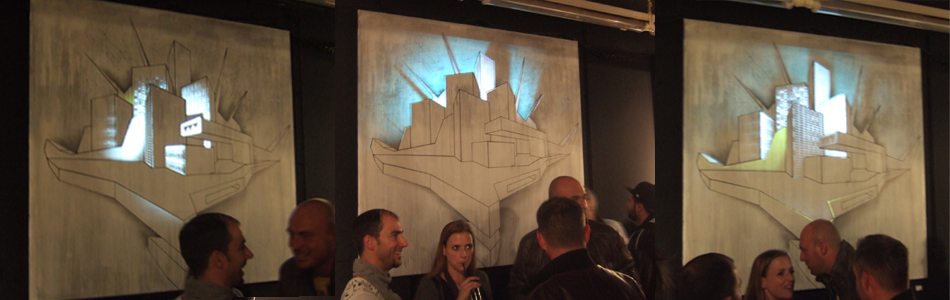
Graffiti artist Marc C. Woehr and Interaction Designer Achim Kern have collaborated on this project to augment graffiti using light. The installation with the title 'The City Never Sleeps' features a Woehr drawing and uses projection to light paint into it.
It is quite amazing how the light has the power to completely change the scene. It is possible to turn the whole thing inside out by lighting up the facades of the buildings and taking them out of the darkness or especially when the sky behind the buildings becomes the focus of the activity.
Image taken from Achim Kern / Impression form the exhibition where 'The City Never Sleeps' was shown. The artist were not atisfied with the exhibition pace, not dark enough, so they prduced a second visual shich can be seen HERE.
Graffiti feature everywhere in the urban scene and are already quite a lively part of the street scape, since they apear and disappear on a short term basis. Adding the temporality of the lighting this could grow into a fully blown interactive urban landscape using augmented reality or tagging technologies. Maybe even in combination as demonstrated by the Tales of Things team at the last CASA Seminar. Martin de Voot demonstrated how to use QR tags as AR tags.
With technology becoming available, especially for examples mobile projectors this could be a fantastic feature for the urban context. Products are available for examples from Microvision.
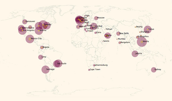
The NCL raw data collection has been running continuously over the past few weeks and data has been collected for cities around the world. It seems time to update the world map from is previous version. So far we have covered 67 cities. However they are not all mapped yet. This will take a bit more time, but we are working on it.
In fact, so far we have in order of appearance: New York, London, Munich, Paris, Moscow, Sydney, San Francisco, Barcelona, Denver, Hong Kong, Beijing and Chongqing. Further more the urban areas that need processing are: City Abu Dhabi, Amsterdam, Athens, Atlanta, Bangalore, Basel, Berlin, Bogota, Boston, Cairo, Cape Town, Chicago, Doha, Dubai, Dublin, Glasgow, Guongzhou, Istanbul, Jakarta, Johannesburg, Lima, Liverpool, Los Angeles, Madrid, Manchester, Manila, Mexico City, Mumbai, New Delhi, Oslo, Rio de Janeiro, Rome, Sana'a, Santiago, Sao Paulo, Sfax, Shanghai, Sofia, Stockholm, Taipe, Tehran, Tokyo, Toronto, Tripoli, Tunis, Vancouver, Zagreb.
The NCL maps show a virtual landscape generated from geo located tweets sent from within a 30 km radius of the urban centre.
For now there is an updated world map of NCL world map with links to the individual locations. A link is provided to click through to the interactive and zoomable version of the individual urban area map. This will allow to explore the city of interest in more detail. It does now including the covered area. If you zoom in to a location the 30 km radius is plotted as an overlay.
For a large scale map click HERE. The maps were created using our CASA Tweet-O-Meter, in association with DigitalUrban and coded by Steven Gray, this New City Landscape represents location based twitter activity.
There are, as pointed out in earlier posts great variations between the cities activities on twitter. Also the number of geolocated tweets vary dramatically. So far Amsterdam is clearly leading the table with over 50% geolocated tweets. Compared the most active cities London and New York both on average send about 10% geolocated tweets.
Image by single-blogs for NCL / Urban Areas with total number of tweets (purple) and total no of geolocated tweets (yellow)> This gives an idea of the relationship between tweets and geolocated tweets in different areas of the world.
The space we work in is subject to personal adjustments and preferences. To the extend possible it gets customised and personalised. This is, if working in a large corporate company not always posible to the extend desired and often is reduced to putting up a photograph of a loved one or a colourful coffee mug.
However, how do we choose our workplace if there is a lot more freedom, how do you create your working environment at home? The MyDesk interview series is looking into this and unveils freelancers work desks and other workflow secrets, of course with great snapshot.
Image taken from the desk of / Photograph of Robb Ogle's desk. He lives in Ontario. Prior, three years were spent in New York after seven years in Boston as a graphic designer and occasional typography professor. Even before that, a lot of Pennsylvania, Georgia, and Wisconsin happened. He is fascinated by words and pictures of words.
Kate Donely describes her 'Desk' projects as "A site dedicate a site solely to canvas of the Desk.
A Desk is where we work. Symbolic. Physical. Present. A second and third home. A Desk is a platform. A hearth. Roots are planted. It’s where hours upon hours pass."
The interviews are often very detailed and can be intimate about routines and habits. Very quickly the individual persona shows through. But still the rules for the contribution are very clearly sated "Please, don’t stage it. Don’t clean it (a messy desk doesn’t make a messy mind). Don’t make it something you or your work is not. Keep it real".
THe guardian for a ong time has this as a image with a short text in the Review section of the Saturday edition. Sometimes it was called 'a writer's room' or 'an artist's room'. For example there was Richard Sennett's writing room published on Saturday 25 April 2009.
In the interviews the desk owners get usually very personal and affectionate about the arrangements on the table. The intimacy of the scenery is real and almost always each object has its very own story and reason to exactly feature in this way.
Robb Ogle explains about his arrangements "Ugly little vinyl pitbulls from a bubble vending machine atop one of two Behringer Truth monitors which sound like heaven. Little Nemo in Slumberland vol 1. from Sunday Press Books sits against the wall. Off to the left, rolled up poster by Derek Hess.
Image taken from the desk of / Photograph of Adrian Tomine's desk. was born in 1974 in Sacramento, California. He is the writer and artist of the comic book series Optic Nerve, as well as the books Sleepwalk and Other Stories, Summer Blonde,and Shortcomings. His comics and illustrations have appeared in The New York Times and McSweeney’s, among others, and he is a frequent contributor to The New Yorker. He lives in Brooklyn with his wife and daughter.
"It appears you are quite organized." And Adrian Tomines replays (see his desk above) "Other cartoonists make fun of me for having such a spartan, tidy studio. All my friends have these amazing rooms filled to the rafters with books, toys, artwork, etc., and then my studio looks like it belongs to an anal-retentive architect or something. It’s probably some low-grade OCD thing, but I actually have a hard time working in a cluttered, pack-rat environment."
The importance of the little bibelots is very present in these documentations. Sometimes the technical equipments can play this role and has an individual story, mainly in the case of geeks, but very often additional elements such as figures and collectables, which appear to have no apparent use, occupy these prime spots in the workery scene. It is all about inspiration.
I will be giving a lecture today at the Bartlett School of Architecture to the MA Urban Design course students. The course is directed by Professor Colin Fournier. My talk will focus on the spatial dimension of narratives and time in everyday urban live. The different topics discussed are Repetition, with an introduction to the machine city and different types of cycles to create an identity of the place, Time as a framework of organisation, Space as a result of body physicality and experience, Pattern as a combination of time and space and a conception of place as mental maps to Morphology as the physical result of the narrative created. As illustration material serves the data collected via the twitter microblogging site, the New City Landscape maps, as well as urbanDiary GPS tracking data.
Talking cycles and repetition, this is probably the most prominent example everybody remembers from primary school, the water cycle. The rain comes down over the mountains filters through the stone, a spring, a creek, a river, a stream into the ocean, where it is picked up by clouds, ferries to the mountains.
A fairly romantic picture, but definitely a basic diagram explaining connection. Also it servers very well as a starting point for questions. For example for a six year old, why is the water salty in the ocean, but not the rain? How does the water know the way to the ocean? And why are the couds not drifting of to the moon?
This could go on and on developing into a full blown session on earthly systems, but it is all about the basic idea of a systemic concept. It is not about what happens it is more about what happens with it.
So or an ad explaining what a water supplier company does, this is a gold one, back to school.
Taking pictures is the main activity for tourists. They are constantly snapping away, trying to capture the extend of their explorations, banning experience onto the sensor. A certain desire drives them, the eager to document what has happened in order to proof that it did.
It is like almost taking a piece of it home. This idea of possession or conquering is still part of the human nature as hunter and collector and going on holiday is only successful once one can see the perfect view on the tiny little LCD screen of the camera over and over again. Like a box ticked.
Image taken from mymodernmet / St. Basil's basilica on the Red Square in Moscow
The Swiss artist Corinne Vionnet has built here work 'Photo Opportunity' around this topics. From online sharing sites she sources her material of hundreds of similar snapshots of landmarks, in German 'Sehenswuerdigkeit' (literally translated 'worthy to see'), and overlays them as transparent images. The results are slightly blurred, but recognisable images of the landmarks of the top snap shot locations around the world.
Regarding the sourcing of images Vionett explains "This work is intrinsically linked to the people who took these pictures. The collaboration is obvious, but it is without their knowledge. These pictures are on the Internet, to be seen by any eventual visitors. I am just one of those visitors. It is the sheer quantity of these almost identical pictures that gave me the idea of superimposing them. I do not think I would have had the idea if I had made all these pictures of the same places myself. Anyway, the work would loose its meaning."
Image taken from photolucida / THe Parliament in London
The images evoke a sense of a collective memory. They quite literally illustrate this idea of hundreds of people sharing he same experience. In this case it is having see the same thing, or more precise having taking almost the ame picture. What they have seen is not quite clear.
Interesting is that each image shows the same subject, largely they are visually the same images. However the collective memory is defined by Maurice Halbwach as: "While the collective memory endures and draws strength from its base in a coherent body of people, it is individuals as group members who remember" (Maurice Halbwachs, Collective Memory, p.48) His conception of collective memory as a very confined and group specific construction is very clear and he was one of the first to promote this idea of connected and very local collective memories.
Image taken from photolucida / The Forbidden City in Beijing China. Here Vionnet has focus on the Mao portrait to adjust the different images overlaid.
A similar approach is taken by the German artist xxxx. He also uses online photo sharing platforms such as flickr to manipulate images and provoke memories of personal experiences. He explains: "The installation consists of two projections, the perception and the memory layer. Both shell be explained in what follows. The perception layer represents the sensory memory before any priorities have been chosen. It receives the newest images from flickr (flickr.com) which get distorted, mixed and blended to persuade some sort of sensory noise."
Image taken from Matthias Dörfelt / Screenshot of my installation "Selective Memory Theatre" which is my bachelor thesis at art school.
The thing with time is that if your not on it, you might have missed it. The opportunity windows are small and meeting with others' shedule might be tricky. This is the same in the ever so present online networking world. Nothing is more boring than a static profile page as you might have on linkedIn or Academia. However, this is one of the option for not to get missed, just be always there.
In the ephemeral world of twitter, facebook, gowalla or foursquare this is not an option. If your facebook page hasn't changed in the past day, something is wrong, if you haven't checked in at any location that day on foursquare you must be very ill and in bed and if you did not send any tweets in the past hour this isn't gona work.
The flow of tweets however, does not guarantee that if you tweet your tweet is being read. On the contrary things are changing fast and as a tweeter your basically battling on your own against the rest of the tweeter kingdom for a sunny spot on the top of any readers list, but on time. Right at that moment this follower of yours is actually reading the first three tweets on the feed, picks the one you wrote and retweets or replays or clicks, but does something with it.
This is tricky, but time is on our side, or better the human desire to organise around it in cycles. Even here on tweet-eden routine rules the behaviour and there is a certain time of the day your tweets will have the prime spot, most-impact-in-24-hours-moment it would be called.
And of course there is an app for everything - here is TIMELY. It is simple but functional. Write a tweet you want to send out, timely looks through your past 199 re-tweeted tweets checks them agains a 24 hour timeframe and calculates the time of the day your tweets had the most impact in the past. At this very moment in the upcoming 24 hours your tweet will be sent. Ever though of something like that?
There isn't much more to it, really. And to proof the point, the guys at timely, actually flowtown, provide you a basic statistic with the past tweets send on this platform showing the number of clicks, the number of retweets and the number of readers (potential readers) your tweet has had so far.
With this you can really start to enjoy your day. No more worries about keeping up with the bomb shell tweet, just follow the stream of incoming messages, relaxed you can watch other struggle along with tweeting, everything with the peace of mind that your three tweets scheduled will be on time. Thats all that counts.
Of course timely does offer other functions, for example you can have multiple accounts, or invite other people to schedule tweets on your timeline, this is great for collaboration on one account. It features an integrated url shortener that actually work The settings allow you to controle how many tweets will be sent per 24 hours and accordingly the analysis will be adjusted. Weekends can be different or ignored and you can also force a tweet to go out in the next 30 minutes, of course timed to fit the best time frame.
One thing to mention though is that the management of the queue, you can prewrite a whole list of tweets, is tricky since there is only a delete, edit or move to the top button. A move up and down, especially for the top few in the queue would be very handy.
Anyway try it for yourself and get your tweets out on time. At least some of them, you can still use in parallel other platforms to reply or interact, this is gona be the back bone to keep your twitter account running on time!
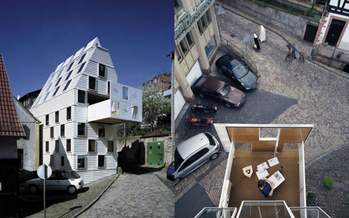
Architecture is the creation of space for people to move in. All the most things can be moved within the spaces and rooms, definitely not the rooms themselves.
But wait, wasn't there this house in Paris, by this french guy, you know the .... Jean Nouvel, you know the Institut du Monde Arabe with its moving facade. Elements of high-tech photosensitive mechanical devices are used to control light levels and transparency. It opens and closed mechanically in the fashion of shutters used in photo cameras.
Image taken from obviousmag / 3D section of the rotation tower and view from the balcony. To move this 5000 m3 and 1500 tons mass, the architect Invernizzi conceived an artful system of 3 circular rails connected to the cover of the basis-building, where a bunch of 15 "roller skates" were sliding mutually with the superior building. The energy was provided by two diesel motors that afforded the displacement at a speed of 4mm per second, allowing a complete rotation in 9 hours and 20 minutes. It's more than the necessary time to follow the sun movement.
Oh and there is the version of the rotating restaurant just like the one on the Schilthorn, Switzerland, you remember the scene in this James Bond movie, On Her Majesty's Secret Service ? These sort of restaurants were the big hit in the seventies and eighties. There is one on the top of the BT tower here in London. It has been closed since the 1980ies and was used as a call centre by BT. Plans for a reopening were handed around in the past two years, but its gone all quite now.
Keeping it rotating there is the Dynamic Architecture project pursued by Dr. Fisher, the rotating tower in Dubay, we have all seen renderings of.
And yes, let me give one more example, the Villa 'il girasole' near Verona, Italy. It was built by Angelo Invernizzi and Ettore Fagiuoli, with the help of their artist, sculptor, designer and architect friends. Only recently it was completely restored by his daughter. See the trailer of the film 'Il Girasole: A House Near Verona' by Marcel Meili and Christoph Schaub. Goes HERE for a flight to the location of the house on Google Earth.
There are quite some examples and architecture does move, in parts. You can probably think of a few yourselve, please pop them in the comments. In fact some of the very important developments in architecture actually have to do with motion. Maybe the wheel could be one, to transport the building material, then the elevator by Elisha Otis was definitely an important development in the 1850ies boosting the hight of the buildings and then in modern buildings there is so much technology reliant on movement, such as sun shading, ventilation, escalators, doors and windows and so on.
The Birkhauser publication 'Move: Architecture in Motion: Dynamic Components and Elements' brings these mobility aspects in architecture together. However it is not just a listing of curiosities, it is also a design manual as it documents in detail how each example works, is designed and built. This includes photographs text, but also detail drawings.
The structure of the book follows an ordering principe of the actual motion the architecture does. This is interesting as it provides a degree of abstraction, very useful to compare and asses the different examples. The list is as follows swivel, rotate, flap, slide, fold, expand and contract, gather and roll up, pneumatic.
Image taken from yatzer.com / The residential building negates the usual distinctions between inside and outside, public and private. Passers-by can look inside and see what they would normally expect to find in the outdoors: a rocky area. The private spaces are suspended above. The building unites art and architecture. The art created here is integral to the house, but also autonomous. This increases the communicative power of the house. Living Room speaks to the people and the things around it - and awaits response.
This is however, only the second part of the book, there is a first half to it. Here the authors discuss the different aspects of movement in architecture. This ranges from a chapter on energy evaluating the different technologies for solar gain (Institute du Monde Arabe as above), ventilation and heating and so on, to the movement as an activity using examples of video theater an film as well as the discussions around smart materials and smart structures.
This is really a hands on book, in the sense that it discusses the topic from beginning to end, not linearly but in ordered fashion. Moreover it is not just a showcase but a discussion and definitely a book that belong in every architects library, things are moving and architecture does too. You just have to plan it in the right way and it can be a dream come true.
Image taken from library du moniteur / Move: Architecture in Motion book cover.
Four steps, picture, four steps, picture, four steps picture, it must have counted him in such a sequence for the ret of the week after Ken Ardito finished his timeLapse 'Walking'. Exactly 743 times he's taken a picture after four steps. What's this thing with four steps?
Not sure but it works and the result is a a lovely stroll through Brooklyn, there is the bridge, some familiar high-rise buildings, a fright ship sails up the river and a ferry arrives. Just the normal day that is.
Slightly whitish in stile it flows in pairs of four, why not? Here you go.
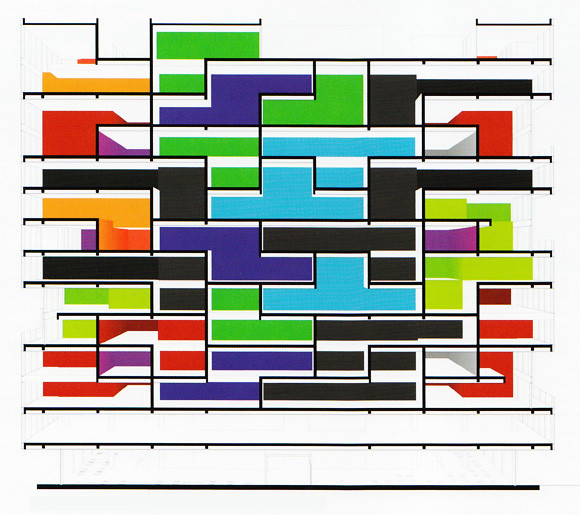
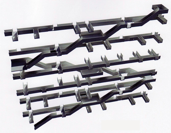
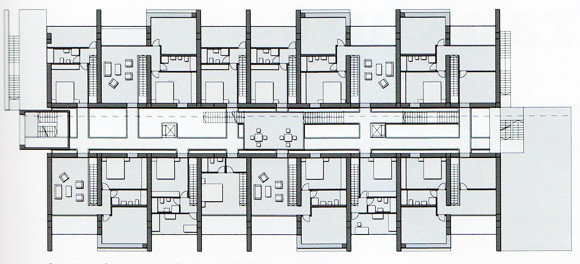
Not only since the dawn of the financial crisis are the high street and office spaces under pressure. Flexible working schemes and online shopping also pull revenue out of these traditional markets. As a result, especially with shops the small and independent units are disappearing and big chains fill the city centres. However, on the fringes, more and more empty units, both business and retail are left unused.
The architecture in many of these buildings has been rather specific and very clear in its typology about the usage. A shop is a shop and an office building is an office building. But what to do with them if they are empty? They leave massive holes in the urban fabric, simple because they are under used or unused.
Image taken from single-blogs on flickr / Section of 'Living Cubes' by Jan Conradi and Jens Ullersperger.
Together with the idea of the functional city, these usages have established themselves in central city locations taking over and pushing out any other use, including living. As a result most western cities have no, or very little mixed usage in central city locations.
The decline in shops and office needs could be a chance to reestablish pockets of housing in these location in order to reclaim the city centre also as a place for housing. However the main chalenges are the sustainable and typological adaptations of a mono functional area. How to live in an office block?
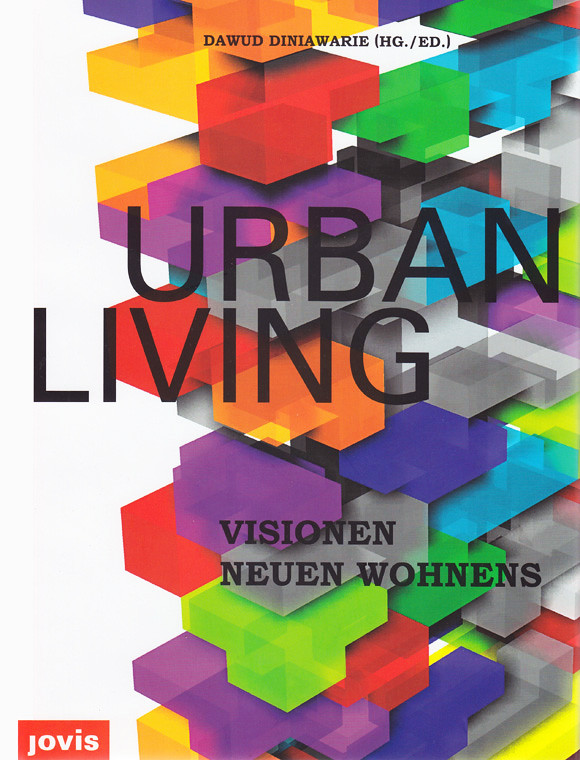
In an international student competition this question was addressed. The results are summarised in the JOVIS publication 'Urban Living' and give an overview of ideas and concepts to reuse office buildings and develop innovative urban housing concepts.
The competition was sponsored by the 'Immobilienforum Frankfurt' as they have realised the decline as well as the potential. At the time they estimated, that across Germany in the seven most important business locations (Berlin, Duesseldorf, Frankfurt, Hamburg, Cologne, Munich and Stuttgart) more than 10% of office space in prime locations are unused. In cooperation with the Deutsches Architekturmuseum Frankfurt (DAM) the international competition was launched in 2007.
Image taken from single-blogs on flickr / Top: Visualisation of staircase and gangways of 'Canyon Connection' by Jan Becker. Bottom: Floor plan first floor of 'Canyon Connection' by Jan Becker.
The publication showcases 46 projects of great variety, all based on existing office building structures being transformed into housing. As you would expect there is the bare concrete 80ies office block with the dominant structural facade towering over the rest of the street now turning into a gentle and soft host for a variety of living concepts.
The projects show an impressive variety of ways of living. The students have really put some thought into, not only transforming the existing structure but also ways of live and organisation of living. There are a lot of merging activities, working and sleeping overlaps as well as privat and semi public to public space are here conceptually possible in the same space. Often these solutions imply a temporal separation. In this sense time is added as an additional dimension to organisation of living and activity.
Overall concepts fo course bring in the normal suspects, nomade living, nested units, communal concepts, mobile units, green living and so on. However, most of them have a unique twist to it, probably not least because of the unique setting.
It is a great task for students to be challenged by the constraints of such a 80ies monster, but also a very interesting contribution to a ongoing urban discussion. Eventually this scenario will become reality and the vast number of these structures is a chalenge of change.
Image taken from single-blogs on flickr / Urban Living Book Cover, visualisation of the project 'Living Cubes' by Jan Conradi and Jens Ullersperger
Diniawarie, D., 2009. Urban Living: Visionen neuen Wohnens Bilingual., Berlin: Jovis.
In a land fa far away three days can be endless. In tokyo the mother of all 24 hour cities this is definitely the case. However if you have time to spare and musse to dive into the endlessness you might as well become one with the place explore every inch.
In 'Totally Tokyo' Will Armitage has done exactly this and filled his camera with images on the way. THe result is this great timelapse, a never ending flood of people, building, roads and lights, infrastructure everywhere. A short personal portrait of a city that never sleeps in a far away land.
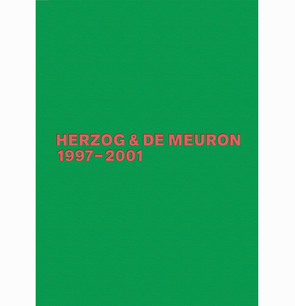
The fourth volume of the documentation series about the work of Herzog & de Meuron 1997 -2001, the Swiss architecture practice is very much in the tradition of the previous publications. It still uses the Remy Zaugg homage cover. However, the office and the architects are now superstars and part of the leading elite in the architecture scene. This is visible in the publication very much in Herzog & de Meuron (HdM) fashion, as a neatly designed, understatement pretending firework of surprises.
This doesn't really go together but the Birkhauser publication in the 1. edition manages exactly this. A book able to reproduce exactly what the content is capable of in a very independent and clear manifestation of good design.
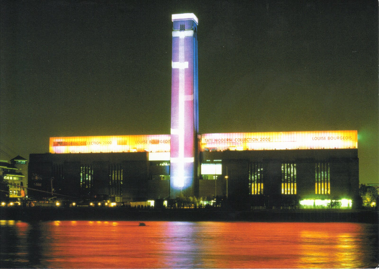
Image taken from postales inventadas / Night shot of the Tate Modern building, the former power station on the south bank of the River Thames.
As the author Gerhard Mack points out in his introduction in between the third and this fourth publication about the work of HdM they entered the ranks of architecture superstars, mainly at first in connection with the Tate Modern museum project in London. However subsequently through out the documented period in this publication 1997-2001 they reinforce this position with every project and receive in 2001 the Prizker Architecture Prize.
This publication pretty much covers the architecture icons a the turn of the century. Each project is very well known and had, most still do its very own impact on the architecture scene and beyond.
A series of very large museum projects basically form the spine of this period. Starting with the Tate Modern Building in London, to the Expansion of the Aargauer Kunsthaus in Aarau, Switzerland, to the expansion of the Museum of Modern Art in New York, USA (project), to the Kramlich Residence and Media Collection in Oakville, USA, to TEA, Tenerife Espacio de les Artes Santa Cruz de Tenenerife, Canary Island, Spain, to the Schaulager, Basel, Switzerland, to Jack S. Blanton Museum of Art, Austin Texas, USA, to the de Young Museum, Goldengate Park, San Francisco, USA, to the Walker art Centre, Expansion, Minneapolis, Minnesota, USA, to the Expansion of the Kunstmuseum Basel, Switzerland (project) and the Caixa Forum in Madrid, Spain.
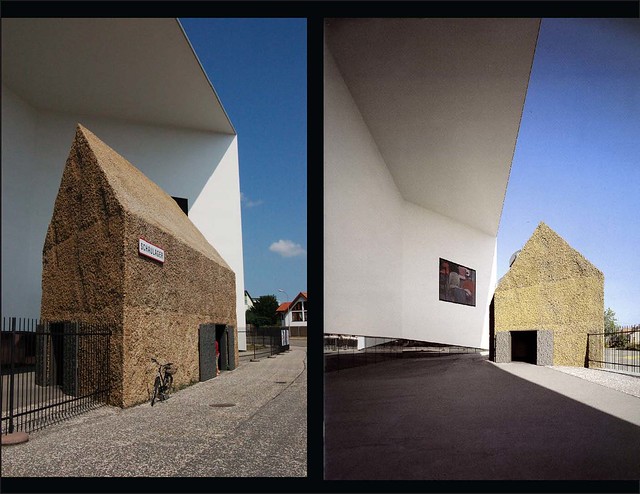
Image taken from Evan Chakroff / HdM - Schaulager, Basel, Switzerland, two views of the entrance with gate house.
A sort of surprise in this publication is the privat business/residential project XXXX in Basel, Switzerland. It seems to be the first an only time this project has been extensively documented and published. It has a really fascinating roof concept, something HdM have developed further in following projects.
Their activities however not only focus on the building of architecture. The number of publications they have published is extensive and HdM are involved in different research projects as well as teaching. At ETH they run their own Studio since 1999, called ETH Studio Basel, since they are from Basel and it also is based on Basel, a unique situation for the ETH. This studio is run together with Roger Diener, from Diener and Diener, Marcel Meili, from Meili Peter. With a group of students the studio investigates different aspects of the urban context. This can sometimes be a longterm project involving changing groups o students as for example with the project 'Switzerland an Urban Portrait'.
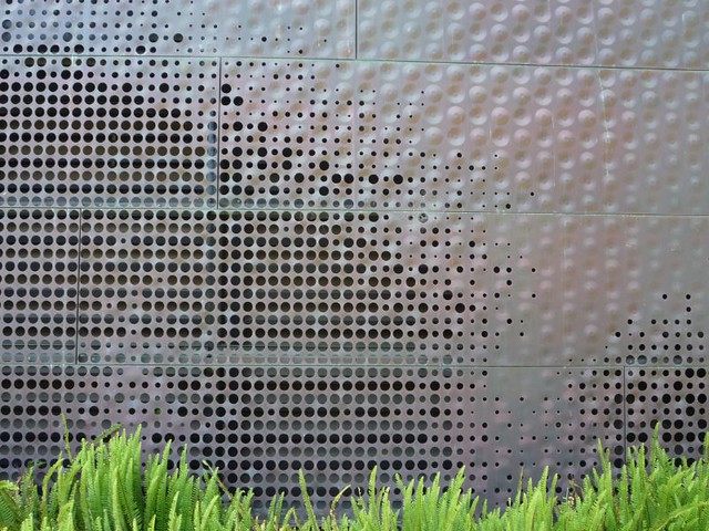
Image taken from architechnophilia / De Young Museum, San Francisco, USA, detail of material and treatment.
The publication is extensive and the projects each are documented carefully and in detail. It is not that this is just some book about Herzog & de Meuron, but this is the book about HdM. The author Gerhard Mack is working very closely with HdM and the office produces all the required content themselves. In this sense the office is almost co-author but at least contributor.
In terms of the book design, for this volume new graphic designers were on board and this is really visible. The publication has its very own character. It is based on traditional very well structured book design, but extends, adds, ignores and overrules it where ever possible. There i a lot of playing with the font, sizing and borders, really keeping the reader on the toes, in a very good sense.
the different sections are clear and distinct and together contribute tot he whole of the publication discussing different aspects. This includes the inside cover with the icons of each project right through to the last bit with the spread wide photographs of the different projects. In a sense the publication manages to extract the anatomy of the complete work only to bring it back together as a narrative of singular projects.
Image taken from architonic / Herzog & de Meuron 1997-2001, cover
Sound is part of the everyday experience landscape as much as the visual, however dramatically less present. The dimensions and the extensions of sound scapes were earlier discussed in the MyTime interview with Salomé Voegelin.
One of the major topics in this discussion was the relationship between sound and space or the construction of an soundTimeSpace a Voegelin called it.
Image by Andriko Lozowy taken from merlepachett / View of a tailings pond and Syncrude Oil Sand Mine in the distance.
In some new research work, Merle Pachett investigates sound landscapes. She has be working recently in Canada and her project im by mapping the acoustic ecologies of the Athebasca Oil Sands to develop on the work of the ground-breaking 1970’s project Soundscapes of Canada whose objective was to capture disappearing sounds in response to over noise pollution.
In her most recent presentation of the collected raw material she collaborates with a photographer, Andriko Lozowy, from the University of Alberta. The two media appear to work rather well together and do not simply merge into one as if it were video recordings. The tension that builds up between the different media is really the interesting bit in this documentation.
It is not as if sound was too boring to listen to just like that, but with the photographs a certain dialect emerges between how it looked at this time and how it sounds in this moment.
It seems surprising how the aspects of time play a very different role in both these two medias. We are trained and have acostomised to read photographs as a document of the past. Certain aspects of the image can be read as to guess the approximate time distance. With sound however, this seems less of an immediate reaction. This data is much more in the present, there is not this reflex as to put it as something of the past.
The Feltron Annual Reports have become something like an institution. On one hand for the graphics they celebrate but on the other hand also for the content or topic each report focuses on.
In the current design climate of hyped data visualisation the Feltron Report is one of the leading publications. Even though the series started earlier in 2004, it became an icon with the 2007 report. It features for example in the great documentary 'Journalism on the Age of Data'.
Image taken from Feltron / Page 3. The 2010 Annual Report on personal activities.
How are these reports compiled? Feltron explains in the FAQ: "The first and most difficult step is to keep meticulous records of the year. On top of my own records, I rely on services like Last.fm, Netflix and Flickr to keep records of my music-listening, movie-renting and photo activities. For my offline activities, I make daily recordings in iCal which are later poured into spreadsheets to enable counting and comparisons within the data."
The rising interest has lead to the creation of the logging platform Daytum. Here individuals can start collecting data about everyday live activities as a sort of log book. Further more the page offers the option to also visualise the data, of course very much in the style of the Feltron Annual Reports.
Image taken from asis&t / The personal logbook at EMoore.
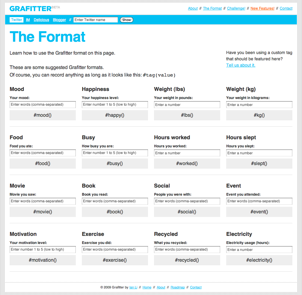
Other Self Surveillance Services could be Moodstats or lifemetric. A more embedded approach takes grafitter. It monitors your twitter account and picks up on defines hashtags. This can then be graphed out. So you can tweet away your log book.
Image taken from farm4 / The settings and hashtag definition page at grafitter.
The lates Feltron report departs from the personal log book and maps out a third persons life line. In this case it is Feltron's father. This relates very much to the Travel Pattern Over Generations report compiled by David Bradley. It is an interesting documentation, not so much in it self, but very much as a personal comparison. With the personal dimension of the data it is very easy to relate to it and the primary reading of it will be in relation to one's own history.
Image taken from Feltron / Page 4. The 2010 Annual Report is an encapsulation of my father's life, as communicated by the calendars, slides and other artifacts in my possession.
The Feltron Reports are available for purchase in the Feltron Shop.
The Internet of Things (IOT) is taking shape. Idea and practice, applications and concepts, as well as discussion and writings are shooting out of the ground like mushrooms, great. A term old enough for most of too old to be around, the vision seems finally to grow into an actual practice.
It is no only the line up presented earlier at the be2awards, the sort of pachube and TalesOfThings, but many more like ioBridge, the NabazTag or also IBM's 'Building a Smarter Planet' project largely builds on networked things.
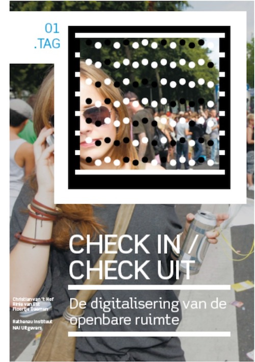
NAi Publishers bring with 'Check In / Check Out, the Public Space as an Internet of Things' one of the first books on this topic in relation to the use of space. The authors Christian van 't Hof, Rinie van Est and Floortje Daemen clearly focus on the public real in urban areas in connection to this new technologies. This connection is quickly established with the authors describing the move from 'on the net' to 'in the net' via the gadgets increasingly used in public spaces and on public transport. On the other hand also the public space as such is wired up with CCTV cameras, RFID and NFC chips, pollution sensors, temperature sensors or weather stations. All linked to the net for remote sensing and data gathering for evaluation and decision making.
The book itself is using tag to extend the content into the virtual dimension and link external content such as sound and video files to particular paragraphs in the book. For this the Microsoft Tag is used. A self acclaimed next generation of QR code. MS also offers tag readers for mobile patforms such as the iPhone and Android. Use this LINK from your mobile to download the corresponding tag.
The first tag let you check in, to the book I presume, but for the content of the book you have to read on conventionally. In six chapters the publications discussed the most important fields IOT is increasingly active. Those are 'Gated Stations' on the rise of chip card in public transport, 'Networked Cars' on linking cars to establish intelligent traffic, 'Money Mobiles' on paying by phone, 'Street Imges' on CCTV and surveilance, 'Geoweb' on live mapping and 'Living Maps' on a scenario of total real time data streems.
A lot of these systems are already quite established in the western world and people have started to accept their presence. We are using the chip card, Oyster Card in the case of London or Octopus Card in the case of Hong-Kong, on a daily base, being tracked forexample for the game Chromaroma. Paying using alternative methods, not cash, is widely established with changing technologies and tools, networked cars is something researchers and developers are already talking for quite a while, so it seems familiar even though it has not been realised to a large extend. Automobile industry is again painfully slow integrating innovations. And of course the Geoweb and to some extend the Living Maps are both practices we are in the middle of at the moment.
The book offers a very clear structured approach to discussing these topics both overall and within each chapter. At times it is a facts book, at time an experience report and then a outsider perspective. However the structure is always clear and informative if at times with a few too little references. But hey, its early times and things are completely flowing.
What is extremely appreciated, is the critical distance and the book establishes through out and within each chapter it self. It is not a selling text for the IOT, but a critical discussion raising concernes equally to praising benefit and potential.
"Big Brother, once a warning against totalitarianism, now has become a symbol of the importance of being known" (P.112)
In this sense the final chapter the 'Conclusion', on identity management, makes these points once more very clear in a summary and outlines avenues for future practice whilst employing these emerging technologies. A must read for network-developers, and urban-computer-programmers, digital-interaction-designers, virtual-data-architects and sensorist-planners to keep up with the discussions.
The internet has become this wast virtual pile of linked information snippets, data streams are poring out of every button, code is behind every pixel, it is everything and nothing. Finding something is what it takes, even if your not looking for something. Navigating and orientating is what we spend our time doing as we dash through cables globally.
A Google Search promisses wonders and this doesn't need much promotion, since everybody is in the boat and captain G has got his hat on. It is not about the course we are sailing but about the fact somebody is taking care of things, somebody is watching, steering and comes up with a destination.
This is not far from were we have started from and things might just be around the corner. Why wait there is another term with an underline, another one, one more. And now we are lost, going nowhere, just clinging on to links and bold type titles. No worries since we are not going places we have time to go down this alleyway. Lets explore his topic or this wiki. This is what we know, its collaborative just strolling.
There is much to this getting lost and more it is related to la derive than Situationists ever had dreamed of, getting lost is practice 50 odd years on. Maybe its the naked internet that tells the story, or the joy of losing touch to reconnect on 140 characters a second this is short. I have to go I'm late got lost, but sure I'll be back, an sailer at heart.
Not with promotion but with engagement the search giant bring the narrative as method and make your own. The link is HERE and instructions can be found on the Google Blog. It comes in seven steps with sound, great fun. An the new single-blogs trailer:
The Google Version was played during the Superbowl and inspired this simple editing tool to be made available, every little clip, home made, is an ad more.
This Wednesday at the Building Centre in London was the big BE2 show up with awards of course. In sixteen categories 64 projects, teams and individuals were nominated. Awards are numerous and everywhere they are won or lost, but BE2 promisses to be more than that. The BE2Awards grew out of the BE2Camp a plat form to promote web 2.0 applications in the context of the built environment, eg for planners and developers. A number of camps too place since 2008. Now the Awards area logical next step. "It's now time to start shouting about some of the best practice that has emerged. It's time for the world's first awards for social media in the built environment."
Image taken from ecologiqyest blog / In order to store and track the stories behind the objects, as well as connect people with similar experiences, Tales of Things launched a website that assists those trying to sell their second-hands on ebay or other e-commerce sites by allowing the media-link through QR from their beta site.
The structure for the awards was: "the Be2 award nominations were sourced from you, our "crowd", and voted upon by the same "crowd": you. This helped ensure we got a wide spread of nominations, and also encouraged shortlisted candidates to mobilise their supporters once online voting began." In this sense it was also a test for BE2 on how good they are able to mobilise the crowd to actually make this work. And it worked out for both the nominations and the voting.
Image taken from Marko Manriquez / This is my first attempt to visualize a data feed from Pachube (energy consumption in this case) using an augmented reality app. The app in question is Porthole, powered by Pachube, a cool and easy to use augmented reality (AR) application that provides a view into the data environments hosted by Pachube. Pachube itself is a vast data brokerage platform for the internet of things, managing millions of datapoints per day from thousands of individuals. Its created by Usman Haque who designs interactive architecture systems and researches how people relate to each other and their spaces.
The winner were announce on the 9th of February and were voted for on the website. In total some 40'000 vote came in to support the contestants. The full list of winners:
Joe Peach won two awards for him self as a blogger in the category best blogger and another one for best blog for This Big City. A blog on everything urban and sustainable covering stories around the planet.
In the category Best 'Internet of Things' application the Tales of Things project developed at CASA was the winner. The team with Andrew Hudson-Smith from digitalUrban, Ralph Bartel and Martin de Jode developed it here at the Centre for Advanced Spatial Analysis together with Brunel University, Edinburgh College of Art, University College London, University of Dundee, University of Salford for the past two years. Its great to see this now winning the first award. This category is definitely going to see many more applications to come in the near future. ALready there was stiff competition in this category with patchub, bubblino and sen.se.
Image taken from fazeleyevents / He watches twitter for a chosen keyword and every time he finds a new mention then he blows bubbles.