A quick visualisation illustrating the location war between foursquare, brightkite, Gowalla, twitter, flickr, blockChalck and Bump. This is a weeks worth of data. Animation is created in processing.org The data was intially collected during the South by SouthWest Interactive Festival. The live datastream was available on http://austin.vicarious.ly It is a demonstration using SimpleGEO, the online geo database project.
Rabu, 31 Maret 2010
Selasa, 30 Maret 2010
He Blinded Me With Science - Requested Tees For Teen/YA/A (Males & Females)

So hey..
I got this request from some people to make
these tees for YA/A Females and Teen Males.
these tees for YA/A Females and Teen Males.
Apparently they really like it so I thought why not making more?
Now since I have time and I'm being generous :P
I decided to make these for Teen Fems as well.
(You guys are really spoiled! :P)
So now all your geeky teen sims in the hood can have these XD.
SCIENCE = GEEK (?)
I decided to make these for Teen Fems as well.
(You guys are really spoiled! :P)
So now all your geeky teen sims in the hood can have these XD.
SCIENCE = GEEK (?)
Then I'm a geek...well, not really. :P
Anyway, almost forget, the tees can be found in
Everyday, Sleepwear & Athletic category.
Recolorable
(except the stencil part)
And there's 5 Tees in each file.
I made all of them in one row.
+ Bee Robot +
+ Robot For Science +
+ Robot & Ghost +
( As seen here)
+ PlayBot +
+ Do You Like My Robot? +
Well, Enjoy!
Go Simming!
Have lots of FUN!
NewOne
+ TEEN MALES VERSION +
(click the pics to enlarge them)


+ DOWNLOAD +
FOR TEEN MALES
For YA/A Males
You can get it here
------------------------------------------------------------
+ FEMALES VERSION +

Models by Me:
Alice
Ashton
(Teen)
Custom Content By Me:
Skinny Jeans For Teen Males
Custom Content I used:
Skins by Aikea & Subaxi
Hairs by Anubis & Peggy
Brows & Blush by Subaxi
Lipstick by Lemon Leaf
Eyeliner by Rose Sims
Eyes by Sims2Time
Credits:
CTU Team for the tool
All creators above for creating cool CC. Thankies!
Alice & Ashton
<3
Anyway, almost forget, the tees can be found in
Everyday, Sleepwear & Athletic category.
Recolorable
(except the stencil part)
And there's 5 Tees in each file.
I made all of them in one row.
+ Bee Robot +
+ Robot For Science +
+ Robot & Ghost +
( As seen here)
+ PlayBot +
+ Do You Like My Robot? +
Well, Enjoy!
Go Simming!
Have lots of FUN!
NewOne
+ TEEN MALES VERSION +
(click the pics to enlarge them)

CLOSE UP


+ DOWNLOAD +
FOR TEEN MALES
For YA/A Males
You can get it here
------------------------------------------------------------
+ FEMALES VERSION +

+ DOWNLOAD +
+ + + + +
Models by Me:
Alice
Ashton
(Teen)
Custom Content By Me:
Skinny Jeans For Teen Males
Custom Content I used:
Skins by Aikea & Subaxi
Hairs by Anubis & Peggy
Brows & Blush by Subaxi
Lipstick by Lemon Leaf
Eyeliner by Rose Sims
Eyes by Sims2Time
Credits:
CTU Team for the tool
All creators above for creating cool CC. Thankies!
Alice & Ashton
<3
Presentaion Tool as You Dream it
Prezi the tool you have been dreaming of ever since you were forced to use powerpoint for the first time. Finally these dreadful times are over! Prezi is here and it work! There is little to be said just head over to Prezi and start using it. Alternatively you stay here and test it right below with the embedded presentation. Use the arrow to click through, once you feel comfortable you can freely interact and drag the canvas with the mouse or zoom in and out with the moue weel or trackpad gesture. Note, I had problems loading this particular prezi with my chrome browser. I am having an issue with flash, safari and firefox should be safe.
However if you are still here, or you have come back, here is some more information on what it is and what it ca do.
It is a flash based application that will allow you to present content in a non linear way. You re working on a single infinite canvas, on which you can arrange content. Double click anywhere to write text, add images or shapes. It works all intuitively and is graphically stylish from the beginning.
The structuring is archived foremost by panning the canvas and the zooming in or out on content. These simple gestures make for extremely powerful tools and together with the stylish camera animation the result is astonishing.
The zooming is applied already while populating the canvas. By zooming in, performing gestures know from digital map navigation, a certain hierarchy is established. Text size for example will be directly adjusted to the current zoom level. There are virtually no limitations to the zoom level. This in it selve is already an extreme feature that can be used to surprise the audience. Details can be unveiled while the show progresse, elements that were only burred lines will suddenly be the important points. This will definitely engage the audience.
The panning or sequencial camera movement is applied by a separat tool as a path of numbered dots. O course they will be invisible in presentation mode. The panning is not restricted to horizontal and vertical movement, ut can aso be rotations and with a cleaver integration this too will definitely engage.
For me the online version is definitely more interesting. Having a fast internet connection helps. The very first question then is what kind of web content can be integrated. Here the functions are limited, but the most important feature works, videos can be embedded vi youtube. Simple put the link as text on the canvas. The clip will be shown just there, however an internet connection is required.
Presentations can be either put together on line in your web browser or you can download a desktop client. The final product can either be presented online or be downloaded and be shown locally. To present locally you don't need any extra software this will be integrated.
This is a really cool tool, with the downside of the price tag. There is a free version that will have a prezi watermark on it, next up will set you back $60 or then $160 per year. If you have to give a few presentation a year and you want to spice them up while having fun this product is definitely worth it! There is also an academic license available, a great option.
So far I have been using Google docs to do my presentations, mainly because it was a simple solution to have the content I wanted to show online. I have to say, that I actually dont like it, the graphics and the interface are just horrible and the options are very limited, which in it selve is not a bad thing. But if elements can not be arranged or scaled properly, combined with limited font and colour options, it becomes extremely difficult to create a nice sheet. Also the presentation options were constantly limited to the browser window and the biggest thing on the screen was usually the Google logo. Prezi is a lot slicker and offers stile out of the box. The potential of the nonlinear structure and the power of the zoom are a revelation. For me this is definitely one of the softwares of the year! And it comes with a cool Twitter support.
Thanks for the link go to urbagram
Senin, 29 Maret 2010
Book - Grand Urban Rules
A book with a great question: what do we owe the planning and building rules? An for a change, this is a different approach to try and explain what the urban form, the urban morphology is and where it comes from.
Traditionally, this seemed very easy, being simply the sum of all the individual buildings. becoming more complicated with for examples Kevin Lynch's Image of the city were the idea settled that individuals perceive the city and this in turn influences how we understand and then obviously it became even more complicate with the introduction of the social dimension as a informing parameter of the built form, as for example in 'the Social Logic of Space'.
So it is complicated and the search for the identity of the place is going round and round.
Going back, picking up a very pragmatic element and start rolling up the question from a completely different angle could be a very good idea. This is what I thought when I saw the book.
Grand Urban Rules by Alex Lehnerer and published by 010 Publishers "is a tribute to the city's will to form...") as it says on the book back cover. The concept is then, nevertheless introduced using two aspects. One is to base it on the building rules or regulations exemplary taken from cities of central Europe and the United States with the exception of Vancouver and Hong Kong. The second aspect is then already the social connection with the statement "Setting standards is first and foremost a cultural act." So we are back in the social business, but that is most likely a very good move.
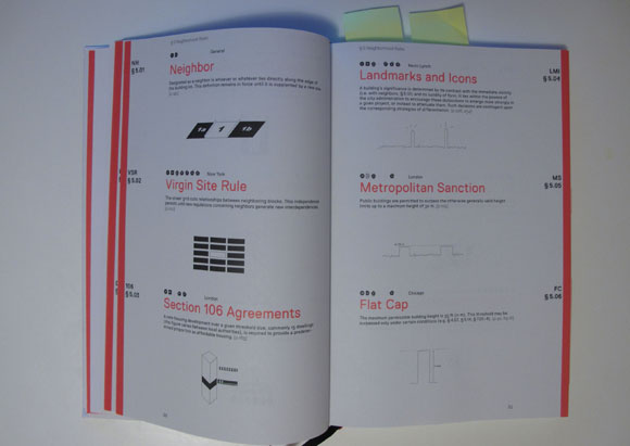
Image taken by single-blogs / Book spread with an overview of urban rules.
The book might encounter a difficult problem, a certain resistance from readers to engage, specially from practitioners side. Very often the rules and standards are something that is seen as a negative force engaging in the creative process. This often creates the two sides of the planning an building process. On one hand the authority setting out the rules and on the other hand the planner or architect who has to 'implement' them. It often ends in a battle between the two. To some extend this is ok and part of the ongoing process of finding and defining the position of the current culture, to refer back to the statement on the book back cover. But too often this ends in useless, consuming debates.
Refreshing then here, that this publication manages to completely avoid this topic and present, discuss and 'implement' regulations as a positive part of the planning process. As you start diving in to the publication and flip through the first 51 pages skimming all 115 examples chosen here you kind of forget about the battle and the misery it turns most debates into. Slowly but steadily a feeling creeps in to your mind, that actually this discussion is a lot larger than the battle between the parties of one building and the personal emotions involved and that it could actually be a cultural, society based discussion that authority and planner could lead and develop together.
Having said that, the book is much more fun and not at all as heavy as my thoughts on this topic. It is actually fun and present the ideas and concept with a certain implicit humor that you will have a constant smile on your face as you read along, that it very rear with architecture, planning publications.
It presents the '2h Shadow' used in Zurich, Switzerland "A high-rise may not place a neighboring residential building in shadow for more than two hours per day." and the 'London View Management' "Through the heights of the adjacent buildings, the upper space around the cathedral shall remain unencumbered by visual interference. Tall structures will be permitted to stand in the cathedral's view shadow." or the '5-Story Rule of Paris' "Buildings cannot be taller than the height residents and users are prepared to climb using stairs. For buildings without elevators, this threshold has been reached at a height of five stories." to name a few examples.
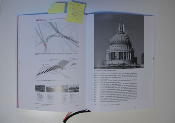
Image taken by single-blogs / Book spread discussing the London View Management
Using these 115 examples the book then develops a clearly structured understanding of rules and regulations by comparing situations, implementations and outcome of different locations. For this it uses plenty of illustrative examples and makes beautiful use of illustrations. By the way the book is designed by Joost Grootens, who also did 'the New Dutch Water Defence Line'.
To sum up, this is a brilliant read and a book that could lead a new and much more open debate around the implications and possibilities of identity of the place.
Lehnerer, A., 2008. Grand Urban Rules, Rotterdam: 010 Publishers.
Traditionally, this seemed very easy, being simply the sum of all the individual buildings. becoming more complicated with for examples Kevin Lynch's Image of the city were the idea settled that individuals perceive the city and this in turn influences how we understand and then obviously it became even more complicate with the introduction of the social dimension as a informing parameter of the built form, as for example in 'the Social Logic of Space'.
So it is complicated and the search for the identity of the place is going round and round.
Going back, picking up a very pragmatic element and start rolling up the question from a completely different angle could be a very good idea. This is what I thought when I saw the book.
Grand Urban Rules by Alex Lehnerer and published by 010 Publishers "is a tribute to the city's will to form...") as it says on the book back cover. The concept is then, nevertheless introduced using two aspects. One is to base it on the building rules or regulations exemplary taken from cities of central Europe and the United States with the exception of Vancouver and Hong Kong. The second aspect is then already the social connection with the statement "Setting standards is first and foremost a cultural act." So we are back in the social business, but that is most likely a very good move.
Image taken by single-blogs / Book spread with an overview of urban rules.
The book might encounter a difficult problem, a certain resistance from readers to engage, specially from practitioners side. Very often the rules and standards are something that is seen as a negative force engaging in the creative process. This often creates the two sides of the planning an building process. On one hand the authority setting out the rules and on the other hand the planner or architect who has to 'implement' them. It often ends in a battle between the two. To some extend this is ok and part of the ongoing process of finding and defining the position of the current culture, to refer back to the statement on the book back cover. But too often this ends in useless, consuming debates.
Refreshing then here, that this publication manages to completely avoid this topic and present, discuss and 'implement' regulations as a positive part of the planning process. As you start diving in to the publication and flip through the first 51 pages skimming all 115 examples chosen here you kind of forget about the battle and the misery it turns most debates into. Slowly but steadily a feeling creeps in to your mind, that actually this discussion is a lot larger than the battle between the parties of one building and the personal emotions involved and that it could actually be a cultural, society based discussion that authority and planner could lead and develop together.
Having said that, the book is much more fun and not at all as heavy as my thoughts on this topic. It is actually fun and present the ideas and concept with a certain implicit humor that you will have a constant smile on your face as you read along, that it very rear with architecture, planning publications.
It presents the '2h Shadow' used in Zurich, Switzerland "A high-rise may not place a neighboring residential building in shadow for more than two hours per day." and the 'London View Management' "Through the heights of the adjacent buildings, the upper space around the cathedral shall remain unencumbered by visual interference. Tall structures will be permitted to stand in the cathedral's view shadow." or the '5-Story Rule of Paris' "Buildings cannot be taller than the height residents and users are prepared to climb using stairs. For buildings without elevators, this threshold has been reached at a height of five stories." to name a few examples.
Image taken by single-blogs / Book spread discussing the London View Management
Using these 115 examples the book then develops a clearly structured understanding of rules and regulations by comparing situations, implementations and outcome of different locations. For this it uses plenty of illustrative examples and makes beautiful use of illustrations. By the way the book is designed by Joost Grootens, who also did 'the New Dutch Water Defence Line'.
To sum up, this is a brilliant read and a book that could lead a new and much more open debate around the implications and possibilities of identity of the place.
Lehnerer, A., 2008. Grand Urban Rules, Rotterdam: 010 Publishers.
Parkour gone timeLapse
Movement through the city has many different forms and shapes and speeds and purposes and desires and impacts and joys. Parkour is on e of the more specialised forms of moving around and definitely one that has changed the perception of movement in space in recent years.
Not to dwell on its history, a quote from Wikipedia: “It is a non-competitive, physical discipline of French origin in which participants run along a route, attempting to negotiate obstacles in the most efficient way possible, as if moving in an emergency situation.”
To visualise the type of movement here a great timeLapse visual - enjoy.
Found through dpr-barcelona
Jumat, 26 Maret 2010
"He Blinded Me With Science" 5 Tees - Update New Files

+ Please re-download +
I made some mistakes when I made these tees.
(This was back in my early days of making custom content)
But don't worry I already fixed it.
I also fixed the graphic stencils. Now they look much better in game.
From Original Post
+ August 11th 2009 +
Yes folks, I made shirts. :)
But don't ask how long I worked on these (I'm a total noob :P)
(From figured out how to make DDS Plug Ins
works on my 'puter, learn the Tut - bunch of Trial & Error -
to finally had the "Gotcha!" moment)
works on my 'puter, learn the Tut - bunch of Trial & Error -
to finally had the "Gotcha!" moment)
Long story short, I made these stencil shirts (5 in total) for your YA/A Male Sims.
Why robot, you may ask? Cause they're COOL! :P
(Raise your hand if you agree ^_^)
I hope you like them as much as my sims and I like it.
Enjoy and Happy Simming, Everyone!
NewOne
He Blinded Me With Science
Young Adult & Adult
Everyday I Sleepwear I Athletic
Recolorable
(except the stencil part)
+ Bee Robot +
+ Robot For Science +
+ Robot & Ghost +
(As seen here)
+ PlayBot +
+ Do You Like My Robot ? +
(Click on the pics to enlarge them)
(Click on the pics to enlarge them)


+ DOWNLOAD +
Bee Robot
Robot For Science
Robot & Ghost
PlayBot
Do You Like My Robot?
All 5 Tees
(In One Row)
+ For Teen Males +
You can get it here
Models by Me:
Custom Content By Me:
Custom Content I Used:
Skin by Subaxi
Hairs by
Eyelashes by Arisuka
Piercing by Astray Sims
Credits:
CTU Team for the tool
All creators above for creating cool CC. Thankies!
My Boys
Ethan, Hayden & Jiro
-----------------------------------------------------------------------------------------

-----------------------------------------------------------------------------------------

Book - The Infrastructural City
The city has many different faces and as we all know it cannot be described in one sentence or one equation. It also is not a computer chip, although some recent master plans might have a formal similarity, nor is it a single organism growing for one purpose. It is more of a collective consisting of individuals capable of creating, deciding and moving. It is organized, as one currently would describe it, in networks and some of the elements of the collective are private where as other are public, in the sense of providing service to a larger group of the collective. Within the network these services manifest in infrastructure serving the public. In a number of ways this infrastructure tells a large part of the story about the collective or the city as such. In the sense of 'Show me your infrastructure and I tell you who you are.' the book 'Infrastructural City - Networked Ecologies in Los Angeles' edited by Kazys Varnelis and published by Actar tells the story of an urban area. This specific focus reveilles so much about the society that invented it, it is fascinating and sometimes shocking. From mobile phone tower camouflaged as palm trees to engineered tarmac graffiti everything is revealed and sets the context to the 21st century society.

Image by single-blogs / Book spread.
The analysis comes in three parts, Landscape, Fabric and Objects. The titles do not obvious characterize the content though. I haven't really figured out what the organisation is. This, however doesn't matter because you should read them all, or the reader can jump from one to another and back. It is not a necessarily linear read and this is a relief, because its content is extremely dense.
The detailed descriptions are accomplished with three elements describing the linear city. Lane Barden follows linear infrastructure elements and explores the city. This gives a very specific angle on the subject, but also helps high lighting due to the focus. The lines are documented by a map and sequential photographs as well as a little bit of background text. In a very calm and focused way the city takes shape along these lines. The elements are, the river, the street - Wilshire Boulevard and the trench - freight transport.

Image by single-blogs / Book spread.
In 'Counting (on) Change' Roger Sherman describes and illustrated the pace at which change takes place and how planning and design professionals fall behind the latest trends and are doomed to react rather than help shape the future. He sais: "For architects, the time has come to recognize, finally, that contemporary urbanism is better rethought around conceptions of progress and potential - via design strategies for unfolding the future - rather than by another utopian horizon." In a series of detailed diagrams the negotiations and changes over land and ownership at a number of scales.
The book ends with a report on probably the biggest and most vital piece of infrastructure in the city of Los Angeles. 'The Trench' is the ten miles long transport corridor Bringing the arriving goods from the port out of the city to distribution centres that will feed the rest of North America. The specs are impressive, more than $200 billion in cargo are transported on this route, but it is largely unnoticed as a feature in the city. It used to be a dominating feature due to its rail crossings and activity of the trains, but nowadays all the trains run in a fifty feet wide and thirty-three feet deep cut on a lower city level out of sight. And still it is probably the main artery of the city. Lane Barden sais: "It would be realistic to argue that the trench is central to the everyday efficiency of global capitalism."
In this sense, the city might as well be a machine.
This is a book on urban infrastructure that not only describes the elements, but positions them in a social and cultural city context. The approach is not about isolating elements to simplify it, rather it is about piecing it together to help shape an understanding of the whole. It really is a book about the city, the city of the everyday.
For other reviews see: archidose or we-make-money-not-art.
Varnelis, K., 2009. The Infrastructural City. Networked Ecologies in Los Angeles, Barcelona: Actar.

Image by single-blogs / Book spread.
The analysis comes in three parts, Landscape, Fabric and Objects. The titles do not obvious characterize the content though. I haven't really figured out what the organisation is. This, however doesn't matter because you should read them all, or the reader can jump from one to another and back. It is not a necessarily linear read and this is a relief, because its content is extremely dense.
The detailed descriptions are accomplished with three elements describing the linear city. Lane Barden follows linear infrastructure elements and explores the city. This gives a very specific angle on the subject, but also helps high lighting due to the focus. The lines are documented by a map and sequential photographs as well as a little bit of background text. In a very calm and focused way the city takes shape along these lines. The elements are, the river, the street - Wilshire Boulevard and the trench - freight transport.

Image by single-blogs / Book spread.
In 'Counting (on) Change' Roger Sherman describes and illustrated the pace at which change takes place and how planning and design professionals fall behind the latest trends and are doomed to react rather than help shape the future. He sais: "For architects, the time has come to recognize, finally, that contemporary urbanism is better rethought around conceptions of progress and potential - via design strategies for unfolding the future - rather than by another utopian horizon." In a series of detailed diagrams the negotiations and changes over land and ownership at a number of scales.
The book ends with a report on probably the biggest and most vital piece of infrastructure in the city of Los Angeles. 'The Trench' is the ten miles long transport corridor Bringing the arriving goods from the port out of the city to distribution centres that will feed the rest of North America. The specs are impressive, more than $200 billion in cargo are transported on this route, but it is largely unnoticed as a feature in the city. It used to be a dominating feature due to its rail crossings and activity of the trains, but nowadays all the trains run in a fifty feet wide and thirty-three feet deep cut on a lower city level out of sight. And still it is probably the main artery of the city. Lane Barden sais: "It would be realistic to argue that the trench is central to the everyday efficiency of global capitalism."
In this sense, the city might as well be a machine.
This is a book on urban infrastructure that not only describes the elements, but positions them in a social and cultural city context. The approach is not about isolating elements to simplify it, rather it is about piecing it together to help shape an understanding of the whole. It really is a book about the city, the city of the everyday.
For other reviews see: archidose or we-make-money-not-art.
Varnelis, K., 2009. The Infrastructural City. Networked Ecologies in Los Angeles, Barcelona: Actar.
Stuttgart 24
A timeLapse portrait of the city of Stuttgart in Germany. It is a film by Christoph Kalck & Jascha Vick, with music by Sebastian Bartmann and shows the city of the period of 24 hours. A selection of 20 locations make it a divers portrait ranging from market hall to zoo, to train station and cross road. The feature of the tiny schematic clock in the bottom corner provides a good sense of orientation in temporal terms.
The movie was produced at the Stuttgart Media University (hdm-stuttgart.de) in the study course Audiovisual Media from October 2009 till January 2010. The material is shot with a Canon EOS-1D Mark II.
Interesting also is the map provided with the locations of the shootings. This can provide some sort of orientation. However, without the aspects of time and sequence there is something missing.
Kamis, 25 Maret 2010
Book - Urbanisms - a Position
Urbanism is in a crisis in terms of identity of the profession, the work it should do and the work it can do as well as the way it interconnects with other disciplines. Well actually it has never had a position regarding these points. Pressure is rising from all sides, Sustainability approaches are developed here and there, but not within the profession, theoretical concepts as well as technical concepts are also developed elsewhere and even the job is done by other people. What can be done?
What a joy to read a book on urbanism that actually seeks and to some extend manages to to shape a particular position. There are clear references to were this position comes from and what the tools are that are used to work, but it leaves the clear impression that it creates something different.

Image taken from Steven Holl / Spread 12/13, Beijing: The linked Hybrid Located just off the second Ring Road.
In terms of tools, clearly the architectural approach is used. There are plans, there are models, there is usually even a building. Not just a shadow but actually a proposal or even a project that is being built. So what makes this variance then?
The difference really is the scale. Starting on page two with a plan that is actually more of a map covering a large section of Manhattan, page there a map-plan covering the centre of Amsterdam and page four a map-plan showing the lower section of the Saine in Paris. I call it a map-plan because it is a plan of the project location, the site or building is marked in a black and white context in red, but the scale is really more what you would expect of a map. The approach could be accused of simply scaling up the building project to city scale and claiming this to be urbanism. This is probably true, however I believe the result counts. An in this case at least the book and the presented projects here really strongly give a sense or urban character and importance.

Image taken from Steven Holl / Spread 4/5, title page showing the project Ile Seguin in France.
Covering a time span of 43 years, from 1967 with a student project to 2010, Steven Holl covers his position on large scale interventions and overall this detailed collage manages to piece together a position. A position that really lets you believe again that something like urbanism really exists.
The book we are talking about here is 'Urbanisms - Working with Doubt' by Steven Holl, published by Princeton Architectural Press. It is a book, very much in the sense of a book. It has a very traditional feel to it, even though it makes use of the new arrangements, like page numbering or ordering of elements and so on. However layout and font, but also the feel to the cover and the square format render it extremely formal.
38 projects are presented, together with essays and statements by Steven Holl. Together this creates the position. The most important statement, that also has given the book the subtitle it probably 'Working with Doubt', here Steven Holl says: "Today working with doubt is unavoidable; the absolute is suspended by the relative and the interactive. Instead of stable systems we must work with dynamic systems. Instead of simple and clear programs we engage contingent and divers programs. Instead of precision and perfection we work with intermittent, crossbred systems, and combined methods. ... Working with doubt becomes an open position for concentrated intellectual work." (Steven Holl, p13)

Image taken from Steven Holl / The 'Linked Hybrid', my favorite large scale building.
This position is illustrated in the book with the project and it is possible to understand this position, I think this is the real achievement of this book, as an entity it works great.
However, in the sense of the starting question it might provide guidance and thoughts, but no solutions. I am not convinced that this super-sized architectural style has solutions in all situations, especially when it comes to diversity, social, and longer term temporal aspects. What Steven Holl offers are large scale buildings, quite literally (with massive projects in the middle East, particularly China), that have the potential to play a an important role, define spaces and create identity for an area, but they are not the city.
These super-sized site plans on city scale seem to be the new trend at the moment. For example also the new Herzog and De Meuron Book is making use of this tactic to locate the presented projects. Where this will take us we will see.
Nevertheless, this is the most recent comprehensive urban statement you can get your hands on. It will challenge your position.
Holl, S., 2008. Urbanisms: Working with Doubt, New York, N.Y: Princeton Architectural Press.
What a joy to read a book on urbanism that actually seeks and to some extend manages to to shape a particular position. There are clear references to were this position comes from and what the tools are that are used to work, but it leaves the clear impression that it creates something different.
Image taken from Steven Holl / Spread 12/13, Beijing: The linked Hybrid Located just off the second Ring Road.
In terms of tools, clearly the architectural approach is used. There are plans, there are models, there is usually even a building. Not just a shadow but actually a proposal or even a project that is being built. So what makes this variance then?
The difference really is the scale. Starting on page two with a plan that is actually more of a map covering a large section of Manhattan, page there a map-plan covering the centre of Amsterdam and page four a map-plan showing the lower section of the Saine in Paris. I call it a map-plan because it is a plan of the project location, the site or building is marked in a black and white context in red, but the scale is really more what you would expect of a map. The approach could be accused of simply scaling up the building project to city scale and claiming this to be urbanism. This is probably true, however I believe the result counts. An in this case at least the book and the presented projects here really strongly give a sense or urban character and importance.
Image taken from Steven Holl / Spread 4/5, title page showing the project Ile Seguin in France.
Covering a time span of 43 years, from 1967 with a student project to 2010, Steven Holl covers his position on large scale interventions and overall this detailed collage manages to piece together a position. A position that really lets you believe again that something like urbanism really exists.
The book we are talking about here is 'Urbanisms - Working with Doubt' by Steven Holl, published by Princeton Architectural Press. It is a book, very much in the sense of a book. It has a very traditional feel to it, even though it makes use of the new arrangements, like page numbering or ordering of elements and so on. However layout and font, but also the feel to the cover and the square format render it extremely formal.
38 projects are presented, together with essays and statements by Steven Holl. Together this creates the position. The most important statement, that also has given the book the subtitle it probably 'Working with Doubt', here Steven Holl says: "Today working with doubt is unavoidable; the absolute is suspended by the relative and the interactive. Instead of stable systems we must work with dynamic systems. Instead of simple and clear programs we engage contingent and divers programs. Instead of precision and perfection we work with intermittent, crossbred systems, and combined methods. ... Working with doubt becomes an open position for concentrated intellectual work." (Steven Holl, p13)
Image taken from Steven Holl / The 'Linked Hybrid', my favorite large scale building.
This position is illustrated in the book with the project and it is possible to understand this position, I think this is the real achievement of this book, as an entity it works great.
However, in the sense of the starting question it might provide guidance and thoughts, but no solutions. I am not convinced that this super-sized architectural style has solutions in all situations, especially when it comes to diversity, social, and longer term temporal aspects. What Steven Holl offers are large scale buildings, quite literally (with massive projects in the middle East, particularly China), that have the potential to play a an important role, define spaces and create identity for an area, but they are not the city.
These super-sized site plans on city scale seem to be the new trend at the moment. For example also the new Herzog and De Meuron Book is making use of this tactic to locate the presented projects. Where this will take us we will see.
Nevertheless, this is the most recent comprehensive urban statement you can get your hands on. It will challenge your position.
Holl, S., 2008. Urbanisms: Working with Doubt, New York, N.Y: Princeton Architectural Press.
Twitter on Layar - Now You are on Air
This gang here tracks the tweeters and brings them presents or other surprises. It is not digital or on screen, oh shocking, it’s REAL! When have you last seen real people, real talking, in the real street? Yes these men are real and they drive a real van with a lot of chunk in the back, some old fashioned TV’s, not the LCD flatscreen ones, and they will come after you. You are leaving enough traces, well you are actually publicly broadcasting yourself, so it is easy to find you with an iPhone and layar on it. There you go SURPRISE!
Rabu, 24 Maret 2010
Book - A Manifesto for Sustainable Cities
A manifesto for sustainable cities is definitely a task with two diverting possible outcomes to it. On one side this is a winner, because everyone is talking sustainability and if you can offer this bound knowledge on the topic you are clearly up to the task. However, there is also the other side, you can only fail with this approach. It has been over used and become a real media word without meaning or program. Furthermore some sort of resignation has settled and a lot of practitioners think it is just too complex to fit in one field of expertise.
This book here with the title: ‘Albert Speer & Partner: A Manifesto for Sustainable Cities, Think Local, Act Global’ by Jeremy Gaines & Stefan Jaeger, published by Prestel in 2009, is probably such a candidate for this kind of black and white judgement. It is either great and you love it, or you will find it terrible and you don’t bother. However, the topic is kind of urgent and it has to be taken seriously globally to tackle the issue and every little helps.
This book is not a little, but 220 pages think and therefore must have something to say?
It is organised in ten chapters each in command style what you have to do and how you have to do it. It looks kind of more like a manual than a manifesto. The content is put together from practice examples drawn from all over the world, both in house Albert Speer & Partner (AS&P) projects and external projects by leading practices.

Image by AS&P, taken from german-architect / Artist impressio nof the proposal for Abuja, Nigeria. Note the six lane boulevard running down the length of the proposed development. This not only creates two parts or reminds us of Haussmanns Paris, but it also is clearly planned for individual traffic - cars - sustainable? More ilustrations can be found HERE.
The guys at Albert Speer & Partner really seem to know what they are talking about and they know it so well that they have to tell everyone else that they know it. So what you get with the book, is a set of ten rules, and I have to stress the importance of these rules, on how to do it. I have to repeat it again, this book tells you how to do it and of course also tells you how not to do it. It comes as a surprise to actually find such an old school approach to the complex topic of sustainable urban design especially because planners and designer only begin to grasp the extent of the topic and the required complexity of processes needed to address some of the issues at hand. But with this publication in hand you are saved and with you the planet, if this is not sarcastic enough.
There seems to be a never ending list of complex interwoven topics that render this book impossible to acknowledge as serious beyond a marketing publication. The text starts right away in the introduction with a sharp critique on the Fosters and Partner project ‘Masdar’, the zero carbon city outside Abu Dhabi. I agree with the critique in some points, but why would you choose to open a book with such a statement? Is there such a need to establish this distance between oneself and the others, dealing with the same problems? Similar, at a later point, there is talking about the new Alianz Arena in Munich, a new Football Arena built for the World Cup in Germany 2006. AS&P somehow had a part in this project, but the actual architect is not once mentioned in the paragraph. And who do you guess the architect was? A famous architect of course and not Foster and Partner. Yes, it was Herzog and de Meuron. This strategy of not mentioning seems to go through the book and frequently not the whole context is revealed. Other examples can be found again in the introduction where the talk is of another mysterious zero carbon city, this time in the United Arab Emirates called Ras al-Khaimah, who do you guess is the project author for this one - O(h)M(y)A(?). The name of the architect must have gone lost somewhere on the way. Also in the paragraph ‘Icons and Idiosynchrasies’ where only specifically selected icons are presented, such as the Guggenheim in Bilbao, but with great care not mentioning the architect. More is in ‘Current Mobility Fosters Immobility’ with the example of the Curitiba Bus System but no reference to where it came from and who invented it.
Either it is a decision to keep the descriptions extremely simple and this information is considered as clutter or it is strategical non-placement of references that would distract from the glory of AP&P.

Image by AS&P / perspective view of the master plan for Changchun JingYue, Ecological City in China. Extreme axial organisation again, as in the previous example, while creating a lot of physical boundaries in addition with transport and water features. Surprising her is the lack of clarity regarding the definition of space or voids. The parcels seem to be developed under aspects of value and dimension along a grid of roads. The buildings are then detached isolated placed floating around inside the plot. It is only a diagram yes, but one that clearly states the road in with it the individual car traffic as its dominant factor,
The glory really doesn’t end here. You have probably by now understood that the book must be in ten chapters - reference, what comes in ten chapters down from the hill, somewhere in the desert? AS&P must also have picked it up somewhere in the desert as they ... sorry this is going to far, but yes The Ten Commandments are, according to Wikipedia: “a list of religious and moral imperatives”. As if this is not good enough, there is an eleventh chapter, the conclusion. This is the book killer, it is entitled: ‘Applying The Ten Commandments: Cairo’ ??? Is this some sort of 21st Century Christianization? (I am aware that the Ten Commandments do also play a role in Islam, but the context and the way ideologies are thought directly by the head teacher is truly astonishing.)
A note on the style of the text, it is surprising at times and lets one wonder who actually is telling the story here. From the first impression you would expect that this is some kind of a knowledge output by an architectural practice, they talk about what they learned and experienced. But then after a few lines you come across the first third person reference and then follows the first quote of someone, apparently a board member of AS&P. After a few times this lets you wonder who is writing here. Do architects also have ghost writers?
Overall there is very little good to say about the style of the book. However, it has to be said that it covers different aspects of sustainability, illustrates them and through this can offer a perspective on the topic. It is just that one has to like the style to like the book, I guess. This is a half hearted recommendation, but have a look at the book and see what you think of it.
Gaines, J. & Jager, S., 2009. Albert Speer & Partners: a Manifesto for Sustainable Cities: Think Local, Act Global, Prestel.
This book here with the title: ‘Albert Speer & Partner: A Manifesto for Sustainable Cities, Think Local, Act Global’ by Jeremy Gaines & Stefan Jaeger, published by Prestel in 2009, is probably such a candidate for this kind of black and white judgement. It is either great and you love it, or you will find it terrible and you don’t bother. However, the topic is kind of urgent and it has to be taken seriously globally to tackle the issue and every little helps.
This book is not a little, but 220 pages think and therefore must have something to say?
It is organised in ten chapters each in command style what you have to do and how you have to do it. It looks kind of more like a manual than a manifesto. The content is put together from practice examples drawn from all over the world, both in house Albert Speer & Partner (AS&P) projects and external projects by leading practices.
Image by AS&P, taken from german-architect / Artist impressio nof the proposal for Abuja, Nigeria. Note the six lane boulevard running down the length of the proposed development. This not only creates two parts or reminds us of Haussmanns Paris, but it also is clearly planned for individual traffic - cars - sustainable? More ilustrations can be found HERE.
The guys at Albert Speer & Partner really seem to know what they are talking about and they know it so well that they have to tell everyone else that they know it. So what you get with the book, is a set of ten rules, and I have to stress the importance of these rules, on how to do it. I have to repeat it again, this book tells you how to do it and of course also tells you how not to do it. It comes as a surprise to actually find such an old school approach to the complex topic of sustainable urban design especially because planners and designer only begin to grasp the extent of the topic and the required complexity of processes needed to address some of the issues at hand. But with this publication in hand you are saved and with you the planet, if this is not sarcastic enough.
There seems to be a never ending list of complex interwoven topics that render this book impossible to acknowledge as serious beyond a marketing publication. The text starts right away in the introduction with a sharp critique on the Fosters and Partner project ‘Masdar’, the zero carbon city outside Abu Dhabi. I agree with the critique in some points, but why would you choose to open a book with such a statement? Is there such a need to establish this distance between oneself and the others, dealing with the same problems? Similar, at a later point, there is talking about the new Alianz Arena in Munich, a new Football Arena built for the World Cup in Germany 2006. AS&P somehow had a part in this project, but the actual architect is not once mentioned in the paragraph. And who do you guess the architect was? A famous architect of course and not Foster and Partner. Yes, it was Herzog and de Meuron. This strategy of not mentioning seems to go through the book and frequently not the whole context is revealed. Other examples can be found again in the introduction where the talk is of another mysterious zero carbon city, this time in the United Arab Emirates called Ras al-Khaimah, who do you guess is the project author for this one - O(h)M(y)A(?). The name of the architect must have gone lost somewhere on the way. Also in the paragraph ‘Icons and Idiosynchrasies’ where only specifically selected icons are presented, such as the Guggenheim in Bilbao, but with great care not mentioning the architect. More is in ‘Current Mobility Fosters Immobility’ with the example of the Curitiba Bus System but no reference to where it came from and who invented it.
Either it is a decision to keep the descriptions extremely simple and this information is considered as clutter or it is strategical non-placement of references that would distract from the glory of AP&P.
Image by AS&P / perspective view of the master plan for Changchun JingYue, Ecological City in China. Extreme axial organisation again, as in the previous example, while creating a lot of physical boundaries in addition with transport and water features. Surprising her is the lack of clarity regarding the definition of space or voids. The parcels seem to be developed under aspects of value and dimension along a grid of roads. The buildings are then detached isolated placed floating around inside the plot. It is only a diagram yes, but one that clearly states the road in with it the individual car traffic as its dominant factor,
The glory really doesn’t end here. You have probably by now understood that the book must be in ten chapters - reference, what comes in ten chapters down from the hill, somewhere in the desert? AS&P must also have picked it up somewhere in the desert as they ... sorry this is going to far, but yes The Ten Commandments are, according to Wikipedia: “a list of religious and moral imperatives”. As if this is not good enough, there is an eleventh chapter, the conclusion. This is the book killer, it is entitled: ‘Applying The Ten Commandments: Cairo’ ??? Is this some sort of 21st Century Christianization? (I am aware that the Ten Commandments do also play a role in Islam, but the context and the way ideologies are thought directly by the head teacher is truly astonishing.)
A note on the style of the text, it is surprising at times and lets one wonder who actually is telling the story here. From the first impression you would expect that this is some kind of a knowledge output by an architectural practice, they talk about what they learned and experienced. But then after a few lines you come across the first third person reference and then follows the first quote of someone, apparently a board member of AS&P. After a few times this lets you wonder who is writing here. Do architects also have ghost writers?
Overall there is very little good to say about the style of the book. However, it has to be said that it covers different aspects of sustainability, illustrates them and through this can offer a perspective on the topic. It is just that one has to like the style to like the book, I guess. This is a half hearted recommendation, but have a look at the book and see what you think of it.
Gaines, J. & Jager, S., 2009. Albert Speer & Partners: a Manifesto for Sustainable Cities: Think Local, Act Global, Prestel.
Augmented (Hyper) Reality - You've Got an Interactive Table?
A rather disturbing clip of a possible near future. Might be unlikely, but talking about it is going on rather for a while now. It has become possible to actually do exactly what is visualised in this imaginary representation. By using available free digital tools such as layar everyone with access to the internet and consumer hardware in the form of a smart phone and a computer could put this together. probably not as visually impressive as Keiichi Matsuda manages in this clip produced for is master of architecture. This is a truly astonishing visual with a lot of love for good graphics and good design. I love it.
Selasa, 23 Maret 2010

Srilanka Bikini fasion model
Dannielle Kerkoven is one of the hottest, promising Sri Lankan Super Model aspiring to make it big in the glamour fashion world. Her exotic beauty that makes most males literally go weak at their knees! How ever, it’s been said more than once one might add in the simplest of sentences: “Dannielle is a lovely girl!” and that says it all. An exclusive collection was showcased by LiCC Jeans Fashion Show at Colombo Fashion Week 2010 held at the Hilton Colombo recently.


![[Dannielle+Kerkoven+Sri+Lanka.jpg]](http://3.bp.blogspot.com/_hdL0BfpTMV0/S54SZ_j_IEI/AAAAAAAAGFw/7_kFXNKBnok/s1600/Dannielle%2BKerkoven%2BSri%2BLanka.jpg)
Prima Kottumee calendar was both fun and educational
Prima Kottumee recently took steps to provide the present day youhts of the nation a unique calendar for the year 2010. The calendar was launched on December 17, at mount Lavinia Hotel and the 24 calendar models were given the opportunity to showcase their 'Hot and Spicy' looks and skills to the media at a stunning fashion show, which took place at the launch. From around 1500 applicants , 24 models were chosen by a panel of judges headed by former Miss Sri Lanka for Miss Universe 2005, Rozanne Diasz for the Prima Kottumee Calendar 2010.


![[Apoorva+Vishwanathan.jpg]](https://blogger.googleusercontent.com/img/b/R29vZ2xl/AVvXsEhLg_5CcroVmh3AT7dPyyHMd-Nwecx0Fxy9Xyxy5QiyN8RKptvzj2ZorvNKpKs9lwsTyDH8wxWZ6n7Ner_1kSbnE88YZyY7A9lP96ZM85uC2l7DGM0VnwkHfH51DplU9vgFWLL1FuovzXA/s1600/Apoorva+Vishwanathan.jpg)
![[CHIC+fashion+show.jpg]](https://blogger.googleusercontent.com/img/b/R29vZ2xl/AVvXsEjbGk-KxBBIVTUU9P5WTek_WxkDy90Fc7vVvJ7KKYVGKdb14Aga4fjTI7pMgK4hW6-woxM1vNZDLZMCnX8M8fnZzHgPToniKKwyLIpmQa1Lek0-u4YoqxmJiEgOXY4NH8Z09o-PQTpEfqG5/s1600/CHIC+fashion+show.jpg)


![[Fallon+Shilathi.jpg]](https://blogger.googleusercontent.com/img/b/R29vZ2xl/AVvXsEg82zXT24ePnCxWS1ILrcpbxLxDd_bKKdHrME1gZwWr0ikGG0HZlFpeT8DBXcBHWWQvh5YRbucnO3tdDQND3aiL_i4gfJ28gWlLmWQwEZ24k7U6Zwg79XJz1mKu0kA5nC9pyQ2pV5SYoEw/s1600/Fallon+Shilathi.jpg)
![[Fallan+Shiranthi.jpg]](https://blogger.googleusercontent.com/img/b/R29vZ2xl/AVvXsEhWuW2hZ-7KjNq1-nSzVTIznOdhcqR3zpm_OTFoQeBdiXlQb8s5pIPrmunZfufIsz2_2F7h3o3mRrfRCh0VTPK5cvMshK2U8fKmWWZX_dOnRT5Z3iK0rCTpURFlresU5F5AVaZhU8knMRPV/s1600/Fallan+Shiranthi.jpg)


Senin, 22 Maret 2010
Narrative and Time - MArch Urban Design
I will be at the Bartlett School of Architecture to give a talk on Narrative and Time. It will be for the MArch Urban Design students. I have put together elements of my current research work to explore the aspects of the narrative as a specific aspect of time as well as an tool to visualise time. The idea of the story plays an increasing importance in my work. It came up through the tracking project UrbanDiary and now plays an important role in the latest work on Twitter and the Tweet-O-Meter, where the stories old start the spatial investigation.
With this presentation the focus is on the everyday, the ordinary and how we are involve or selves in daily stories as we navigate the passage of time in space. The second part of the presentation focuses on examples of how a narrative can directly be employed for a project. The simpler the story the better and the more powerful the pictures painted. Examples are Senones, a revitalisation project for a small former industrial ‘city’ in France. Where three character played the lead role to explain and illustrate four future scenarios for the valley. Also the Nearness clip, as an interpretation of the ‘Ein Lauf der Dinge’ by Fischli und Weiss. Or there is also the BluDot chair tracking project, furniture stories in New York.
It has changed quite a bit since there is now more data on for example the twitter project. On the other hand there is for this specific talk also an element introducing some of the tools used to handle the data. This will be a range from Google Maps, My Maps, Google Earth to proper GIS. I am not really a professional on any of them, simply a user. Thanks for input on this part go to Dan over at Volunteered Geographic Information.
Book - Atlas of the new Dutch Water Defence Line - Colour Seduction
A book you don't want to give out of your hands for its beautiful cartography and graphic design overall. Well it goes in the tradition of Atlases designed by Jost Grootens. He has only recently received the Rotterdam Design Prize for the set of atlases he designed for 010 Publishers so far. Those are the Groten KAN Atlas, the Metropolitan World Atlas, the Limes Atlas and the Vinex Atlas.
The now published 'Atlas of the New Dutch Water Defence Line' edited by Rita Brons and Bernhard Colenbrander, designed by Studio Joost Grootens and published by 010 Publishers adds an other chapter to this 'series'. It continues with the power full use of colour that already the 'Metropolitan World Atlas' made so attractive, but this new publication makes a lot better use of the overall appearance. It is a real gem.
In the first place it is the cartography you will be looking at, but beside this the book actually has a true subject. And this is simply as the title says the Dutch Water Defence Line. Actually this is about defense in a proper military sense, and not as you might have guessed while already seduced by the pretty colours about water defense. Since it is set in the Netherlands it could have been about water drainage and pumping systems to fight the storm flooding of vital agricultural land, but its not. It is about a specific element of Dutch history, built between 1815 and 1885 as a "technically accurate territorial military system" (Johan van der Zwart abd Clemens Steenbergen in Atlas of the New Dutch Water Defence Line, p.28)
In a nutshell the military conceptis to defend the territory by simply flooding a stretch of land and in this way make it impossible for any land based mode of transport to traverse. It sounds very effect full and simple, but is actually a rather complicated piece of infrastructure and engineering. A detailed system of canals and basins are laid out in such a way as to create, by opening strategically positioned flood gates, a man made flood zone.
The whole system is based on the element the Netherlands has enough anyway and since water has its very own rules the given parameters are tight. Not only from the water element but also in terms of the landscape. In this sense, the here documented military defense structure is in a very strong way trying to make the most of a successful management of possibilities over constraints. This results ins a strongly context based solution, that is unique to this exact location and circumstances and paints a beautiful portrait of the character of an entire region.

Image taken from 010 Publishers / Showing a spread of the publication.
As hinted in the introduction, the graphics, cartography and design overall are brilliant. Especially the colour schema used for the maps is intriguing. In terms of the graphic design even this book is not protected from mistakes and problems. Everyone who is working with maps and plans knows these painful moments when you have a strong concept and clear structure and then for some elements it just doesn't work out. A name is too long to fit in the desired space in the key, in one summary map suddenly two colours representing important information cancel each other out or the approach chosen for one element does not fit for another or in other scales. It is sort of a tradeoff and ad-hoc adjustment job one has to do, restricting damage while hoping the final product may remain close to the desired result. This sounds all very pain full, I know, and it actually is. However, this process can be used to continue developing the strategy and representation and ideally will raise the quality of the end product over the initially thought out concept. Still some minor problems will always be there and the quality of the end product is probably more about these are managed and integrated than how good the anyway functioning elements are developed. I believe this publication managed this process extremely well and the final product is great.
For me the main issue with the graphic elements in this publication is the representation of the forts. This being the central element of focus it plays many roles and obviously a single representation can't be able to play all of them equally well. The colouring of the water protecting the forts as well as the pink used for the fill are not always consistent with the overall context of the maps.
The maps actually come with quite extensive background information in the form of essays and I think it is worth pointing this out because of the almost over powering presence of the cartography. I kind of owe it to this review that I have actually read and tried to understand the background, because otherwise I am pretty sure I would have been (still am) simply seduced by the pretty pictures and had satisfied put the publication to the top of my pile of inspirations. But going beyond the graphics starts opening up a perspective on a cultural territorial identity of a region that is even more inspiring and actually informative.
In this sense there is a hidden treasure in this book, but one needs to battle the dragon of seduction first, a fight I am bound to loose, at times. This one is definitely worth the effort already for the beauty of an bright orange or pink.
A book, or even a series, that has definitely already set a standard and will let loose a trend.

Image taken from Kosmograd / Showing a spread of the publication.
See also reviews on mammoth and Kosmograd.
Brons, R. & Colenbrander, B. eds., 2009. New Dutch Water Defence Line, 010 Publishers.
The now published 'Atlas of the New Dutch Water Defence Line' edited by Rita Brons and Bernhard Colenbrander, designed by Studio Joost Grootens and published by 010 Publishers adds an other chapter to this 'series'. It continues with the power full use of colour that already the 'Metropolitan World Atlas' made so attractive, but this new publication makes a lot better use of the overall appearance. It is a real gem.
In the first place it is the cartography you will be looking at, but beside this the book actually has a true subject. And this is simply as the title says the Dutch Water Defence Line. Actually this is about defense in a proper military sense, and not as you might have guessed while already seduced by the pretty colours about water defense. Since it is set in the Netherlands it could have been about water drainage and pumping systems to fight the storm flooding of vital agricultural land, but its not. It is about a specific element of Dutch history, built between 1815 and 1885 as a "technically accurate territorial military system" (Johan van der Zwart abd Clemens Steenbergen in Atlas of the New Dutch Water Defence Line, p.28)
In a nutshell the military conceptis to defend the territory by simply flooding a stretch of land and in this way make it impossible for any land based mode of transport to traverse. It sounds very effect full and simple, but is actually a rather complicated piece of infrastructure and engineering. A detailed system of canals and basins are laid out in such a way as to create, by opening strategically positioned flood gates, a man made flood zone.
The whole system is based on the element the Netherlands has enough anyway and since water has its very own rules the given parameters are tight. Not only from the water element but also in terms of the landscape. In this sense, the here documented military defense structure is in a very strong way trying to make the most of a successful management of possibilities over constraints. This results ins a strongly context based solution, that is unique to this exact location and circumstances and paints a beautiful portrait of the character of an entire region.
Image taken from 010 Publishers / Showing a spread of the publication.
As hinted in the introduction, the graphics, cartography and design overall are brilliant. Especially the colour schema used for the maps is intriguing. In terms of the graphic design even this book is not protected from mistakes and problems. Everyone who is working with maps and plans knows these painful moments when you have a strong concept and clear structure and then for some elements it just doesn't work out. A name is too long to fit in the desired space in the key, in one summary map suddenly two colours representing important information cancel each other out or the approach chosen for one element does not fit for another or in other scales. It is sort of a tradeoff and ad-hoc adjustment job one has to do, restricting damage while hoping the final product may remain close to the desired result. This sounds all very pain full, I know, and it actually is. However, this process can be used to continue developing the strategy and representation and ideally will raise the quality of the end product over the initially thought out concept. Still some minor problems will always be there and the quality of the end product is probably more about these are managed and integrated than how good the anyway functioning elements are developed. I believe this publication managed this process extremely well and the final product is great.
For me the main issue with the graphic elements in this publication is the representation of the forts. This being the central element of focus it plays many roles and obviously a single representation can't be able to play all of them equally well. The colouring of the water protecting the forts as well as the pink used for the fill are not always consistent with the overall context of the maps.
The maps actually come with quite extensive background information in the form of essays and I think it is worth pointing this out because of the almost over powering presence of the cartography. I kind of owe it to this review that I have actually read and tried to understand the background, because otherwise I am pretty sure I would have been (still am) simply seduced by the pretty pictures and had satisfied put the publication to the top of my pile of inspirations. But going beyond the graphics starts opening up a perspective on a cultural territorial identity of a region that is even more inspiring and actually informative.
In this sense there is a hidden treasure in this book, but one needs to battle the dragon of seduction first, a fight I am bound to loose, at times. This one is definitely worth the effort already for the beauty of an bright orange or pink.
A book, or even a series, that has definitely already set a standard and will let loose a trend.

Image taken from Kosmograd / Showing a spread of the publication.
See also reviews on mammoth and Kosmograd.
Brons, R. & Colenbrander, B. eds., 2009. New Dutch Water Defence Line, 010 Publishers.
Sabtu, 20 Maret 2010
Its not too late to save Sandra-James marriage
 Forget the tattooed home wrecker, the headlines and the heartbreak: It's not too late for Oscar-winner Sandra Bullock to save her five-year marriage, experts say.
 The ugly public revelations that husband Jesse James cheated on Bullock are painful but not fatal for the couple's reeling relationship.
"Sandra would have to get to a place where she could give her husband the gift of trust," said Dr. Flo Rosoff, a marriage counselor.
"That can only happen if she is based in a relationship where they have a high regard for each other as people, not as simply an attractive man and attractive woman."
Rosoff is a contributor to Ladies Home Journal's "Can This Marriage Be Saved?" column, as is fellow Long Island counselor Dr. Robin Newman.
Newman echoes her colleague's prognosis that the celebrity couple can salvage their relationship, despite James' reported affair with ink-stained wench Michelle (Bombshell) McGee.
"Fight for your marriage, fight for it," Newman advised. "And look at what your part in it was. I'm not saying Sandra was all at fault, but there's something going on there that she needs to address herself."
The Oscar-winning star of "The Blind Side" remained out of the public eye Friday, offering no response to her husband's apology after garish tattoo model McGee claimed the two had an affair.
Bullock has canceled an appearance at the London premiere of her hit film and reportedly moved out of the couple's Southern California home.
Beleaguered husband James surfaced to walk his kids to school Friday morning, his wedding ring still visible on his left hand.
His inked-up inamorata surfaced, too, in a far-less flattering series of Nazi-themed photos.
The raven-haired McGee sported a black officer's cap, bra, panties and a Nazi armband in the shots unearthed by TMZ.com.
In one picture, McGee suggestively licks the tip of a knife.
McGee was also denounced by her ex-husband, who hopes to regain custody of their 5-year-old son.
Ronald Modica charged in court papers that McGee was an unfit mom who exposed little Avery to X-rated antics, Us Magazine reported.
"I need protection for my son," Modica said. "I will not continue to expose him to the kind of life Michelle desires and seeks: full on, pornographic, party all the time."
According to McGee, the affair started while Bullock was filming her Academy Award-winning role in "The Blind Side."
James had been married twice, including a two-year union with porn star Janine Lindemulder, before landing America's sweetheart in 2005.
"The Bounty Hunter"- Dont Waste your money!!!
 Save your money.
 The actors may be pretty, but the film is about as dull as a doorknob. That's the consensus from critics regarding The Bounty Hunter, starring Jennifer Aniston and Gerard Butler, which opens this weekend.
The new romantic comedy has been blasted by 9 out of ten film critics, with most agreeing the script is at best unfunny and at worst cringe-inducing.
As the story goes, Milo Boyd (Butler) is having a rough go of things as a bounty hunter. But his luck appears to change when his next job places him on the trail of his ex-wife, the bail-jumping reporter Nicole Hurly (Aniston).
The old flames play a game of cat-and-mouse, only to find themselves back together and running for their lives.
Of course, critics could care less.
Roger Ebert said he "stared with glazed eyes at The Bounty Hunter. Here is a film with no need to exist."
Wesley Morris of the Boston Globe said the movie's title was similar to A&E's show Dog The Bounty Hunter. "Is it wrong to find that show funnier and more romantic?" he asked.
And the film's two stars, Butler and Aniston, who have been deflecting rumors of off-screen romance for months now, can't seem to muster enough on-screen romance to satisfy critics.
Claudia Puig from USA Today said they don't "muster any believable chemistry. A lot of mugging happens, but no magic."
Still, regardless of what the critics say, if you're a fan of Aniston and/or Butler you should probably run out and see The Bounty Hunter. Just don't say we didn't warn you.
Langganan:
Postingan (Atom)