Its part of the series to demonstrate the power of the web browser. The war is on for quite a while between the companies and is currently fought the hardest on the browser front. Firefox has only just recently launched the new version and Microsoft is currently putting up paper adds across London trying to sell the detail capacity of the all new Explorer.

Image taken from readwriteweb / Screenshot of the WebGL Globe showing world population. Click the image for the interactive version
The chrome Experiments are already an established institution and contains a large selection of projects. Brilliant stuff like the interactive human body in 3D, the TimeLaps GigaPan or last years music video feature the Wilderness Downtown. Its an ongoing collection, so some new features will come up all the time.
The WebGL Globe uses web GL for the rendering all based on JavaScript. Doug Fritz of the Google Data Arts Team explains the challenges as: "The primary challenge of this project was figuring out how to draw several thousand 3D data spikes as quickly and smoothly as possible. To do this, we turned to Three.js, a JavaScript library for building lightweight 3D graphics. For each data point, we generate a cube with five faces – the bottom face, which touches the globe, is removed to improve performance. We then stretch the cube relative to the data value and position it based on latitude and longitude. Finally, we merge all of the cubes into a single geometry to make it more efficient to draw."

Image taken from readwriteweb / Screenshot of the WebGL Globe showing Google Search results by language. Click the image for the interactive version
The second challenge was to create the interaction with the globe to enhance the experiment. since it is 3D users with the experience of Google Earth will want to drag and pan the globe. Using the mouse wheel there is also a zoom function so the data can be looked at locally. In this sense the interaction is quite nice however, the large spikes are difficult to grasp. The local level is really only for the smaller spikes.
The Google Arts Team has put online two data visualisations. One is showing the world population showing at three intervals 1990, 1995, 2000 accessible via some click links. The second visual is showing Google search volume by language.
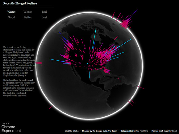
Currently the tool seems only to offer point data and they have not yet announced a plan for additional features. It is not much more than an visualisation. However they are hoping it will be picked up by the community and have set up a Google code page, but not yet put the code for donned. Currently there seems to be only one custom visual, showing the bloggers mood around the world, based on the english speaking blogger community.
The language for the visualisation is not based on KML, but a sort of JSON interpretation. not sure how the transformation will work but apparently this should be simple. The package is now available for download on the projects Google Code page, including the two examples for reference. If you have a play with it and come up with some exciting stuff you can submit your project to Google HERE.

Image taken from alignedleft / Screenshot of the WebGL Globe showing Recently Blogged Feelings based on english speaking blogs.
Tidak ada komentar:
Posting Komentar