In the past few years more and more people are recording their movements using different methods, mostly GPS devices. With the new smart phone with built in GPS this has become even easier. Numerous apps are now out there helping you to record organise and visualise your movements.
Three guys, Andy Woodruff over at Cartogrammar and Eric Fischer who is the creator of the citie maps based on the geo taged images on flickr and picasa and Achim Tack have been dedicated to record all the 2010 trips and visualise them on a map.
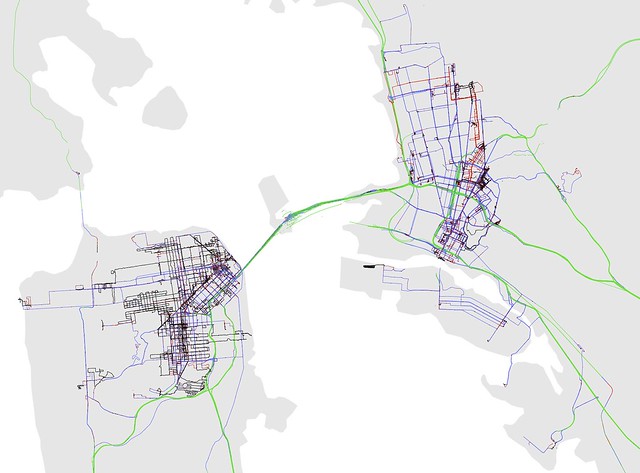
 Image taken from Eric Fischer on flickr / Personal geography of 2010. How big is your word?
Eric has coded his trips using a colour code for modes of transport. Very similar to the coding he used for the photo mapping project. So it goes like this: "black is walking, red is bicycling, blue is cars or buses, and green is above-ground rapid transit or freeways". He points out that tunnels are not shown.
It is quite interesting how the red and blue, the bicycle and the car, over lap and almost match. Would be interesting to know if he also used the same automatic mode of transport detection based on speed as he did for the photo mapping project.
Eric is traveling around San Francisco on both sides of the bay area. Here is the corresponding NCL twitter map.
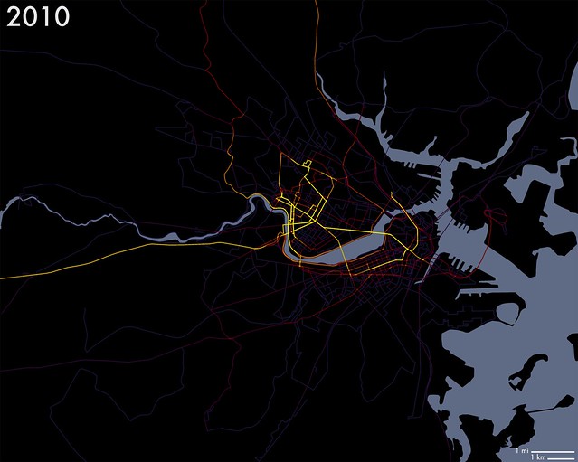
 Image taken from Andy Woodruff on flickr / 2010 tracks with intensity. More yellow = more frequently traveled.
Andy is doing this very low key by hand. Of course many, including myself have suggested to him to start using a GPS unit. But he continues to resist and manually retrace his steps as a sort of summary of the day.
Interesting also his motivation "The most valuable thing about this habit, though, is not the post-mapping analysis but rather the motivation it generates to get out and explore and get to know new parts of the city. I’m sure you can imagine the thrill of getting to draw a line on a new part of the map".
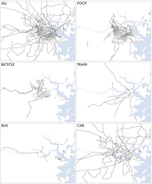
Andy also has recorded the modes of transport on his drawings. Here are the maps by type.

Image taken from Andy Woodruff on flickr / 2010 tracks by mode of transportation.
Unfortunately we havent got a NCL twitter map of Boston yet but we are working on it.
Achim is also using a GPS device, a Holux GPSort 245 (we would be interested to hear his experiences with this one), since his move to Hamburg earlier this year and has ever since recorded his everyday moves.
The colour coding here is also according to mode of transport automatically detected via speed, done using arcGIS.
His interest lies more on the repetitive patterns and this is also how he has coded the maps. He notes: "Thursday I go to the gym (Donnerstags gehe ich ins Fitness)" / "I take the bus no 120 to go to work (Ich nehme den Bus 120 zur Arbeit)"
Here is for example a map of his Weekend trips:
The presentation using zoom.it is pretty neat and allows for details to be explored. It works like the imageCutter software that was used for the NCL maps and the twitter social networks. More on Achims paths on his blog.
My own track record has a different cycle, it starts in autumn. The lates map is from October 2009 to October 2010. This year the map shows a comparison between the previous year and the most recent year. However mode of transport is not represented.

Image by single-blogs / London overview of the 2010 GPS track record. A one year drawing of movement on a daily basis, recording all activities and trips. For a large version click HERE.
The NCL London map is available HERE and the corresponding twitter social network HERE.
Tidak ada komentar:
Posting Komentar