Also there is to note, that this time the graphs have been calculated slightly differently. Where as before it was purely on a count basis, this time it is based on the activity percentage per time unit for each participant. This accounts for the effect of one particular active event has on the overall picture.
The weekly graph remains the same. There is significantly less activity during the week days than there is on Saturdays. Even Sunday remains in line with the rest of the week. Why on Saturday participants record almost twice the amount of activity I don’t know at the moment. Is has something to do with outdoor activity, probably some sports.
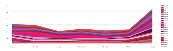
Image by single-blogs for UrbanDiary - Activity graph per day of the week for twenty participants.
While looking at the weekly pattern, the peaks remain largely the same. There is the nine o’clock peak for the morning rush hour and the six o’clock peak for the evening rush hour. There is also the after peak hour both for the morning and the evening.
Clearer in this graph now is the fact that there are more afternoon activities than morning activity. This most likely has to do with the weekend, particularly the Saturday. I suspect that the large chunk of Saturday recordings are based on afternoon activities.
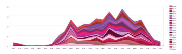
Image by single-blogs for UrbanDiary - Activity graph per 24 hours of one day for twenty participants.
Tidak ada komentar:
Posting Komentar