Senin, 30 November 2009

UD Track Map - Update

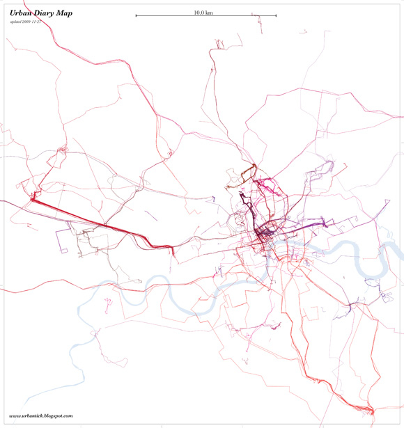
The latest UrbanDiary map is here, update 2009-11-27. This now includes twenty participants, each tracked over the period of two month. It adds a number of new highlighted routes that mark individual routines. The density of the centre has risen again and strengthens the centralistic structure of routine trips. However there are now also more one of trips to paint a more detailed picture of the London network.
Out of the twenty participants one stands out with a not centric oriented routine. In this case it is a more radial shape produced, with one of’s leading into the centre. If you compare it on the ‘what shape are you?’ it stands out for its orientation - it is square 2/5.
More UrbanDiary updates on the facebook page - become a fan!

UDtracks_map_091127.aLfk5qaRMmGY.jpg
Image by single-blogs for UrbanDiary - Tracking map showing twenty participants by colour, updated 2009-11-27

Minggu, 29 November 2009

8 LAYERED SHIRTS (NEW files + Now Available For Teens)


Hi guys!

I got this request from a guest (hey there, Guest! :)
who really likes my layered tees but wants to have all of them only in one row in CAS.

Yeah I know it's crazy to have 14 of them separated.
(Sorry if that bothers y'all but I am glad somebody let me know about this) 

So after one week break plus Thanksgiving
(oh, btw Happy Turkeyness y'all! :) 
the first thing I did is fix the files and combine all of the them into one.

Wish I had done this before..
Why didn't I think about it?!
(me here talk to myself, just pretend you don't read/listen ;)

Anyway, I made these new files and deleted the old ones.
Sorry but I couldn't make all 14 tees in a row
not because I don't know how to do it but the CTU tool didn't let me.
(The limit is 6 stencil tees in a row)

So instead of making a row of 14 tees, I divided them into 3 parts.
Part 1 & 2 are for this upload only.
And Part 3 is for my another upload - 6 Layered Shirts.
I made all 6 tees in a row, you can get it here

Ok. Now for this upload I made 2 parts.
(Keep reading, people :)

+ Part 1 +
Rock Guitars
Kings
Dominos
Cyclops

+ Part 2 +
Radio Psychologist
Lotus
Primal Beast
Code Zebra

Just like their old version, you can get these in 
Everyday, Sleepwear and Athletic category outfits.

Also they're recolorable (2 Alpha Channels) and Non Default.
For Young Adult and Adult male only.

Some screenies

(click the pics to enlarge them)

I used Adam and Hayden as models,
the links to their threads are right under the download links.

Part One


Part Two


As always..
Enjoy and Happy Simming, Everyone!
NewOne

D O W N L O A D

For YA/A Only

For Teens Only
Part One
Part Two

And if you want to have these tees separated
so you can pick only what you like,
you can get it here

+ + + + +

Models by me:

Adam from here
Hayden from here

Custom Content by me:

8 Layered Shirts

Custom Content I used:

Skins
Face by Peggy
Body by Aikea

Hairs
Sims Cave
Cazy

Eyes by Sims2Time
Necklace by Rose (FREE)
Piercings by Aikea

Credits:
Delphy, for CTU tool
All creators above for creating cool CC. Thankies!
Adam & Hayden, my models (ILU and I'm so proud of you!)
Google

Sabtu, 28 November 2009

Srilankan cute fasion show


Srilanka model collection photo,wallpaper


Srilankan fasion model


Srilankan masala seree-Nadeesha Alahapperuma


Srilankan teledrama actress Nadeesha Alahapperuma


Srilankan model Rozan Diaz


SacSachini Ayendra sexy hot photo

Sachini Ayendra 2010 hot photos


Srilankan actress Sachini Ayendra latest photo


sri Lanka bridal photo collection


Nehara piris unseen sexy photo

Jumat, 27 November 2009

Tilt-Shift or Shift-Tilt?

This is a really surprising timelapse tilt shift clip. Something that leaves you puzzled for the approaching weekend. Anyway enjoy, it might inspire you for some work over the weekend.
It is done by UpperFirst a studio working in the field of motion graphics and film. They have some more infos on how it is produced online HERE.

Colorama - Makeover from Upper First on Vimeo.

Whate Shape Are You? - Update

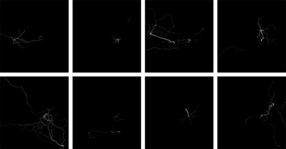
As an update to the ‘what shape are you?’ post, here are some new shapes. The Project now counts twenty participants so we also have twenty shapes.
All shapes are produced over the period of two month and are represented here at the same scale.
As previously noted these ‘drawings’ depend on the location of important destination relative to one another and on mode of transport as well as frequency. The mental picture of the city that each individual builds up while interacting with the urban fabric is tremendously different. Linking back to the visualisation ‘The Naked City’ the phsychogeography of the city is very much dependant or a result of this as produced through the derive.

whatShapeAreYou_BW.XM5ooDPazs8m.jpg
Image by single-blogs for UrbanDiary - (click for large version) - Different shapes produces by participants of the UrbanDiary project over the same period of time.

Kamis, 26 November 2009

New Graphs - The Activity During the Week

Finally I took the time to reprocess the UrbanDiary graphs. Since the last time the study sample has grown from 12 to twenty. This is a good sample size and will give a different picture. However it is to say, that the sample is not as consistent as it was with the first batch. They have all undertaken the study more or less during the same time frame, where as now the sample is spread over the period of half a year or more. Nevertheless the individual tracking time remains the same at two month continuously.
Also there is to note, that this time the graphs have been calculated slightly differently. Where as before it was purely on a count basis, this time it is based on the activity percentage per time unit for each participant. This accounts for the effect of one particular active event has on the overall picture.

The weekly graph remains the same. There is significantly less activity during the week days than there is on Saturdays. Even Sunday remains in line with the rest of the week. Why on Saturday participants record almost twice the amount of activity I don’t know at the moment. Is has something to do with outdoor activity, probably some sports.

UDgraphsWeek_091126.KQzJ5CqZp14X.jpg
Image by single-blogs for UrbanDiary - Activity graph per day of the week for twenty participants.

While looking at the weekly pattern, the peaks remain largely the same. There is the nine o’clock peak for the morning rush hour and the six o’clock peak for the evening rush hour. There is also the after peak hour both for the morning and the evening.
Clearer in this graph now is the fact that there are more afternoon activities than morning activity. This most likely has to do with the weekend, particularly the Saturday. I suspect that the large chunk of Saturday recordings are based on afternoon activities.

UDgraphsDay_091126.7P72v1f7f7xY.jpg
Image by single-blogs for UrbanDiary - Activity graph per 24 hours of one day for twenty participants.

Nehara Peris latest photos

LUX RUWATHI YUWATHI REACHES A GRAND FINALE

Glamour and Pageantry of Lux Ruwathi Yuwathi Reaches a Grand Finale

The radiance and beauty of the fiery sunset and the gently swaying palm trees of Hotel Blue Water set the backdrop for the spectacular Lux Ruwathi Yuwathi grand finale hosted by Unilever’s flagship beauty brand, LUX.

Fifteen finalists were selected for the 2009 Lux Ruwathi Yuwathi TV series on Derana TV, and graced the ramp in all their splendour. The celebrity panel of judges comprised Brands Director of Unilever Sri Lanka Ramani Samarasundera, Model Trainer and former Miss Sri Lanka Rozanne Dias, Popular Actor Roshan Ranawana, Veteran designer Keerthi Sri Karunaratna and Choreographer Graham Hatch.

The glamorous event was undoubtedly, one of the most memorable for these 15 finalists, whose hidden beauty was brought to surface with the efforts and guidance of eminent gurus in the beauty and style industry Ramani Fernando and Michael Wijesuriya, and the talented choreography conducted by Creative Show Director, Senaka De Silva. The contestants looked elegant and glamorous in saris and evening gowns designed especially for the occasion, and paraded the ramps in all their glory, making the judges’ final decision a very difficult one.

The lead-up to the grand finale was the complete makeover for each contestant, previously nominated as a participant for the ‘Lux Ruwathi Yuwathi’ talk show which included a platform for young women to express themselves on issues relevant to their lifestyle. Lux Ruwathi Yuwathi went beyond the norms of a beauty programme and delved into a host of issues and experiences shared by all Sri Lankan women.

Lux Brand Manager, Preminda Fernando stated, “Lux has been the epitome of beauty for Sri Lankan women and through the finals of the Lux Ruwathi Yuwathi we hope to turn the spotlight on these winners and bring out the best in them. I believe that this attempt brings out Lux’s true spirit, allowing young women the freedom to seek beauty and glamour, and to openly discuss and express themselves on issues and events that mould their lifestyles and drives their dreams and ambitions”, he emphasised.

This glamorous event concluded with Ms.Tharuka Shaamindri, form Galle crowned ‘Lux Ruwathi Yuwathi 2009’, she was awarded a cash prize worth Rs. 50,000 and Yasanthika Lakmali, the first runners up and Thilini Perera, as the second runners up received cash prizes worth Rs. 30,000 and Rs. 20,000 respectively. All three winners were also presented with valuable saris sponsored by Gee Bees, gift vouchers courtesy Ramani Fernando Salon, Stone n’ String and a specially designed Lux Ruwathi Yuwathi trophy. All 15 finalists received cash prizes and exclusive Lux gift hampers.

The event, taking on from its first season, focused on highlighting the hidden beauty of each contestant, and concluded on a very glamorous note.

ABOUT UNILEVER: Unilever’s mission is to add vitality to life. We meet everyday needs for nutrition, hygiene and personal care with brands that help people feel good, look good and get more out of life.

UNILEVER SRI LANKA: Unilever Sri Lanka is one of the largest marketers and manufactures of some of Sri Lanka’s leading brands which is a part of the very successful multinational Unilever Plc.

Rabu, 25 November 2009

Parade

Every year the festivals return and bring a special character to the streets. A nice timeLapse of the Parade in Aberdeen. It has some really nice night time shots. As Adam says:“Look out for reindeer, pipers, giant swans, mascots, red-hats and big yellow trucks.”

Aberdeen Parade Timelapse from Adam Proctor on Vimeo.


Senin, 23 November 2009

Space is What we Use? - boxSpace

The discussion around space is a complex topic and it seems that architects and planners are amongst the people having the biggest difficulties defining it. The reason might be lent two the fact that they have to deal with a unequal pair or space as in the construction of physical objects as well as the creation of space as a resulting void. This shall not be read as a final definition of the nature of space. It is only a attempt to collect some examples on the discussion around space.
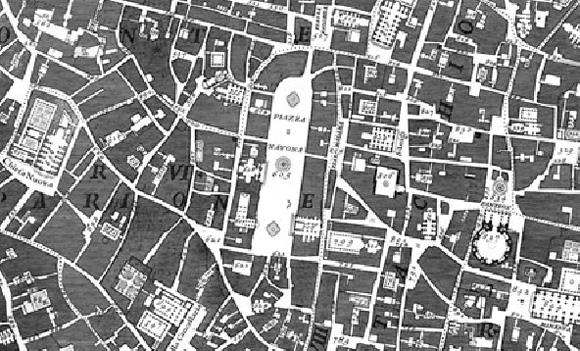
I would like to start with the widely accepted idea of the figure ground representation of built form. I believe this technique is derived from the Nolli plan of Rome, invented by Giambattista Nolli and published in 1748. In essence it is the representation of physical form in black, leaving the void (space) in between white.
nolliPlanRome.EE1s8B1djjd2.jpg
Image taken from the Nolli Map Engine 1.0 by James Tice and Eric Steiner

You guessed it, this is the ultimate claim of objectivity implemented in the plan. However, usually it is claimed o be in use only for visualisation and communication purposes. Nevertheless it also contains the implementation of truth and the establishment of power through the plan.
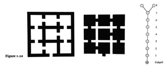
Bill Hillier describes space in his book ‘Space is the Machine’ 1996 as: “Space is, however, a more inherently difficult topic than physical form, for two reasons. First, space is vacancy rather than thing, so even its bodily nature is not obvious, and cannot be taken for granted in the way that we think we can take objects for granted” (Hillier 1996, p 26). He continues however with “Space is quite simply, what we use in buildings” (Hillier 1996, p 28). And finally he comes up with an astonishing example of a spatial description (and this is the reason it stands in this context to the Nolli plan).
hillierFig122.dzjP9jdzDrQI.jpg
Image by Hillier, taken from Space is the Machine, Fig 1.22 on page 30

For me this image represents two things. For one this is the statement of intent to follow the tradition of the Nolli figure-ground representation as the visualisation for space, and secondly it raises the question of what exists outside the black line. To some extend, I think, the question is answered with the implied assumption that space is taken in a Euclidean sense as a container, a box that you can put things in and arrange them - boxSpace.
In architecture many famous example of the employment of the Nolli Plan can be found. See for example Ado Rossi.
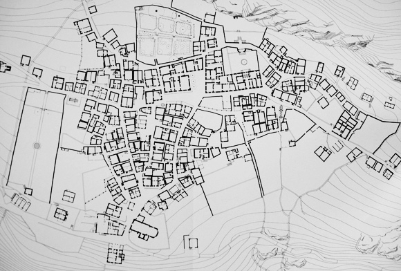
His take on architecture and the representation has largely influenced the Soglio study and the in this context developed representation techniques. The study on alpine architecture in the village of Soglio in Switzerland was conducted by the Institute of Architecture of the University of Applied Science Basel and lead by Michael Alder.
soglio01.7FVHS8rC8vTd.jpg
Image taken from ‘Soglio - Siedlungen und Bauten’ - Ground Floor whole settlement

This example takes the idea of figure-ground to the level of the settlement. It completely relies on the rule of accessibility as the guide for spatial representation. In this sense it is what Hillier is talking about in his example. Space is the vacancy between for the human body impenetrable material (I should say object here I guess). In this sense you could probably also call it an accessibility map or a walking guide.
This is then how Hillier introduces the space syntax concept of space description, as a sequence of, for the human body, accessible spaces.
He says: “...related space, almost by definition, cannot be seen all at once, but require movement from one to other to experience the whole” (Hillier 1996, p 26). Interesting here for me is that to some extend this raises some critique on the figure-ground idea of space, as it employees movement ‘to experience the whole’. But more of this in a following post.

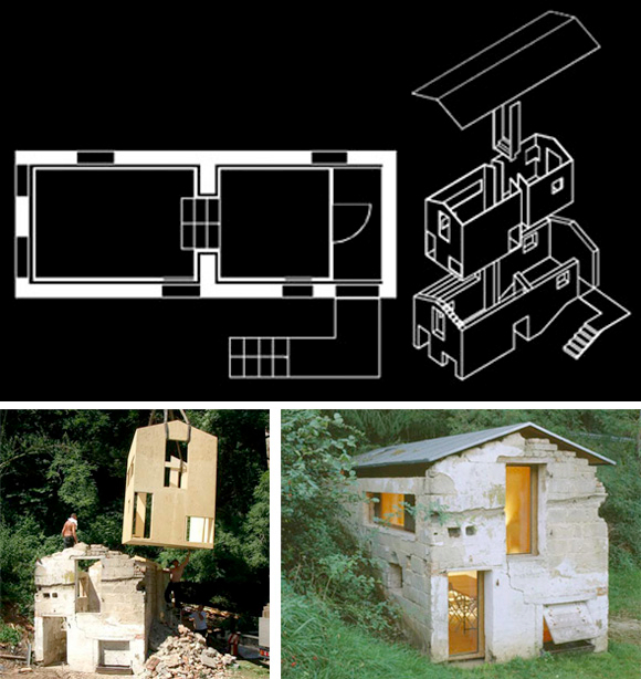
As a physical manifestation of this concept here an example I recently came across on A Daily Dose of Architecture. In some sense this is the above space Box concept in built, including the fabrication and installation process.
fnp_Schaustall.zVWceEIbcKld.jpg
Images by FNP - The project ‘S(ch)austall’ as published by DBZ-online

Alder, M. & Giovanoli, D., 1997. Soglio: Siedlungen und Bauten / Insediamenti e construzioni 2nd ed., Birkhäuser Basel.
Hillier, B., 1996. Space Is the Machine: A Configurational Theory of Architecture, New York: Cambridge University Press.