Alone the collection of examples is astonishing and can serve as a visual encyclopaedia. I happily spend hours just browsing the pages and dive here and there in contextual texts of one of the illustrations.
The timing for this publication seems perfect. Time is a hotter topic than ever, from science labs to the work place to everyday live. Every service has a temporal aspect these days.
The content is presented in eight chapters, that seem to fit with the content maybe because it has multiple meanings. For one it represents loosely history, but also the history of the book as the process of developing and writing it and at the same time imposes structure to large groups of aspects. It starts with genealogy charts and develops over linear history charts to end in the chapter 'Big Time' where arrangements of long term timescales up to the current days are presented. Even though we take the timeline as a given tool of communication, the authors demonstrate here how this understanding was developed and how it came to be so intuitive.

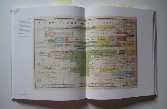
Image taken from Cartographies of Time p120 / Joseph Priestley, 1769, A New Chart of History.
The examples shown are documented and explained with of lot of care for details and put in context. A lot of te examples are beautiful coloured in with watercolours, showing these quiet but present colours of green yellow, red and blue. Most examples are linear, but some are circular or even three dimensional. It features John Sparks' 1931 'The Histomap' but also R. Buckminster Fuller's 1943 'Profile of the Industrial Revolution as Exposed by theChronological Rate of Acquisition of the Basic Inventory of Cosmic Absolutes' and his 1963 'Shrinking of our Planet by Man's Increased Travel And COmmunication Speed Around the Globe'.
The book puts a lot of emphasis on the graphics and representation techniques. So not surprising, the first book quoted is Eduard Tufte's 'The Visual Display of Quantitative Information'
and the second is from the same author, 'Beautiful Evidence'.
The publication makes it clear in the first sentence what the content is about: "While historical texts have long been subject to critical analysis, the formal and historical problem posed by graphic representation of time have largely been ignored." (p.10) The authors introduce two terms for one subject, History = Time. Very few publications actually state their intentions this clearly and usually try to benefit from some vague outlines. 'Cartographies of Time' really is a history book, as the authors themselves admit in the lecture.

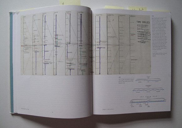
Image taken from Cartographies of Time p24 / Manuscipt timeline for Olaf Stapledon's classic 1930 science fiction novel, 'Last and First Men: A Story of the Near and Far Future.
For me, in this sense, the title of the book can be a little misleading and the move to declare time and history the same is questionable. For me there are overlaps and one (history) benefits from the other (time - especially concepts of linear times as in the sense of a time 'line' line). However the publication incudes representation of time that go beyond a pure history representation. For example it features Charls Josephs Minard's 1860s graph depicting Napleon's assult on Russia, a first sketches of ideas and devices to capture many frames in immediate sequence as developed by Muybridge and Marey in , '201 Days' artwork by Katie Lewis where she mapped body sensation over a period of time on an abstract map or the 'Historical Atlas' by Eduard Quin published in 1828 depicting the spatial extension of the known world at different points in time using clouds as a graphical metaphor of the unknown.
Those examples for me indicate that there is a lot more to the aspect of time than the traditionally linear approach often chosen by historians. But at the same time history is not history and in the meaning of the word, for me, has more to do with story than line. In a sense I picture history and mapping history especially, similar to J. R. R. Tolkien's 'Lord of the Rings' map of Middle-earth and accurat representation of an idea. TIme and time concepts are very much representations of a social and scientific understanding or concept. I am aware that this is a big discussion and authos such as Zerubavel or Thrift have written extensively about it.

Image taken from Cartographies of Time p128 / Eduard Quin, 'An Historical Atlas'. The European known Earth shown through clouds from the birth of Christ to the death of Constantine, A.D. 337. In full color from Scandinavia and Morocco to Korea.
However even though it is absent from this publication here, it was stated by the authors at the very beginning and this publication has its strength, as highlighted above, in very different areas.
This is a book about the graphical representation of history, told along a brilliantly selected chain of examples and the physical extend of it clearly shows that this is enough. Further more, the content demonstrates that this book contributes a significant elements, again as identified by the authors, to the field of time research as well as the discussion, for witch debating the subject again in this case is not necessary.
But maybe there is room for a sister publication on the representation of time in other fields, for example time, space, maths, religion, ...
For additional reviews see the one on Bibliodyssey or information and a audio record of the lecture given by the authors at the book launch party organised by Cabinet.
Rosenberg, D. & Grafton, A., 2010. Cartographies of Time, Princeton Architectural Press, New York.
Tidak ada komentar:
Posting Komentar