Image taken from alphagalileo / Sanaa, Learning Centre, Ecole Polytechnique Federale de Lausanne' in Switzerland.
A big question mark has to be put to the selection process. In the introduction it is pointed out that a range of sizes and shapes are selected for both projects and offices. However, flipping through the pages you will quickly realize that there are mainly well known architects, and of them a very special group represented. The introduction starts with a paragraph on Zaha, this sets out the standard. Projects, according to the index, tend to be located in the UK or the US (14 each), similar the offices.
There is no description about the selection process, however competitions are named as a good source in the introduction.
But then still, which entries from the particular competition are chosen? For example take the competition for the 'Learning Centre, Ecole Polytechnique Federale de Lausanne' in Switzerland. The project is represented with a proposal by Mecanoo from the Netherlands. You either love or hate their work, but for this particular competition there were some much better entries, for example Herzog and de Meuron or xxxxxx. Similar with the Gazprom Headquarters in Russia. A competition held between Herzog & De Meuron, RMJM, Rem Koolhaas's Office for Metropolitan Architecture, Jean Nouvel and Fuksas Associates. Only Studio Daniel Libeskind features in the publication.
Furthermore, the winners of the competition in Lausanne were SANAA with an absolute beautiful project, see the film HERE, that has now been built. Opening was only last month. In the light of such a dominating winner and a result that can not leave any designers dreams unrealized, the question creeps up what kind of master work can any of the loser projects be? In other words, following the rules of the competition, there is only one winner, it becomes obsolete to source masterpieces from this design machine.
Nice that the publication offers an index to locate keywords. It is built up of architect office, architect names, name of proposal, city and country, this really helps with navigating if you are like myself, a reader who does not start from the front and ends at the back. Also, the author offers a short introduction to each chapter, trying to provide a sense of content.
There are some elements and question that pop up while going through the book that would definitely need to be put up for discussion. Those have to do with design, organisation and selection. In the following some examples to illustrate these points.
The Battersea Powerstation comes up twice with a proposal by Arup (Advanced Geometry Unit) in the section Masterplans and once in the section Housing with a part of this masterplan, this time designed by ARUP Associates.
The other multipel featured project location is the site of the former World Trade Center in Manhatten, New York. Three projects feature, FOA, Foster and Partners and Rafael Vinola Architects with Frederic Schwarz, Shigeru Ban and Ken Smith.
Jean Nouvell has some really nice projects in this book. i.e Guggenheim Museum in Mexico, W Hotel in United Arabique Emirates and the Performing Arts Centre in South Korea.
There are some questions about the structure and design of the publication. Three chapters seem to cover similar topics. Chapter one 'Arts and Entertainment', 'Museums' and 'Culture and Education'. You end up with the 'National Portrait Gallery' in chapter one, 'Arts and Entertainment', but all the other museums are in chapter four 'Museums'. Similar the visitor centre projects for Stonehenge and Sherwood Forest, could be in the 'Culture and Education' chapter instead of 'Arts and Entertainment'. Similarly chapter five is 'Bridges and Towers' as if these two types have anything in common other than the s in the end of the word, similar 'Work and Travel' which fetures a Music Centre that could be in chapter one. The only chapter that is clear with its title is chapter three 'Mater Plans'. However, I guess simply the classification is not clear and this is confusing. Categories are always the toughest part of any organization and this was part of the critique in a number of previous reviews.
Besides the structure there are also some glitches with the graphic design of the publication. The organization of the individual pages are not always clear. Sometimes you have text above the project title and sometimes there is background shading across an illustration.
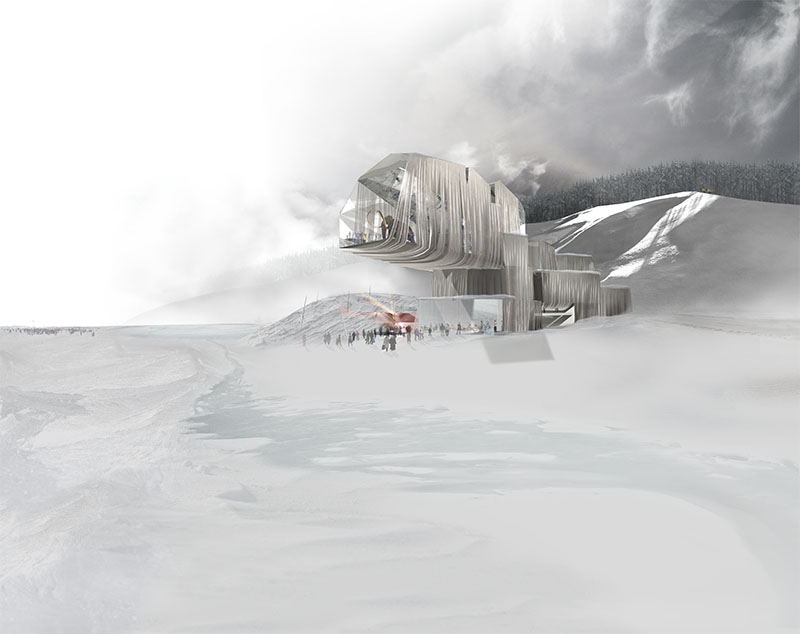
Image taken from predock.com / An outside view, looking towards the building / Mammoth.
Since these are unbuilt works, it all comes down to the visuals. This is enforced, because the text in this publication is unfortunately not representative which helps to turn this 'library' into a picture book.
The top five chosen by single-blogs are: Jean Nouvel with 'Guggenheim Museum' in Mexico, as well as the 'Performing Arts Centre' in South Korea. UN studio with 'Ciuda del Motor' in Spain, OMA with something that could already be a classic and probably is something of a dinosaur in here. It actually dates from 1996 and why it made it into a 21st century book, I don't know. Anyway, the 'Hyperbuilding' and also Antoine Predock with the 'World Mammoth and Permafrost Museum' in Russia (this would most likely be number one). There are also some really bad examples in terms of visuals, but we won't talk about those. Much more exciting are the classics. Can you believe, projects likely not even ten years old and unbuilt, but classics? We'll actually yes, they are and you definitely know them. If not you have to buy the book and find out about them. To name a few: Dillier and Scofidio with the 'Eyebeam Museum of Art and Technology', OMA as before, Foreign Office Architects with the Ground Zero proposal 'World Trade Center Tower 1', or Daniel Liebeskind's V&A Extension.
However, in the end there will always be questions asked about something labled a 'library'. In general the author does a good job and it is an interesting collection of visualisations that are clearly part of the visual image of architecture of the 21st Century. If you are interested in typologies, materials or concepts this is not the place to find answers, but a starting point.
Some further reading on the topic might well be of interest. Once you start on this topic of the thought about, but unrealised there is a whole cave to discover. Some starting points might be 'Unbuilt New York', a last year strated thing that includes an iPhone app, might convince you, or an article on BLDGBLOG on 'Unbuilt Australia'.
Jones, W., 2009. Unbuilt Masterworks of the 21st Century: Inspirational Architecture for the Digital Age, Thames & Hudson.
Tidak ada komentar:
Posting Komentar